
Teams

Jane Doe
“Great developers—fixed my bug so fast I honestly thought it was a feature.”

Alex Turner
“Their website loaded so fast, I thought my Wi-Fi finally got a promotion.”

Julie Days
“My old site crashed daily. Now it only crashes my expectations, in a good way.”
The Teams block is an organizational tool designed to showcase your company’s talent, leadership, or contributors in a professional and cohesive layout. It acts as a smart parent container that automatically adapts its children based on the user’s chosen display mode.
Settings ⚙
General
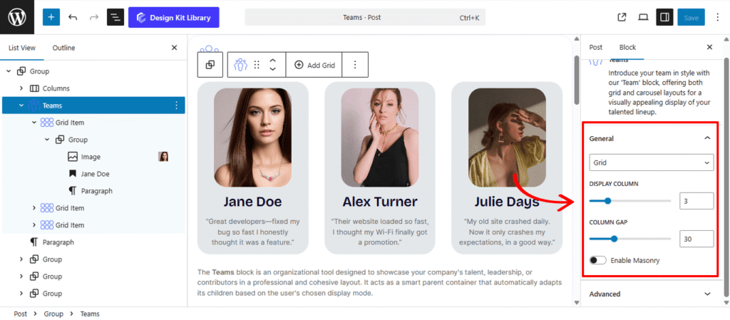
- Layout: Select Grid to display all team members simultaneously in rows and columns, or Carousel to create a horizontal slider that users can navigate through.
- Grid: Displays all team members simultaneously in rows and columns
- Display Column: Define how many team members appear in a single row.
- Column Gap: Adjust the horizontal spacing between team member cards to create a balanced, airy, or compact aesthetic.
- Enable Masonry: Activating this allows items of different heights to shift up into empty spaces, creating a modern, staggered “Pinterest-style” layout.
- Carousel: When the Carousel layout is active, this panel provides granular control over the slider’s behavior and interactive elements.
- Display Column: Determine how many slides are visible at once within the carousel track.
- Centered Slides (Toggle): When active, the current slide will always be positioned in the center of the viewport, which is ideal for highlighting a “featured” team member.
- Gap: Set the specific pixel spacing between each individual slide in the carousel.
- Loop (Toggle): Enable this to allow the slider to return to the first item automatically after the last slide, providing an infinite scrolling experience.
- Speed: Control the duration of the transition effect (in milliseconds) as the slides move from one to the next.
- Remove Slide Transition (Toggle): Switch this on if you prefer an instant jump between slides rather than a smooth sliding motion.
- Autoplay (Toggle): Set the carousel to advance automatically. You can define the Autoplay Delay (the pause between slides) and choose to Reverse Direction if you prefer a right-to-left flow.
- Enable Pagination: Adds dots or numbers at the bottom of the slider to show users their current progress through the list.
- Enable Navigation: Displays “Next” and “Previous” arrows on the sides of the carousel for manual control.
- Grid: Displays all team members simultaneously in rows and columns
Style ◑
Pagination Styles
The Pagination Styles settings is active when layout is Carousel and Pagination is enabled, this allow you to refine the appearance and interactive behavior of the navigation indicators (dots or numbers) for your Carousel. These controls ensure the pagination is both functional and visually aligned with your brand’s UI.
- Align: Set the horizontal placement of the indicators. Toggle between Left, Center, or Right to balance the layout against your team member cards.
- Vertical Positioning: Fine-tune the vertical offset to control how far the pagination sits below the carousel content.
- Gap: Adjust the specific spacing between each individual pagination dot to ensure they are distinct and easy to click.
- Default / Active (Toggle)
- Default:
- Width & Height: Define the base size of the inactive indicators.
- Border Radius: Control the shape, from sharp squares to perfect circles.
- Active:
- Width & Height: Increase these values to make the active slide indicator physically larger or longer (e.g., a “pill” shape) for better visibility.
- Border & Border Offset: Add an outline to the active dot and use the offset to create a “halo” effect (spacing between the dot and its border).
- Border Radius: Independently adjust the curvature of the active indicator.
- Default:
- Color:
- Default: The color of inactive indicators.
- Default Hover: The color shift when a user moves their cursor over an inactive dot.
- Active: The primary color for the dot representing the current slide.
- Active Default: The color of the active dot when hovered.
- Active Border: The specific color of the stroke surrounding the active indicator.
Navigation Styles
- Box Width & Height: Define the clickable area surrounding the navigation arrows. Creating a larger box ensures your gallery is touch-friendly and easy to navigate on mobile devices.
- Border: Add a structural outline to your navigation boxes. This is ideal for “Ghost Button” styles where the background is transparent.
- Border Radius: Use the slider to transition from sharp, modern squares to soft, classic circles.
- Size: Independently scale the arrow icon within its box. You can create a “minimalist small arrow in a large box” or a “bold arrow that fills the frame.”
- Color
- Icon & Icon Hover: Set the color of the arrow itself. Providing a high-contrast hover color gives the user immediate tactile feedback.
- Background & Background Hover: Control the fill color of the navigation box.