

Accordion
The Accordion Block allows you to organize large amounts of information into compact, expandable sections. It is the perfect tool for creating FAQs or detailed content lists, enabling visitors to click a header to reveal text while keeping the rest of the page clean and easy to navigate.
Accordion block is a nested block system consisting of a parent container(Accordion) and a child container(Accordion Item). To ensure a consistent design and effortless workflow, all styling and configuration settings are managed exclusively at the Parent level. When you update a setting on the parent block, it automatically syncs across every child item, saving you from repetitive manual edits.
The Accordion Block offers two variations for displaying accordion content.
- Default
- FAQ Custom Post Type (CPT)
Default Setup
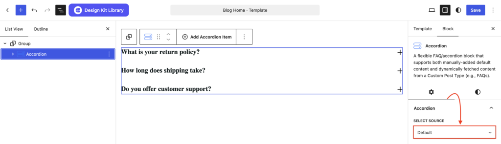
Adding Content to Accordion
The default variation, where users can manually enter the accordion heading and content directly from the WordPress Editor. This option is ideal for static content that does not require dynamic management.
- Heading/Title: Click directly on the Accordion Title placeholder. Type your desired heading or question. You can use the toolbar that appears to apply bold, italics, or inline links to specific words.
- Description: Click into the Paragraph block located immediately below the heading. This area acts as the content body that reveals itself when the accordion is expanded. You can add text, images, or even other blocks here to provide a detailed explanation.
- Add/Remove Item: To Add more items, simply click the (+) icon at the parent container’s toolbar to insert a fresh item. To Delete the item select the accordion item click the the 3 dots (
⋮) and click on delete.
FAQ CPT Setup
Adding Dummy Content
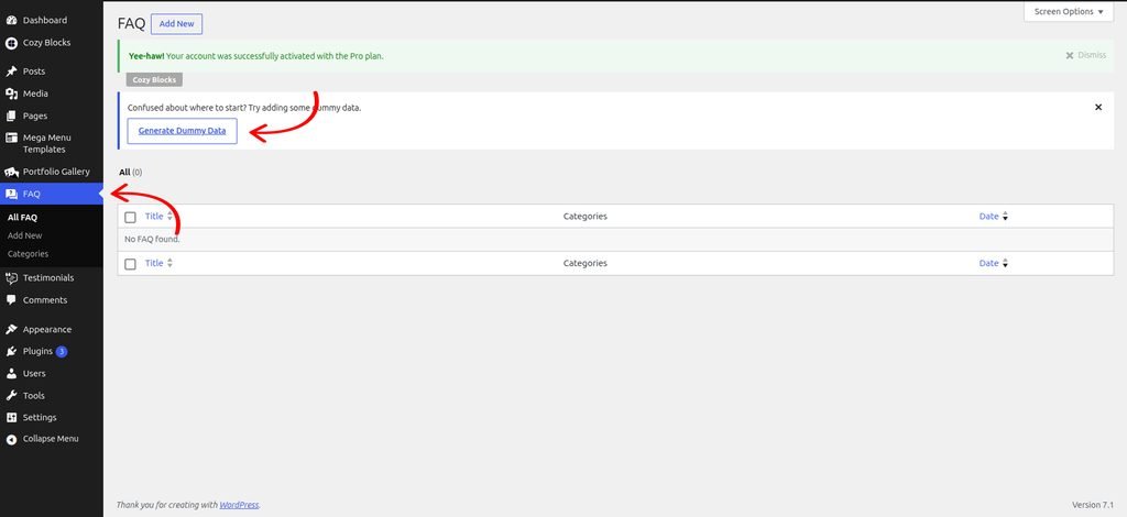
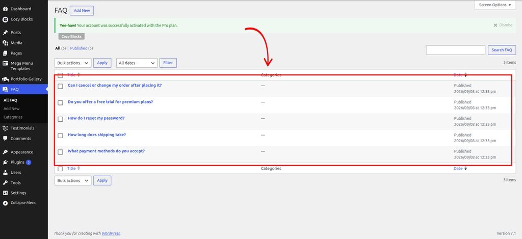
Start by adding the block and adding some dummy content to preview how it looks on your page. Once you are satisfied with the layout, you can replace the dummy content with your actual content.
Navigate to Dashboard > FAQ > Generate Dummy Data
Updating FAQ Slug
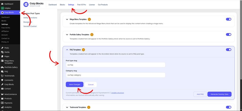
To update the FAQ post type slug and FAQ category slug, navigate to Dashboard > Cozy Block > Settings and enable the FAQ Template toggle.
Once enabled, you can update the Post Type Slug and Category Slug according to your requirements.
To update the permalink structure after changing the slugs, click Update Structure and save the updated structure.
Create FAQs in the CPT
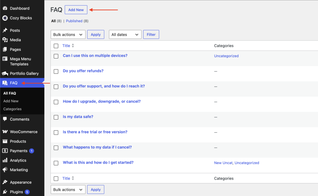
Navigate to Dashboard > FAQ > Add New to create FAQs.
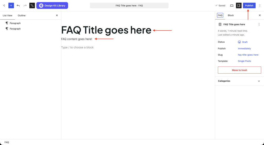
Publish your FAQ post.
Switch the source to FAQ post type to import the FAQs into the Accordion block.
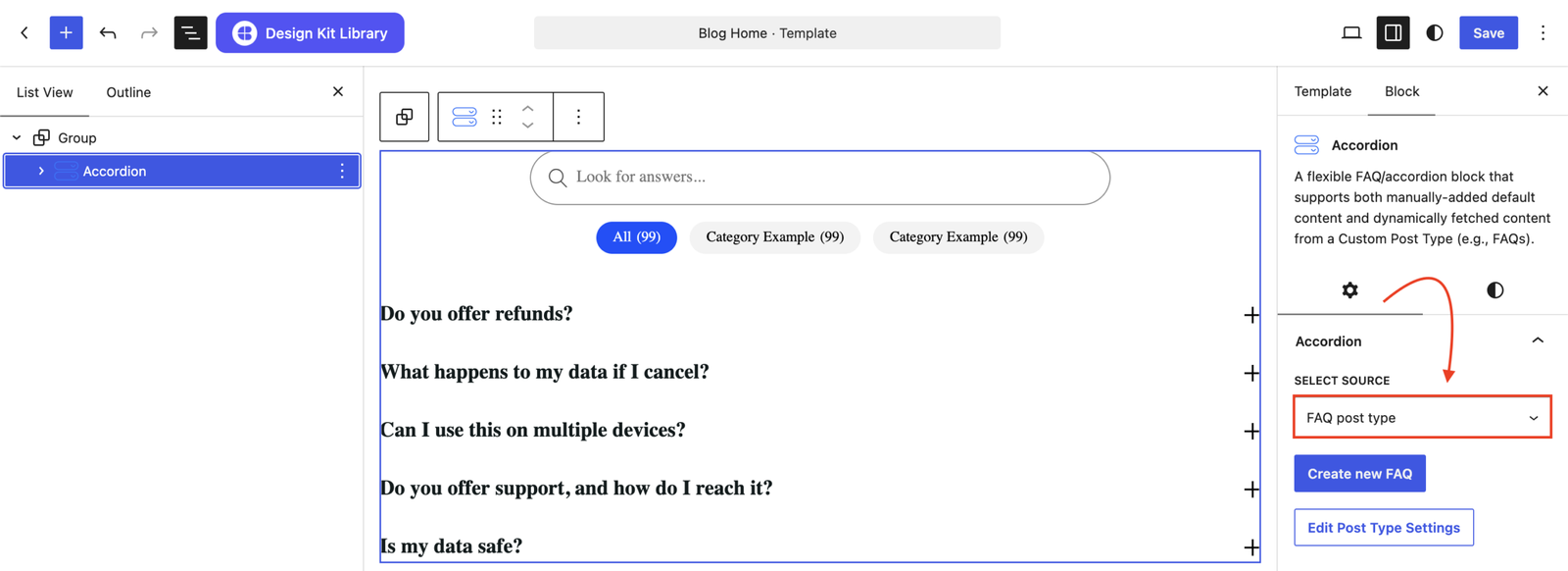
The second variation, introduced in Cozy Blocks v2.2.19, allows users to manage accordion content using a dedicated FAQ Custom Post Type. Users can create and manage their FAQs separately and use the available filter and search options to dynamically display relevant accordion content.
Settings ⚙
Accordion Panel
- Item Spacing: Vertical spacing between each FAQ item.
- Title Tag: The HTML heading level used for each question (e.g. H3) — mainly affects SEO/accessibility, not visual size.
- Title Justification: How the question text and toggle icon are spaced within each row.
- Generate Schema: When turned on, adds FAQ structured data (schema markup) to your page, which can help FAQs show up as rich results in Google search.
Layout Options
This option appears when the source is set to FAQ post type.
- Justification: Controls the alignment of the accordion items with options for Left, Right, and Center.
- Orientation: Sets the layout direction of the accordion items to Vertical or Horizontal.
- Column Gap: Adjusts the horizontal spacing between filters and the content. Appears when the Orientation is Horizontal.
- Column Width: Adjusts the horizontal spacing between filters and the content.Appears when the Orientation is Horizontal.
- Search Bar: Enables or disables the search bar for filtering accordion content.
- Search Placeholder: Defines the placeholder text displayed inside the search bar.
- Category: Enables or disables category-based filtering for the FAQ content.
- Order: Determines the sorting direction of the FAQ items with options for Ascending and Descending.
- Order By: Determines how the FAQ items are sorted, with options for Default, Date, and Count.
- Show All Tab: Enables or disables an All tab that displays all available FAQ items.
- All Tab Placeholder: Defines the label displayed for the All tab.
- Category Count: Displays or hides the number of FAQs associated with each category.
- Category Gap: Adjusts the spacing between the category filter items.
- Not Found Text: Defines the message displayed when no matching FAQ content is found.
Query Options
Appears if the category filter is disabled.
- Order By: What field to sort by.
- Number of Items: Number of FAQs shown at once.
- Categories: Restrict the list to specific FAQ categories.
Icons
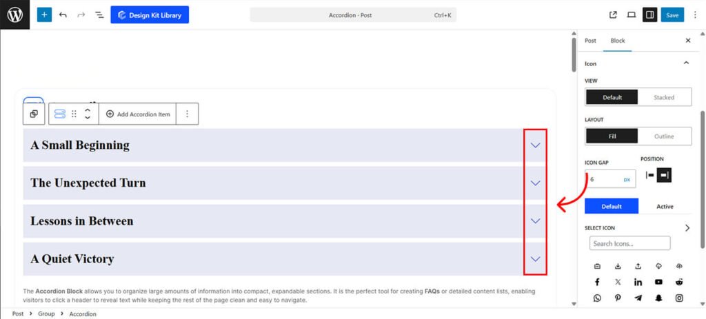
- Icon Layout: Choose Fill for a solid background or Outline for a bordered look.
- Icon Gap: Adjust the specific spacing between the icon and the title text.
- Icon Position: Set the icon to appear on either the Left or Right side of the title.
- Icon Selection: Choose a Default Icon for closed items and an Active Icon to indicate when a section is expanded.
Style ◑
Container Styles
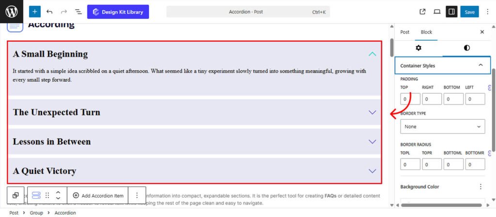
- Background Color: Apply a solid color or gradient to the background.
- Padding: Adjust the inner spacing for a more breathable layout.
- Borders: Set the thickness, color, and style (Solid, Dashed, or Dotted).
- Border Radius: Soften the edges by rounding the corners.
Search Styles
Appears only if the source is set to FAQ post type and Search is enabled.
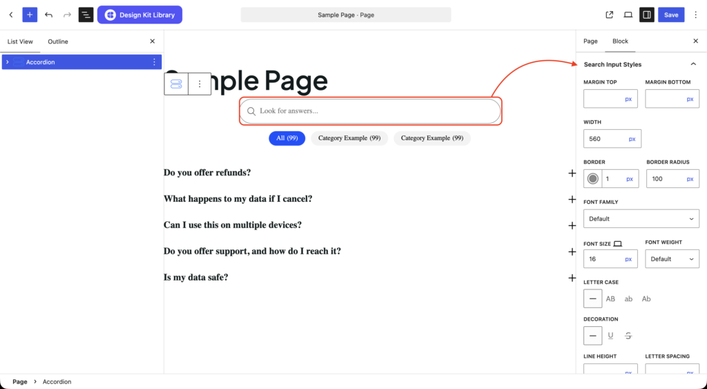
- Margin: Set vertical margin.
- Width: Sets the max-width of the search bar.
- Border: Set the thickness, color, and style (Solid, Dashed, or Dotted).
- Border Radius: Soften the edges by rounding the corners.
- Typography: Full control over your font, including font family, font size, weight, text decoration, letter case, line height, and letter spacing.
- Colors: Color options can be set for the default view and for when the search bar is in a focused state.
Category Styles
Appears only if the source is set to FAQ post type and Category is enabled.
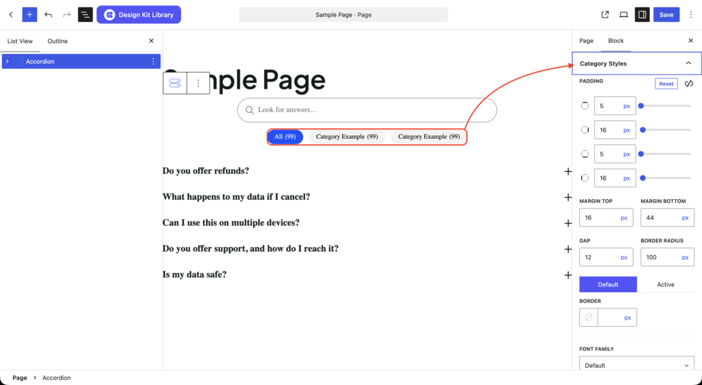
- Padding: Inner spacing around the individual category.
- Margin: Set vertical margin.
- Gap: Add spacing between each category.
- Border Radius: Soften the edges by rounding the corners.
- Border (Default): Set the thickness, color, and style (Solid, Dashed, or Dotted).
- Border (Active): Set the thickness, color, and style (Solid, Dashed, or Dotted) for the active category.
- Typography: Full control over your font, including font family, font size, weight, text decoration, letter case, line height, and letter spacing.
- Colors: Color options can be set for the default view and for when the category is in an active state.
Accordion Item Styling
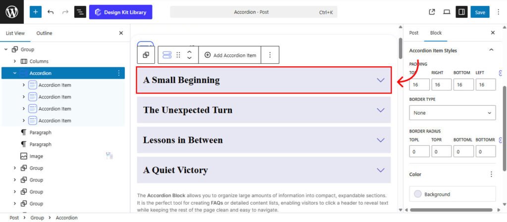
- Background Color: Apply a solid color or gradient to the background.
- Padding: Adjust the inner spacing for a more breathable layout.
- Borders: Set the thickness, color, and style (Solid, Dashed, or Dotted).
- Border Radius: Soften the edges by rounding the corners.
Accordion Icon Styling
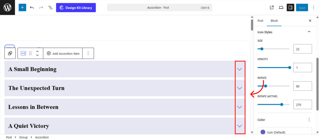
Fine-tune the visual appearance and animation of your accordion icons to match your brand’s style.
Icon Wrapper Styles
- Padding: Inner spacing around the icon.
- Width: Width of the icon container
- Height: Height of the icon container
- Border: Width, style, and color of the icon container’s border.
- Border Radius: Roundness of the icon container corners.
Icon Styles
- Size: Use the slider to scale the icon up or down.
- Opacity: Adjust the transparency of the icon for a subtle or bold look.
- Rotate: Set the starting angle of the icon when the item is closed.
- Rotate Active: Define the rotation angle for when the item is expanded (e.g., rotating a plus into a minus).
Colors
- Icon (Default): Default color of the icon.
- Icon (Active): Color of the icon when the accordion is active.
- Background (Default): Default background color of the icon.
- Background (Active): Background color of the icon when the accordion is active.
- Border (Active): Border color of the icon when the accordion is active.
Accordion Title Styles
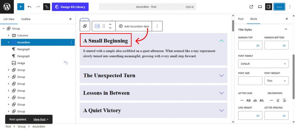
The Title Styles allow you to control the typography and spacing of the accordion headings.
- Margin Top & Bottom: Use these sliders to adjust the outer vertical space above and below the title. This helps you balance the heading within the header area or create separation from the content below.
- Typography: Full control over your font, including font family, font size, weight, text decoration, letter case, line height, and letter spacing.
- Default Color: Set the color of the title when the accordion item is closed.
- Active Color: Choose a specific color for the title when the section is expanded to provide clear visual feedback.
Typography
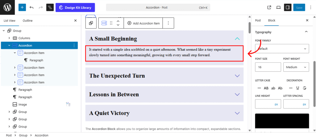
The Typography Panel allows you to style the content revealed when an accordion item is expanded. These settings ensure your descriptions are easy to read and visually distinct from the headings.
- Typography Settings: Full control over your font, including font family, font size, weight, text decoration, letter case, line height, and letter spacing.
- Text Color: Choose a default color for your description text to match your site’s color palette.
Demo
A Small Beginning
It started with a simple idea scribbled on a quiet afternoon. What seemed like a tiny experiment slowly turned into something meaningful, growing with every small step forward.
The Unexpected Turn
No one saw it coming. A minor change in plans opened the door to a new opportunity, proving that sometimes the best outcomes arrive unannounced.
Lessons in Between
Not every moment was perfect, but each challenge carried a quiet lesson. Looking back, those in-between struggles shaped the journey the most.
A Quiet Victory
There was no loud celebration, just a deep breath and a soft smile. The achievement felt personal — a reminder that progress doesn’t always need an audience.
- All (5)
- Consult (4)
- Getting Started (1)
Can I request a consultation?
Absolutely. Contact us to discuss your requirements and find the right solution.
How long does the process take?
Most projects are completed quickly, depending on their size and complexity.
Do you offer custom solutions?
Yes, we offer flexible options that can be tailored to your specific requirements.
How can I get started?
Getting started is simple. Choose the service you need and reach out to our team.
What services do you offer?
We provide reliable solutions designed to meet your needs and help you achieve your goals.