Sidebar Panel
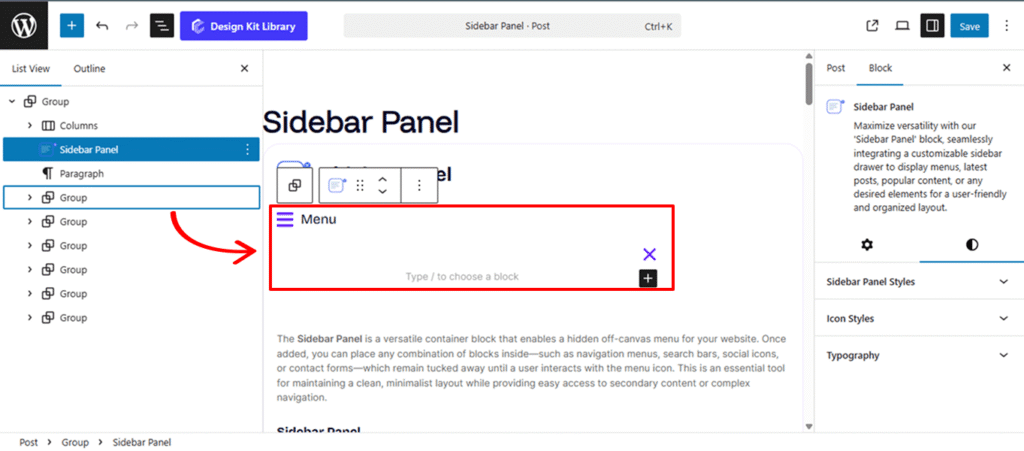
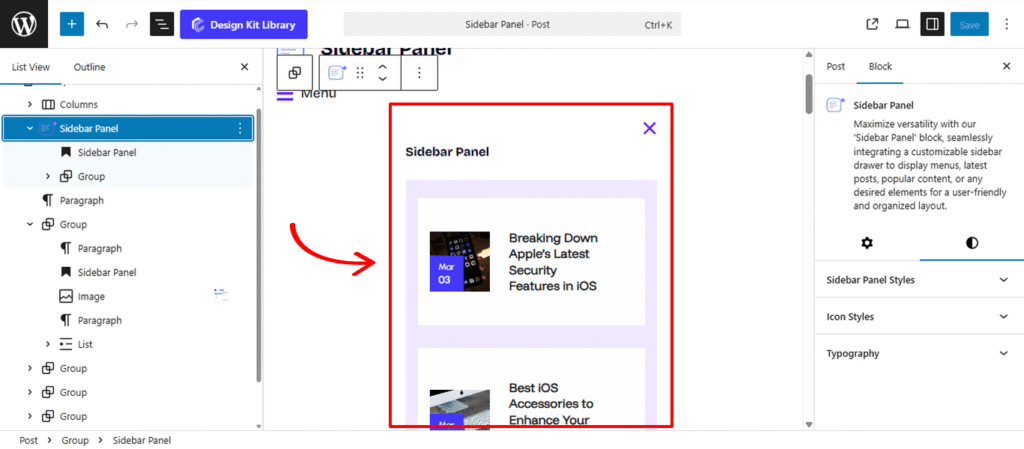
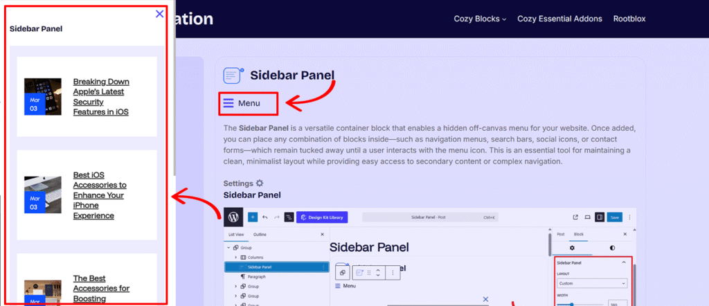
The Sidebar Panel is a versatile container block that enables a hidden off-canvas menu for your website. Once added, you can place any combination of blocks inside—such as navigation menus, search bars, social icons, or contact forms—which remain tucked away until a user interacts with the menu icon. This is an essential tool for maintaining a clean, minimalist layout while providing easy access to secondary content or complex navigation.
Settings ⚙
Sidebar Panel
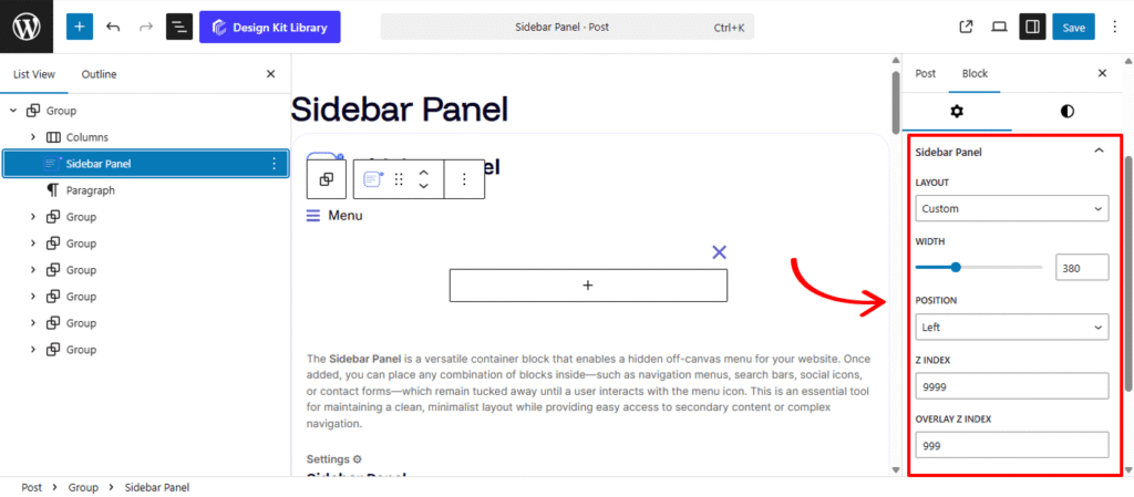
The Sidebar Panel settings allow you to control the physical behavior and layering of the off-canvas menu when it is triggered. These configurations ensure the sidebar integrates perfectly with your site’s navigation flow and depth
- Layout: Choose between two primary architectural modes:
- Full Width: The sidebar expands to cover the entire screen, creating an immersive, focused navigation experience.
- Custom: Allows you to define a specific width for the sidebar, keeping a portion of the main content visible in the background.
- Width: This setting allows you to define the precise horizontal span of the sidebar. You can input a specific value in pixels (e.g., 400px) or percentages (e.g., 30%) to ensure the menu occupies exactly the right amount of screen real estate without completely obscuring the main content.
- Position: This determines the slide-in direction. You can anchor the menu to the Left for a traditional navigation feel or the Right for a more modern, app-like secondary menu.
- Z-Index: Set the stack order of the sidebar panel. This ensures that the menu slides over your header, footer, and other page elements rather than getting tucked behind them.
- Overlay Z-Index: Control the depth of the background overlay (the “shroud” that darkens the rest of the page). By adjusting this, you can ensure the overlay covers the main content perfectly while remaining behind the active sidebar.
Open Icon
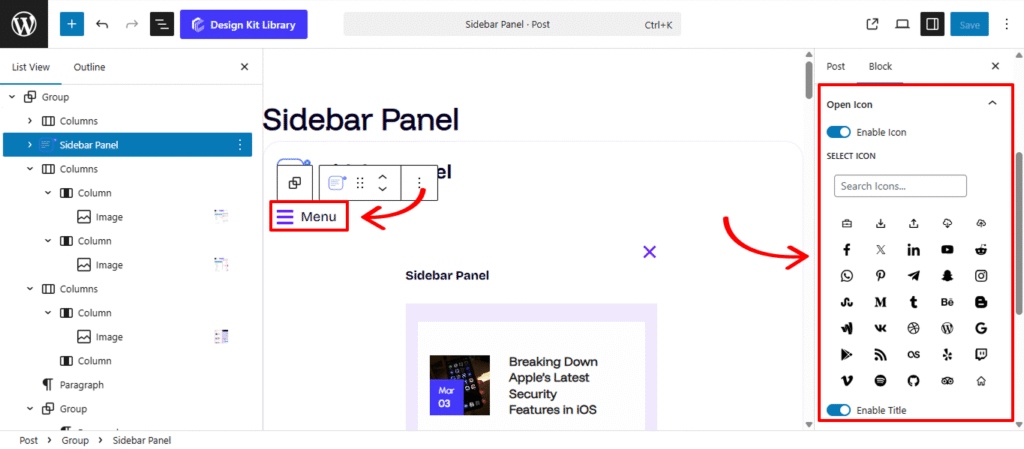
The Open Icon settings allow you to customize the trigger element that users click to reveal your sidebar. This section provides full control over the visual presentation of the menu button, whether you prefer a minimalist “hamburger” icon or a labeled navigation trigger.
- Enable Icon: Switch this on to display a graphic symbol for your menu. Disabling it allows you to use a text-only trigger if preferred.
- Select Icon: Access a library of symbols to choose the perfect representation for your sidebar (e.g., three horizontal lines, a plus sign, or a gear).
- Enable Title: Activate this to add a text label (e.g., “Menu” or “Filter”) alongside your icon for better user guidance and accessibility.
- Title Position: Determine where the label sits in relation to the icon. You can place it to the Left, Right, Top, or Bottom to match your header’s alignment.
- Title: Input the custom text you want to appear as the trigger’s name.
- Gap: Use this slider to define the specific spacing between the icon and the title, ensuring the two elements aren’t crowded and remain easy to read.
Close Icon
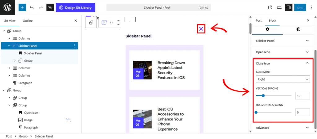
The Close Icon settings allow you to refine the appearance and placement of the exit trigger within your sidebar. Proper positioning ensures that users can intuitively find the button and dismiss the menu at any time.
- Alignment : Determine which side of the sidebar the close button is anchored to. You can align it to the Left for a classic back-button feel or the Right to follow standard web conventions for closing overlays.
- Vertical Spacing: Adjust the amount of “breathing room” above and below the icon. This is essential for preventing the icon from being cut off by the top of the browser or crowding the content inside the sidebar.
- Horizontal Spacing: Control the distance between the icon and the sidebar’s edge. Increasing this value pushes the icon further inward, which can help align it with the padding of the other blocks inside your sidebar.
Style ◑
Icon Styles
The Icon Style configuration allows you to define the visual language of your toggle triggers. These settings ensure that your icons—whether for opening or closing the sidebar—perfectly align with your site’s UI density and branding.
- Icon View: Choose between Default for a simple, standalone icon, or Stacked to place the icon inside a background shape (like a circle or square) for a more prominent “button” appearance.
- Icon Layout: Select Fill to give your stacked icon a solid color background, or Outline for a modern, transparent look with a thin perimeter stroke.
- Size: A precise slider to scale your icon. You can create a subtle, small navigation trigger or a large, high-impact menu button.
- Opacity: Adjust the transparency of the icon. Lowering this value can help the icon feel more integrated into the background rather than sitting harshly on top.
- Icon Rotate: Spin the icon to any degree. This is useful for tilting a “plus” icon to become a “cross” or for creating unique directional arrows.
- Color:
- Default: The standard color of the icon in its idle state.
- Hover: The color the icon shifts to when a user’s cursor passes over it, providing essential visual feedback.
- Open Icon: The color the trigger adopts once the sidebar is active (if the icon remains visible).
- Open Icon Hover: The specific hover state for the icon while the menu is already expanded.
Typography
The Typography panel gives you complete stylistic control over the text label paired with your menu icon. By adjusting the font family, weight, and letter spacing, you can ensure the “Menu” text is perfectly legible and maintains a consistent visual hierarchy with your site’s primary navigation.
- Typography
- Font Family & Size: Select the typeface and scale that best matches your site’s design system.
- Font Weight: Control the thickness (e.g., Bold for emphasis or Light for a modern look).
- Letter Case: Force the labels to Uppercase, Lowercase, or Capitalize without editing the form code.
- Decoration: Apply styles like Underline or Line-through if needed for specific design cues.
- Line Height & Letter Spacing: Fine-tune the vertical breathing room and horizontal character density.
- Color: Controls the color of the numerical progress value, allowing you to highlight the data point with a contrasting or brand-aligned shade.