

Social Icons
The Social Icons block is a sleek, customizable tool designed to connect your visitors with your online presence. It allows you to display a collection of social media links in a consistent style, ensuring your brand’s external channels are easily accessible from any part of your site.
Adding Icons
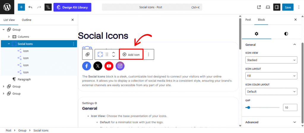
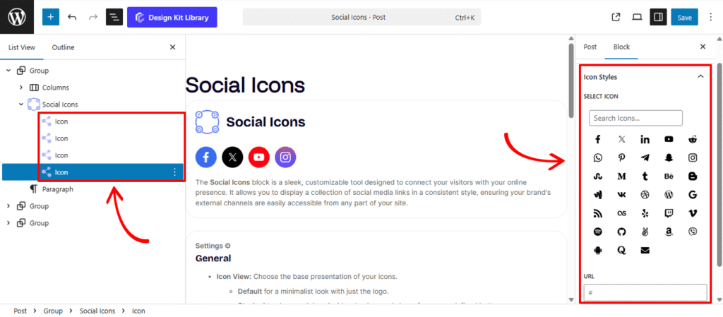
The Social Icon block acts as a container for multiple individual Icon sub-blocks. To expand your list, select the parent block, click the Add Icon (+) button on the toolbar, and then choose your desired platform or icon type from the right-hand sidebar. This modular setup allows you to add as many links as needed, with each icon supporting its own unique URL and custom styling within a single, organized group.
Settings ⚙
General
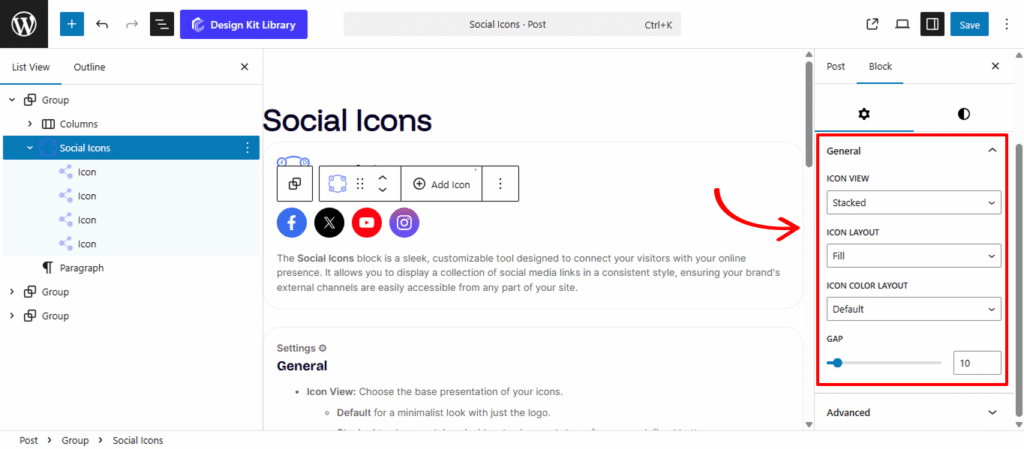
- Icon View: Choose the base presentation of your icons.
- Default for a minimalist look with just the logo.
- Stacked to place each icon inside a background shape for a more defined button appearance.
- Icon Layout: Define the visual style of your stacked icons:
- Fill: Gives the background shape a solid color, making the icons pop against your page content.
- Outline: Provides a modern, transparent look with a thin perimeter stroke around the icon.
- Icon Color Layout: Manage how colors are applied to your social set:
- Default: Automatically applies the official brand colors for each platform (e.g., brand blue for Facebook, red for YouTube).
- Custom: Allows you to override official branding with your own site’s color palette for a more unified and aesthetic design.
Style ◑
Icon Box Styles
- Padding : Adjust the internal spacing between the progress element and the container’s edge. This is essential for creating “breathing room” or a boxed-in look for your progress bars.
- Border Controls: (Visible when Border Type is set to anything other than “None”)
- Border Type: Choose your stroke style (e.g., Solid, Dashed, Dotted).
- Border Width: Define the thickness of the container’s frame.
- Border Color: Select the specific hue for the border to match your brand palette.
- Border Radius : Soften the corners of your container. Use a low value for a professional square look or a high value to create a fully rounded, pill-shaped container.
- Background Color: This setting is active only when Icon Color Layout is set to Custom.
- Normal: Select a specific color for the icon background to match your site’s theme.
- Hover: Define a secondary color that triggers when a user’s cursor passes over the icon, providing an interactive, dynamic feel to your social links.
Icon Styles
- Size: Adjust the physical dimensions of the icons. This slider allows you to scale the logos up for high-visibility footers or down for subtle integration within a header or sidebar.
- Opacity: Control the transparency level of the icons. You can lower the opacity to help the icons blend softly into the background or keep them at 100% for maximum clarity.
- Background Color: This setting is active only when Icon Color Layout is set to Custom.
- Normal: Choose a specific color for the social logo to ensure it aligns with your brand’s unique color palette.
- Hover: Define a feedback color that appears when a user hovers over the icon, creating a responsive and engaging experience.