

Portfolio Gallery
The Portfolio Gallery block is a high-performance visual engine designed to showcase your creative work with professional finesse. It allows you to transform standard project images into an immersive, high-end gallery experience that captures user attention and highlights your portfolio’s unique value. Depending on how you manage your assets, you can choose between two distinct workflow variants:
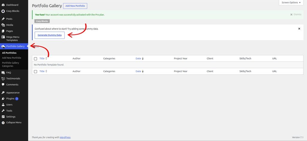
Adding Dummy Content
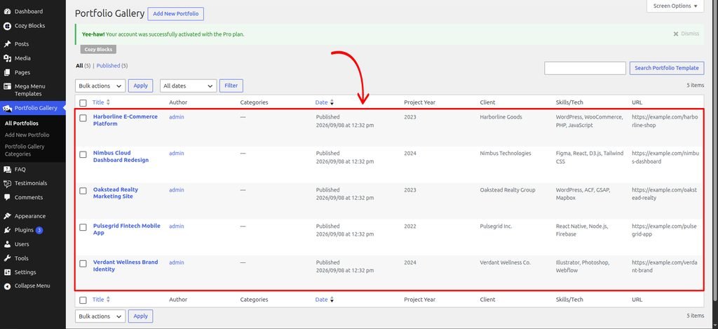
Start by adding the block and adding some dummy content to preview how it looks on your page. Once you are satisfied with the layout, you can replace the dummy content with your actual content.
Navigate to Dashboard > Portfolio Gallery > Generate Dummy Data
Creating Your Templates
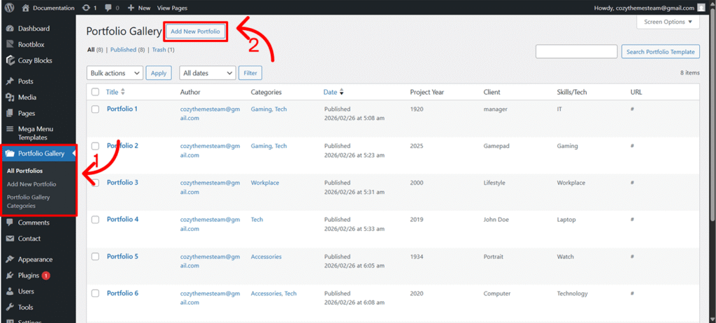
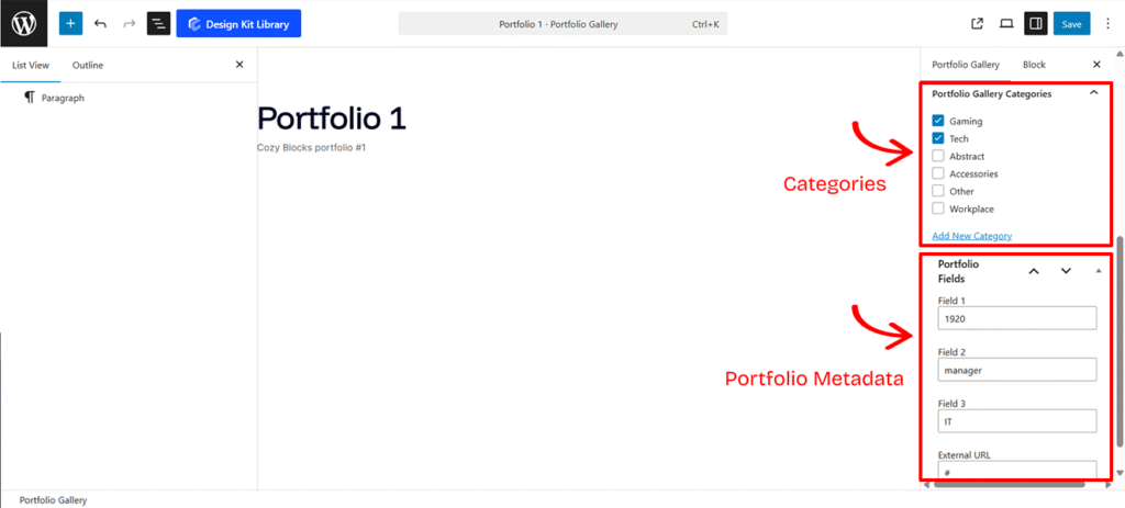
To populate your gallery using this source, you must first build the individual project entries:
- Create the Template: Navigate to Portfolio Gallery
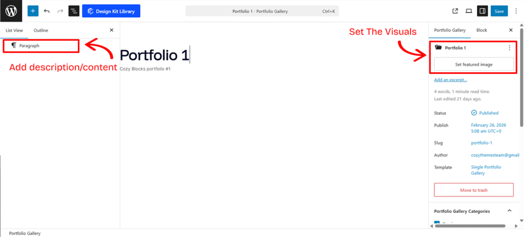
>Add New Portfolio. Each “New Portfolio” entry represents one item in your gallery. - Set the Visuals: Use the Featured Image field. This image acts as the primary thumbnail displayed in the Portfolio Gallery block.
- Add Descriptions: To provide context for your work, simply add blocks (Text, Paragraphs, or Lists) directly into the template editor.
- The Excerpt Logic: All text content you add to this page will be automatically pulled and displayed as the Excerpt within the Portfolio Modal/Popup, giving users a quick summary of the project.
- Assign Metadata: Each template allows you to input four specific data points to give your work context:
- Project Year: (Numeric input only) Perfect for chronological sorting.
- Client: The name of the person or company.
- Skills/Tech: Tag the tools used (e.g., “React,” “Branding,” “Photography”).
- External URL: A direct link to the live project or a detailed case study.
- Organize with Categories: Tag your template with a category (e.g., “Web Design”) to enable filtering in your main gallery block.
Update Portfolio Gallery Slug
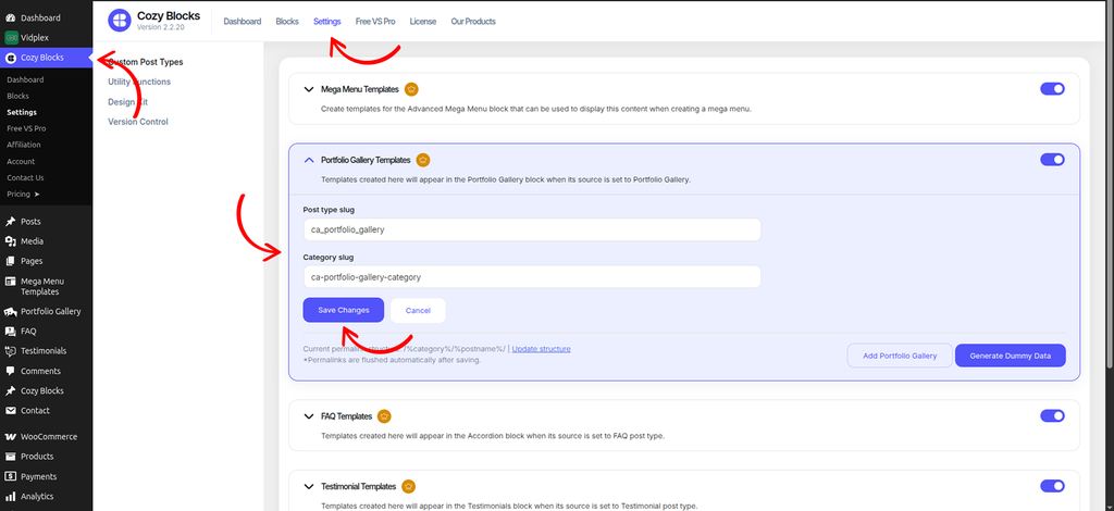
To update the Portfolio Gallery post type slug, navigate to Dashboard > Cozy Block > Settings and enable the Portfolio Gallery Templates toggle.
Once enabled, you can update the Post Type Slug according to your requirements.
To update the permalink structure after changing the slugs, click Update Structure and save the updated structure.
Portfolio Categories
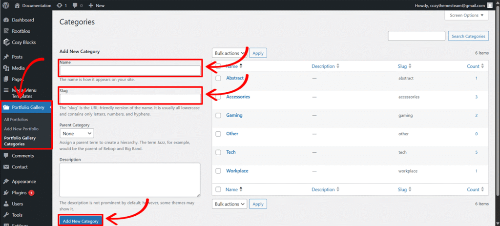
Categories allow you to filter your portfolio, helping visitors find specific types of work (e.g., “Web Design” vs. “Print”).
- Add/Edit Categories: Navigate to Portfolio Gallery
>Portfolio Gallery Categories. - Setup: Fill in the name, slug, parent category and description, then click Add New Category.
- Assignment: Within each individual Portfolio Template, check the box for the relevant category to group your work effectively.
Portfolio Metadata
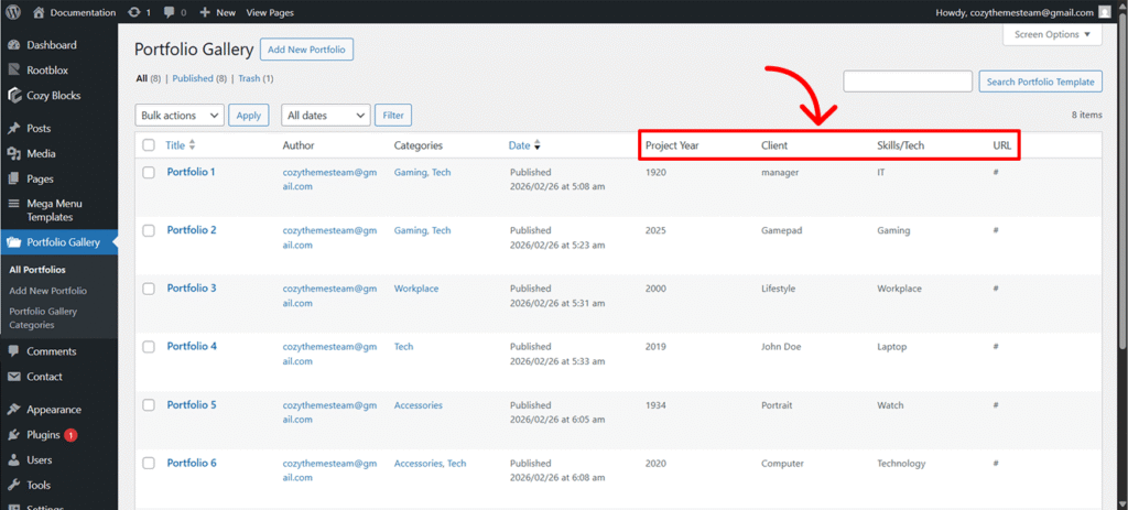
If the default labels like Project Year or Client don’t fit your specific niche (e.g., you want to change “Client” to “Architect” or “Year” to “Phase”), you can rename them using two primary methods.
Editing Labels for Popup View
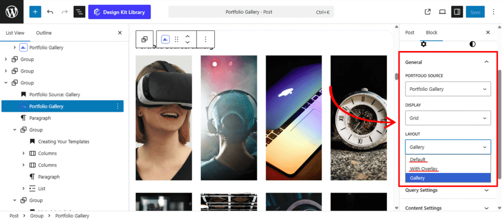
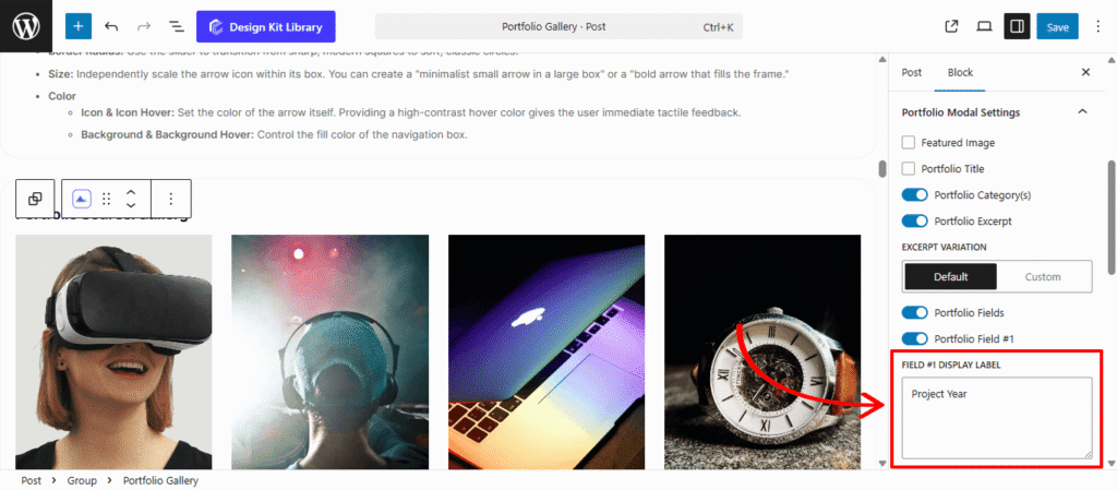
Use this method if you are using the Default or With Overlay layouts and want to adjust labels specifically for the detail popup.
- Select your Portfolio Gallery block in the editor.
- Ensure View Details (Popup) is enabled in the settings.
- Navigate to the Portfolio Modal Settings tab in the sidebar.
- Locate the Portfolio Fields toggle and ensure it is switched On.
- Update the text in Field #1 Label, Field #2 Label, etc., to your preferred titles.
Editing labels for Single Post
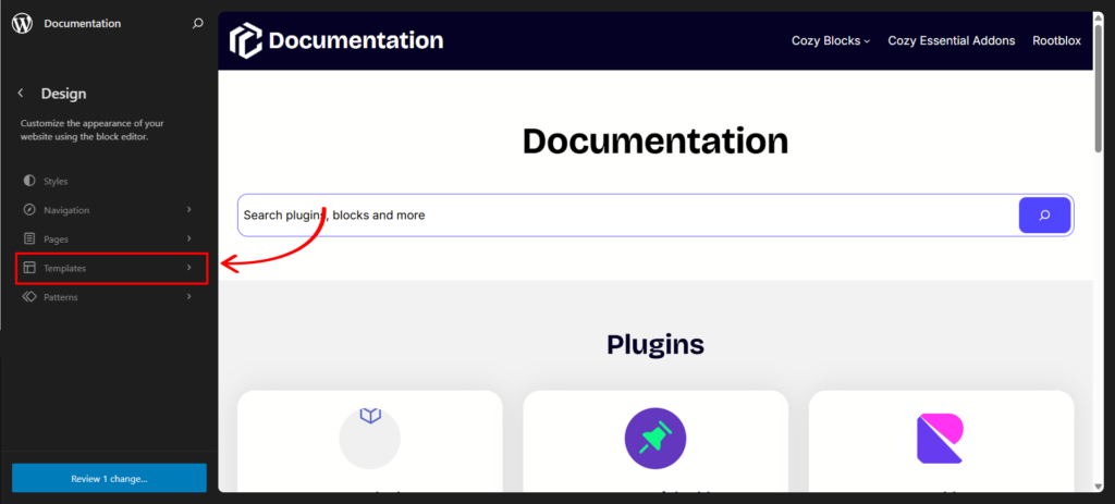
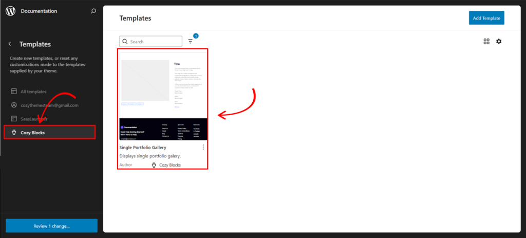
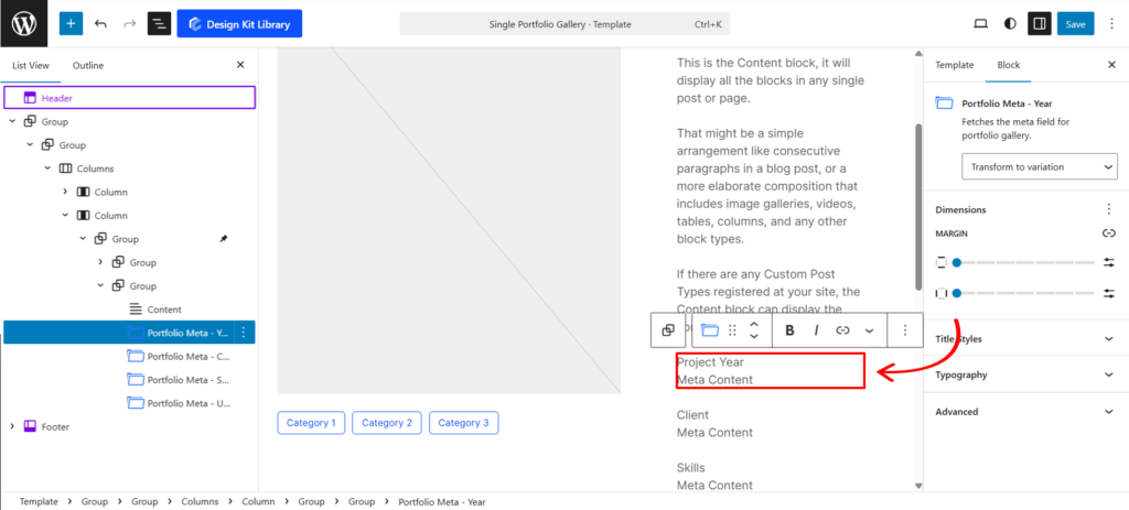
Use this method to change the labels across your entire site by editing the core template.
- Navigate to your Editor > Templates > Cozy Blocks.
- Select the Single Portfolio Gallery template.
- Locate and select the Portfolio Gallery Meta block within the layout.
- Type your new labels directly into the field settings.
- Save the template to apply these changes globally.
Settings ⚙
Display Settings
Choose how your work is presented to the visitor. The options dynamically change based on your selected layout.
- Display Type:
- Grid: A structured, stable layout for a clean and professional look.
- Carousel: A sliding horizontal gallery that saves vertical space while encouraging interaction.
- Display Settings (Display Type : Grid)
- Display Column: Define how many images appear side-by-side.
- HGap & VGap: Precision sliders to control the horizontal and vertical gutters between your portfolio items.
- Enable Masonry: Toggle this to create a “Pinterest-style” staggered layout. It allows images of different heights to fit together seamlessly without forced cropping.
- Carousel Settings (Display Type : Carousel)
- Slides Per View: Determine how many images are visible at once.
- Centered Slide: Keeps the active portfolio item in the middle of the viewport.
- Gap & Loop: Toggle spacing between slides and allow the gallery to restart automatically after the last image.
- Autoplay & Delay: Let the gallery scroll on its own. Use the Delay toggle to set the pause duration between transitions.
- Speed: A slider to control how fast the sliding animation occurs.
- Pagination & Navigation: Enable dots or arrows to give users manual control over the scroll.
- Display on Hover: A sleek option that hides navigation arrows until the user moves their cursor over the gallery, reducing visual clutter.
Layout
When using the Portfolio Gallery source, you have three distinct layout strategies to choose from. Each one changes how your audience interacts with your work—from detailed project breakdowns to high-speed visual browsing.
- Default: Best for detail-oriented work. It features a clean grid that opens a Metadata Popup, displaying specific project info like Client, Year, and Tech. You can toggle this popup on or off to control the depth of information shared.
- With Overlay: A modern, interactive choice that hides Project Titles until a user hovers over an image. Clicking launches a Lightbox Slider for immersive browsing, with the option to enable or disable the detail popup.
- Gallery: The most minimalist approach, displaying only a Custom Icon on hover. It opens an image slider where clicking the image redirects the user directly to the External URL linked in your project template.
Query Settings
The Query Settings allow you to control which portfolio items are pulled from your dashboard and the specific order in which they appear. These parameters ensure your most relevant or recent work always takes center stage.
- Order By: Define the logic used to sort your portfolio items. You can organize your gallery by Date (to show your latest work first), Title (for alphabetical organization), or Random (to give every project equal exposure on refresh).
- Number of Items: Determine how many portfolio pieces are loaded into the block.
- Set a specific number (e.g., 6 or 12) to keep your page length consistent.
- Pro Tip: Enter -1 in this field to automatically pull and display all available images from your portfolio library.
Content Settings
The Content Settings give you granular control over how your portfolio items behave when clicked and how the project titles are structured for both users and search engines.
- Link Image to Portfolio: Toggle this on to make the entire featured image a clickable shortcut to the project’s dedicated page or external URL.
- Behavior Controls: You can choose to Open link in a new tab (to keep users on your gallery) and Mark as no-follow (to instruct search engines not to pass SEO authority to the destination link).
- Portfolio Title: Toggle this to show or hide the project name on your gallery grid or overlay.
- Select Title Tag: Choose the appropriate HTML tag (H1 through H6) from the dropdown. This is a key step for maintaining a proper SEO hierarchy on your page.
- Link Title to Portfolio: Similar to the image settings, this makes the text itself a clickable link.
- Secondary Controls: Includes the same “New Tab” and “No-follow” options to ensure consistent navigation behavior across the entire block.
With Overlay
- Portfolio Excerpt: Toggle this to show a brief project description on hover.
- Default: Automatically pulls the “Excerpt” defined in your dashboard template. If no excerpt exists, it displays the first 40 characters of your project content.
- Custom: Gives you a slider to define a specific character length pulled directly from your template content.
- Button: Toggle this to add or remove a call-to-action button, providing a clear path for users to explore the full project.
- Content Position: A 3 x3 Grid selector that lets you pin your title, excerpt, and button to the top-left, center, bottom-right, or any of the nine standard positions within the image frame.
Gallery
- Icon Toggle: Turn the hover icon on or off.
- Select Icon: Choose from a library of SVG icons (such as a plus sign, magnifying glass, or link chain) to represent the “View Gallery” action. This icon acts as the primary visual trigger for the lightbox slider.
Display Settings
The Display Settings allow you to architect the visual structure of your portfolio. Whether you want a rigid professional grid or a creative, staggered layout, these controls manage the spacing and organization of your project items.
- Display Column: Set how many portfolio items appear in a single row. This helps you balance image size with page length.
- HGap & VGap: Precision sliders to manage the Horizontal and Vertical gutters. Use these to create a “breathable” layout with wide margins or a “seamless” look by setting them to zero.
- Enable Masonry: Toggle this to allow images of different aspect ratios to fit together like a puzzle. This prevents awkward white space when your project thumbnails aren’t all the same height.
- Enable Category Filter: Adds a navigation menu above your gallery, allowing users to filter projects by type (e.g., “Photography,” “Web Design”).
- Select Category: Choose which specific categories to include in the filter bar. Categories are defined in the Portfolio Gallery Templates.
- Category HGap & VGap: Control the spacing between the filter buttons.
- Category Justification: Align your filter menu to the Left, Center, or Right to match your page’s header or overall alignment.
- Enable Dynamic Loader: Activates an AJAX loader. Instead of reloading the entire page, new items or filtered results “pop” into place smoothly, providing a much faster and more modern user experience.
AJAX Loader Settings
The Dynamic Loader (AJAX) ensures your gallery remains fast and interactive by loading additional projects without a full page refresh. This section becomes active when the Enable Dynamic Loader toggle is switched on, allowing you to customize the “Load More” experience for your visitors.
- Button Label: Customize the text on the trigger button. While “Load More” is the standard, you can change this to “View More Projects,” “Discover More,” or any call-to-action that fits your brand voice.
- Label More Reviews: Use this slider to control the quantity of new items that appear each time the button is clicked. This allows you to manage page performance and scroll depth—for example, loading 3 or 6 new projects at a time rather than overwhelming the user with the entire remaining library at once.
Style ◑
Pagination Styles
The Pagination Styles panel allows you to customize the interactive dots or indicators for your Portfolio Carousel.This panel becomes active only when Enable Pagination is toggled on. These settings ensure that the navigation elements are not only functional but also align perfectly with your site’s branding and layout.
- Vertical Position: Move the pagination dots up or down. This is essential for placing them either inside the gallery overlay or neatly tucked below the images.
- Gap Align: Control the specific spacing between each individual pagination dot to prevent them from looking too cluttered or too sparse.
- Width & Height: Use the sliders to define the size of the dots. You can create perfectly circular indicators or elongated “pill” shapes for a modern aesthetic.
- Border Radius: Soften the corners of your indicators. Maximize this slider for classic round dots or set it to zero for sharp squares.
- Outline & Outline Offset: When a slide is Active, you can trigger a surrounding border (outline) to clearly highlight the user’s current position in the gallery. The Offset slider pushes this outline away from the dot for a stylish “halo” effect.
- Color
- Default & Default Hover: Set the base color for inactive dots and how they react when a cursor passes over them.
- Active & Active Hover: Define the “Current” slide color to provide clear visual feedback.
Featured Image Styles
The Featured Image Style panel gives you complete control over the “hero” visuals of your portfolio. These settings ensure your project thumbnails are consistently sized, perfectly cropped, and react beautifully when a visitor interacts with them.
- Width & Height: Define the exact footprint of your project images. Adjusting these ensures your grid remains uniform, even if the original source images vary in size.
- Scale Mode:
- Cover: Fills the entire container by cropping the edges of the image. This is the gold standard for clean, uniform grids.
- Contain: Shows the entire image without cropping, which may result in letterboxing if the image aspect ratio doesn’t match the container.
- Fill: Stretches the image to fit the dimensions, which may cause distortion.
- Margin Top & Bottom: Add external white space above or below the image to separate it from titles or other grid elements.
- Border Radius: Use the slider to round the corners of your images. Small values offer a subtle professional touch, while a maximum value can create circular or pill-shaped thumbnails.
- Image Hover Effect: Zoom In animation that trigger when a user moves their cursor over the project.
- Overlay Color: Apply a semi-transparent color tint that appears on hover. This is particularly useful in the With Overlay layout to ensure white text remains readable against light-colored images.
Portfolio Title Styles
- Typography
- Font Family & Size: Select the typeface and scale that best matches your site’s design system.
- Font Weight: Control the thickness (e.g., Bold for emphasis or Light for a modern look).
- Letter Case: Force the labels to Uppercase, Lowercase, or Capitalize without editing the form code.
- Decoration: Apply styles like Underline or Line-through if needed for specific design cues.
- Line Height & Letter Spacing: Fine-tune the vertical breathing room and horizontal character density.
Overlay Content Style
Note: This Panel is active if the layout is set to ‘With Overlay’.
- Wrapper Padding: Adjust the inner spacing for a more breathable layout
- Button:
- Padding: Adjust the inner spacing for a more breathable layout
- Typography
- Font Family & Size: Select the typeface and scale that best matches your site’s design system.
- Font Weight: Control the thickness (e.g., Bold for emphasis or Light for a modern look).
- Letter Case: Force the labels to Uppercase, Lowercase, or Capitalize without editing the form code.
- Decoration: Apply styles like Underline or Line-through if needed for specific design cues.
- Line Height & Letter Spacing: Fine-tune the vertical breathing room and horizontal character density.
- Color:
- Text Color: Sets the primary color for your project titles and excerpts. If using an overlay, ensure this color provides high contrast against your hover background.
- Button Default & Hover: Define the color of the text inside the button. A common practice is to use a neutral color for the default state and a brand-specific “pop” color for the hover state.
- Button Background (Default & Hover): Controls the solid or transparent fill of the button. You can create a “Ghost Button” by setting the default background to transparent and adding a solid color on hover.
- Button Border Hover: This allows you to change the color of the button’s outline specifically when a user interacts with it, adding an extra layer of tactile feedback.
Portfolio Modal Styles
The Portfolio Modal Styles panel provides deep customization for the popup window that appears when a user clicks a project. This interface uses four navigation buttons to toggle between specific styling categories, ensuring you can polish every detail of the project showcase without a cluttered workspace.
- Padding: Adjust the inner spacing for a more breathable layout
- Typography
- Font Family & Size: Select the typeface and scale that best matches your site’s design system.
- Font Weight: Control the thickness (e.g., Bold for emphasis or Light for a modern look).
- Letter Case: Force the labels to Uppercase, Lowercase, or Capitalize without editing the form code.
- Decoration: Apply styles like Underline or Line-through if needed for specific design cues.
- Line Height & Letter Spacing: Fine-tune the vertical breathing room and horizontal character density.
- Color
- Text: Sets the primary color for the main project description. Choose a color that offers high contrast against your modal background for easy reading.
- Category: Defines the color of the text inside your project tags or category labels.
- Category Background: Controls the fill color of the category “pills,” allowing you to create badges that stand out from the rest of the content.
- Post Title: The color for the main project headline. This is usually the boldest color in your palette to establish a clear visual hierarchy.
- Field Title: Specifically styles the labels of your metadata (e.g., “Client” or “Year”). Using a more muted tone here helps differentiate labels from the actual data.
- Field Subtitle: Sets the color for the data values within your metadata fields. This should be distinct from the Field Title to make the information scannable.
- Link (Default): The base color for any clickable external URLs or links within your project description.
- Link (Hover): The color a link changes to when a user hovers over it, providing essential interactive feedback.
- Background: The solid or semi-transparent color of the modal window itself where all the project content sits.
- Overlay: The color of the “curtain” that covers your website in the background while the modal is open, helping to dim distractions.
- Close Icon: Defines the color of the “X” button in the corner, ensuring users can clearly see how to exit the project view.
Featured Image Styles
- Dimensions: Control the Width and Height to define how much space the image occupies.
- Spacing: Use Margin Top and Bottom to create breathing room between the image and the project details.
- Shape: Apply a Border Radius to match the rounded aesthetic of your main gallery grid.
Portfolio Category Styles
- Layout & Flow: Toggle Stack Layout to list categories vertically, or keep them horizontal with H-Gap and V-Gap adjustments.
- Box Styling: Fine-tune the Padding, Border Radius, and Width/Height to create pill-shaped or rectangular category badges.
- Typography: Set the font family, weight, and size to ensure these labels remain legible but secondary to the main title.
Portfolio Title Style
- Spacing: Adjust Margin Top and Bottom to clear space between the image above and the metadata fields below.
- Typography: Set a bold, clear font to make the project name the focal point of the popup.
Portfolio Field Styles
- Container Styling: Manage the Padding, Border, and Border Radius of the metadata section to separate it visually from the description text.
- Content Gap: Control the vertical spacing between individual data rows (e.g., the space between “Client” and “Project Year”).
- Title/Subtitle Toggle: Switch between styling the Field Label (Title) and the Actual Data (Subtitle). This allows you to, for example, make the labels “Client:” bold while keeping the client’s name in a regular weight.
- Title/Subtitle Toggle: Switch between styling the Field Label (Title) and the Actual Data (Subtitle). This allows you to, for example, make the labels “Client:” bold while keeping the client’s name in a regular weight.
Layout Gallery Styles
The Layout Gallery Style panel provides specific design controls for the interactive elements of the image slider. This interface is organized into three navigation buttons, allowing you to independently style the hover triggers, the exit interface, and the slider navigation to ensure a cohesive visual language across the entire gallery experience.
- Icon Styles: The Icon Styles define the appearance of the trigger that appears when a user hovers over an image in the gallery grid. You can control the Box Width and Box Height to create the icon’s container, while Padding and Icon Size allow you to balance the graphic within that space. For a more polished look, you can add a Border or use the Border Radius slider to transform a standard square container into a smooth circle or a rounded badge, ensuring the “view” prompt matches your site’s UI.
- Typography: The Close Icon settings give you precision control over the “X” button that appears within the image modal. Beyond basic dimensions like Box Width, Box Height, and Icon Size, this section features Vertical and Horizontal Offset sliders. These allow you to nudge the close button into the perfect position—whether you want it tucked into the corner or floating outside the image frame. You can also style the button’s Border and Border Radius to make the exit path unmistakable for the user.
- Gallery Navigation Styles: The Gallery Navigation Styles manage the “Previous” and “Next” arrows used to cycle through your portfolio. Much like the other icons, you can adjust the Box Width, Box Height, and Padding to create a comfortable click target for users. The Border and Border Radius controls allow you to frame these arrows as buttons, while the Icon selector lets you choose the specific arrow style that best fits your design aesthetic, ensuring a seamless browsing flow from one project to the next.
- Color
- Icon (Default & Hover): Sets the color of the primary “view” icon that appears on the gallery grid. The hover state allows the icon to change color as the user moves their cursor, providing a clear interactive cue.
- Icon Background (Default & Hover): Controls the fill color of the shape behind the grid icon. You can use a transparent background for a minimal look or a solid color that shifts on hover to make the icon “pop” against the image.
- Icon Border (Hover): Defines the color of the icon’s outline when active. This adds an extra layer of visual feedback, helping the icon stand out against complex image backgrounds.
- Close Icon (Default & Hover): Manages the color of the “X” button within the slider. Choosing a high-contrast color ensures that users can always find the exit path effortlessly.
- Close Icon Background (Default & Hover): Sets the background color of the close button’s container. Styling the hover state helps the button feel more responsive when the user prepares to close the gallery.
- Close Icon Border (Hover): Controls the border color of the close button during interaction, allowing you to match the styling of your other UI elements.
- Navigation (Default & Hover): Sets the color of the “Previous” and “Next” arrows. Ensuring these change color on hover makes the navigation process more intuitive for the visitor.
- Navigation Background (Default & Hover): Controls the color of the buttons housing the navigation arrows. You can use this to create subtle or bold directional triggers at the edges of the slider.
- Navigation Border (Hover): Adjusts the outline color of the navigation buttons during a hover event, adding a professional, polished finish to the slider interface.
- Pagination: Sets the color of the dots or numbers that indicate the user’s current position within the image sequence.
- Overlay: Defines the color and transparency of the backdrop that appears behind the image slider, dimming the rest of your website to minimize distractions.
Demo
Portfolio Source: Default
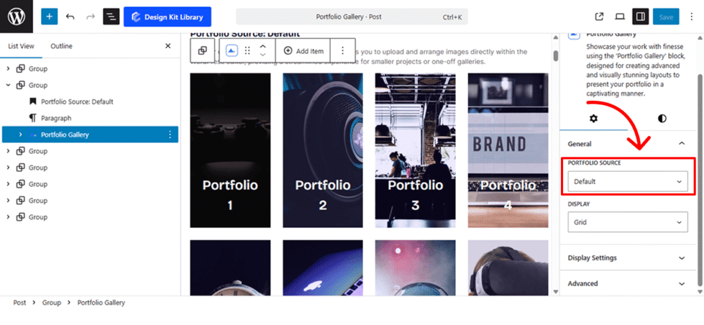
Ideal for quick, on-the-fly layouts. This version allows you to upload and arrange images directly within the WordPress editor, providing a streamlined experience for smaller projects or one-off galleries.

Portfolio 1

Portfolio 2

Portfolio 3

Portfolio 4

Portfolio 5

Portfolio 6

Portfolio 7

Portfolio 8
Portfolio Source: Gallery
-

Portfolio 1
Project Year
1920
Client
manager
Skills/Tech
IT

Portfolio 2
Project Year
2025
Client
Gamepad
Skills/Tech
Gaming

Portfolio 3
Project Year
2000
Client
Lifestyle
Skills/Tech
Workplace

Portfolio 4
Project Year
2019
Client
John Doe
Skills/Tech
Laptop

Portfolio 5
Project Year
1934
Client
Portrait
Skills/Tech
Watch

Portfolio 6
Project Year
2020
Client
Computer
Skills/Tech
Technology

Portfolio 7
Project Year
2017
Client
DJ
Skills/Tech
Lifestyle

Portfolio 8
Project Year
2023
Client
Jane Doe
Skills/Tech
VR
Built for advanced users managing extensive collections. This variant pulls content from a centralized gallery created in your dashboard, allowing you to organize, tag, and reuse your portfolio assets across multiple pages with consistent styling.