

Testimonials
The Testimonials block allows you to display client feedback, reviews, and positive experiences in a professional and engaging layout. The block provides two variations: Default and Testimonials CPT, allowing you to choose between manually adding testimonials or displaying testimonials from the registered Testimonials post type.
The Testimonials Block offers two variations for displaying accordion content.
- Default
- Testimonial Custom Post Type (CPT)
Default Setup
Adding Content to Testimonials
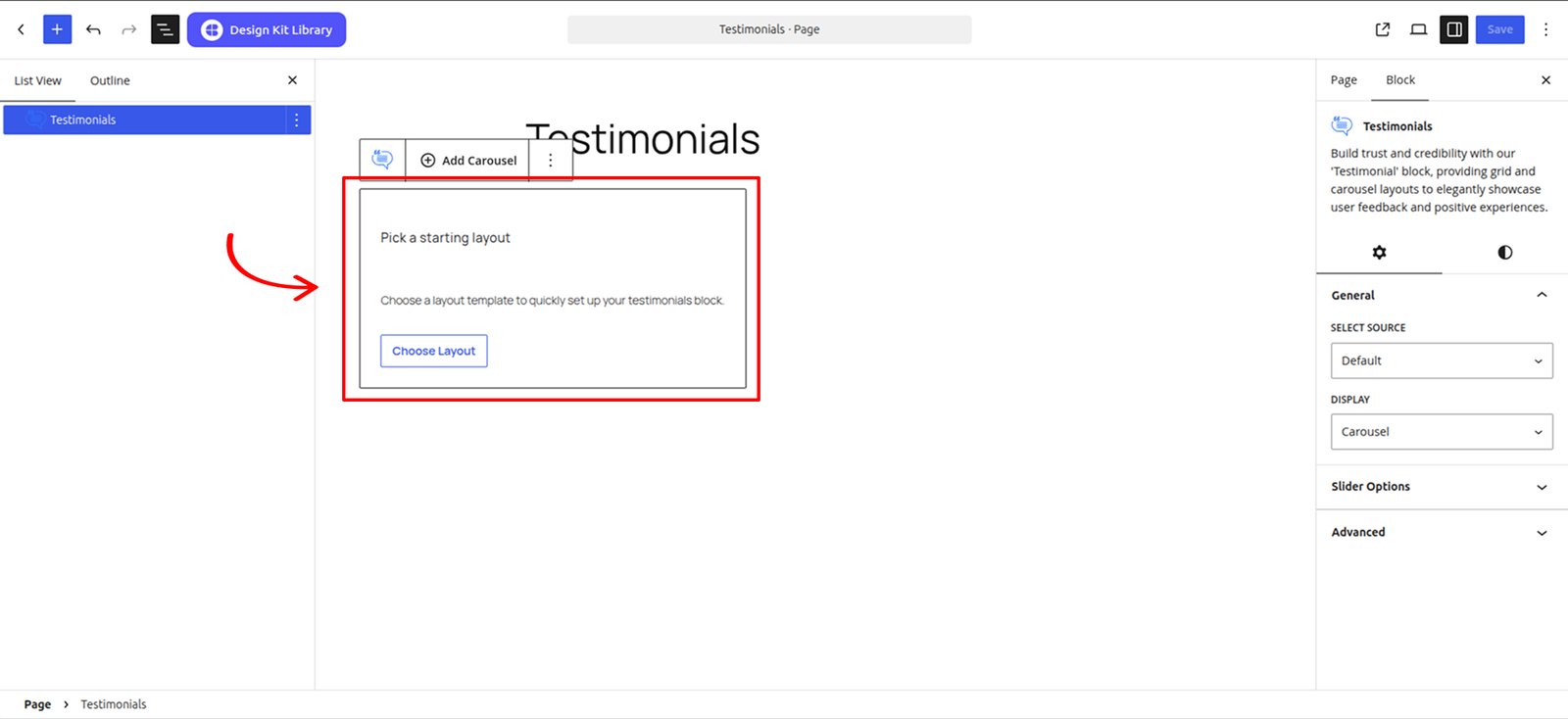
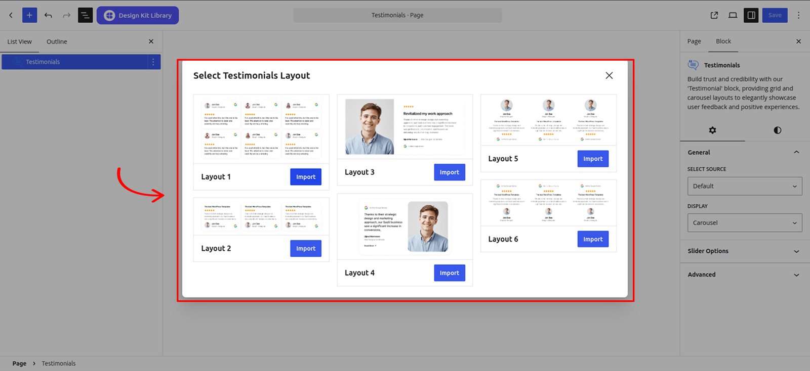
The Default variation works similarly to the Brand Showcase block. It provides pre-built patterns that can be imported directly using the Choose Layout option, allowing you to quickly create a testimonial section and customize the content according to your requirements.
Testimonials CPT Setup
Adding Dummy Content
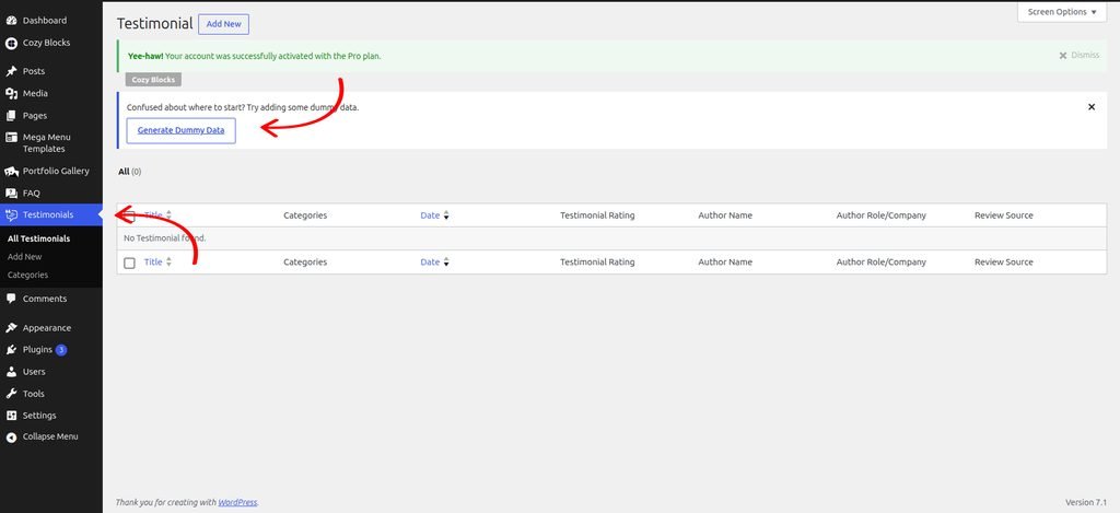
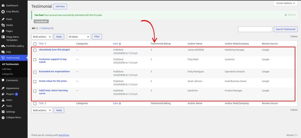
To get started start by adding a dummy content and see how it looks.
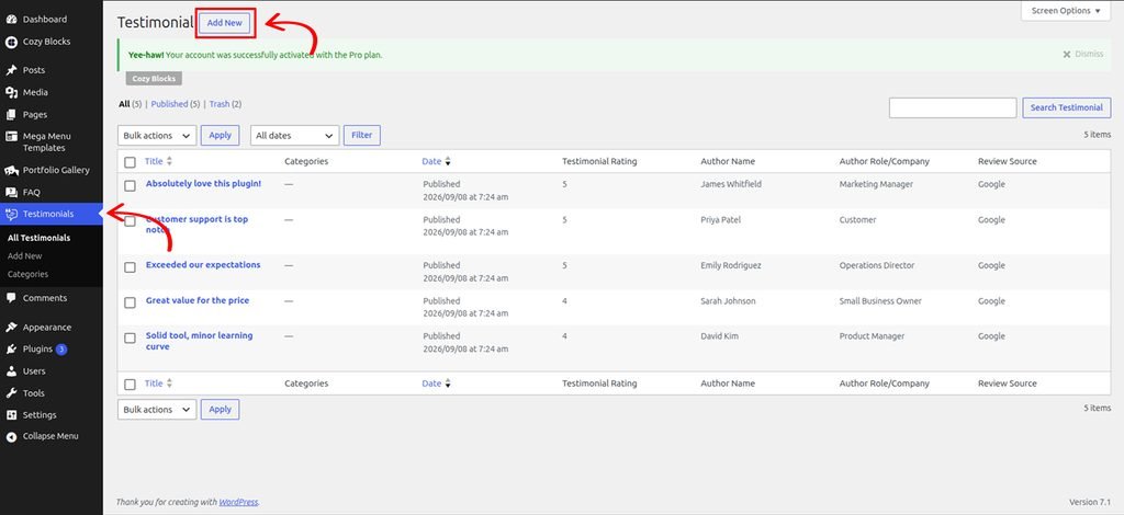
Navigate to Dashboard > Testimonials > Generate Dummy Data
Create Testimonials in the CPT
Navigate to Dashboard > Testimonials > Add New to create Testimonials.
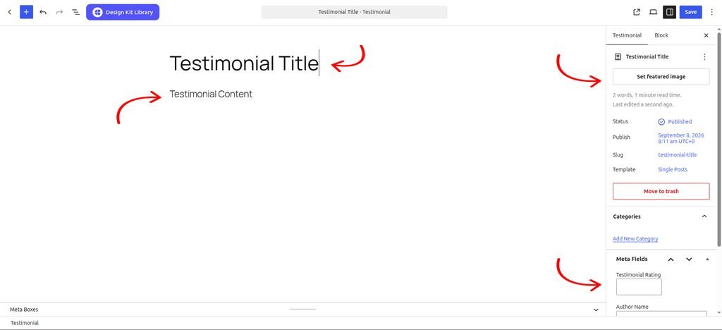
Fill the details and publish your Testimonial post.
Switch the source to Testimonial post type to import the Testimonials into the Testimonials block.
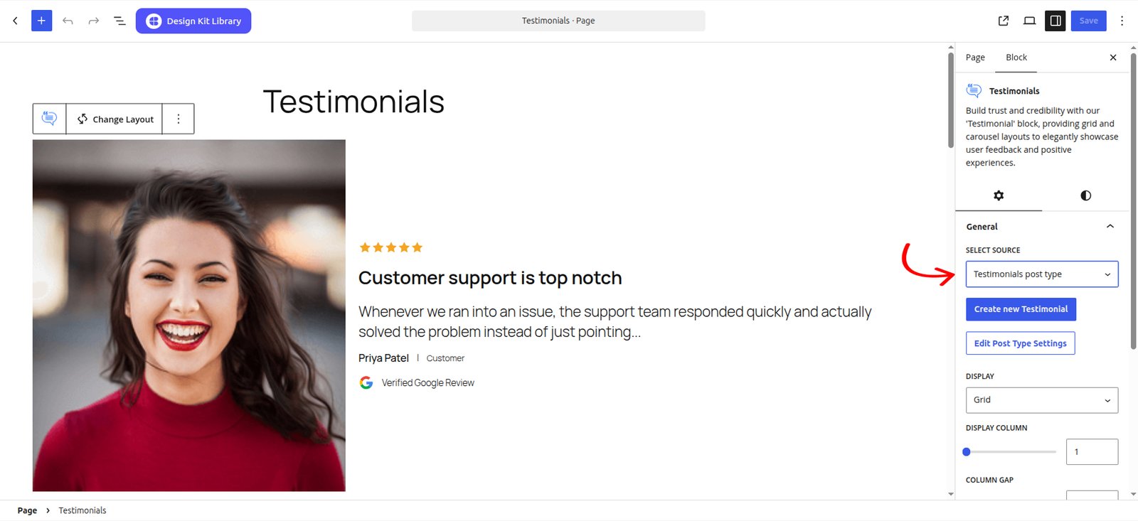
The second variation, introduced in Cozy Blocks (v 2.2.0) Testimonial Post Type, allows users to manage testimonial content using a dedicated Testimonial Custom Post Type. Users can create and manage their testimonials separately and use the available display, filter, and query options to dynamically display relevant testimonials within the block.
Updating Testimonial Slug
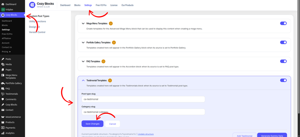
To update the Testimonial post type slug and Testimonial category slug, navigate to Dashboard > Cozy Block > Settings and enable the Testimonial Template toggle.
Once enabled, you can update the Post Type Slug and Category Slug according to your requirements.
To update the permalink structure after changing the slugs, click Update Structure and save the updated structure.
Settings ⚙
General
- Select Source: Choose the source for displaying testimonials. You can select Default to manually add testimonials or Testimonial Post Type to retrieve testimonials from the Testimonials custom post type.
- Display: Choose how the testimonials are displayed. Available options are Grid and Carousel.
- Grid
- Display Column: Determine how many testimonial items are displayed in each row.
- Column Gap: Set the horizontal spacing between testimonial items in the grid.
- Enable Masonry: Enable this option to arrange testimonial items in a masonry-style layout, allowing items with different heights to fit together dynamically.
- Grid
- Generate Schema: When turned on, adds Testimonial structured data (schema markup) to your page, which can help Testimonial show up as rich results in Google search. This option is available for Testimonial CPT variant only
Query Options
This panel is available for Testimonial CPT variant only.
- Order By: What field to sort by.
- Number of Items: Number of Testimonial shown at once.
- Categories: Restrict the list to specific Testimonial categories.
Content Options
This panel is available for Testimonial CPT variant only, this provides options to control which testimonial content and author information are displayed within the block.
- Thumbnail: Enable or disable the display of the testimonial author’s thumbnail.
- Rating Stars: Enable or disable the display of the testimonial rating stars.
- Post Title: Enable or disable the display of the testimonial title.
- Select Tag: Choose the HTML tag used for the testimonial title. Available options include H1–H6, Div, and Paragraph.
- Post Content: Enable or disable the display of the full testimonial content.
- Post Excerpt: Enable or disable the display of the testimonial excerpt.
- Author Name: Enable or disable the display of the testimonial author’s name.
- Select Tag: Choose the HTML tag used for the author’s name. Available options include H1–H6, Div, and Paragraph.
- Author Role: Enable or disable the display of the testimonial author’s role or designation.
- Review Source: Enable or disable the display of the platform or source from which the review was submitted.
Slider Options
When the Carousel display is selected, this panel provides options to control the slider’s behavior and navigation.
- Display Column: Determine how many testimonial items are displayed in each row.
- Centered Slides: Enable this option to position the active testimonial in the center of the carousel.
- Loop: Enable this option to continuously loop through the testimonials, returning to the first item after the last.
- Speed: Control the duration of the slide transition effect in milliseconds.
- Remove Slide Transition: Enable this option to remove the sliding animation and switch between testimonials instantly.
- Autoplay : Enable this option to automatically advance through the testimonials.
- Autoplay Delay: Set the amount of time the carousel waits before automatically moving to the next testimonial.
- Slider Reverse Direction: Enable this option to reverse the direction in which the carousel moves.
- Enable Pagination: Add pagination indicators to show the user’s current position within the testimonials.
- Enable Navigation: Display navigation arrows that allow users to manually move between testimonials.
- Display on Hover: Enable this option to display the carousel controls when the user hovers over the testimonial section.
Style ◑
Styles
- Padding: Adjust the inner spacing for a more breathable layout.
- Margin Top: Set the spacing above the block.
- Margin Bottom: Set the spacing below the block.
Item Styles
This panel provides options to control the spacing and appearance of individual items.
- Padding: Set the inner spacing of each item.
- Margin Top: Set the spacing above each item.
- Margin Bottom: Set the spacing below each item.
- Border: Customize the border of each item.
- Border Radius: Soften the edges by rounding the corners.
Post Title Styles
This panel provides options to customize the typography and spacing of the post title.
- Margin Top: Set the spacing above each item.
- Margin Bottom: Set the spacing below each item.
- Font Family: Choose the font family for the post title.
- Font Size: Set the size of the post title text.
- Font Weight: Set the thickness of the post title text.
- Letter Case: Choose the text capitalization style for the post title.
- Decoration: Apply text decorations such as underline or line-through to the post title.
- Line Height: Set the vertical spacing between lines of the post title.
- Letter Spacing: Adjust the spacing between individual characters.
- Color: Set the text color of the post title.
Rating Styles
This panel provides options to customize the appearance and spacing of the rating stars.
- Margin Top: Set the spacing above each item.
- Margin Bottom: Set the spacing below each item.
- Size: Set the size of the rating stars.
- Color: Choose the color of the rating stars using the Primary or Secondary color.
Typography
This panel provides options to apply consistent typography styles across the entire block.
- Font Family: Choose the font family for the block content.
- Font Size: Set the font size for the block content.
- Font Weight: Set the thickness of the text throughout the block.
- Letter Case: Choose the text capitalization style.
- Decoration: Apply text decorations such as underline or line-through.
- Line Height: Set the vertical spacing between lines of text.
- Letter Spacing: Adjust the spacing between individual characters.
- Color: Set the text color for the block content.
Pagination Styles
- Vertical Positioning: Fine-tune the vertical offset to control how far the pagination sits below the content.
- Gap: Adjust the specific spacing between each individual pagination dot.
- Align: Set the horizontal placement of the indicators. Toggle between Left, Center, or Right to balance the layout.
- Default / Active (Toggle)
- Default:
- Width & Height: Define the base size of the inactive indicators.
- Border Radius: Control the shape, from sharp squares to perfect circles.
- Active:
- Width & Height: Increase these values to make the active slide indicator physically larger or longer (e.g., a “pill” shape) for better visibility.
- Border & Border Offset: Add an outline to the active dot and use the offset to create a “halo” effect (spacing between the dot and its border).
- Border Radius: Independently adjust the curvature of the active indicator.
- Default:
- Color:
- Default: The color of inactive indicators.
- Default Hover: The color shift when a user moves their cursor over an inactive dot.
- Active: The primary color for the dot representing the current slide.
- Active Default: The color of the active dot when hovered.
- Active Border: The specific color of the stroke surrounding the active indicator.
Demo
Default Layout

Jesisica Nguyen
Graphics Designer


I’ve used other kits, but this one is the best. The attention to detail and usability are truly amazing.

Jesisica Nguyen
Graphics Designer
I’ve used other kits, but this one is the best. The attention to detail and usability are truly amazing.

Jesisica Nguyen
Graphics Designer
I’ve used other kits, but this one is the best. The attention to detail and usability are truly amazing.

Jesisica Nguyen
Graphics Designer
I’ve used other kits, but this one is the best. The attention to detail and usability are truly amazing.

Jesisica Nguyen
Graphics Designer
I’ve used other kits, but this one is the best. The attention to detail and usability are truly amazing.

Jesisica Nguyen
Graphics Designer
I’ve used other kits, but this one is the best. The attention to detail and usability are truly amazing.
Testimonial Post Template Layout

Customer support is top notch
Whenever we ran into an issue, the support team responded quickly and actually solved the problem instead of just pointing…

Solid tool, minor learning curve
It took a little while to get used to all the features, but once we did, it became an essential…

Exceeded our expectations
Our team was skeptical at first, but within a week everyone was on board. The customization options let us tailor…

Great value for the price
We compared several options before settling on this one, and it was clearly the best choice. Setup was quick and…

Absolutely love this plugin!
This tool completely transformed how we manage our workflow. The interface is intuitive and support has been fantastic every step…