Icon List
The Icon List block is a high-performance evolution of the standard WordPress list, functioning as a flexible parent container for nested List Item blocks. It transforms basic bullet points into fully customizable design elements, allowing you to assign unique SVG icons, colors, and specific styles to each individual item. This modular structure provides total creative control over spacing and alignment, making it the perfect tool for building professional feature lists, checklists, or branded navigation menus that integrate seamlessly with your site’s aesthetic.
Icon List
The Icon List block provides a centralized control panel to define the structure and behavior of your list. These settings allow you to transition from a traditional vertical list to a modern, horizontal navigation bar with just a few clicks.
Settings ⚙
General
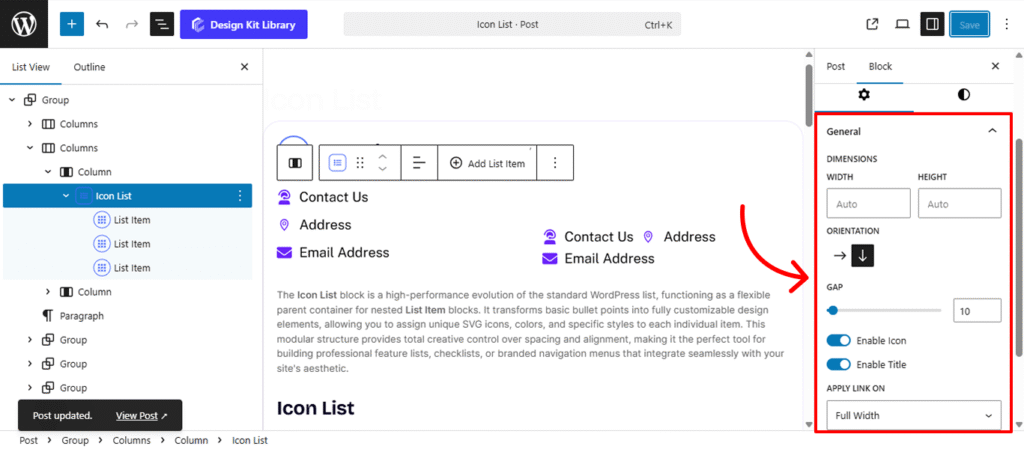
- Dimensions
- Width & Height: Manually define the boundaries of the list container. This is particularly useful for constraining a list to a specific sidebar width or creating a fixed-height scrolling area.
- Orientation:
- Vertical: The classic stacked layout, perfect for feature highlights and checklists.
- Horizontal: Aligns list items side-by-side, ideal for creating footer menus, breadcrumbs, or inline social links.
- Gap: Control the specific distribution of whitespace between each list item. Increasing the gap creates a more airy, premium feel, while a smaller gap keeps content compact and scannable.
- Enable Icon: Globally show or hide the SVG markers for all nested items.
- Enable Title: Toggle the text labels. Disabling this while keeping icons enabled creates a clean, icon-only “social bar” effect.
- Apply Link On: Choose between Full Width (the entire row is clickable) or Inline (only the icon and text act as a trigger).
- Open in New Tab: When checked, clicking a list item won’t navigate away from your current page.
- Mark as No-Follow: Essential for SEO when linking to external affiliates or paid sponsors, telling search engines not to pass authority to the destination URL.
Style ◑
List Item Style
The List Item Styles panel allows you to define the visual appearance of the individual rows or buttons within your list. These settings apply to the background and frame of each item, helping you transform simple text into interactive “pills,” cards, or menu items.
- Padding🔗: Control the internal spacing between the list item block container. Adding padding ensures your content has enough “breathability” and doesn’t feel cramped against the borders.
- Border Controls: (Visible when Border Type is set to anything other than “None”)
- Border Type: Choose your stroke style (e.g., Solid, Dashed, Dotted).
- Border Width: Define the thickness of the container’s frame on hover.
- Border Color: Change the stroke color to create a “glow” or a more defined outline.Typography
- Font Family & Size: Select the typeface and scale that best matches your site’s design system.
- Font Weight: Control the thickness (e.g., Bold for emphasis or Light for a modern look).
- Letter Case: Force the labels to Uppercase, Lowercase, or Capitalize without editing the form code.
- Decoration: Apply styles like Underline or Line-through if needed for specific design cues.
- Line Height & Letter Spacing: Fine-tune the vertical breathing room and horizontal character density.
- Border Radius🔗: Define the curvature of the container’s corners. You can keep them sharp for a professional, corporate look, or increase the radius to create soft, rounded pods that feel modern and friendly. Linked by default for uniform symmetry.
- Background Color
- Normal: The default appearance of the list item when the page loads.
- Hover: Define a secondary set of colors and borders that trigger when a user moves their cursor over the item.
The Link Tool 🔗: The chain icon connects all four sides to keep your design even. It is on by default; toggle it off to enter different values for each side (e.g., rounding only the top corners).
Icon Style
- Icon Position: Choose whether the icon appears to the Left or Right of the text. This is essential for RTL (Right-to-Left) language support or for creating unique mirrored layouts.
- Icon View: Toggle between Default (the icon sits alone) or Stacked (the icon is placed inside a circular or square background shape).
- Icon Layout: When using the Stacked view, choose Fill for a solid colored background or Outline for a modern, transparent look with a thin border.
- Icon Size: Scale the icon up for high-impact feature lists or down for subtle, professional checklists.
- Icon Rotate: Rotate the icon by a specific degree. This is perfect for pointing arrows in a new direction or creating a playful, tilted look for modern designs.
- Opacity: Adjust the transparency of the icon. Lowering the opacity allows the icon to sit subtly in the background without distracting from the primary text.
Typography
- Typography
- Font Family & Size: Select the typeface and scale that best matches your site’s design system.
- Font Weight: Control the thickness (e.g., Bold for emphasis or Light for a modern look).
- Letter Case: Force the labels to Uppercase, Lowercase, or Capitalize without editing the form code.
- Decoration: Apply styles like Underline or Line-through if needed for specific design cues.
- Line Height & Letter Spacing: Fine-tune the vertical breathing room and horizontal character density.
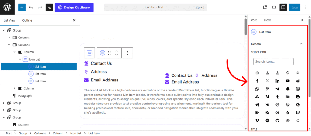
List Item
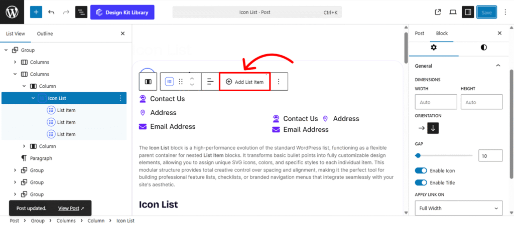
The List Item is the individual content block nested within the Icon List. While the parent block controls the overall layout, these settings allow you to define the specific identity and destination for each point in your list.
Add List Item: To expand your list, select the parent Icon List block and click the Add List Item button in the toolbar or inspector. This dynamically inserts a new row with inherited styles.
- Select Icon: Choose a unique SVG marker from the integrated library. You can use a consistent icon for a clean checklist or assign distinct icons to each item to visually represent different categories or services.
- Title: Enter the primary text for your list item. This acts as the label and is the main piece of information your users will read.
- URL: Define the destination link for the item. When a URL is provided, the item becomes interactive, allowing you to link to internal pages, external resources, or downloadable files.