
Cozy Button
The Cozy Button expands on the standard WordPress button functionality, offering enhanced styling and icon integration. It allows you to create highly interactive call-to-action elements that align perfectly with your brand’s visual identity.
To use the Cozy Button variation, start by adding the default WordPress Buttons block to your page. Once added, select the individual Button block inside it. In the right-hand sidebar settings panel, click on the Cozy Button icon.
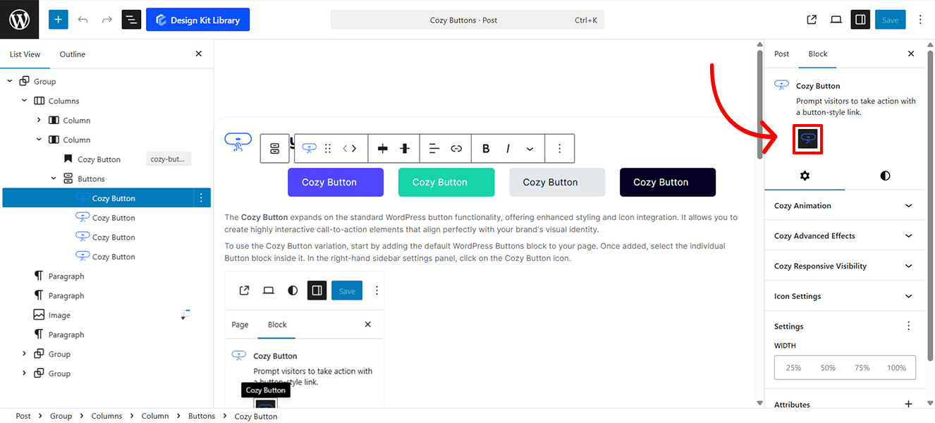
This will instantly transform the standard Button into the Cozy Button variation, giving you access to its enhanced styling and features.
Style ◑
Hover Color Palette
The Hover Color Palette gives you precise control over how the button transforms when a user interacts with it. By defining distinct hover states, you provide essential visual feedback that improves the user experience and encourages clicks.
- Background Color: Set the fill color that appears when a user hovers over the button. Use a contrasting shade or a subtle shift in brightness to make the button feel “active.”
- Text Color: Adjust the color of the label (and icon) during the hover state. This ensures your text remains perfectly legible if the background color changes significantly.
- Border Color: Define the color of the button’s stroke on hover. This is a great way to create a “glow” effect or a more pronounced outline that signals the button is clickable.
Icon Style
The Icon Style panel gives you granular control over the visual presentation and placement of your button’s icon. Fine-tune these settings to ensure the icon perfectly balances with your text and button dimensions.
- Margin Top & Bottom: Precisely nudge the icon vertically to ensure it aligns perfectly with the baseline of your text or the center of the button.
- Box Width & Height: Define the invisible “container” around the icon. This is particularly useful if you want to create a perfectly square or circular background area for the icon to sit within.
- Size: Adjust the scale of the icon itself. You can make it a subtle accent or a bold focal point.
- Rotate: Spin the icon to any angle (0° to 360°). This is great for repurposing a single arrow icon for “Up,” “Down,” “Left,” or “Right” directions.
- Color Palette:
- Icon Default: Set the primary color of the icon to match your button’s initial state.
- Icon Hover: Choose a specific color for the icon to switch to when a user mouses over the button. This allows the icon to change color independently of, or in sync with, the button text.
Settings ⚙
Icon Settings
- Enable Icon: A simple toggle to turn the icon feature on or off. When enabled, additional configuration options will appear.
- Select Icon: Choose from a built-in library of high-quality SVG icons. You can browse or search for the specific symbol that best fits your button’s label.
- Gap: Fine-tune the horizontal spacing between the icon and the text label. This ensures the elements don’t feel crowded while maintaining a cohesive look.
- Position: Determine where the icon sits relative to your text:
- Left: Places the icon before the text (ideal for “Back” buttons or list items).
- Right: Places the icon after the text (perfect for “Next,” “Submit,” or “Learn More” links).