
Before/After Image


The Before/After Image block provides an interactive way to compare two images using a sliding divider. This is perfect for showcasing case studies, photo edits, or product transformations.
Settings ⚙
General
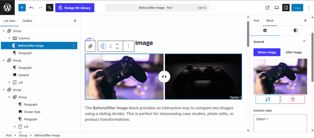
- Toggle Menu: The settings panel features a toggle menu to switch between the Before and After views. Based on your selection, you can manage the following for each state:
- Change or Delete Image: Easily swap out the source files for both the “Before” and “After” sections.
- Overlay Label: Enter custom text (e.g., “Original” vs. “Result”) that will appear as an overlay on the image.
- Alt Text: Provide descriptive text for each image to ensure your site remains accessible and SEO-friendly.
- Divider Direction: Choose between a Horizontal (Left to Right) or Vertical (Top to Bottom) split for the comparison.
- Image Height: Set a specific height for the block to ensure it aligns perfectly with your page layout.
- Label Vertical Position: Use the slider to move the text overlays higher or lower on the image for optimal visibility.
Style ◑
Divider Style
The Divider Styles panel allows you to customize the interactive slider that separates your “Before” and “After” images. You can switch between two toggleable tabs to independently style the divider line and the central handle icon.
- Divider: This represents the vertical or horizontal line that users drag to reveal the image transformation.
- Width: Adjust the thickness of the separator line. A thinner line offers a seamless transition, while a thicker line makes the interactive element more prominent.
- Icon: This is the central handle or “trigger” that sits in the middle of the divider line, signaling to users that the element is draggable.
- Icon Selection: Choose a custom graphic (such as double arrows) from the icon library.
- Padding: Control the internal spacing within the icon container to change the “hit area” and overall scale.
- Size: Use the slider to increase or decrease the visual scale of the icon relative to the divider.
- Radius: Adjust the curvature of the icon’s background. Use a high value for a circular handle or 0 for a square one.
- Color: Customize the icon, icon background and divider colors.
Overlay Label Style
The Overlay Label Style panel allows you to customize the appearance of the “Before” and “After” text indicators. Use these settings to ensure your labels are legible and perfectly positioned over your images.
- Padding: Adjust the internal space around the label text. Increasing this creates a larger background “pill” or box for the label.
- V Gap (Vertical): Control the distance between the label and the bottom of the image container using the bottom margin.
- H Gap (Horizontal): Define the horizontal offset. This adjusts the margin-left for the “Before” label and the margin-right for the “After” label, pushing them toward or away from the image edges.
- Border: Set the thickness, style, and color of the stroke surrounding the icon.
- Border Radius : Control the curvature of the wrapper’s corners—use a higher value for rounded edges or 0 for sharp, square corners.
- Typography: Fully customize the font stack, including Font Family, Weight, Size, and Letter Spacing, to match your site’s primary headers or UI elements.
- Colors:
- Text Color: Set the color of the label font.
- Background Color: Define the fill color of the label container.