Advanced Tabs

Technology has quietly become one of the most personal parts of our daily lives. From the moment we wake up to the time we wind down, we’re interacting with devices that are designed not just to function, but to feel intuitive. The way something fits in our hands, responds to touch, or visually communicates its purpose plays a huge role in how we connect with it.
Manufacturers today focus heavily on ergonomics, minimalism, and emotional connection. A well-designed device doesn’t overwhelm the user. Instead, it feels natural, almost like an extension of the body. Subtle curves, balanced layouts, and tactile feedback all contribute to creating something that feels effortless to use.

When people hear the word networking, they often think about formal events, business cards, or awkward small talk. But in reality, networking is much more than that. It’s about building meaningful relationships that create opportunities, spark ideas, and support personal growth.
No matter your industry or career stage, opportunities often come through people, not just job applications. A conversation at an event, a recommendation from a colleague, or a simple introduction can lead to partnerships, mentorship, or even your next big career move.
One common misconception is that networking is about asking for favors. In reality, the best networking happens when you focus on giving value first. That could mean sharing knowledge, offering help, connecting two people who might benefit from knowing each other, or simply being a supportive contact.

Productivity is often misunderstood as doing more in less time, but in reality, it’s about doing what truly matters with focus and intention. In a world filled with constant notifications, meetings, and digital distractions, staying productive requires more than just a to-do list. It demands clarity, structure, and self-awareness.
One of the most important foundations of productivity is having clear priorities. When everything feels urgent, nothing truly gets done well. Taking a few minutes each morning to define your most important tasks can completely change the direction of your day. Instead of reacting to messages and interruptions, you begin working with purpose. Clarity reduces stress and gives you a measurable sense of progress.
Another key element of productivity is focused attention. Multitasking might feel efficient, but it often leads to fragmented thinking and lower-quality results. Deep, uninterrupted work sessions allow your mind to fully engage with a task. Even setting aside 30 to 60 minutes of distraction-free work can significantly improve both speed and output. Over time, these focused sessions build momentum and confidence.
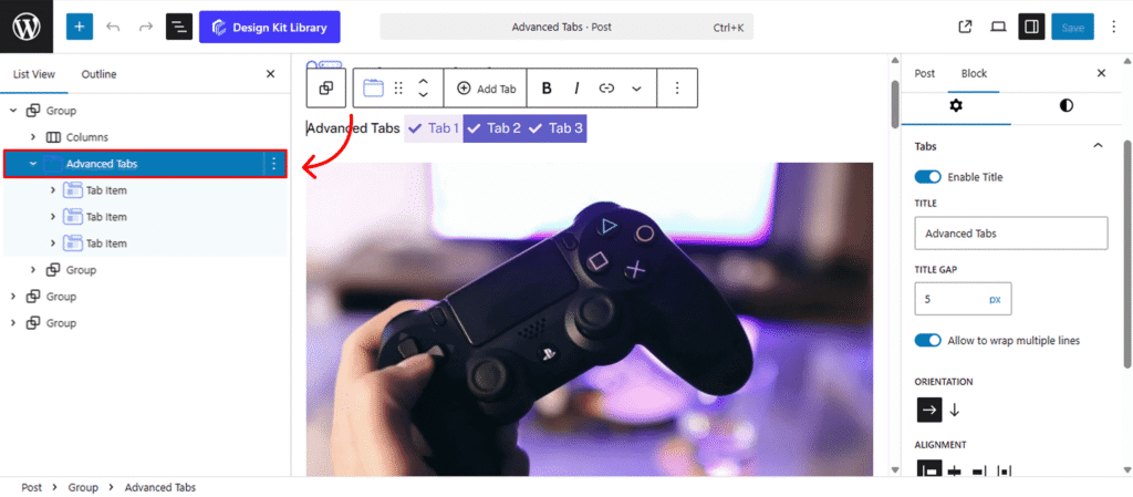
The Advanced Tabs block is an interactive organizational tool designed to condense large amounts of information into a clean, space-saving interface. By categorizing content into horizontal or vertical tabs, you can reduce page scrolling and improve user experience for FAQs, product features, or service details.
This block uses nested Tab Items as flexible containers, allowing you to house any content—such as images, buttons, or complex layouts—within each individual tab panel. With full control over active states and responsive behavior, it ensures your content remains organized and professional on all devices.
Settings ⚙
Tabs
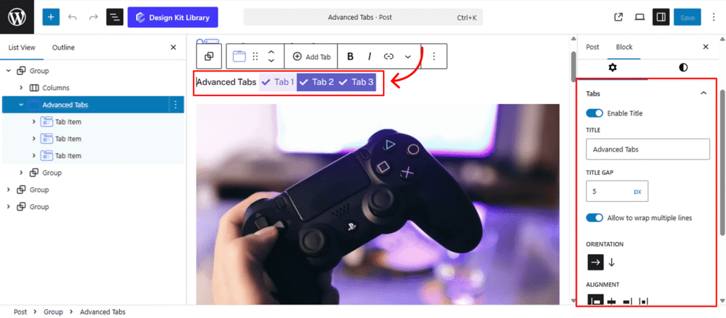
The Tabs Panel provides the structural configuration for how your tab navigation and content areas are positioned. Use these settings to define the layout orientation and overall spacing for the block.
- Enable Title: Toggle this option to add a heading above the tabs. Once enabled, an input field will appear to enter your custom title.
- Title Gap: Adjust the vertical distance between the main title and the tab navigation when the title is enabled.
- Allow to Wrap Multiple Lines: Enable this to allow the title and the tab navigation to wrap onto separate lines if the space is constrained.
- Orientation (Horizontal or Vertical):
- Horizontal (Default): Tabs are arranged in a row above the content.
- Vertical: Tabs are positioned in a sidebar next to the content, stacked one above another.
- Alignment: When set to Horizontal, align your tabs to the Left, Center, Right or Space-Between of the container.
- Vertical Layout Controls: When Vertical orientation is selected, two additional sliders appear:
- Tab Width: Define the specific width of the sidebar containing the tabs.
- Content Gap: Adjust the horizontal distance between the tab sidebar and the main content area.
- Tabs Spacing: Control the individual spacing between each tab item to ensure a clean, organized look.
- Note:
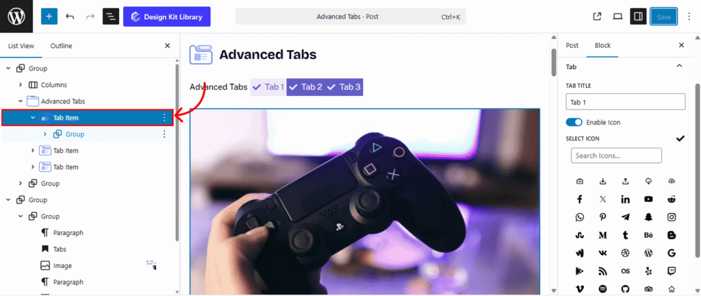
- Updating Titles & Icons: To change a tab’s title, simply click on the tab directly and type, or select the nested Tab Item block and update the Tab Title and Icon in the right-hand sidebar settings.
- Adding Tabs: To add more sections, select the parent Advanced Tabs block and click the Add Tab button on the block toolbar.
Icon
The Icon Panel allows you to customize the visual style and physical proportions of the icons displayed within each tab. Use these settings to ensure the icons complement your typography and layout.
- Layout (Fill or Outline): Choose the primary visual style for your icons.
- Fill: Displays a solid, colored icon for a bold, high-contrast look.
- Outline: Displays a minimalist stroke-based icon for a clean, modern aesthetic.
- Size: Use the slider to scale the overall dimensions of the icon within the tab item.
- Spacing: Control the distance between the icon and the tab text to ensure a clear and organized visual hierarchy.
Style ◑
Wrapper Styles
The Wrapper Style panel defines the outer container for your Advanced Tabs block. Use these settings to create a distinct visual frame that separates the tabs from the rest of your page content.
- Padding 🔗: Adjust the internal spacing between the main wrapper and the content block to prevent your layout from looking crowded.
- Border Type: Select the style of the outer stroke (e.g., Solid, Dashed, or Dotted).
- Border Width & Color: If a border type is selected, these options allow you to define the thickness (in pixels) and the specific color of the stroke to match your site’s branding.
- Border Radius 🔗: Control the curvature of the wrapper’s corners—use a higher value for rounded edges or 0 for sharp, square corners.
- Background Color: Set the fill color for the entire tab container. This helps distinguish the tab area from the page background.
Title Typography
The Title Typography panel provides complete control over the text style of the main heading when the Enable Title toggle is active. Use these settings to ensure the tab heading matches your site’s global typography.
- Font Family: Select the specific typeface for the title.
- Font Size: Use the slider or input field to set the text scale.
- Font Weight: Choose the thickness of the characters (e.g., Light, Regular, Bold).
- Letter Case: Force the text to Uppercase, Lowercase, or Capitalize each word.
- Decoration: Add styles like Underline, Overline, or Line-through.
- Line Height: Adjust the vertical space between lines of text for better readability.
- Letter Spacing: Control the horizontal distance between individual characters.
- Color: Set the specific hex or RGB color for the title text.
Tab Style
The Tab Style panel gives you full control over the individual navigation buttons. These settings allow you to define the look and feel of the tabs, ensuring a clear distinction between the “Normal” and “Active” states.
- Padding 🔗: Adjust the internal spacing of each tab button to control its overall size and tap target.
- Border Type: Choose the stroke style (Solid, Dashed, etc.) for the tab buttons. When enabled, you can define the Border Width and Border Color to frame each item.
- Border Radius 🔗: Control the curvature of the wrapper’s corners—use a higher value for rounded edges or 0 for sharp, square corners.
- Active Separator Overlay: Enable this checkbox to allow the active tab’s bottom border to seamlessly overlap the container’s separator line. This creates a “connected” visual effect often seen in professional UI designs.
- Typography: Fully customize the font family, size, weight, and spacing for the tab labels to match your brand identity.
- Color States: Define the color palette for both static and selected tabs:
- Text & Text Active: Set the color of the label for standard tabs and the currently highlighted tab.
- Background & Background Active: Choose the fill color for the tab buttons. Using a distinct Background Active color helps users instantly identify which section they are viewing.
Separator Style
The Separator Style panel controls the visual divider that sits between the tab navigation and the content area.
- Padding 🔗: Adjust the internal spacing of each tab button to control its overall size and tap target.
- Border Type: Choose the stroke style (Solid, Dashed, etc.) for the tab buttons. When enabled, you can define the Border Width and Border Color to frame each item.
Content Style
The Content Style panel manages the appearance of the main area where your images, text, and nested blocks are displayed. These settings ensure that the information within each tab is presented clearly and remains separate from the navigation.
- Padding 🔗: Adjust the internal space between the tab content and its outer border.
- Vertical Spacing (Margin Top & Bottom): Control the external distance above and below the content area to prevent it from crowding other page elements.
- Border Type: Select the style of the stroke (e.g., Solid, Dashed, or Dotted) that surrounds the content panel.
- Border Width & Color: If a border is active, define its thickness and specific hex color to match your tab navigation.
- Border Radius 🔗: Control the curvature of the wrapper’s corners—use a higher value for rounded edges or 0 for sharp, square corners.
- Background Color: Apply a fill color to the entire content section. This is often used to create a “card” effect that makes the active tab’s information pop.
The Link Tool 🔗: The chain icon connects all four sides to keep your design even. It is on by default; toggle it off to enter different values for each side (e.g., rounding only the top corners).