
Advanced Gallery
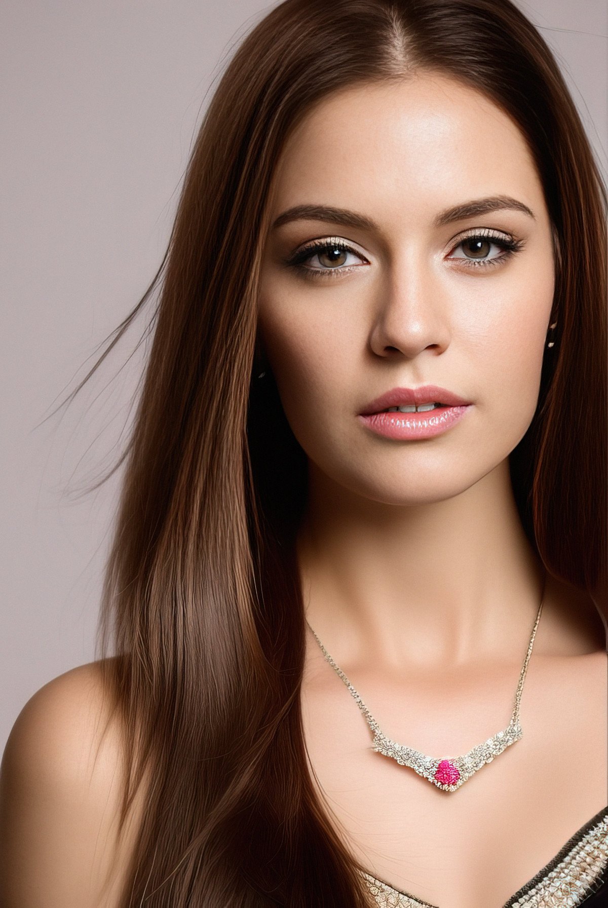 Portrait Image of a woman
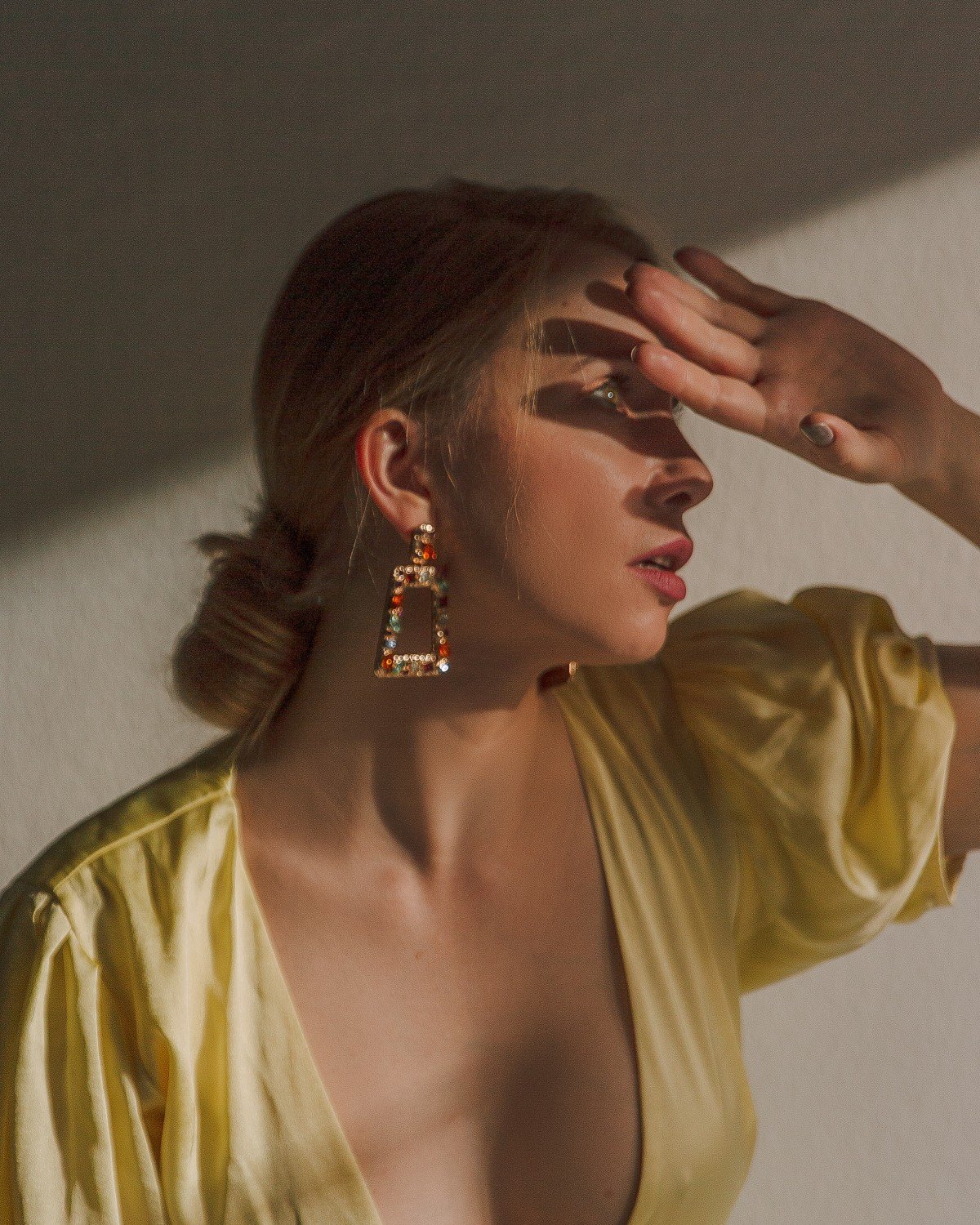


- Portrait Image of a woman
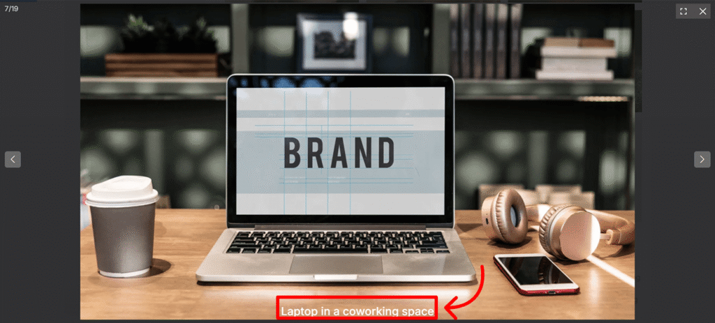
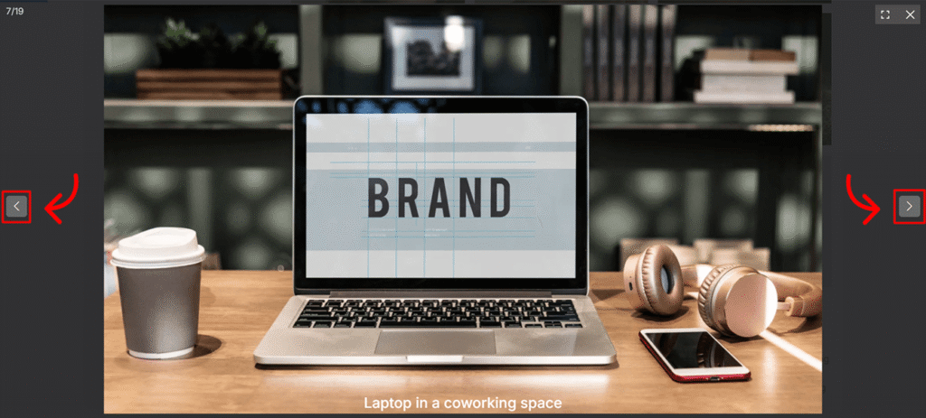
 Laptop in a coworking space


The Advanced Gallery block provides a sophisticated platform for showcasing image portfolios and dynamic collections with professional flair. Moving beyond basic grids, it creates an engaging visual environment by integrating a responsive Lightbox for seamless, full-screen browsing and an Ajax Loader to ensure rapid, fluid transitions. This combination of high-performance technology and adaptive layouts ensures your gallery remains both visually striking and technically optimized for a modern user experience.
Settings ⚙
General Options
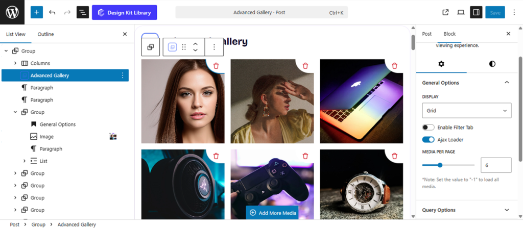
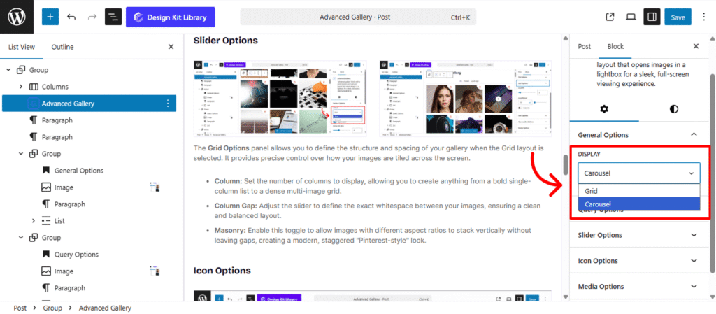
Configure your gallery’s core behavior in one place. Use the Display dropdown to choose between Grid or Carousel layouts, and the Media Per Page slider to set your image count. Toggle the Filter Tab to add category navigation, or enable the Ajax Loader for seamless, instant content transitions.
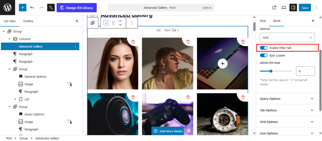
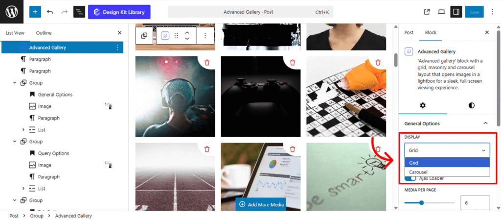
- Display Dropdown: Select your preferred layout from the dropdown. Choose Grid for a structured, multi-column arrangement that displays all images at once, or Carousel for an interactive slider that saves vertical space.
- Toggle Filter Tab: This allows you to add a navigation menu above your gallery, enabling visitors to sort and view specific image categories instantly. This keeps larger portfolios organized and easy to browse.
- Enable Ajax Loader: Enhances performance by fetching and displaying new images or filtered content without a full page refresh. This ensures that transitions between categories or pages remain fluid and fast, providing a high-end, “app-like” experience for your users.
- Media per-page: Use the slider or input the value to control how many images appear at once. To showcase your entire collection on a single screen without pagination, simply enter -1 in the input field to display all images.
Query Options
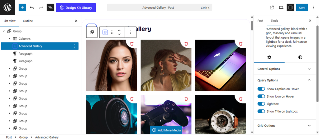
The Query Options panel controls how your visitors interact with and view your images. Use these toggles to enhance the user experience:
- Show Caption/Icon on Hover: Choose whether to reveal image descriptions or a stylized icon when a user mouse-overs a gallery item.
- Lightbox: Enable a full-screen, immersive viewing mode that allows users to browse high-resolution images without leaving the page.
- Show Title on Lightbox: Toggle this to display the image’s name or metadata directly within the lightbox overlay for better context.
Tab Options
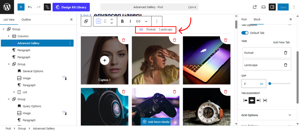
The Tab Options panel is active only when the Toggle Filter Tab is enabled. It allows you to create and manage the navigation menu that lets visitors sort your gallery by category.
- Default Tab: Sets the initial view (usually “All”) that visitors see when the page first loads.
- Tabs/Add New Tabs: Allows you to create custom categories to organize your image collection.
- Gap (Slider): Controls the horizontal spacing between each tab for a clean, balanced layout.
- Tab Alignment: Positions your menu to the Left, Center, Right, or Space-between to match your page design.
Grid Options
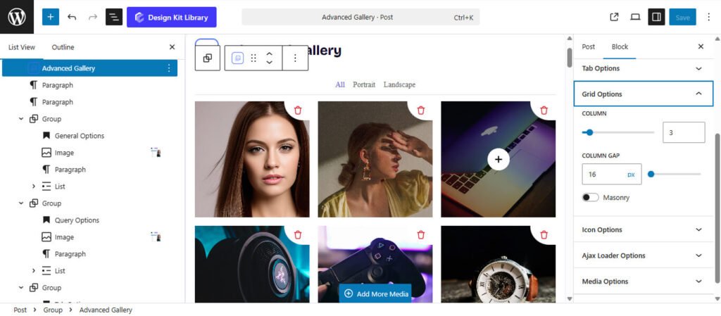
The Grid Options panel allows you to define the structure and spacing of your gallery when the Grid layout is selected. It provides precise control over how your images are tiled across the screen.
- Column: Set the number of columns to display, allowing you to create anything from a bold single-column list to a dense multi-image grid.
- Column Gap: Adjust the slider to define the exact whitespace between your images, ensuring a clean and balanced layout.
- Masonry: Enable this toggle to allow images with different aspect ratios to stack vertically without leaving gaps, creating a modern, staggered “Pinterest-style” look.
Slider Options
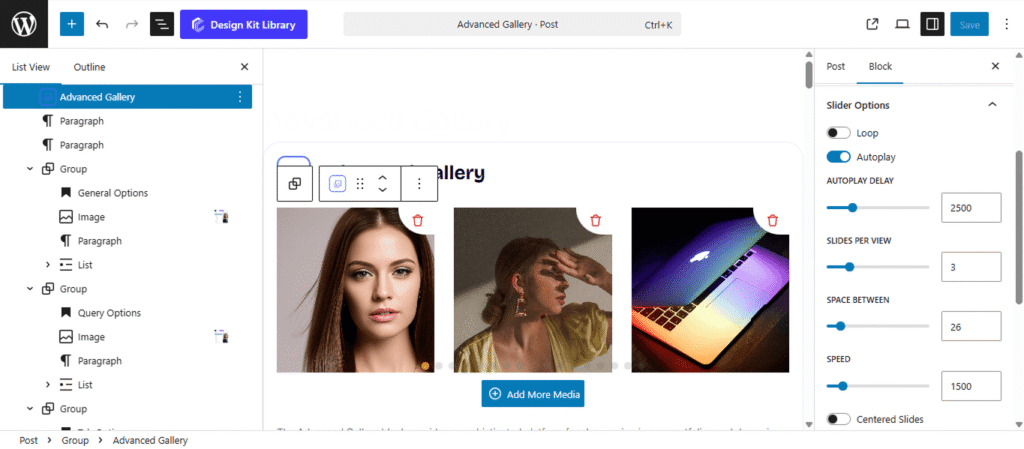
The Slider Options panel provides a comprehensive set of controls to transform your gallery into an interactive, high-performance carousel. These settings allow you to manage everything from the timing of transitions to the specific visual effects used when moving between images.
- Loop: Enable this to allow the slider to return to the first image automatically after reaching the last one, creating an infinite scrolling experience.
- Autoplay: Activate this to have the gallery transition through images automatically without user input.
- Autoplay Delay: Set the duration (in milliseconds) each slide remains visible before moving to the next.
- Slides Per View: Define how many gallery images are visible at once within the slider container.
- Space Between: Adjust the horizontal gap (in pixels) between individual slides to ensure the layout feels balanced.
- Speed: Control the duration of the transition animation itself. A higher value results in a slower, smoother slide effect.
- Centered Slides: When enabled, the active slide will always be positioned in the center of the viewport, which is ideal for highlighting a single focal point while showing glimpses of neighboring images.
- Effect: Choose the visual style of the transition:
- Slide: The standard horizontal or vertical movement.
- Fade: A smooth cross-dissolve between images.
- Coverflow/Cube/Cards: Advanced 3D transitions that add depth and a modern aesthetic to your gallery.
- Enable Pagination: Adds clickable dots or numbers at the bottom of the slider for quick navigation.
- Enable Navigation: Adds “Previous” and “Next” arrow buttons to the sides of the gallery.
- Display on Hover: Set the navigation arrows or pagination to remain hidden until a user moves their mouse over the gallery area, maintaining a clean look.
Icon Options
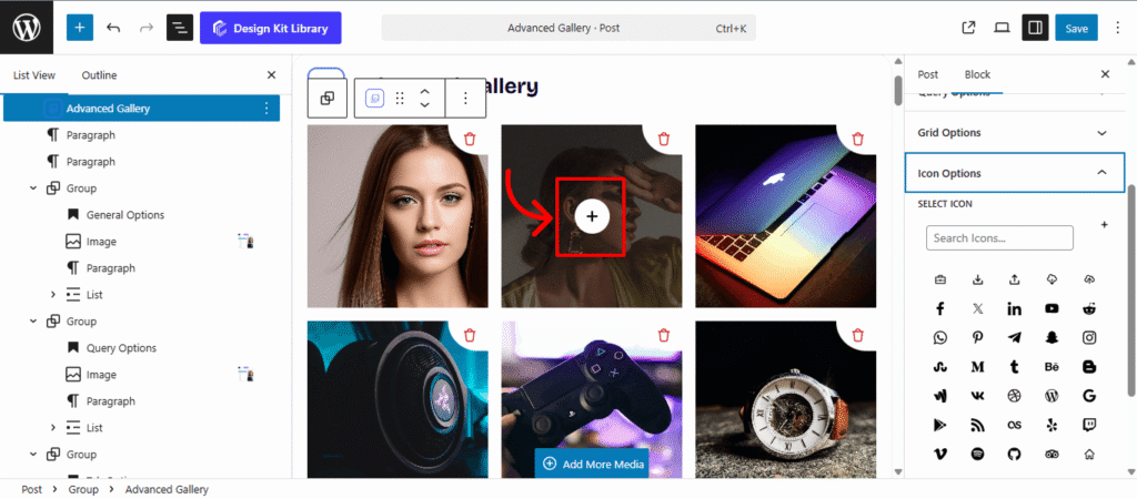
The Icon Options panel allows you to customize the visual cue that appears when a user hovers over a gallery image. This icon typically signals that the image can be expanded or interacted with, adding a layer of intuitive navigation to your portfolio.
Ajax Loader Options

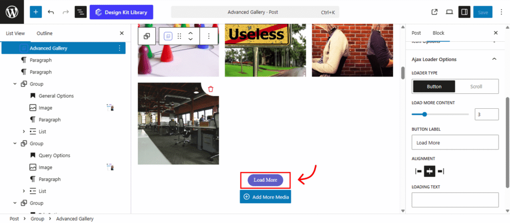
The Ajax Loader options allow you to define how more images are fetched and displayed in your gallery without a full page refresh. This ensures your portfolio remains fast and interactive even with a large number of items
- Loader Type: Choose between Button, where users click to see more, or Scroll, which automatically triggers new content as the visitor reaches the bottom of the gallery.
- Button Label: Customize the call-to-action text, such as “Load More” or “View All Projects,” to match your site’s voice.
- Alignment: Position your loading button to the Left, Center or Right to fit your layout.
- Loading Text: Set the specific message (e.g., “Fetching…”) that appears while the gallery is actively retrieving new images.
Media Options
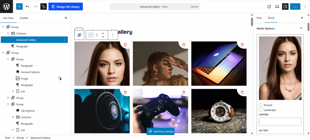
The Media Options panel is where you manage the specific data and organizational details for each individual image in your gallery.
- Tabs (Collection Categories): Assign each image to one or more categories. These tags are power by the Tab feature, allowing users to sort your gallery dynamically.
- Caption: Add a brief description or title that appears on hover or within the lightbox. This provides immediate context for your work.
- Alt Text: Enter a descriptive “Alternative Text” for each image. This is essential for accessibility (screen readers) and improves your site’s SEO by helping search engines understand your visual content.
Style ◑
Image Styles
The Image Styles panel allows you to fine-tune the visual appearance and interactive behavior of each gallery item. Use these settings to create a consistent and polished look for your portfolio.
- Toggle Hover Effect: Enable or disable the transition animation that occurs when a user mouses over an image.
- Dimensions: Precisely control the Width, Height, and Border-Radius (rounded corners) to define the shape and scale of your media.
- Title Alignment : Position your image titles to the Left, Center, or Right.
- Title Vertical Spacing: Adjust the top and bottom spacing to control the vertical position of the title within the image area.
- Typography: Customize the font family, size, weight, and style of your image captions for maximum readability.
- Color (Text & Overlay): Define the Text Color for your captions and set the Overlay Color—the tinted layer that appears over the image on hover—to enhance contrast and branding.
Icon Styles
The Icon Styles panel provides precise control over the appearance and interactive states of the icons displayed on your gallery images. Use these settings to define the icon’s scale, spacing, and color transitions.
- Padding: Adjust the internal spacing between the icon and its background boundary.
- Border: Set the thickness, style, and color of the stroke surrounding the icon.
- Radius: Define the corner curvature of the icon’s background—set to a high value for a circular look or 0 for a square.
- Size: Use the slider to scale the overall dimensions of the icon.
- Color: Set the primary colors for the icon graphic and its background, then define separate colors for the hover state to create a dynamic visual response.
Ajax Loader Styles
The Ajax Loader Styles panel allows you to customize the appearance of the “Load More” button and its animated loading indicator. Use these settings to ensure the transition between image sets matches your site’s design.
- Spacing ( Padding): Adjust the internal Padding for the button size.
- Spacing ( Margins):Set the Margin Top and Margin Bottom to control the vertical distance between the gallery and the loader.
- Max Width: Define the maximum horizontal width of the loading button or container.
- Border & Radius: Set the thickness and style of the button’s stroke, and use the Radius to create rounded or squared corners.
- Typography: Select the font family, size, weight for the “Load More” and “Loading” text.
- Colors: Customize the default and hover states for the text, background, and border. This section also defines the Spinner Primary (the moving loader) and the Spinner Secondary (the background path the loader spins around).
Lightbox Title Styles
The Lightbox Title Styles panel allows you to customize the text that appears when an image is viewed in full-screen mode, ensuring consistency with your gallery’s branding.
- Title Alignment: Position the title to the Left, Center, or Right of the lightbox overlay.
- Vertical Spacing: Adjust the top and bottom spacing to control the distance between the title and the image or the edge of the lightbox.
- Typography: Select the font family, size, weight, and style for the lightbox text.
Lightbox Navigation Styles
The Lightbox Navigation Styles panel allows you to customize the appearance of the “Previous” and “Next” arrows that appear when an image is viewed in full-screen mode.
- Dimensions (Width & Height): Set the specific horizontal and vertical size for the navigation arrow’s container.
- Icon Size: Use the slider to scale the arrow graphic within its container for better visibility.
- Border & Radius: Define the thickness and style of the stroke surrounding the navigation box, and use the Radius to create rounded or squared corners.
- Colors (Icon & Background): Customize the primary and hover states for the icon, background, and border. This ensures the navigation elements remain highly visible against any image background.