

Product Slider
The Product Slider Block is a high-impact layout engine specifically engineered for storefront hero sections and featured collection areas. While it shares the same robust DNA as the Product Grid/Carousel block—utilizing nested WooCommerce Query Loops and Product Templates—it is pre-configured for a “one-slide-at-a-time” immersive shopping experience. This block allows you to create cinematic transitions for your top-tier products while retaining full granular control over the design of each slide.
This block functions as a Product Hero Container, designed to draw immediate attention to featured items or seasonal promotions at the top of a shop page or homepage. By default, it is optimized for a single, high-resolution product showcase per view, but it remains fully adaptive, allowing you to scale the number of visible items as needed. Because it uses the native Product Template architecture, you have total creative freedom: you can overlay titles on top of striking product photography or include interactive elements like the Add to Cart Icon block, Wishlist, and Quick View. It inherits the same powerful filtering logic from the Query Loop, ensuring your slider always displays your most relevant, up-to-date inventory automatically.
Settings ⚙
Slider Options
- Slides Per View: Define how many products are visible in the slider at once.
- Centered Slides: Toggle this to keep the active product card positioned in the middle of the viewport. This is particularly effective for high-impact hero sliders where you want to draw the eye to a single featured item.
- Gap: Adjust the horizontal spacing between each product slide to prevent your layout from feeling cluttered.
- Loop: Enable this to allow the carousel to wrap around indefinitely. Once the shopper reaches the last product, the slider seamlessly transitions back to the first.
- Autoplay: Activate this to have the products slide automatically. This is a great way to showcase a large inventory without requiring user interaction.
- Autoplay Delay: Set the duration (in milliseconds) that each product remains static before the next one slides into view.
- Speed: Control the transition velocity. A higher value creates a slow, cinematic glide, while a lower value makes for a snappy, high-energy transition.
- Enable Pagination: Displays “dots” or “bullets” at the bottom of the carousel, providing a visual progress indicator for the shopper.
- Enable Navigation: Adds directional arrows to the left and right, allowing users to manually browse through your collections.
- Display on Hover: Use this to pause the Autoplay when a user moves their mouse over a specific product. This ensures they have plenty of time to view the details or click the “Add to Cart” button without the slide moving away.
Style ◑
Pagination Styles
The Pagination Styles settings is active when layout is Carousel and Pagination is enabled, this allow you to refine the appearance and interactive behavior of the navigation indicators (dots or numbers) for your Carousel. These controls ensure the pagination is both functional and visually aligned with your brand’s UI.
- Vertical Positioning: Fine-tune the vertical offset to control how far the pagination sits below the carousel content.
- Gap: Adjust the specific spacing between each individual pagination dot to ensure they are distinct and easy to click.
- Align: Set the horizontal placement of the indicators. Toggle between Left, Center, or Right to balance the layout against your team member cards.
- Default / Active (Toggle)
- Default:
- Width & Height: Define the base size of the inactive indicators.
- Border Radius: Control the shape, from sharp squares to perfect circles.
- Active:
- Width & Height: Increase these values to make the active slide indicator physically larger or longer (e.g., a “pill” shape) for better visibility.
- Border & Border Offset: Add an outline to the active dot and use the offset to create a “halo” effect (spacing between the dot and its border).
- Border Radius: Independently adjust the curvature of the active indicator.
- Default:
- Color:
- Default: The color of inactive indicators.
- Default Hover: The color shift when a user moves their cursor over an inactive dot.
- Active: The primary color for the dot representing the current slide.
- Active Default: The color of the active dot when hovered.
- Active Border: The specific color of the stroke surrounding the active indicator.
Sale Badge Styles
The Sale Badge Styles panel provides the aesthetic toolkit to transform a standard “On Sale” notice into a high-conversion visual element. These controls allow you to define the shape, orientation, and “pop” of your discount indicators, ensuring they grab the shopper’s attention without clashing with your product photography.
- Padding: Adjust the internal space within the badge. Increasing the padding creates a larger, more button-like “pill,” while tighter padding keeps the badge compact and minimalist.
- Border Type: Choose from Solid, Dashed, Dotted or more outlines to add a stylistic frame around your discount text.
- Border Width: Enter the border width.
- Border Color: Select the border color.
- Border Radius: Control the curvature of the badge corners. A value of 0px creates a sharp, modern rectangle, while a high value (like 50px) creates a friendly, rounded “capsule” shape.
- Vertical & Horizontal Positioning: Use these granular offsets to “pin” the badge to specific areas of the product image. You can tuck it into the top-right corner or center it along the bottom edge for a unique look.
- Rotate: Add a touch of personality by tilting the badge (e.g., a -15° or 10° angle). This “sticker” effect is a proven way to draw the eye toward promotional offers.
- Rotate: Add a touch of personality by tilting the badge (e.g., a -15° or 10° angle). This “sticker” effect is a proven way to draw the eye toward promotional offers.
- Typography
- Font Family & Size: Select the typeface and scale that best matches your site’s design system.
- Font Weight: Control the thickness (e.g., Bold for emphasis or Light for a modern look).
- Letter Case: Force the labels to Uppercase, Lowercase, or Capitalize without editing the form code.
- Decoration: Apply styles like Underline or Line-through if needed for specific design cues.
- Line Height & Letter Spacing: Fine-tune the vertical breathing room and horizontal character density.
- Color
- Text Color: Set the color for your “Sale” text or discount percentage. High-contrast colors (like white text on a dark background) are recommended for readability.
- Background Color: Apply a vibrant fill to the badge. Using a signature “Action” color—like a bright red, orange, or your brand’s primary accent—ensures that customers never miss a deal while browsing your grid or carousel.
Sale Badge Typography
- Typography
- Font Family & Size: Select the typeface and scale that best matches your site’s design system.
- Font Weight: Control the thickness (e.g., Bold for emphasis or Light for a modern look).
- Letter Case: Force the labels to Uppercase, Lowercase, or Capitalize without editing the form code.
- Line Height & Letter Spacing: Fine-tune the vertical breathing room and horizontal character density.
- Color
- Text Color: Set the color for your “Sale” text or discount percentage. High-contrast colors (like white text on a dark background) are recommended for readability.
Demo
-
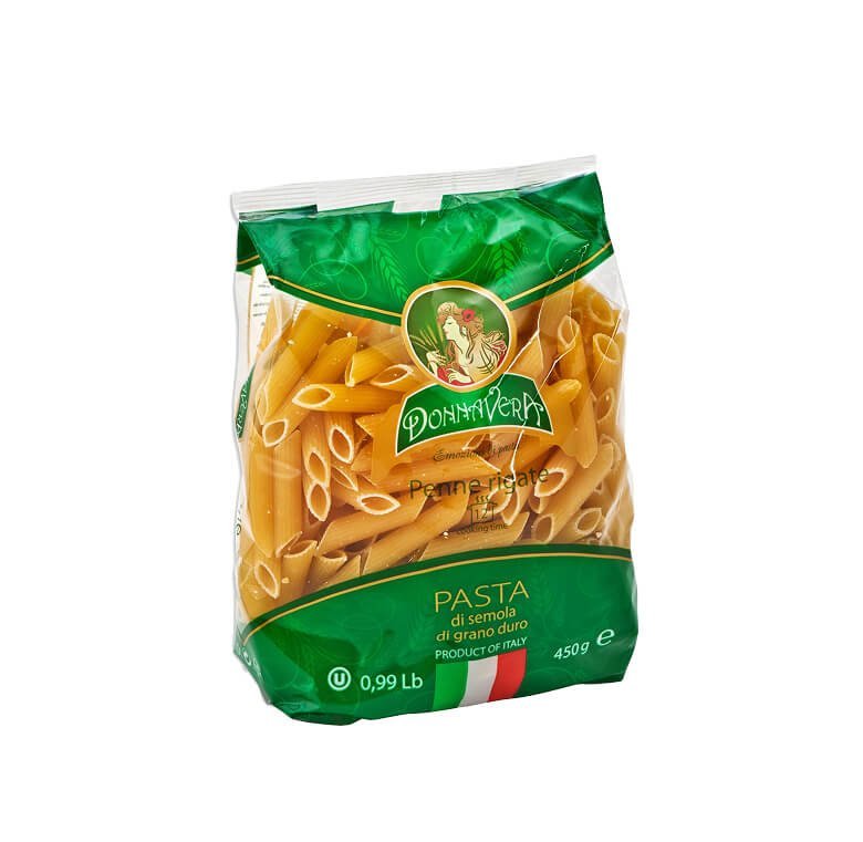
Penne Pasta
Enjoy the authentic taste and perfect texture of our high-quality Penne Pasta, crafted from the finest durum wheat for a deliciously firm bite. Its tube-shaped, ridged design makes it ideal for holding onto sauces, whether it’s a classic marinara, creamy Alfredo, or a zesty pesto. Rich in protein and fiber, our pasta is a wholesome…
Price range: ₨ 11.99 through ₨ 12.99 -
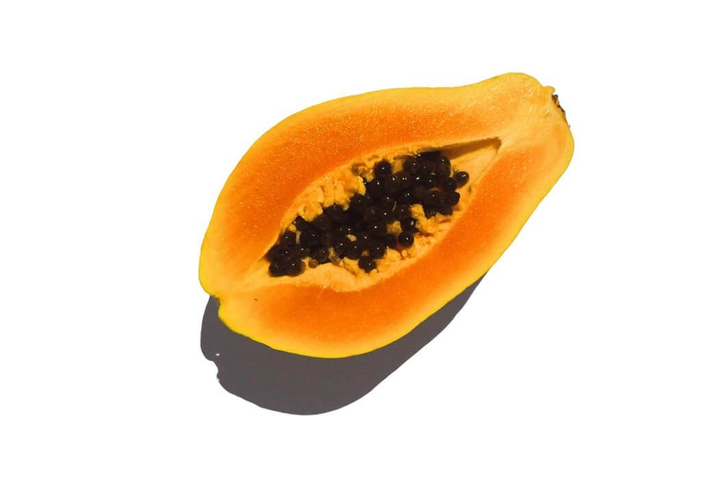
Fresh Papaya Juice
Indulge in the tropical delight of 100% fresh papaya juice, bursting with natural sweetness and loaded with essential nutrients. Made from handpicked, ripe papayas, this refreshing juice is rich in vitamin C, antioxidants, and digestive enzymes that promote gut health, boost immunity, and nourish your skin. With no added sugar, preservatives, or artificial flavors, it’s…
Original price was: ₨ 27.99.₨ 12.99Current price is: ₨ 12.99. -
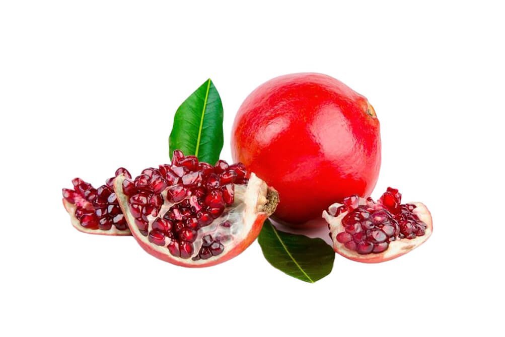
Fresh Pomegranate Juice
Experience the refreshing taste and health benefits of 100% pure pomegranate juice, freshly extracted from premium-quality pomegranates to deliver a rich, tangy-sweet flavor in every sip. Packed with essential vitamins, powerful antioxidants, and natural goodness, our juice supports immunity, promotes heart health, and enhances overall wellness. With no added sugar, preservatives, or artificial flavors, it’s…
Original price was: ₨ 19.99.₨ 11.99Current price is: ₨ 11.99. -
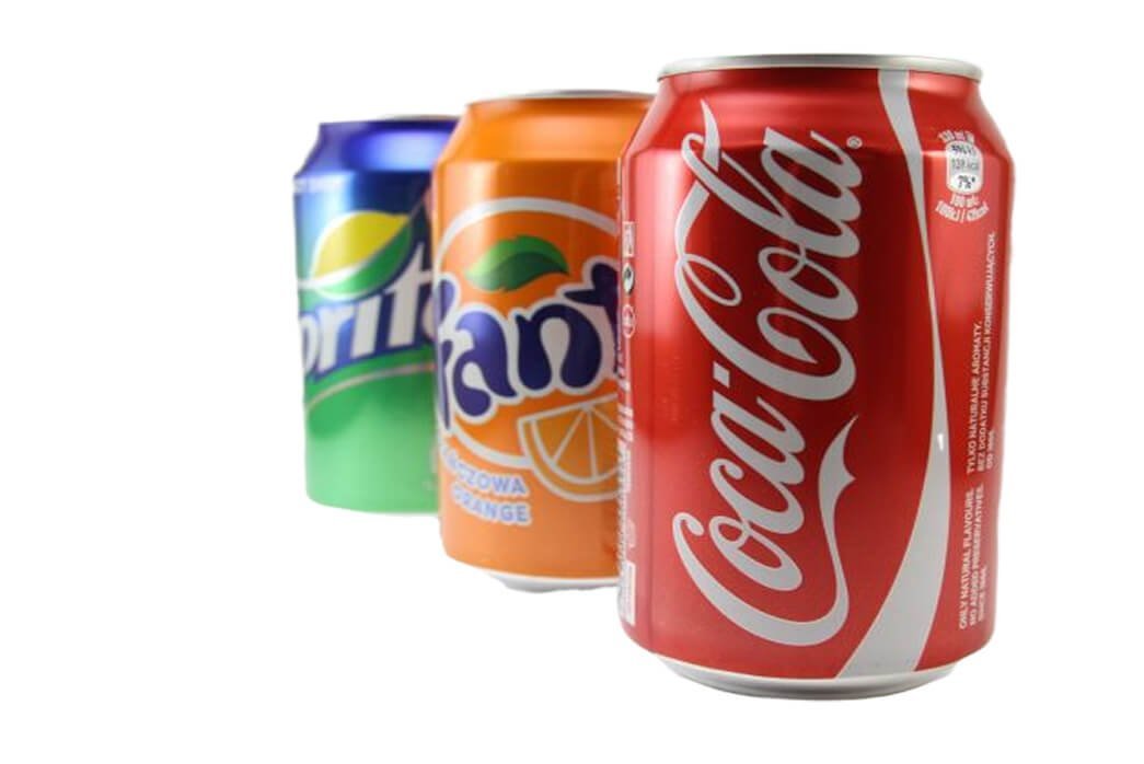
Cold Drinks
Beat the heat and stay refreshed with our deliciously chilled cold drinks, crafted to deliver the perfect burst of flavor and hydration. From fizzy sodas and energizing fruit juices to cool iced teas and refreshing mocktails, we have something for everyone. Made with high-quality ingredients, our drinks are perfect for any occasion—whether you’re relaxing at…
Original price was: ₨ 18.99.₨ 9.99Current price is: ₨ 9.99. -
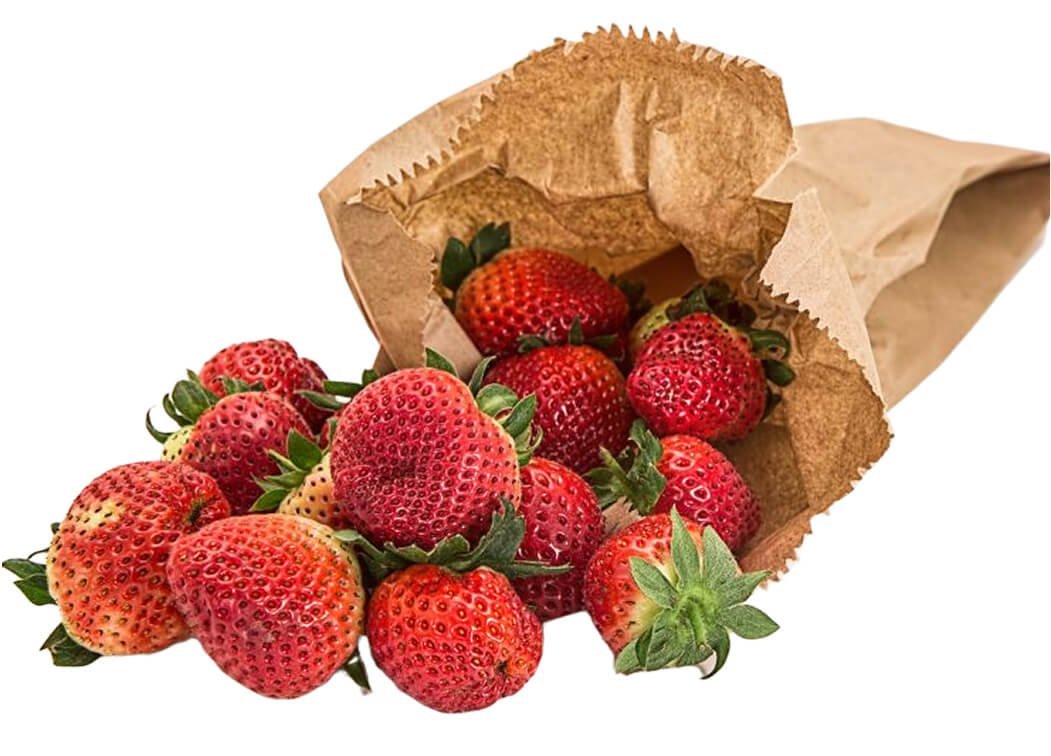
Fresh Strawberry
Enjoy the natural sweetness and vibrant flavor of our fresh, handpicked strawberries, bursting with juicy goodness and rich in vitamins, antioxidants, and fiber. Perfect for snacking, smoothies, desserts, or adding a refreshing touch to your meals, these farm-fresh berries offer a delicious blend of sweetness and tanginess. With their bright red color and irresistible taste,…
Original price was: ₨ 29.99.₨ 24.99Current price is: ₨ 24.99. -
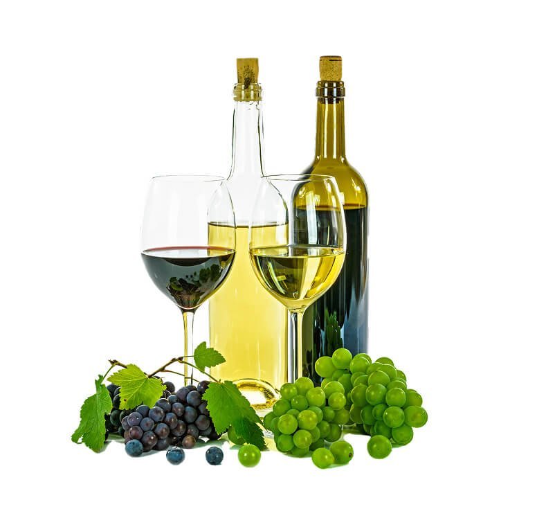
Red and White Wine
Discover our premium Wine Collection, featuring a handpicked selection of the finest reds, whites, rosés, and sparkling wines from renowned vineyards. Whether you prefer the bold richness of a full-bodied red, the crisp freshness of a chilled white, or the delicate elegance of a rosé, our collection offers something for every palate. Perfect for celebrations,…
Original price was: ₨ 1,100.00.₨ 999.99Current price is: ₨ 999.99. -
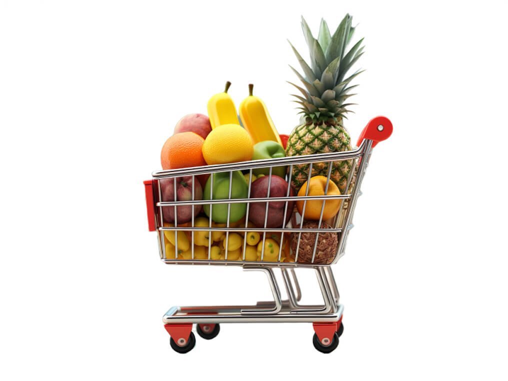
Mixed Fruit Cart
Enjoy a vibrant assortment of fresh, handpicked fruits, carefully selected to bring you the perfect blend of sweetness, juiciness, and nutrition. Our Mixed Fruits Cart is packed with seasonal favorites like succulent mangoes, crisp apples, juicy oranges, luscious berries, and more, offering a delicious and healthy treat for any time of the day. Rich in…
Original price was: ₨ 34.99.₨ 24.99Current price is: ₨ 24.99.