Featured Product Tabs
Featured Product Tabs
Latest
Top Rated
On Sale
 Sale
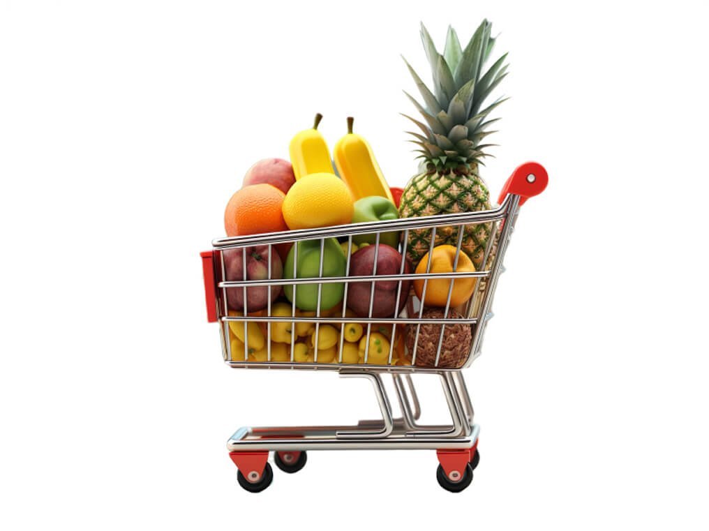
SaleMixed Fruit Cart
Enjoy a vibrant assortment of fresh, handpicked fruits, carefully selected to bring you the…
Original price was: ₨ 34.99.₨ 24.99Current price is: ₨ 24.99.
 Sale
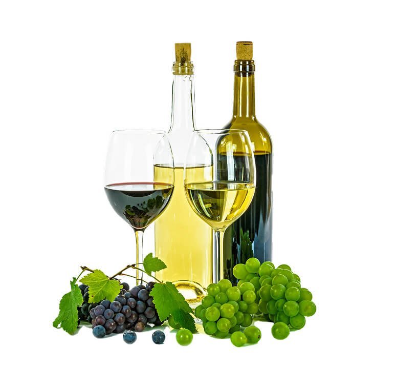
SaleRed and White Wine
Discover our premium Wine Collection, featuring a handpicked selection of the finest reds, whites,…
Original price was: ₨ 1,100.00.₨ 999.99Current price is: ₨ 999.99.
 Sale
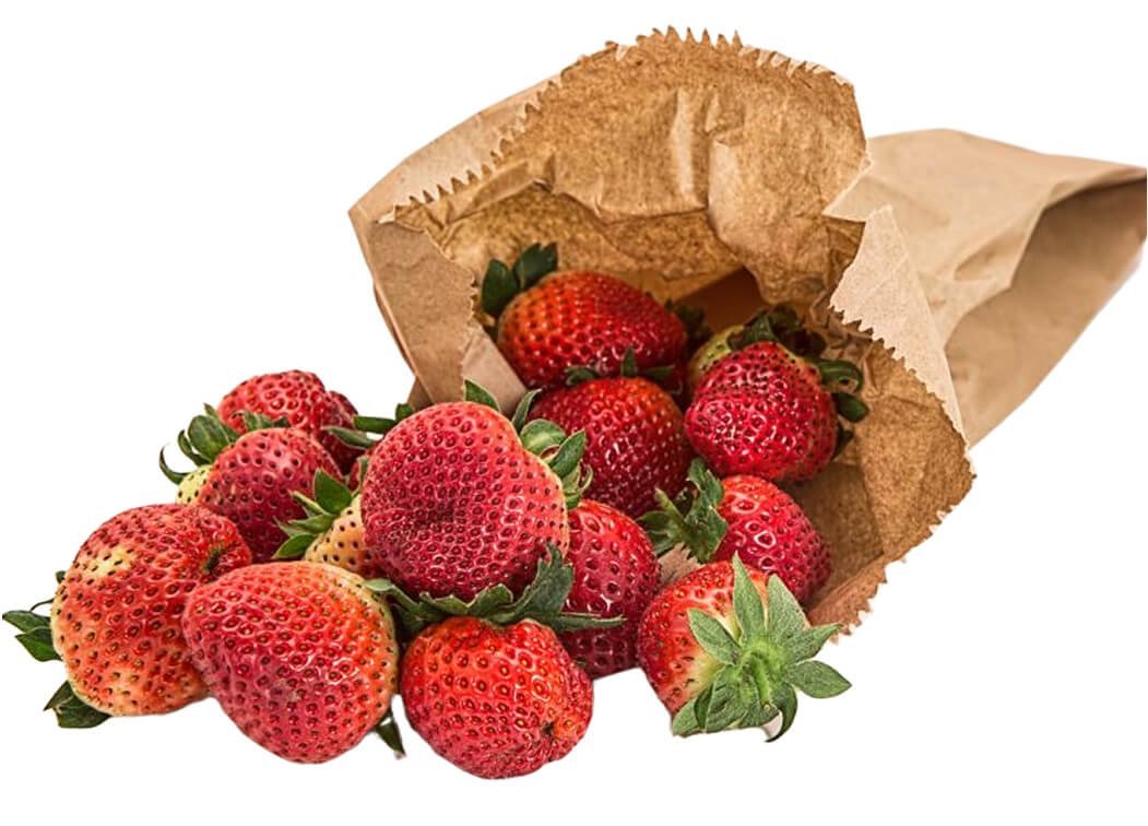
SaleFresh Strawberry
Enjoy the natural sweetness and vibrant flavor of our fresh, handpicked strawberries, bursting with…
Original price was: ₨ 29.99.₨ 24.99Current price is: ₨ 24.99.
 Sale
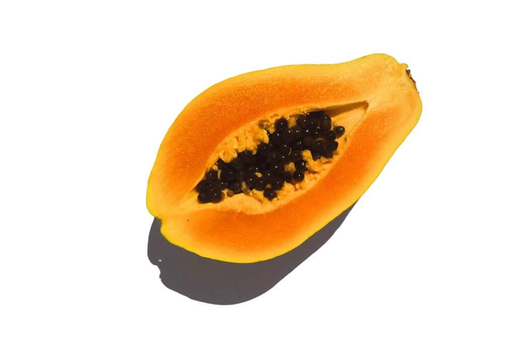
SaleFresh Papaya Juice
Indulge in the tropical delight of 100% fresh papaya juice, bursting with natural sweetness…
Original price was: ₨ 27.99.₨ 12.99Current price is: ₨ 12.99.
 Sale
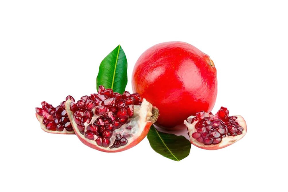
SaleFresh Pomegranate Juice
Experience the refreshing taste and health benefits of 100% pure pomegranate juice, freshly extracted…
Original price was: ₨ 19.99.₨ 11.99Current price is: ₨ 11.99.
- Sale
Fresh Strawberry
Enjoy the natural sweetness and vibrant flavor of our fresh, handpicked strawberries, bursting with…
Original price was: ₨ 29.99.₨ 24.99Current price is: ₨ 24.99.
- Sale
Fresh Papaya Juice
Indulge in the tropical delight of 100% fresh papaya juice, bursting with natural sweetness…
Original price was: ₨ 27.99.₨ 12.99Current price is: ₨ 12.99.
- Sale
Fresh Pomegranate Juice
Experience the refreshing taste and health benefits of 100% pure pomegranate juice, freshly extracted…
Original price was: ₨ 19.99.₨ 11.99Current price is: ₨ 11.99.
 Sale
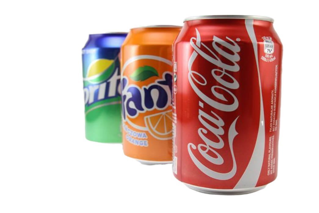
SaleCold Drinks
Beat the heat and stay refreshed with our deliciously chilled cold drinks, crafted to…
Original price was: ₨ 18.99.₨ 9.99Current price is: ₨ 9.99.
The Featured Product Tabs panel provides a dynamic, space-efficient interface for organizing your inventory into specific marketing categories. By utilizing this tabbed system, you can present multiple curated collections within a single block, allowing shoppers to effortlessly toggle between different product groups. The block is equipped with four specialized tabs—Latest, Best Seller, Top Rated, and On Sale—which automatically filter your catalog to highlight new arrivals, high-volume favorites, customer-approved picks, and active discounts respectively. This structured approach not only cleans up your page layout but also guides users toward your most relevant and high-converting products.
Settings ⚙
General
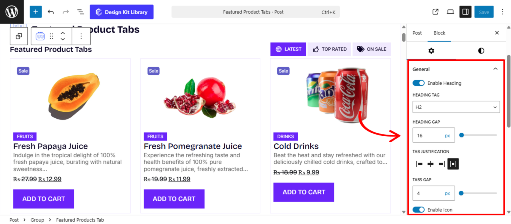
- Enable Heading : Toggle this option to display or hide the main section title.
- Heading Tag: Select the appropriate HTML tag (from H1–H6 or Paragraph) to ensure proper SEO structure and typographic hierarchy.
- Heading Gap: Adjust the vertical spacing between the heading and the navigation tabs to prevent the header area from feeling cluttered.
- Tab Justification: Control the horizontal distribution of the header and tabs. You can align them to the Left, Center, Right, or use Space-between to push the heading and tabs to opposite ends of the container.
- Tabs Gap: Define the horizontal space between individual tab labels to ensure clear separation and readability.
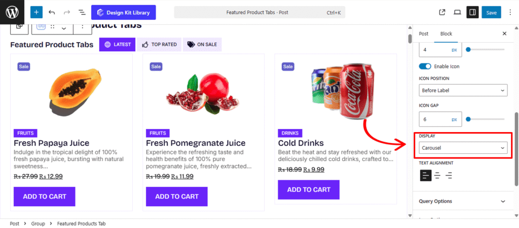
- Enable Icon: Add a visual cue to your tabs by enabling icons.
- Icon Position: Choose whether the icon appears Before or After the tab label.
- Icon Gap: Fine-tune the precise spacing between the tab text and its associated icon.
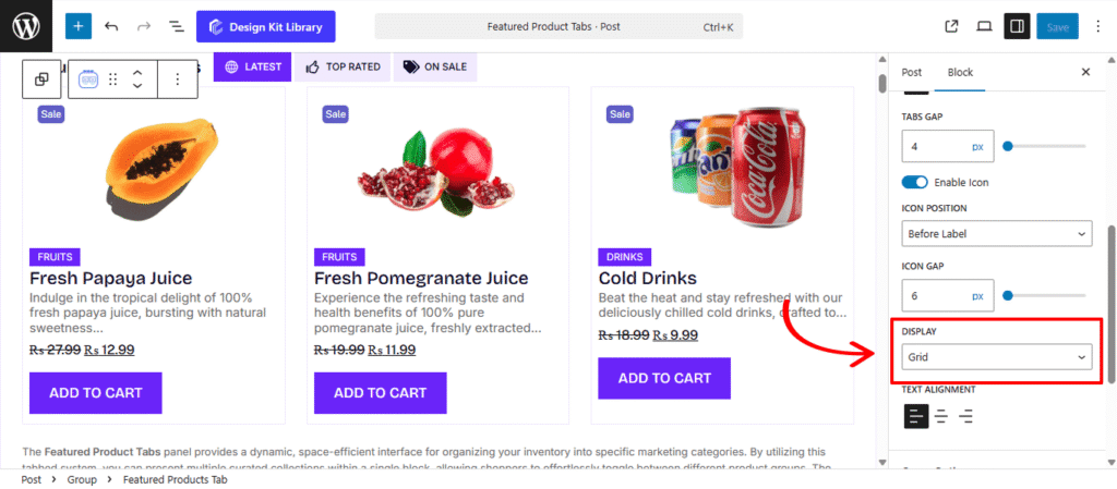
- Display Mode: Switch between a rigid Grid, a sliding Carousel, or a vertical List to best suit your page’s design requirements.
- Content Gap (List Only): Specifically for the List view, this adjusts the vertical spacing between each product row.
- Text Alignment: Globally set the alignment of your text content to Left, Center, or Right for consistent styling throughout the block.
Query Option
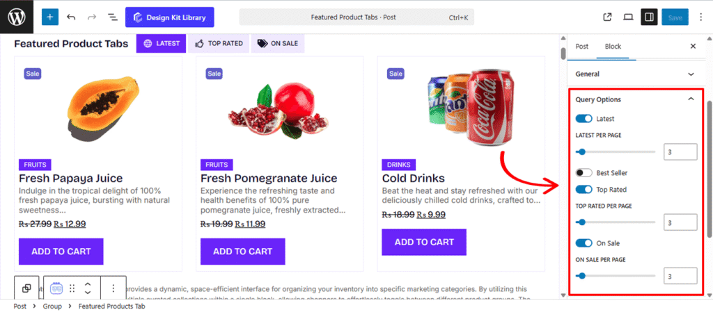
The Query Options panel gives you granular control over the data displayed within each of the four featured tabs. These settings allow you to toggle specific collections on or off and define exactly how many products appear in each category, ensuring your storefront stays focused and high-performing.
- Latest: Enable this to include a tab for your most recent additions.
- Best Seller : Activate this tab to highlight your top-performing products by sales volume.
- Top Rated: Toggle this to display products that have received the highest customer ratings.
- On Sale: Enable this tab to automatically aggregate all products currently featuring a discount or sale price.
Note: Each tab toggle includes a dedicated “Per Page” slider, providing granular control over exactly how many items are displayed within that specific collection. This allows you to highlight your most important categories with more visibility while keeping others compact.
Icon Options
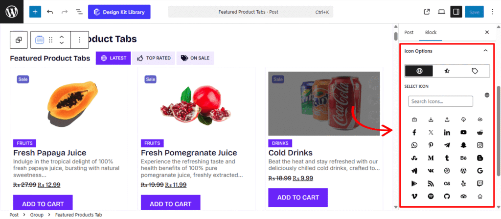
The Icon Options panel allows you to assign specific visual markers to each of your enabled product collections. By adding unique icons to your tabs, you improve the user experience through intuitive visual cues, making it easier for shoppers to navigate between different categories at a glance.
- Tabs Icon Toggle: For every collection enabled in the Query Options, you will find a dedicated toggle tab specifically for that tab (Latest, Best Seller, Top Rated, or On Sale).
- Select Icon: Once a tab’s icon is toggled, you can browse and select a graphic from the icon library that best represents that category.
Grid Options
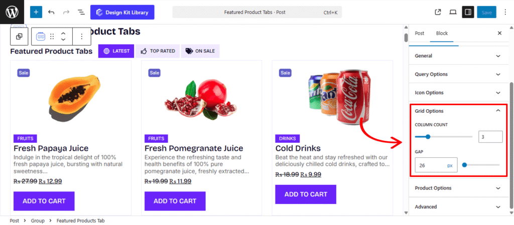
The Grid Options panel provides the essential structural settings for organizing your products into a clean, multi-column layout. These controls allow you to define the density of your display and maintain a consistent layout throughout your section. This Panel is available only when the Display is set to Grid from the General Panel
- Column Count: Define the total number of products displayed in a single horizontal row. This allows you to set a fixed grid structure that best fits the width of your page.
- Gap: Adjust the spacing between your product cards. This setting controls the gutters between items, ensuring they don’t feel crowded and that there is a clear visual separation between each product’s details.
Carousel Options
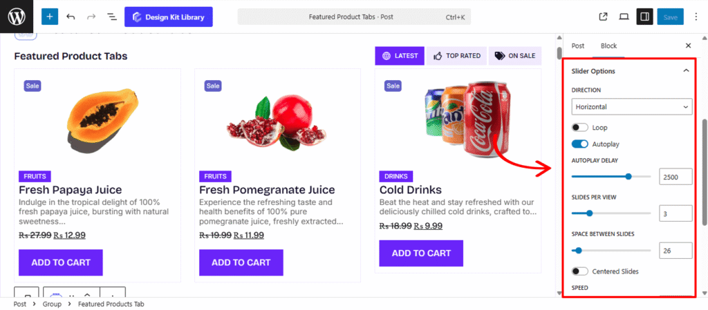
The Carousel Options panel provides the settings necessary to transform your featured product list into an interactive, sliding showcase. This display mode is ideal for presenting large collections without taking up excessive vertical space on your page. This Panel is available only when the Display is set to Carousel.
- Direction: Choose between a Horizontal or Vertical flow. While horizontal is standard for product rows, a vertical carousel can create a unique, modern look for sidebars or specialized layouts.
- Height: This setting becomes active only when the vertical direction is selected. It allows you to define the fixed height of the carousel container, ensuring it fits perfectly within your page layout.
- Loop: Enable this to allow the carousel to wrap around indefinitely. Once the shopper reaches the last product, the slider seamlessly transitions back to the first.
- Autoplay: Activate this to have the products slide automatically. This is a great way to showcase a large inventory without requiring user interaction.
- Autoplay Delay: Set the duration (in milliseconds) that each product remains static before the next one slides into view.
- Slides Per View: Define how many products are visible in the slider at once.
- Space Between: Adjust the horizontal spacing between each product slide to prevent your layout from feeling cluttered.
- Speed: Control the transition velocity. A higher value creates a slow, cinematic glide, while a lower value makes for a snappy, high-energy transition.
- Centered Slides: Toggle this to keep the active product card positioned in the middle of the viewport. This is particularly effective for high-impact hero sliders where you want to draw the eye to a single featured item.
- Enable Pagination: Displays “dots” or “bullets” at the bottom of the carousel, providing a visual progress indicator for the shopper.
- Enable Navigation: Adds directional arrows to the left and right, allowing users to manually browse through your collections.
- Display on Hover: Use this to pause the Autoplay when a user moves their mouse over a specific product. This ensures they have plenty of time to view the details or click the “Add to Cart” button without the slide moving away.
Style ◑
Tab Heading Styles
The Tab Heading Styles panel allows you to customize the typography and color of the main section title. These settings ensure that your heading effectively introduces the product tabs while remaining consistent with your site’s overall branding.
- Typography
- Font Family & Size: Select the typeface and scale that best matches your site’s design system.
- Font Weight: Control the thickness (e.g., Bold for emphasis or Light for a modern look).
- Letter Case: Force the labels to Uppercase, Lowercase, or Capitalize without editing the form code.
- Decoration: Apply styles like Underline or Line-through if needed for specific design cues.
- Line Height & Letter Spacing: Fine-tune the vertical breathing room and horizontal character density.
- Color:
- Heading: Choose a specific color for the heading text. You can select a bold color to draw attention or a more subtle tone to complement the surrounding layout and product imagery.
Heading Styles
The Heading Styles panel provides dedicated controls to customize the visual character of your component’s main title. These settings allow you to go beyond standard typography, turning your heading into a stylized design element that captures the user’s attention.
- Padding: Adjust the internal space between the text and the boundary of the heading’s background or border. This is essential for ensuring the text doesn’t feel cramped when using background colors.
- Border: Apply a stroke style, width, and color around the heading. This can be used to underline, frame, or fully encase the title for added emphasis.
- Border Radius: Define the curvature of the heading’s corners. This works in tandem with the background or border to create a sleek, modern look.
- Clip-path: Enter a custom CSS clip-path value (such as
polygon(50% 0, 100% 50%, 50% 100%, 0 50%)orcircle(40%)) to create unique, non-rectangular shapes for the heading’s background. This allows for creative, high-end design layouts like slanted or notched headers. - Color:
- Text Color: Set the primary color for the heading typography to ensure it is legible and brand-consistent.
- Background Color: Apply a fill color specifically to the heading area, which can be used to create a “badge” or “highlight” effect behind the title.
Tab Style
The Tab Styles panel controls the aesthetics and spacing of the navigation buttons that allow users to switch between your product collections. These settings help you define the “look and feel” of the tabs, whether you prefer a minimalist text-based approach or a more structured, button-like appearance.
- Top Spacing: Adjust the external margin above the entire tab bar. This is useful for creating a gap between the section heading and the navigation links.
- Bottom Spacing: Define the external margin below the tab bar to control the distance between the navigation and the product results below.
- Padding: Control the breathing room inside each individual tab. Increasing the padding makes the clickable area larger, which is especially helpful for improving the user experience on touch-screen devices.
- Border Radius: Define the roundness of the tab corners. Set this to a high value to create soft, pill-shaped buttons, or keep it at 0px for sharp, professional edges that align with a modern or formal design.
- Typography
- Font Family & Size: Select the typeface and scale that best matches your site’s design system.
- Font Weight: Control the thickness (e.g., Bold for emphasis or Light for a modern look).
- Letter Case: Force the labels to Uppercase, Lowercase, or Capitalize without editing the form code.
- Decoration: Apply styles like Underline or Line-through if needed for specific design cues.
- Line Height & Letter Spacing: Fine-tune the vertical breathing room and horizontal character density.
- Default/Active Toggle: This section allows you to define how a tab looks in its normal state versus when it is currently selected. Providing a clear distinction between these states is essential for intuitive navigation.
- Border: Apply a stroke style and color to the tab. You can use this to create an “outline” effect for the Active tab to make it pop.
- Color
- Text: Set the font color for the tab labels. Typically, a bolder or more vibrant color is used for the Active state to highlight the current selection.
- Background: Define the fill color for the tab container. Switching background colors between states helps transform the tabs into interactive, high-contrast buttons.
Tab Separator Style
The Tab Separator Styles panel provides design controls for the container or background area that houses your individual tabs. These settings are ideal for creating a cohesive “navigation bar” look, allowing you to wrap your tabs in a distinct visual tray.
- Padding: Adjust the internal space between the product content (image, title, price) and the edge of the box. This creates a balanced, professional frame for each item.
- Border: Apply a stroke style and color to the product container. A subtle border can help separate products from the page background, especially on minimalist white layouts.
- Border Radius: Define the curvature of the box corners. Use a higher value for a soft, friendly look or 0px for a sharp, modern aesthetic.
- Tab Overlay (Toggle): Enable this to create a layered visual effect, often used to place a background “pill” or indicator behind the tabs.
- Color
- Background: Set the fill color for the separator area. By applying a background color here, you can create a unified bar that spans the width of your tab group, helping it stand out from the rest of the page.
Product Box Style
The Product Box Styles panel allows you to customize the outer container of each individual product within the grid or carousel. These settings define the “frame” for your product information, helping you create a clean, consistent look for every item in your catalog.
- Padding: Control the internal spacing between the product’s content (such as the image, title, and price) and the edge of the box. Proper padding ensures your products don’t feel cramped and provides a professional, airy layout.
- Border: Apply a stroke style and color to the product container. This is a great way to subtly separate products from one another or to create a structured “card” design that stands out against the page background.
- Border Radius: Define the roundness of the corners for each product box. You can use a slight radius for a modern, soft look, or a higher value to match a more playful or rounded brand aesthetic.
- Box Shadow: When the Box Shadow toggle is enabled, you can add depth and dimension to your container to make it “pop” off the page:
- Position: Choose Outline for a traditional drop shadow or Inset to make the shadow appear inside the container, creating a “pressed” effect.
- Horizontal & Vertical: Shift the shadow’s position along the X and Y axes to simulate a specific light source.
- Blur & Spread: Blur softens the edges of the shadow for a natural look, while Spread expands or contracts the overall surface area of the shadow.
- Shadow Color: Select the color and transparency (opacity) of the shadow effect.
Image Style
The Image Style panel provides a suite of controls for the product’s primary visual. These settings allow you to standardize how your product photography is framed and how it responds when a user interacts with it.
- Hover Effect (Toggle): Enable dynamic animations—such as a subtle zoom or a secondary image swap—that trigger when a shopper mouses over the product.
- Width & Height: Define the exact dimensions for your product images to ensure a uniform grid, even if the original source files vary in size.
- Object Fit: Use this toggle to determine how the image fills its container. Cover fills the entire area (cropping if necessary), while Contain displays the full image without cropping.
- Object Position: Adjust the focal point of the image within the frame (e.g., Top, Center, Bottom) to ensure the most important part of the product is always visible.
- Margin Top & Bottom: Fine-tune the vertical spacing above and below the image to separate it from badges or titles.
- Radius: Control the corner roundness of the image. Use a higher value for a soft, modern look or 0px for sharp edges.
- Colors
- Overlay: Apply a tinted color layer over the image. This can be used to dim the image slightly to make text more readable or to add a branded “wash” to your photography.
Sale Badge Style
The Sale Badge Styles panel provides high-level customization for the promotional stickers that appear on discounted items. These settings allow you to communicate value clearly while ensuring the badge aligns with your store’s specific promotional branding.
- Content Type: Choose what information is displayed.
- Default: Displays a standard “Sale” text.
- Percentage: Automatically calculates and shows the discount percentage (e.g., -20%).
- Amount: Displays the specific currency amount saved (e.g., Save $10).
- Content Type: Choose what information the badge displays. You can show a Default “Sale” message, the exact Discount Amount (e.g., $10 Off), or the Discount Percentage (e.g., 20% Off).
- Preceding Label: Add custom text before the dynamic value, such as “Save” or “Up to,” to create a more compelling call to action.
- Subsequent Label: Add custom text after the dynamic value, such as “Saved” or “Off,” to create a more compelling call to action.
- Padding: Adjust the internal spacing to control the overall size and “breathability” of the badge text.
- Position (Left/Right): Quickly anchor the badge to the left or right side of the product image.
- Vertical & Horizontal Positioning: Fine-tune the exact placement using coordinate offsets to ensure the badge doesn’t overlap critical parts of the product photo.
- Rotation: Tilt the badge to a specific angle (e.g., -45°) to create a dynamic “slanted sticker” effect.
- Border & Border Radius: Apply a stroke for a high-contrast outline, and adjust the corner roundness to create anything from sharp rectangular tags to soft, circular badges.
- Typography
- Font Family & Size: Select the typeface and scale that best matches your site’s design system.
- Font Weight: Control the thickness (e.g., Bold for emphasis or Light for a modern look).
- Letter Case: Force the labels to Uppercase, Lowercase, or Capitalize without editing the form code.
- Decoration: Apply styles like Underline or Line-through if needed for specific design cues.
- Line Height & Letter Spacing: Fine-tune the vertical breathing room and horizontal character density.
- Colors
- Text & Background Color: Set the primary colors for the badge. Using high-contrast colors (like white text on a bright red or orange background) ensures the discount is the first thing a customer sees.
Util Icon Style
The Util Icon panel provides comprehensive layout and styling controls for functional icons (such as Wishlist, Quick View, or Compare). These settings allow you to define the spatial positioning, sizing, and interactive behavior of these icons to ensure they are both accessible and visually integrated.
- Display on Hover: Toggle this to only display the Utililiy Icons (Cart, Wishlist and Quick View blocks) on hover over the product box.
- Direction: Choose between a Horizontal or Vertical stack if you are displaying multiple utility icons.
- Vertical & Horizontal Align: Quickly snap the icon container to the Top, Bottom, Left, Center, or Right of its parent element.
- Vertical & Horizontal Positioning: Fine-tune the exact placement using coordinate offsets for precise “pixel-perfect” anchoring.
- Size: Control the scale of the icon itself.
- Box Width & Height: Define the dimensions of the clickable area surrounding the icon. This is essential for creating consistent touch targets for mobile users.
- Border & Border Radius: Apply an outline and define corner roundness. High radius values can transform the container into a perfect circle.
- Colors: Customize the appearance across three distinct interaction states (Default, Hover, and Active)
- Icon: Set the color of the glyph/graphic for each state.
- Background: Define the fill color of the icon’s container box. Changing this on hover or active states provides excellent tactile feedback.
- Border: Specifically adjust the border color, with a dedicated option for the Active state to highlight which utility is currently engaged.
Product Category Style
The Product Category Styles panel allows you to customize the labels that identify which collection a product belongs to. These settings help you style category links as subtle text or prominent buttons, improving both site navigation and visual organization.
- Gap: If a product belongs to multiple categories, this setting controls the space between each individual category tag.
- Padding: Adjust the internal breathing room around the category text. Adding padding is useful for creating a “badge” or “pill” effect.
- Margin Top & Bottom: Control the external vertical spacing to define the distance between the category labels and surrounding elements like the product image or title.
- Border: Apply a stroke style and width to the category container.
- Border Radius: Define the roundness of the corners. Use high values to create modern, rounded tags that match your brand’s aesthetic.
- Hover Effect: Apply subtle animations or transitions to the category tag when a user mouses over it, ensuring the navigation feels responsive and polished.
- Typography
- Font Family & Size: Select the typeface and scale that best matches your site’s design system.
- Font Weight: Control the thickness (e.g., Bold for emphasis or Light for a modern look).
- Letter Case: Force the labels to Uppercase, Lowercase, or Capitalize without editing the form code.
- Decoration: Apply styles like Underline or Line-through if needed for specific design cues.
- Line Height & Letter Spacing: Fine-tune the vertical breathing room and horizontal character density.
- Colors: Customize the appearance across three distinct interaction states (Default, Hover, and Active)
- Text (Default/Hover): Set the base color for your category labels and define a hover color to provide clear visual feedback when a user interacts with the link.
- Background (Default/Hover): Apply a fill color behind the category text. Switching the background color on hover creates a dynamic, interactive feel.
- Border Hover: Specifically change the outline color during a hover event to further emphasize the link.
Product Title and Price Style
The Product Title Style panel manages the typography and layout of your product names. Use Top and Bottom Spacing to perfectly position the title within the card, and define Link Default and Hover colors to provide clear interactive feedback when a shopper engages with the product.
The Product Price Style panel ensures the cost is clear and well-positioned. It features dedicated Top and Bottom Spacing to separate the price from surrounding elements, along with a Text Color setting to apply a high-contrast shade that makes your pricing immediately visible at a glance.
- Top & Bottom Spacing: Use these sliders to manage the vertical margins around both the title and the price. Adjusting the Top Spacing helps separate the text from the product image, while Bottom Spacing ensures there is a clear gap between the price and any action buttons below, preventing the layout from feeling overcrowded.
- Typography
- Font Family & Size: Select the typeface and scale that best matches your site’s design system.
- Font Weight: Control the thickness (e.g., Bold for emphasis or Light for a modern look).
- Letter Case: Force the labels to Uppercase, Lowercase, or Capitalize without editing the form code.
- Decoration: Apply styles like Underline or Line-through if needed for specific design cues.
- Line Height & Letter Spacing: Fine-tune the vertical breathing room and horizontal character density.
- Colors: Customize the appearance across three distinct interaction states (Default, Hover, and Active)
- Product Title Colors: Since titles typically act as navigation, you can set a Link Default color for its standard state and a Link Hover color to provide interactive feedback when a user mouses over the product name.
- Price Color: Choose a dedicated Text Color for the price. This is an excellent opportunity to use a bold or high-contrast color to ensure the cost is immediately visible to the customer at a glance.
Cart Button Style
The Cart Button Styles panel allows you to customize the primary call-to-action for your products. These settings ensure that the “Add to Cart” button is prominent, on-brand, and provides clear visual feedback to shoppers.
- Button Label: Customize the text displayed on the button. You can use standard phrases like “Add to Cart,” “Buy Now,” or “Get it Today” to match your store’s voice.
- This setting will be deprecated starting from plugin version 2.2.9. In newer versions, the button text will automatically sync with your global WooCommerce Add to Cart settings to ensure a consistent shopping experience across your entire store.
- Width: Define the horizontal span of the button. You can set it to a specific size or make it full-width to fill the product card.
- Padding: Adjust the internal space between the label text and the button’s edge for a balanced, clickable look.
- Margin Top & Bottom: Control the external vertical spacing to perfectly position the button relative to the price or product summary.
- Border: Apply a stroke style, width, and color to the button’s outline.
- Border Radius: Control the curvature of the button corners. Use a high value for a pill-shaped button or 0px for a sharp, formal rectangle.
- Typography
- Font Family & Size: Select the typeface and scale that best matches your site’s design system.
- Font Weight: Control the thickness (e.g., Bold for emphasis or Light for a modern look).
- Letter Case: Force the labels to Uppercase, Lowercase, or Capitalize without editing the form code.
- Decoration: Apply styles like Underline or Line-through if needed for specific design cues.
- Line Height & Letter Spacing: Fine-tune the vertical breathing room and horizontal character density.
- Colors:
- Text (Default/Hover): Set the color of the label for both its static and interactive states.
- Background (Default/Hover): Choose the button’s fill color. Using a distinct hover color provides essential tactile feedback when a user is about to click.
- Border Hover: Specifically change the outline color during a hover event to further emphasize the link.