Featured Post Tabs
Latest
Popular
Trending

All Product Review
All Product Review The All Product Review Block is a comprehensive social proof engine designed to aggregate and display customer…

Product Grid/Carousel
Product Grid/Carosuel The Product Grid/Carousel Block is the versatile engine of your WooCommerce storefront, designed to showcase your products in…

Product Category
Product Category The Product Category Block is a powerful navigation and discovery tool designed to showcase your store’s taxonomy in…

Advanced Categories
Advanced Categories The Advanced Categories block is a powerful navigation tool designed to transform a standard list of topics into…

Accordion
Accordion The Accordion Block allows you to organize large amounts of information into compact, expandable sections. It is the perfect…
Categorized Post Tabs
Categorized Post Tabs The Categorized Post Tabs block is a dynamic content solution designed to organize and display your articles…
Magazine Grid
Magazine Grid The Magazine Grid Block is a professional layout powerhouse designed to transform your content into a high-end, editorial-style…

Advertisement
Advertisement The Advertisement Block is a versatile monetization tool designed to help you integrate revenue-generating content into your site layouts….
Featured Post Tabs
Featured Post Tabs The Featured Post Tabs block is a high-performance content discovery tool designed to streamline navigation and boost…
The Featured Post Tabs block is a high-performance content discovery tool designed to streamline navigation and boost user engagement on documentation sites and news portals. This block organizes your content into five distinct, data-driven tabs—Latest, Popular, Trending, Tags, and Comments—enabling readers to pivot between chronological updates, all-time favorites, and time-sensitive trending topics with a single click.
By integrating a sophisticated “Featured Post” layout, the block creates an editorial-grade visual hierarchy; a primary article is prominently showcased with an expanded preview, while a curated list of supporting posts flows alongside it. This structure not only maximizes vertical space but also ensures that your most valuable documentation or insights are spotlighted effectively, providing a balanced mix of deep-dive content and quick-access updates within a sleek, interactive interface.
Settings ⚙
General
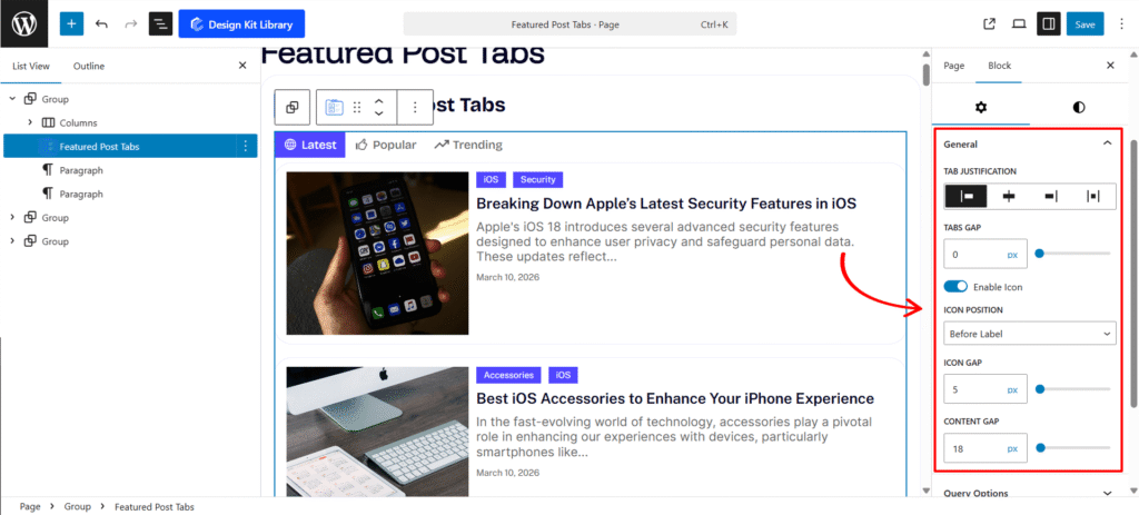
- Tabs Justification: Define the horizontal distribution of your tab navigation. Choose from Left, Center, or Right for standard alignment, or use Space Between to push tabs to the outer edges of the container for a wide, modern look.
- Enable Icon: A simple toggle to show or hide icons within the tab buttons.
- Icon Position: Control the visual flow by placing icons Before Label, After Label, or choosing Icon Only for a minimalist, tooltip-driven interface.
- Icon Gap: Adjust the specific breathing room between the SVG icon and the tab text label.
- Content Gap: A dedicated control to set the vertical distance between the tab navigation header and the active post content area, helping you manage the overall “white space” and visual breathing room of the block.
Query Options
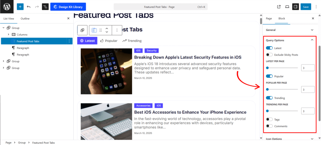
This panel allows you to enable or disable specific data filters (tabs) and configure the unique fetching logic, such as post counts and link behaviors for each.
- Latest (ToggleControl): Enables the “Latest” tab to display your most recently published posts.
- Exclude Sticky Posts: Visible when Latest is active. Prevents posts marked as “Sticky” from appearing at the top, maintaining a strict chronological order.
- Latest per Page (RangeControl): Sets the total number of recent posts to be fetched and displayed (1 to 50).
- Popular (ToggleControl): Enables the “Popular” tab to highlight posts based on high engagement or view counts.
- Popular per Page (RangeControl): Visible when Popular is active. Limits the maximum number of high-traffic posts shown in the list.
- Trending (ToggleControl): Activates the “Trending” tab to showcase posts gaining rapid traction or “hot” status.
- Trending per Page (RangeControl): Visible when Trending is active. Sets the limit for the number of trending articles to display.
- Tags (ToggleControl): Enables a tab specifically for displaying a list of active post tags.
- Open link in new tab: Visible when Tags is active. Forces tag links to open in a separate browser tab when clicked.
- Tags per Page (RangeControl): Controls the maximum number of tags displayed within the panel.
- Comments (ToggleControl): Enables a tab to display the most recent site comments and discussions.
- Open link in new tab: Visible when Comments is active. Configures comment links to open in a new window to keep users on the current page.
- Comments per Page (RangeControl): Limits the number of recent comments shown in the tab’s list.
Icon Options
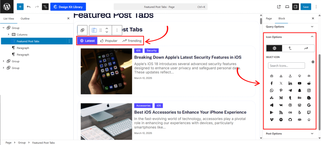
This panel is available when icons are enabled in the General settings. It allows you to assign unique icons to each of your active tabs, providing a distinct visual identity for different content types.
- Icon Selector (ToggleGroupControl): Use the toggle buttons to switch between the configuration settings for each active tab. The available options dynamically update based on which tabs you have enabled in the Query Options.
- Latest: Select and preview the icon for the “Latest” posts tab.
- Popular: Select and preview the icon for the “Popular” posts tab.
- Trending: Select and preview the icon for the “Trending” posts tab.
- Tags: Select and preview the icon for the “Tags” tab.
- Comments: Select and preview the icon for the “Comments” tab.
- CozyIconSelectControl: Visible for the currently selected toggle. A specialized control that allows you to choose from a library of icons or upload a custom SVG for the specific tab type (Latest, Popular, Trending, Tags, or Comments).
Post Options
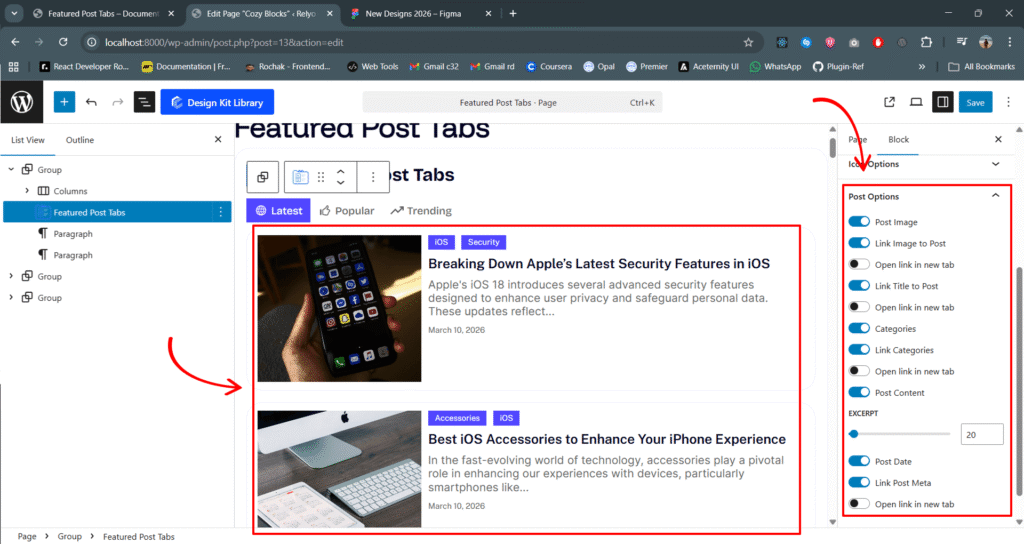
This panel allows you to control which elements of a WordPress post are displayed within your tabs and how they behave when interacted with. It is visible when at least one post-based query (Latest, Popular, or Trending) is active.
- Post Image (ToggleControl): Shows or hides the featured image for each post.
- Link Image to Post: Visible when Post Image is active. Turns the featured image into a clickable link.
- Open link in new tab: Visible when Link Image is active. Configures the image link to open in a separate browser tab.
- Link Title to Post (ToggleControl): When enabled, the post title becomes a clickable link directed to the full article.
- Open link in new tab: Visible when Link Title is active. Forces the title link to open in a new browser tab.
- Categories (ToggleControl): Displays the categories assigned to the post.
- Link Categories: Visible when Categories is active. Makes the category labels clickable, leading to their respective archive pages.
- Open link in new tab: Visible when Link Categories is active. Opens the category archive link in a separate tab.
- Post Content (ToggleControl): Displays a summary or excerpt of the post text.
- Excerpt (RangeControl): Visible when Post Content is active. Adjusts the length of the displayed text, ranging from 5 to 300 words.
- Post Date (ToggleControl): Shows the publication date of the post.
- Link Post Meta: Visible when Post Date is active. Wraps the date metadata in a link (typically leading to the date archive).
- Open link in new tab: Visible when Link Post Meta is active. Configures the metadata link to open in a new browser tab.
Style ◑
Tab Style
The Tab Styles panel provides a comprehensive set of design tools to define the visual structure and personality of your Tab components. From precise spacing to interactive states, this panel ensures your navigation aligns perfectly with your brand identity.
- Top & Bottom Spacing: Use the HeightControl sliders to adjust the outer vertical margins. This allows you to create the necessary “breathing room” between the tab navigation and surrounding content blocks.
- Padding: The integrated BoxControl gives you granular command over internal spacing. Link all sides for a uniform look, or unlink them to create custom, asymmetrical shapes that enhance the clickability of each tab.
- Border Radius: Define the corner curvature of your tabs using the BoxControl. Set a high value for modern, pill-shaped tabs, or keep it at
0for a sharp, professional, and boxy aesthetic. - Typography
- Font Family & Size: Select the typeface and scale that best matches your site’s design system.
- Font Weight: Control the thickness (e.g., Bold for emphasis or Light for a modern look).
- Letter Case: Force the labels to Uppercase, Lowercase, or Capitalize without editing the form code.
- Decoration: Apply styles like Underline or Line-through if needed for specific design cues.
- Line Height & Letter Spacing: Fine-tune the vertical breathing room and horizontal character density.
- Color
- Text/Icon Color: High-contrast color picking for your tab labels and icons. Ensure your active tab is immediately recognizable by choosing a distinct color from your theme palette.
- Background Color: Full support for solid colors and alpha transparency. Create subtle ghost-style tabs for the default state and vibrant, solid backgrounds for the active state to guide user focus.
Tab Separator Style
The Tab Separator Style panel allows you to design the structural divider between your navigation and content area. This panel is essential for creating the popular “Underline” or “Overlapping” tab effect seen in modern web interfaces.
- Padding: Use the BoxControl to define the internal breathing room of the separator container. This is particularly useful for adding vertical distance between the tab labels and the separator line.
- Border: Provides full control over the separator’s line style. Define the thickness, color, and style (solid, dashed, or dotted) to create a clear visual boundary.
- Border Radius: Define the curvature of the corners for each item. Use a value of 0px for sharp, professional corners or a higher value for a softer, more modern rounded look.
- Tab Overlay (Toggle): Enable this feature to create a seamless, integrated look between the active tab and the separator line.
- Color
- Background Color: Set the fill color for the entire separator area. This can be used to create a distinct “track” for your tabs to sit on, or kept transparent to let your site’s main background show through.
Icon Style
The Icon Styles panel provides complete creative control over the icons within your tabs. Whether you need a minimal aesthetic or a bold, background-supported look, these settings allow for precise brand alignment.
- View (Default / Stacked): Choose the structural foundation of your icons.
- Default: Displays the icon as a standalone element, perfect for clean, minimal designs.
- Stacked: Places the icon inside a background container, turning it into a focal point.
- Layout (Fill / Outline): Define the decorative style of the icon’s container.
- Fill: Applies a solid background color to the icon, providing high visibility.
- Outline: Uses a transparent background with a bordered edge for a sophisticated, light-weight look.
- Icon Size: Use the RangeControl to scale your icons. Whether you need tiny utility markers or large, illustrative icons, you can adjust the dimensions to fit your typography perfectly.
- Opacity: Fine-tune the prominence of your icons. Lowering the opacity is an excellent way to create “de-emphasized” icons for inactive states or a more subtle, modern UI feel.
Post Box Style
The Post Box Style panel controls the primary container for your post entries. This section allows you to define the “card” aesthetics, ensuring each post is framed beautifully within your layout.
- Padding: Use the BoxControl to manage the internal breathing room of the post card. Adjusting this ensures that your post titles, excerpts, and meta-data aren’t cramped against the edges of the box.
- Border: Provides full control over the container’s outline. Define the thickness and style (solid, dashed, or dotted) to create a clear visual separation between posts.
- Border Radius: Soften the corners of your post boxes. A subtle radius creates a modern, friendly UI, while a value of
0delivers a sharp, professional grid. - Typography
- Font Family & Size: Select the typeface and scale that best matches your site’s design system.
- Font Weight: Control the thickness (e.g., Bold for emphasis or Light for a modern look).
- Letter Case: Force the labels to Uppercase, Lowercase, or Capitalize without editing the form code.
- Decoration: Apply styles like Underline or Line-through if needed for specific design cues.
- Line Height & Letter Spacing: Fine-tune the vertical breathing room and horizontal character density.
- Box Shadow: When the Box Shadow toggle is enabled, you can add depth and dimension to your container to make it “pop” off the page:
- Position: Choose Outline for a traditional drop shadow or Inset to make the shadow appear inside the container, creating a “pressed” effect.
- Horizontal & Vertical: Shift the shadow’s position along the X and Y axes to simulate a specific light source.
- Blur & Spread: Blur softens the edges of the shadow for a natural look, while Spread expands or contracts the overall surface area of the shadow.
- Shadow Color: Select the color and transparency (opacity) of the shadow effect.
- Color
- Background (Default): Set the base fill color for your post card. Use a solid color or subtle alpha transparency to match your site’s overall theme.
- Background (Hover): Define a secondary background color that activates when a user moves their cursor over the post. This is a powerful way to indicate interactivity and improve click-through rates.
- Border (Hover): Elevate the “active” feel of the card by changing the border color on hover. This adds a layer of sophistication, making the post box feel responsive to the user’s journey.
Post Image Style
The Post Image Style panel gives you full creative control over the featured images in your post grid. From defining precise dimensions and corner rounding to adding interactive hover animations, these settings ensure your visual content is perfectly framed and engaging for your readers.
- Width & Height: Take full command of your image dimensions using the UnitControl. Whether you need a consistent aspect ratio for a clean grid or custom sizing for a unique layout, these settings ensure your featured images fit perfectly within the post box.
- Border Radius: Define the corner curvature of your images. Use a subtle radius for a modern feel or a high value to create rounded, organic shapes that match your brand’s aesthetic.
- Gap: Adjust the spacing between the image and the surrounding post content. This control allows you to create a clear visual hierarchy and prevent the layout from feeling cramped.
- Hover Effect (Zoom In): Add an interactive layer to your post grid. Enabling this effect creates a smooth, magnifying transition when a user hovers over the image, providing immediate visual feedback and encouraging clicks.
Post Category Style
The Post Category Styles panel provides complete control over the taxonomy badges in your post grid. These settings allow you to refine the positioning, shape, and interactive behavior of your categories to create a clear and engaging visual hierarchy.
- Gap: Define the horizontal spacing between multiple category badges. This ensures that your tags remain distinct and readable even when several are displayed together.
- Top & Bottom Spacing: Use the HeightControl to adjust the outer vertical margins. This allows you to perfectly position the category labels relative to the post image or title.
- Enable Hover Effect: Add a sophisticated layer of interactivity. When enabled, category badges will smoothly shift upward on hover, providing immediate visual feedback to the user.
- Padding: Manage the internal breathing room of each category badge using the BoxControl. Adjusting this ensures the text is perfectly centered and the badge feels substantial.
- Border: Full control over the badge’s outline. Define the thickness, style, and color to create a subtle boundary or a bold, high-contrast look.
- Border Radius: Control the corner curvature of your category boxes. Set a high value for modern, pill-shaped badges or a lower value for a professional, rectangular aesthetic.
Post Category Style
The Post Category Styles panel provides complete control over the taxonomy badges in your post grid. These settings allow you to refine the positioning, shape, and interactive behavior of your categories to create a clear and engaging visual hierarchy.
- Top & Bottom Spacing: Use the HeightControl to manage the vertical margins above and below the title. This is key to maintaining a clear visual hierarchy between the post image, category badges, and the post excerpt.
- Top & Bottom Spacing: Use the HeightControl to adjust the outer vertical margins. This allows you to perfectly position the category labels relative to the post image or title.
- Enable Hover Effect: Add a sophisticated layer of interactivity. When enabled, category badges will smoothly shift upward on hover, providing immediate visual feedback to the user.
- Padding: Manage the internal breathing room of each category badge using the BoxControl. Adjusting this ensures the text is perfectly centered and the badge feels substantial.
- Border: Full control over the badge’s outline. Define the thickness, style, and color to create a subtle boundary or a bold, high-contrast look.
- Border Radius: Control the corner curvature of your category boxes. Set a high value for modern, pill-shaped badges or a lower value for a professional, rectangular aesthetic.
Post Title Style
The Post Title Style panel provides the essential tools to define the typography layout and advanced styling for your post headings. These controls ensure your titles are perfectly positioned and allow for deep integration with your active theme.
- Top & Bottom Spacing: Use the HeightControl to manage the vertical margins above and below the title. This is key to maintaining a clear visual hierarchy between the post image, category badges, and the post excerpt.
- Typography
- Font Family & Size: Select the typeface and scale that best matches your site’s design system.
- Font Weight: Control the thickness (e.g., Bold for emphasis or Light for a modern look).
- Letter Case: Force the labels to Uppercase, Lowercase, or Capitalize without editing the form code.
- Decoration: Apply styles like Underline or Line-through if needed for specific design cues.
- Line Height & Letter Spacing: Fine-tune the vertical breathing room and horizontal character density.
- Additional CSS Classes: This field allows for limitless customization by letting you apply custom styles or utility classes directly to the title.
Post Date Style
The Post Date Style panel allows you to refine the presentation of the publication date within your post grid. These settings help you balance the metadata’s prominence while ensuring it complements the overall post card design.
- Top & Bottom Spacing: Use the HeightControl to manage the vertical margins above and below the title. This is key to maintaining a clear visual hierarchy between the post image, category badges, and the post excerpt.
- Padding: Manage the internal breathing room using the BoxControl. This ensures the date text is comfortably framed, especially when using background colors or borders.
- Border: Full control over the container’s outline. Define the thickness and style to create a distinct boundary for the date badge.
- Border Radius: Control the corner curvature. Use a high value for a modern, rounded look or a lower value for a sharp, clean aesthetic.
- Typography
- Font Family & Size: Select the typeface and scale that best matches your site’s design system.
- Font Weight: Control the thickness (e.g., Bold for emphasis or Light for a modern look).
- Letter Case: Force the labels to Uppercase, Lowercase, or Capitalize without editing the form code.
- Decoration: Apply styles like Underline or Line-through if needed for specific design cues.
- Line Height & Letter Spacing: Fine-tune the vertical breathing room and horizontal character density.
- Color
- Link (Default & Hover): Set the base color for the date link and its secondary color when hovered to provide clear visual feedback.
- Background (Default & Hover): Define the fill color for the date container for both static and interactive states.
- Border Hover: Elevate the interactive feel by changing the border color specifically when a user moves their cursor over the date.