

All Product Review
The All Product Review Block is a comprehensive social proof engine designed to aggregate and display customer feedback from across your entire store. By pulling reviews from all products into a single, centralized list, this block helps build immediate trust with new visitors and highlights the overall quality of your brand. It is an essential tool for dedicated “Testimonials” pages or for adding a dynamic “What Customers Are Saying” section to your homepage.
Settings ⚙
General
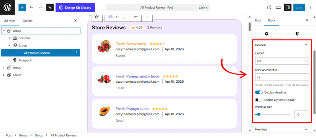
- Layout: Select the primary organizational framework for your products.
- List: A classic vertical stack that works well in sidebars or at the bottom of long-form landing pages.
- Vertical Gap: Control the precise spacing between individual review cards. Increasing the gap creates a more open, modern feel, while a smaller gap allows more content to be visible above the fold.
- Grid: Arranges products in a stable, multi-column format. This is the standard choice for “Shop” pages or detailed product catalogs where structure is key.
- Display Column: Define how many product cards appear side-by-side.
- Column Gap: Control the horizontal gutter between your product columns. Increasing this value creates a more “airy,” high-end boutique feel, while a smaller gap maximizes screen real estate.
- Carousel: Converts the product list into a horizontal, touch-ready slider. This is perfect for homepages where you want to showcase multiple items without taking up excessive vertical space.
- List: A classic vertical stack that works well in sidebars or at the bottom of long-form landing pages.
- Reviews Per Page: Define the maximum number of reviews to load at once. This helps maintain fast page loading times while giving you control over the section’s length.
- Display Heading: Toggle this to show or hide a section title (e.g., “Customer Reviews” or “What People Are Saying”). This helps provide immediate context to the reader.
- Enable Dynamic Loader: When active, this feature allows more reviews to load automatically or via a “Load More” button without refreshing the entire page. It’s an essential tool for stores with a high volume of feedback.
Heading Options
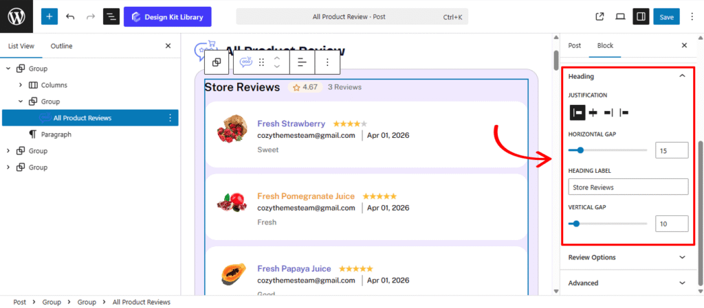
The Heading Panel provides the design controls for the section title of your reviews. This allows you to create a clear visual anchor for the All Product Review Block, ensuring your “Customer Testimonials” or “Recent Reviews” stand out with professional alignment and spacing.
- Heading Label: Enter the custom text you want to display as the title of this section (e.g., “What Our Customers Are Saying” or “Verified Store Reviews”).
- Justification: Define the horizontal alignment of the heading and any associated elements (like “See All” links):
- Left / Center / Right: Aligns the text to your preferred side or the middle of the block.
- Space-Between: Spreads the heading and secondary elements (like navigation arrows) to the far edges of the container, creating a balanced, high-end layout.
- Horizontal Gap: When using the Space-Between or inline elements, this controls the precise gutter between the heading text and any adjacent icons or buttons.
- Vertical Gap: Adjust the spacing between the Heading and the first row of reviews. This ensures the title doesn’t feel “stuck” to the content below, giving the section a clean, breathable appearance.
Review Options
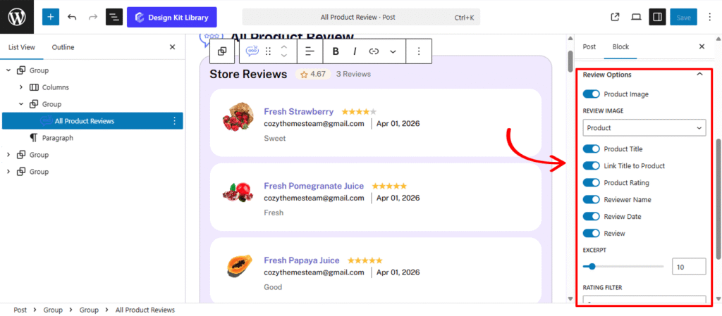
The Review Options Panel is the data-management hub for the All Product Review Block. These settings allow you to curate exactly what information is displayed for each testimonial, ensuring your social proof is both informative and visually integrated with your store’s design.
- Product Image: Toggle this to display the thumbnail of the specific item being reviewed. This provides immediate visual context for the shopper.
- Review Image: When the Product Image is active, you can choose to display the Product Thumbnail or the Reviewer’s Avatar. Displaying the reviewer’s photo often adds a more personal, authentic touch to the feedback.
- Product Title: Enable this to show the name of the item (e.g., “Premium Leather Boots”).
- Link Title to Product: Turn this on to make the product title clickable, allowing users to navigate directly from a glowing review to the product page to make a purchase.
- Product Rating: Displays the star rating (1–5) assigned by the customer.
- Reviewer Name & Date: Show the identity of the customer and the timestamp of their feedback to establish transparency and relevance.
- Rating Filter: A powerful curation tool that allows you to set a minimum threshold (e.g., 4 Stars). The block will then only fetch and display reviews that meet or exceed this value, ensuring your storefront only highlights your best-received products.
Carousel Options
The Carousel Options panel provides the core configuration for your Carousel layout, allowing you to define how your posts move, transition, and respond to user interaction. Because this block nests the WordPress Query Loop and Post Templates, these settings control how those individual post cards are sequenced in the slider.
- Slides Per View: Define how many popular posts are visible at once. You can show a single featured story or a dense row of trending topics.
- Centered Slides: When enabled, the active post will stay perfectly centered in the viewport. This is particularly effective for “Showcase” layouts where you want the primary content to be flanked by partially visible neighboring posts.
- Gap: Adjust the padding between each post card or headline to ensure the layout remains legible and professional.
- Autoplay & Autoplay Delay: Enable Autoplay to let the content move automatically. Use the Delay setting to determine how many seconds each post stays on screen before transitioning.
- Loop: Activate this to create an infinite scroll, ensuring that once the last “most-viewed” post is reached, the animation seamlessly restarts from the top.
- Reverse Direction: Toggle this to change the flow of the animation, moving your posts from left-to-right instead of the standard right-to-left.
- Speed (ms): Fine-tune the duration of the transition animation itself. A higher millisecond value creates a smoother, slower glide between posts.
- Enable Navigation & Pagination: Add manual “Next/Previous” arrows or pagination dots to the Carousel, giving users full control over their browsing.
- Display on Hover: A critical user-experience toggle that pauses the animation whenever a reader mouses over a specific post, allowing them time to read the headline or click the link.
Dynamic Loader
The Dynamic Loader settings panel allows users to load and display additional content by clicking a button. This Panel is only active when the the Dynamic Loader toggle is enabled and for Grid and List layout type.
- Label: Enter the text to be displayed on the loader button, such as “Load More”, “View More”, etc.
- Load More Reviews: Use this slider to set the number of additional reviews to be loaded each time the button is clicked.
Style ◑
Container Styles
The Container Style Panel gives you full architectural control over the individual review “cards” within the All Product Review Block. These settings allow you to define the boundaries, shape, and interactive personality of each testimonial, ensuring they stand out as distinct, professional units of social proof.
- Padding: Adjust the internal breathing room within each review container. Increased padding creates a more “premium” feel, preventing the text and images from touching the edges of the box.
- Border Type: Choose the style of the container’s outline (Solid, Dashed, or Dotted). This is essential for defining the review cards against the page background.
- Border Width & Color: Once a border type is selected, you can specify exactly how thick the stroke should be and choose a color that complements your site’s UI.
- Border Radius: Soften the corners of the review boxes. A higher value creates a friendly, rounded appearance, while a value of 0px maintains a sharp, modern edge.
- Box Shadow: When the Box Shadow toggle is enabled, you can add depth and dimension to your container to make it “pop” off the page:
- Position: Choose Outline for a traditional drop shadow or Inset to make the shadow appear inside the container, creating a “pressed” effect.
- Horizontal & Vertical: Shift the shadow’s position along the X and Y axes to simulate a specific light source.
- Blur & Spread: Blur softens the edges of the shadow for a natural look, while Spread expands or contracts the overall surface area of the shadow.
- Shadow Color: Select the color and transparency (opacity) of the shadow effect.
- Background Color:
- Normal: Set the base Background Color and Text Color for the review card when it is static on the page.
- Hover: Define an interactive state that triggers when a user mouses over the review. Changing the background color or border on hover provides immediate visual feedback, signaling that the review (and the linked product) is interactive.
Typography
The Typography Panel allows you to refine the personality and readability of every text element within the All Product Review Block (excluding the main block heading and product title). These settings ensure that the reviewer’s voice, the date of purchase, and the body of the feedback are presented in a clean, legible format that matches your store’s brand identity.
- Typography
- Font Family & Size: Select the typeface and scale that best matches your site’s design system.
- Font Weight: Control the thickness (e.g., Bold for emphasis or Light for a modern look).
- Letter Case: Force the labels to Uppercase, Lowercase, or Capitalize without editing the form code.
- Decoration: Apply styles like Underline or Line-through if needed for specific design cues.
- Line Height & Letter Spacing: Fine-tune the vertical breathing room and horizontal character density.
Heading Styles
The Typography Panel allows you to refine the personality and readability of every text element within the All Product Review Block (excluding the main block heading and product title). These settings ensure that the reviewer’s voice, the date of purchase, and the body of the feedback are presented in a clean, legible format that matches your store’s brand identity.
- Typography
- Font Family & Size: Select the typeface and scale that best matches your site’s design system.
- Font Weight: Control the thickness (e.g., Bold for emphasis or Light for a modern look).
- Letter Case: Force the labels to Uppercase, Lowercase, or Capitalize without editing the form code.
- Decoration: Apply styles like Underline or Line-through if needed for specific design cues.
- Line Height & Letter Spacing: Fine-tune the vertical breathing room and horizontal character density.
- Color
- Text Color: Define the primary color for your Heading Label. Whether you want a bold, high-contrast black or a subtle brand accent color, this setting ensures the title is legible and aesthetically aligned with your store’s theme.
- Icon Color: If your heading includes a decorative icon (such as a star for reviews or a fire icon for “On Sale” products), use this setting to set its stroke or fill color. Matching this to your Text Color creates a unified look, while a contrasting color can make the icon stand out.
- Icon Background: Apply a solid or transparent color specifically behind the heading icon.
Review Image Styles
The Review Image Styles panel provides the controls for the visual thumbnails within each review card. Whether you are displaying the Product Image to show what was purchased or the Reviewer Avatar to add a human touch, these settings ensure the imagery is consistent and professionally framed.
- Width: Set a specific width for the image. This is especially useful in List layouts to ensure the images don’t overpower the review text.
- Height: Define the image height to maintain a uniform grid. Using equal width and height values is the standard way to prepare images for a perfectly circular crop.
- Border Radius: Soften the corners of the review boxes. A higher value creates a friendly, rounded appearance, while a value of 0px maintains a sharp, modern edge.
- Hover Effect (Toggle): Enable or disable a subtle animation when a user interacts with the review. When toggled On, this typically applies a gentle zoom or a slight lift to the image, providing a responsive “feel” to the block and encouraging the user to engage with the linked product.
Review Content Styles
The Review Content Style panel gives you precise control over the body of the customer’s feedback. This is the heart of the social proof, and these settings allow you to position the text perfectly relative to the reviewer’s name, product title, and star rating to create a clear, readable hierarchy.
- Margin: Define the external spacing around the review text.
- Position: Determine the structural placement of the comment within the review card:
- Top: Places the customer’s written feedback at the very beginning of the card, making the “voice of the customer” the first thing a shopper reads.
- Bottom: Moves the comment below the Product Title, Rating, and Reviewer Name. This is the traditional layout, providing the context of who and what was reviewed before the reader dives into the detailed feedback.Horizontal Gap: Adjust the precise spacing between the Product Title, the Star Rating, and the Date. Increasing this gap prevents the header of the review from looking cluttered.
Pagination Styles
The Pagination Styles settings is active when layout is Carousel and Pagination is enabled, this allow you to refine the appearance and interactive behavior of the navigation indicators (dots or numbers) for your Carousel. These controls ensure the pagination is both functional and visually aligned with your brand’s UI.
- Vertical Positioning: Fine-tune the vertical offset to control how far the pagination sits below the carousel content.
- Gap: Adjust the specific spacing between each individual pagination dot to ensure they are distinct and easy to click.
- Align: Set the horizontal placement of the indicators. Toggle between Left, Center, or Right to balance the layout against your team member cards.
- Default / Active (Toggle)
- Default:
- Width & Height: Define the base size of the inactive indicators.
- Border Radius: Control the shape, from sharp squares to perfect circles.
- Active:
- Width & Height: Increase these values to make the active slide indicator physically larger or longer (e.g., a “pill” shape) for better visibility.
- Border & Border Offset: Add an outline to the active dot and use the offset to create a “halo” effect (spacing between the dot and its border).
- Border Radius: Independently adjust the curvature of the active indicator.
- Default:
- Color:
- Default: The color of inactive indicators.
- Default Hover: The color shift when a user moves their cursor over an inactive dot.
- Active: The primary color for the dot representing the current slide.
- Active Default: The color of the active dot when hovered.
- Active Border: The specific color of the stroke surrounding the active indicator.
Demo
Store Reviews
3 Reviews
 cozythemesteam@gmail.comSweet
 cozythemesteam@gmail.comFresh
 cozythemesteam@gmail.comGood