Brand Showcase
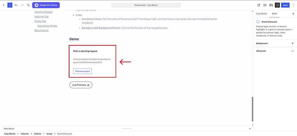
The Brand Showcase block allows you to display the brands, companies, or clients you have worked with in a professional and visually appealing layout. It helps build credibility by showcasing your previous collaborations and the brands associated with your work.
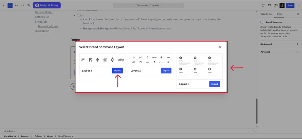
The block includes a collection of pre-built patterns that can be imported and used immediately, making it easy to create a polished brand showcase without designing the layout from scratch.
Settings ⚙
General
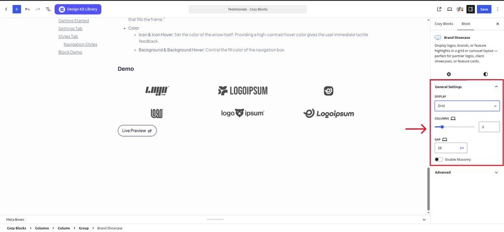
- Layout: Select Grid to display all brand logos simultaneously in a structured format, or Carousel to create an interactive slider that saves screen space.
- Grid: Displays all brand logos simultaneously in rows and columns
- Display Column: Define how many brand logos appear in a single row across different devices.
- Column Gap: Adjust the horizontal spacing between brand logos to create a balanced, airy, or compact aesthetic.
- Enable Masonry: Activating this allows brand logos of different lengths to shift up into empty spaces, creating a modern, staggered layout.
- Carousel: When the Carousel layout is active, this panel provides granular control over the slider’s behavior and interactive elements.
- Slides Per View: Determine how many brand items are visible at once within the carousel. You can define responsive values for different screen sizes.
- Space Between: Set the spacing between each brand item in the carousel. Responsive values can be configured for different screen sizes.
- Center Slides: When enabled, the active brand item is positioned in the center of the carousel viewport.
- Loop : Enable this option to continuously loop through the brand items, allowing the carousel to return to the first item after reaching the last.
- Autoplay: Enable this option to automatically advance the carousel through the brand items.
- Reverse Direction: Change the direction in which the carousel automatically moves when Autoplay is enabled.
- Speed: Control the duration of the carousel transition effect in milliseconds.
- Smooth Transition: Enable this option to apply a smooth transition effect when moving between brand items.
- Fade Effect: Enable this option to display a fade transition when switching between brand items instead of a sliding transition.
- Enable Pagination: Adds dots or numbers at the bottom of the slider to show users their current progress.
- Enable Navigation: Displays “Next” and “Previous” arrows on the sides of the carousel for manual control.
- Show on Hover: When enabled, the carousel’s navigation and pagination controls are displayed when the user hovers over the carousel.
- Grid: Displays all brand logos simultaneously in rows and columns
Style ◑
Styles
This panel provides options to control the spacing and overall positioning of the Brand Showcase block.
- Padding: Set the inner spacing of the Brand Showcase block. Responsive values can be configured for different screen sizes.
- Margin Top: Set the spacing above the Brand Showcase block.
- Margin Bottom: Set the spacing below the Brand Showcase block.
Image Styles
This panel provides options to customize the appearance of brand images in their default and hover states.
- Default/Hover: Choose whether the image styles apply to the default state or when the user hovers over the brand image.
- Enable Filter: Enable this option to apply image filters to the brand images.
- Grayscale: Adjust the grayscale level of the brand images to control how much color is removed.
- Brightness: Adjust the brightness level of the brand images.
Pagination Styles
- Align: Set the horizontal placement of the indicators. Toggle between Left, Center, or Right to balance the layout.
- Vertical Positioning: Fine-tune the vertical offset to control how far the pagination sits below the testimonial content.
- Gap: Adjust the specific spacing between each individual pagination dot.
- Default / Active (Toggle)
- Default:
- Width & Height: Define the base size of the inactive indicators.
- Border Radius: Control the shape, from sharp squares to perfect circles.
- Active:
- Width & Height: Increase these values to make the active slide indicator physically larger or longer (e.g., a “pill” shape) for better visibility.
- Border & Border Offset: Add an outline to the active dot and use the offset to create a “halo” effect (spacing between the dot and its border).
- Border Radius: Independently adjust the curvature of the active indicator.
- Default:
- Color:
- Default: The color of inactive indicators.
- Default Hover: The color shift when a user moves their cursor over an inactive dot.
- Active: The primary color for the dot representing the current slide.
- Active Default: The color of the active dot when hovered.
- Active Border: The specific color of the stroke surrounding the active indicator.
Demo