
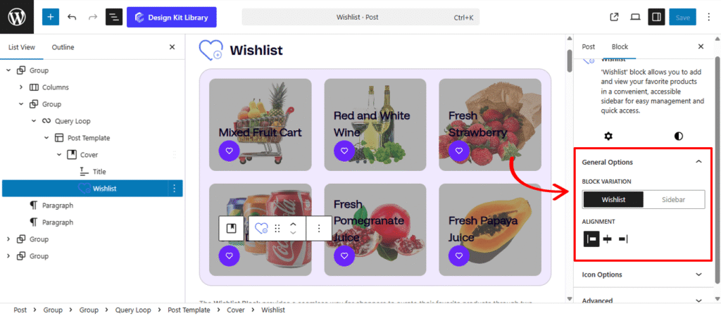
Wishlist
Variation : Wishlist
Variation : Sidebar
The Wishlist Block provides a seamless way for shoppers to curate their favorite products through two specialized variations designed for different parts of the user journey. The Wishlist Variation is built for use within a query loop or product template, functioning as an immediate interaction point much like an “Add to Cart” button. This allows customers to save items to their personal collection with a single click while browsing your catalog, ensuring they can easily keep track of products that catch their eye without leaving the current page.
For managing those saved items, the Sidebar Variation acts as a centralized hub, similar to a mini-cart or sliding side panel. Usually integrated into the site header or a persistent menu, this variation provides a global view of all curated products, allowing shoppers to review their selections, remove items, or move them into the checkout flow from anywhere on the site. Together, these variations create a comprehensive ecosystem that encourages customer engagement and simplifies the path from initial interest to final purchase.
Settings ⚙
General
- Variation Toggle (Wishlist vs. Sidebar): Use this to choose the block’s behavior.
- Wishlist: Select Wishlist for the individual product “add” button used within grids, or Sidebar to enable the comprehensive management panel that displays all saved items.
- Alignment: Specifically for the Wishlist button variation, this setting controls the horizontal placement (Left, Center, or Right) within your product card to ensure it aligns perfectly with your other action icons.
- Sidebar Controls: When the Sidebar variation is active, you can fine-tune its physical presence on the page:
- Sidebar Width: Adjust the horizontal span of the drawer to ensure your saved products are displayed clearly without overwhelming the screen.
- Sidebar Position: Choose whether the wishlist panel slides out from the Left or Right side of the browser, allowing you to match the behavior of your store’s existing navigation or cart drawers.
- Show Count: Toggle this feature to display a numerical badge on the wishlist icon. This provides users with instant visual confirmation of how many items they have saved, encouraging them to revisit and finalize their selections.
- Wishlist: Select Wishlist for the individual product “add” button used within grids, or Sidebar to enable the comprehensive management panel that displays all saved items.
Icon Option
The Icon Option panel allows you to select the visual identifier for the wishlist trigger, ensuring the action is easily recognizable to your shoppers.
- Select Icon: Choose a specific symbol from the integrated library to represent the wishlist action. Whether you prefer a classic heart, a star, or a bookmark, selecting an intuitive icon helps users immediately understand that they can save the product for later review.
Style ◑
Icon Styles
The Icon Style panel gives you full creative control over the appearance and interactive behavior of the Quick View trigger. These settings allow you to transform the icon into a polished button that reacts to user engagement.
- Size: This control specifically scales the icon graphic (the “glyph”) itself within the container. You can use this to ensure the icon remains legible and balanced regardless of the container’s overall width and height.
- Width: Choose between a fixed width or a Full Width layout. A full-width button is highly effective in mobile grids as it provides a larger “tap target” for shoppers.
- Height: Control the vertical scale of the button. Taller buttons often feel more “premium” and are easier to interact with on touchscreens.
- Default / Active State
- Border: Define the stroke style, width, and color. A thin, subtle border can help a white button stand out on a light background.
- Border Radius: Soften the corners of the review boxes. A higher value creates a friendly, rounded appearance, while a value of 0px maintains a sharp, modern edge.
- Color:
- Default Icon & Hover: Choose the color of the icon graphic when the item is not in the wishlist. The hover setting provides a subtle shift as the user mouses over the button.
- Default Background & Hover: Customize the fill color of the icon’s container. Using a hover color here creates a responsive feel, signaling that the button is interactive.
- Default Border (Hover): Apply a specific color to the container’s outline during a hover event to add extra visual emphasis before the user clicks.
- Active Icon & Hover: Set the color for the icon once the product has been added to the wishlist (e.g., a filled-in heart). The hover state allows for further refinement if the user interacts with an already saved item.
- Active Background & Hover: Define the container’s fill color for saved items. Many designs use a brand-specific accent color here to make the active status immediately obvious.
- Active Border (Hover): Control the border color of the active button during a hover, ensuring the “remove from wishlist” or “view wishlist” intent is visually clear.
Notification Style
The Notification panel allows you to customize the small alert or “toast” message that appears when a user successfully adds or removes an item from their wishlist. These settings ensure the feedback is legible and matches your site’s branding.
- Font Size: Adjust the scale of the notification text to ensure it is easily readable without being intrusive.
- Font Family: Select the typeface that aligns with your store’s brand identity.
- Font Weight: Control the boldness of the text, allowing you to make the confirmation message feel light and subtle or heavy and authoritative.
- Color
- Text Color: Choose a color for the message itself that ensures high contrast against its background.
- Background Color: Set the fill color for the notification bubble. Using a distinct color here—like a brand primary color or a soft success green—helps the alert stand out to the user as they browse.
Sidebar Styles
The Sidebar Styles panel is exclusive to the Sidebar variation of the block. It provides the design tools necessary to style the slide-out drawer where users manage their curated list, ensuring the interface matches your store’s aesthetics.
- Padding: Adjust the internal space of the button to control its size and clickability. Larger padding creates a more prominent, “tappable” button for mobile users.
- Content Gap: Control the vertical spacing between individual items within the wishlist. Increasing this gap improves scannability, making it easier for shoppers to distinguish between different saved products.
- Color:
- Cart Button Text: Define the color of the text within the “Add to Cart” or action buttons located inside the sidebar. Choosing a high-contrast color ensures the call-to-action is immediately readable.
- Cart Button Text (Hover): This sets the text color for the button during a hover event. A subtle change here confirms to the user that the button is active and ready to be clicked.
- Cart Button Background: Select the primary fill color for the buttons within the sidebar. This is typically used to draw attention to the next step in the customer’s journey, such as moving an item to the cart.
- Cart Button Background (Hover): This controls the button’s fill color when a user mouses over it. Providing a distinct hover state makes the interface feel more responsive and modern.
- Background: Customize the color of the sidebar panel itself. You can choose a color that matches your site’s navigation menus or one that provides a clean, neutral backdrop for your product imagery.
- Overlay: This allows you to style the backdrop that covers the rest of the website when the wishlist sidebar is open. By adjusting the color and opacity, you can effectively dim the background content to keep the user focused on their saved items.
Count Styles
The Count Styles panel allows you to customize the appearance of the numerical badge that indicates how many items are currently in the wishlist. These settings ensure the badge is visible, well-positioned, and consistent with your site’s design.
- Vertical Positioning: Use this control to shift the count badge up or down relative to the wishlist icon. This allows you to tuck the number into a corner or center it precisely where it fits best.
- Horizontal Positioning: This setting moves the badge left or right. It is essential for ensuring the count doesn’t overlap with other UI elements or the icon graphic itself.
- Padding: Adjust the internal space within the badge. Increasing padding gives the number more room, which is especially helpful for keeping the badge legible when the count reaches double or triple digits.
- Border: Apply a stroke around the badge to help it pop against the icon or the background. This is a great way to add a “ring” effect that makes the number stand out.
- Radius: This determines the shape of the count badge. A low value creates a square badge, while a high value transforms it into a perfect circle or a rounded pill shape.
- Radius: This determines the shape of the count badge. A low value creates a square badge, while a high value transforms it into a perfect circle or a rounded pill shape.
- Typography
- Font Family & Size: Select the typeface and scale that best matches your site’s design system.
- Font Weight: Control the thickness (e.g., Bold for emphasis or Light for a modern look).
- Color:
- Text Color: Set the color of the numerical digit. Choosing a high-contrast color against the badge background ensures the count is always easy to see.
- Background Color: Select the fill color for the badge container. Often, a vibrant “notification” color or a brand primary color is used here to draw the user’s eye to their saved items.
Wishlist Style
The Wishlist Item panel allows you to style the individual product rows or cards as they appear within the wishlist sidebar. These controls help you define the container for each saved item, ensuring a clear and organized list.
- Padding: Adjust the internal spacing for each review entry. This creates a comfortable visual buffer between the text and the edges of the review section, preventing the content from feeling crowded.
- Navigation: Toggle the display of “Previous” and “Next” controls. This is ideal for allowing users to flip through reviews one by one.
- Box Shadow: When the Box Shadow toggle is enabled, you can add depth and dimension to your container to make it “pop” off the page:
- Color:
- Author: Set a specific color for the reviewer’s name. Giving the author a distinct tone helps separate the reviewer’s identity from the feedback itself.
- Date: Choose a color for the timestamp. Usually, a softer or more neutral shade is used here to provide context without distracting from the main review.
- Content: Customize the color of the actual review text. Ensuring this has high contrast against the modal background is key to maintaining legibility.
Product Image
The Product Image panel provides specific controls to define how item thumbnails are displayed within the wishlist. These settings ensure that product photography is presented consistently, regardless of the original image dimensions.
- Width: This setting sets the specific horizontal size of the product image. Adjusting the width allows you to control how much space the thumbnail occupies relative to the product title and details.
- Height: This control determines the vertical dimension of the image. By setting a fixed height, you can ensure that all items in the wishlist list maintain a uniform alignment, creating a clean and professional grid or list view.
- Border Radius: This allows you to modify the corners of the product image. You can keep them at 0px for sharp, square edges, or increase the value to create rounded corners that match the overall design language of your store.
Sidebar Typography
The Sidebar Typography panel provides dedicated styling for the essential text elements of each product—Title, Summary, and Price—within the wishlist drawer. To maintain a clean and organized layout, you can individually toggle each of these elements on or off. When enabled, each toggle provides a suite of customization options to ensure your product details are perfectly legible and brand-consistent.
- Font Size: This allows you to control the scale of each text element independently. You can use a larger size for titles to grab attention while keeping the summary and price more compact to ensure the sidebar remains streamlined.
- Font Family: Select the specific typeface for each element. This ensures that your product information matches your brand’s voice, whether you use a clean sans-serif for modern clarity or a classic serif for a more traditional feel.
- Font Weight: This setting controls the thickness of the characters. You can choose from a range of weights—from light to extra bold—to create a clear visual hierarchy, such as making the price appear heavier than the product summary.
- Color
- Text Color: Choose the primary color for each text element to ensure maximum readability against the sidebar background. Using distinct colors can help visually separate the product name from the price or description.
- Text Hover Color: Define how the text transforms when a user mouses over it. This provides a subtle interactive cue, signaling that the element is active and enhancing the overall responsiveness of the wishlist interface.
Sidebar Button Styles
The Sidebar Button Styles panel gives you full control over the appearance of the action buttons located within the wishlist drawer. Through individual toggles for the Cart Button and Remove Button, you can customize each one to ensure your “purchase” and “clear” actions are distinct and on-brand.
- Padding: Adjust the internal spacing of the buttons to define their overall size. This helps you create large, easy-to-click buttons for mobile users or sleek, compact buttons for a minimalist design.
- Font Size: This allows you to control the scale of each text element independently. You can use a larger size for titles to grab attention while keeping the summary and price more compact to ensure the sidebar remains streamlined.
- Font Family: Select the specific typeface for each element. This ensures that your product information matches your brand’s voice, whether you use a clean sans-serif for modern clarity or a classic serif for a more traditional feel.
- Font Weight: This setting controls the thickness of the characters. You can choose from a range of weights—from light to extra bold—to create a clear visual hierarchy, such as making the price appear heavier than the product summary.
- Letter Case: Transform the button text to uppercase, lowercase, or capitalize the first letter. Uppercase text is often used to give buttons a clean, modern, and authoritative appearance.
- Cart Button / Remove Button Toggles: These switches allow you to enable or disable specific actions. When active, they grant you access to the following specialized styling options for each button type:
- Border: Apply a stroke around the button to define its boundaries. This is ideal for creating “ghost” style buttons or adding extra definition against the sidebar background.
- Border Radius: Control the curvature of the button corners. You can create sharp, modern square buttons or fully rounded pill-shaped buttons to match your brand’s aesthetic.
- Color
- Text & Text Hover Color: Select the primary color for the button labels. The hover setting allows you to define a secondary color that triggers when a user mouses over the button, providing essential interactive feedback.
- Background & Background Hover Color: Customize the fill color of the buttons. Using a vibrant color for the cart button and a neutral shade for the remove button helps visually guide the user’s decision-making process.
- Border Hover: Set a specific color for the button’s outline during a hover event. This adds a refined layer of visual response, making the interface feel more tactile and responsive.