

Scroll Animation
The Scroll Animation Block is an interactive motion-design container that synchronizes element movement directly with the visitor’s scroll progress. By converting passive scrolling into active visual triggers, it allows you to create sticky stacking sections, horizontal reveals, and scroll-driven entrance animations (fade, slide, scale) without writing complex CSS or JavaScript. It transforms standard linear pages into dynamic, narrative-driven experiences that keep users engaged.
The Tab Item block serves as an individual container within the Scroll Animation parent block. It acts as a canvas for the specific content—text, images, media, or other Gutenberg blocks—that you want to animate or trigger during a specific phase of the scroll sequence.
Settings ⚙
General
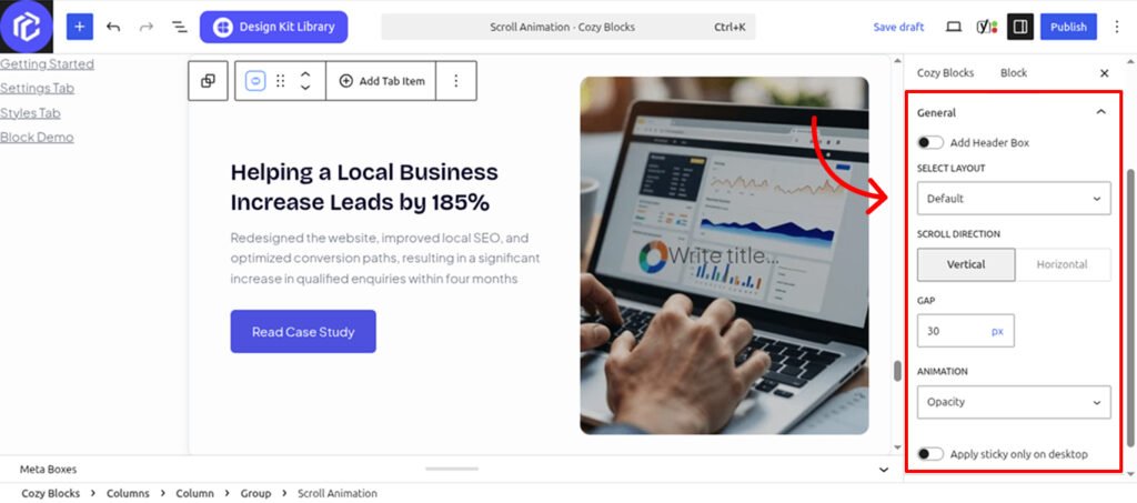
- Add Header Box : Displays a customizable header section at the top of the Scroll Animation block.
- Layout: Controls the structural display and interaction model of the container:
- Default: Operates purely on scroll movement. Each inner Tab Item takes full-width within the container as the user navigates through the sequence.
- Vertical : Animates content top-to-bottom as the user scrolls down the page.
- Gap : Defines the vertical spacing between individual animated items.
- Animation : Controls the visual transition style as elements enter the viewport.
- None : Displays items statically during scroll without transition effects.
- Fade Left : Elements slide in from the right toward the left while fading into view.
- Fade Up : Elements slide upward from the bottom while fading into view.
- Fade Right : Elements slide in from the left toward the right while fading into view.
- Card Stack : Items pin in place and stack directly over one another like playing cards as the user continues scrolling.
- Apply Sticky Only on Desktop : Restricts sticky positioning behavior to desktop viewports, disabling sticky effects on mobile devices for smoother scrolling.
- Horizontal : Animates content left-to-right as the user scrolls down the page.
- Slides Per View : Controls how many Tab Items are simultaneously visible within the horizontal viewport.
- Gap : Defines the horizontal spacing between side-scrolling items.
- Vertical : Animates content top-to-bottom as the user scrolls down the page.
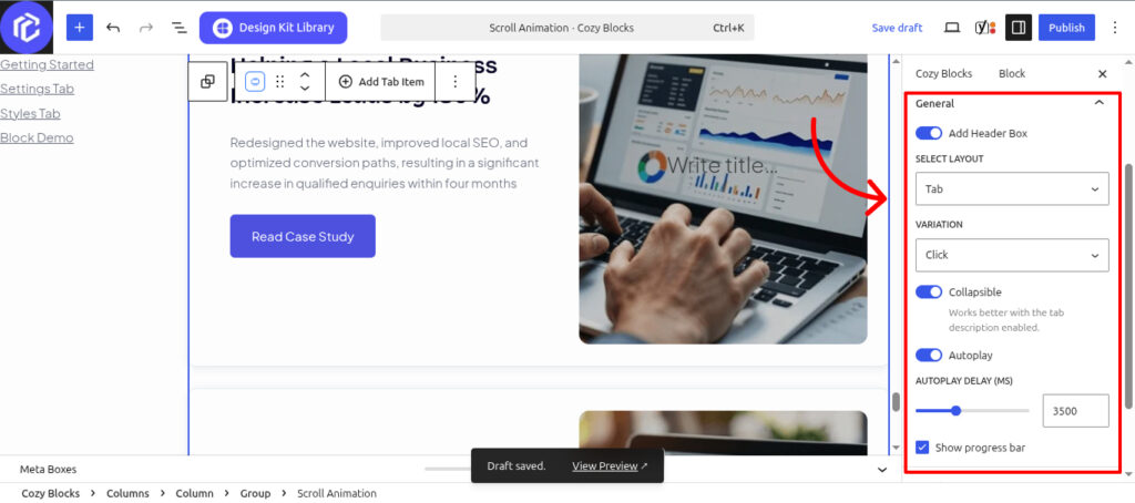
- Tab : Changes the design layout by introducing a navigation tab bar, allowing visitors to navigate through content either by clicking tabs or scrolling.
- Variation : Determines how visitors interact with and navigate through the tab panels.
- Click : Requires the visitor to manually click on individual tabs to view content.
- Autoplay : Automatically cycles through each tab panel sequentially without requiring manual clicks.
- Autoplay Delay : Sets the duration in milliseconds before automatically advancing to the next tab.
- Scroll : Triggers tab switches automatically based on the user’s scroll progress down the page.
- Content Spacing : Defines the spacing and scroll distance required to trigger a transition between active tab panels.
- Click : Requires the visitor to manually click on individual tabs to view content.
- Collapsible : Converts the tab interface into an accordion layout on smaller screens to improve mobile readability.
- Show Progress Bar : Displays a visual progress bar indicating the active scroll progress or autoplay duration across the tabs.
- Variation : Determines how visitors interact with and navigate through the tab panels.
- Default: Operates purely on scroll movement. Each inner Tab Item takes full-width within the container as the user navigates through the sequence.
Header Box Options
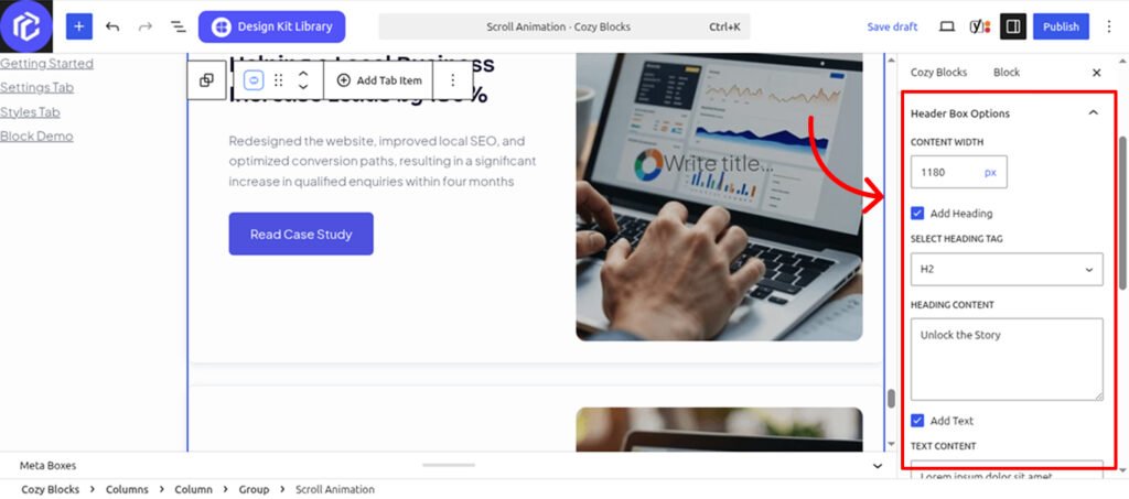
The Header Box Options panel provides custom content and layout controls for framing your animation section, available only when the Add Header Box toggle is enabled.
- Content Width : Defines the overall layout width of the header section.
- Add Heading : Shows or hides the primary heading element inside the header box.
- Select Heading Tag : Chooses the HTML heading hierarchy tag from H1 through H6 or Paragraph.
- Heading Content : Sets the custom text to display as the main heading.
- Add Text : Shows or hides a secondary body text paragraph below the heading.
- Text Content : Sets the custom text to display in the body section.
- Tab Item Gap : Sets the pixel spacing between individual tab navigation items.
- Add Button : Shows or hides a call-to-action button inside the header box.
- Button Label : Specifies the text displayed on the action button.
- Button Link : Sets the URL destination where the button directs visitors.
- Open Link in New Tab : Forces the button URL to open in a new browser tab when clicked.
- Mark Link as No Follow : Adds a rel=”nofollow” attribute to the button link for search engine optimization.
- Vertical Alignment : Sets the vertical positioning of the header content with options for Top, Center, or Bottom.
Tab Columns Options
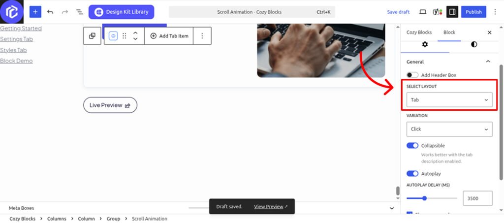
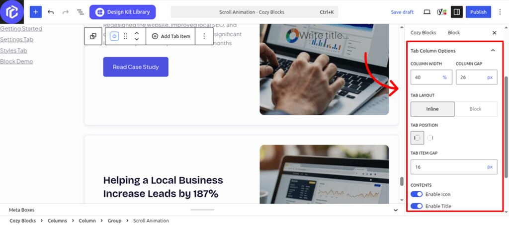
The Tab Column Options panel provides structural and visual controls for customizing the layout, sizing, and content elements of the tab navigation area when Tab Layout is active.
- Column Width : Sets the percentage width occupied by the tab navigation column relative to the main content area.
- Column Gap : Defines the pixel distance between the tab navigation column and the main content section.
- Tab Layout : Controls the display direction of individual tabs within the navigation area.
- Inline : Arranges navigation tabs horizontally in a side-by-side row.
- Tab Position : Determines the placement and alignment (left or right) of the tab navigation bar relative to the content area.
- Block : Stacks navigation tabs vertically on top of one another.
- Tab Position : Determines the placement and alignment (top or bottom) of the tab navigation bar relative to the content area.
- Inline : Arranges navigation tabs horizontally in a side-by-side row.
- Tab Item Gap : Sets the pixel spacing between individual tab navigation items.
- Contents : Controls which elements are displayed inside each navigation tab.
- Enable Icon : Displays an icon inside the navigation tab button.
- Enable Title : Displays the text title inside the navigation tab button.
- Title Tag : Sets the HTML structure tag for the tab title using H1 through H6 or Paragraph.
- Enable Description : Displays a secondary description label inside the navigation tab button.
Style ◑
Header Box Style
The Header Box Style panel provides complete visual and spacing controls to customize the appearance of the header section.
- Padding: Adjust the internal space between the countdown elements and the boundary of the block wrapper. Increasing this value creates a “buffer” that prevents the timer from feeling cramped.
- Margin-Top: Define the external space above the block to separate it from preceding elements like headers or text blocks.
- Margin-Bottom: Define the external space below the block to create a clear division between the timer and the content that follows.
- Border: Customize the stroke thickness, style (solid, dashed, etc.), and color to create a clear boundary for the timer.
- Radius: Adjust the curvature of the corners. A higher value creates a rounded, modern look, while a value of 0 results in sharp, professional corners.
- Typography
- Font Family & Size: Select the typeface and scale that best matches your site’s design system.
- Font Weight: Control the thickness (e.g., Bold for emphasis or Light for a modern look).
- Letter Case: Force the labels to Uppercase, Lowercase, or Capitalize without editing the form code.
- Decoration: Apply styles like Underline or Line-through if needed for specific design cues.
- Line Height & Letter Spacing: Fine-tune the vertical breathing room and horizontal character density.
- Color : Controls the color scheme for individual text, background, and interactive button elements.
- Heading : Sets the text color for the primary heading.
- Text : Sets the text color for the secondary body paragraph.
- Background : Sets the background color for the overall header box area.
- Button : Sets the default text color of the header button.
- Button Background : Sets the default background color of the header button.
- Button Hover : Sets the text color of the header button when hovered over.
- Button Background Hover : Sets the background color of the header button when hovered over.
- Button Border Hover : Sets the border color of the header button when hovered over.
Heading Style
The Heading Style panel provides visual customization options specifically for the block’s main heading element.
- Margin-Top: Define the external space above the block to separate it from preceding elements like headers or text blocks.
- Margin-Bottom: Define the external space below the block to create a clear division between the timer and the content that follows.
- Typography
- Font Family & Size: Select the typeface and scale that best matches your site’s design system.
- Font Weight: Control the thickness (e.g., Bold for emphasis or Light for a modern look).
- Letter Case: Force the labels to Uppercase, Lowercase, or Capitalize without editing the form code.
- Decoration: Apply styles like Underline or Line-through if needed for specific design cues.
- Line Height & Letter Spacing: Fine-tune the vertical breathing room and horizontal character density.
- Color : Sets the text color of the heading.
Tab Style
The Tab Style panel provides comprehensive layout, border, and color customization options for the tab navigation interface.
- Container Padding : Adjusts the inner spacing around the entire tab navigation container area.
- Padding : Adjusts the inner spacing within individual navigation tab buttons.
- Border: Customize the stroke thickness, style (solid, dashed, etc.), and color to create a clear boundary for the timer.
- Radius: Adjust the curvature of the corners. A higher value creates a rounded, modern look, while a value of 0 results in sharp, professional corners.
- Typography
- Font Family & Size: Select the typeface and scale that best matches your site’s design system.
- Font Weight: Control the thickness (e.g., Bold for emphasis or Light for a modern look).
- Letter Case: Force the labels to Uppercase, Lowercase, or Capitalize without editing the form code.
- Decoration: Apply styles like Underline or Line-through if needed for specific design cues.
- Line Height & Letter Spacing: Fine-tune the vertical breathing room and horizontal character density.
- Color : Sets the color scheme for various static, active, and progress indicator elements within the tab bar.
- Title : Sets the text color for inactive tab titles.
- Icon : Sets the color for inactive tab icons.
- Icon Background : Sets the background color behind icons within inactive tabs.
- Tab Background : Sets the default background color for inactive tab buttons.
- Active Tab Icon/Title : Sets the combined icon and title color for the currently active tab.
- Active Tab Text : Sets the text color for description content within the currently active tab.
- Active Tab Background : Sets the background color for the currently active tab button.
- Active Tab Border : Sets the border color for the currently active tab button.
- Progress Bar Primary : Sets the color for the filled, active portion of the tab progress indicator.
- Progress Bar Secondary : Sets the background or unfilled portion color of the tab progress indicator.
Tab Icon
The Tab Icon Styles panel provides sizing, alignment, and border controls to fine-tune the appearance of icons inside navigation tabs.
- Margin Top : Defines the outer spacing above the icon within the tab button.
- Margin Bottom : Defines the outer spacing below the icon within the tab button.
- Box Width : Sets the horizontal width of the icon bounding box container.
- Box Height : Sets the vertical height of the icon bounding box container.
- Border : Customizes the border style, width, and color around the icon container.
- Border Radius : Defines the corner roundness of the icon bounding box.
- Size : Adjusts the actual display scale of the icon symbol.
- Color : Sets the color scheme for the icon and its background container.
- Icon : Sets the fill or stroke color of the icon symbol.
- Icon Background : Sets the background color of the icon container box.
Tab Title Style
The Title panel provides visual customization options specifically for the Tab’s heading element.
- Margin-Top: Define the external space above the block to separate it from preceding elements like headers or text blocks.
- Margin-Bottom: Define the external space below the block to create a clear division between the timer and the content that follows.
- Typography
- Font Family & Size: Select the typeface and scale that best matches your site’s design system.
- Font Weight: Control the thickness (e.g., Bold for emphasis or Light for a modern look).
- Letter Case: Force the labels to Uppercase, Lowercase, or Capitalize without editing the form code.
- Decoration: Apply styles like Underline or Line-through if needed for specific design cues.
- Line Height & Letter Spacing: Fine-tune the vertical breathing room and horizontal character density.
- Color : Sets the text color of the heading.
Tab Description Style
The Tab Description Style panel provides controls for adjusting the spacing and layout of secondary description text within navigation tabs.
- Padding : Adjusts the inner spacing around the tab description text.
Progress Bar
The Progress Bar Style panel provides controls to customize the dimensions, spacing, and color scheme of the tab progress indicator.
- Margin Top : Defines the outer spacing above the progress bar.
- Margin Bottom : Defines the outer spacing below the progress bar.
- Height : Sets the vertical thickness of the progress bar track.
- Color : Sets the color scheme for the active and background states of the progress bar.
- Progress Bar Primary : Sets the color for the active, filled portion of the progress bar.
- Progress Bar Secondary : Sets the background track color of the progress bar.
Demo
Helping a Local Business Increase Leads by 187%
Redesigned the website, improved local SEO, and optimized conversion paths, resulting in a significant increase in qualified enquiries within four months

Helping a Local Business Increase Leads by 187%
Redesigned the website, improved local SEO, and optimized conversion paths, resulting in a significant increase in qualified enquiries within four months
Helping a Local Business Increase Leads by 187%
Redesigned the website, improved local SEO, and optimized conversion paths, resulting in a significant increase in qualified enquiries within four months