
Responsive Visibility

Desktop
Tablet
Mobile
The Responsive Visibility utility gives you precise control over which blocks appear on different devices. This is essential for optimizing the user experience across desktops, tablets, and mobile phones, allowing you to hide complex layouts on smaller screens or show mobile-specific content.
Enabling the Utility
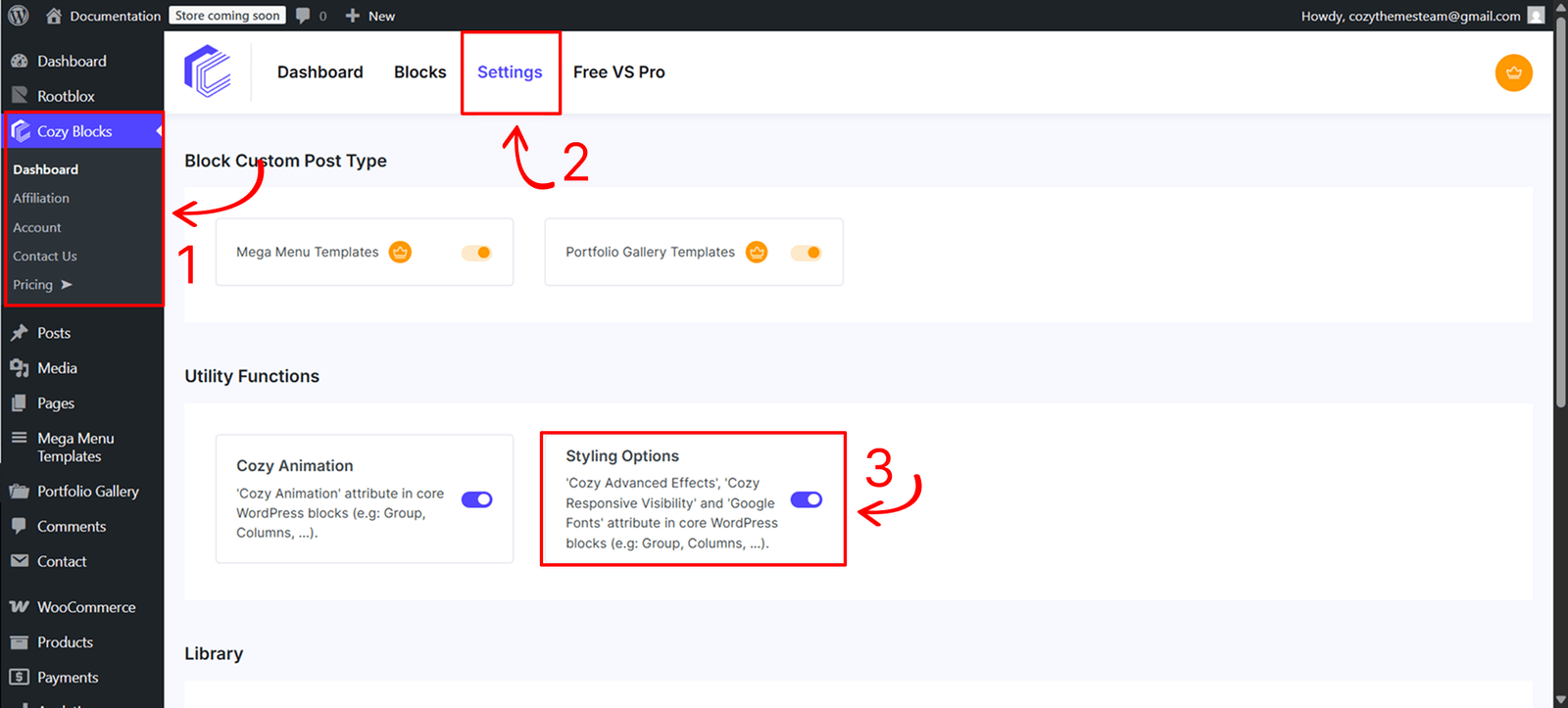
Before using this feature, you must activate the styling engine from your site’s administration area:
- Navigate to Dashboard > CozyBlocks.
- Click on the Settings tab.
- Locate the Utility Function section and toggle on Styling Options.
- Supported Blocks:This utility is available for a specific selection of high-impact blocks:
- Core Blocks: Buttons, Button, Cover, Group, Heading, Post Title, Site Title, Columns, Column, Image, and Paragraph.
- Cozy Blocks: Slider, Post Slider, Product Slider, Mega Menu, and Grid.
Control
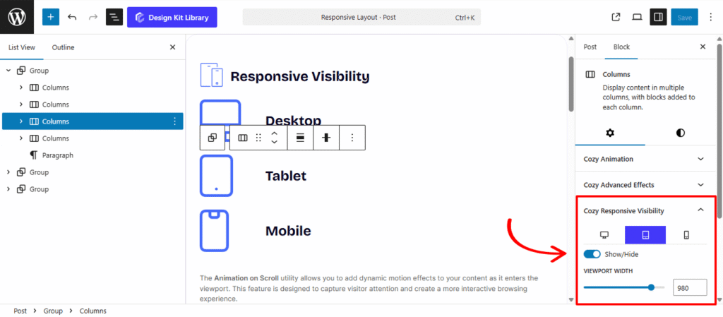
The responsive settings are organized into three dedicated toggle panels: Desktop, Tablet, and Mobile.
- Show/Hide Toggle: Each device panel features a primary toggle. If enabled, the block will be visible on that specific device type; if disabled, the block is hidden from that view.
- Custom Viewport Width Sliders: For the Tablet and Mobile panels, you can use the viewport width sliders to define the exact breakpoint (in pixels) at which the visibility rules should trigger. This allows you to fine-tune the transition between different screen sizes beyond standard defaults.