
Quick View
The Quick View Block is a high-utility interactive element placed within the product template that empowers shoppers to explore deeper details instantly via a sleek modal popup. By allowing users to view the Product Name, detailed Description, and Product Reviews—including paginated feedback—without navigating away from the current page, this block significantly reduces friction in the buyer’s journey. It further streamlines the conversion process by incorporating direct commerce tools like the Add to Cart button and Quantity Selector within the modal, enabling customers to evaluate, select, and purchase items seamlessly before continuing their browse.
Settings ⚙
General
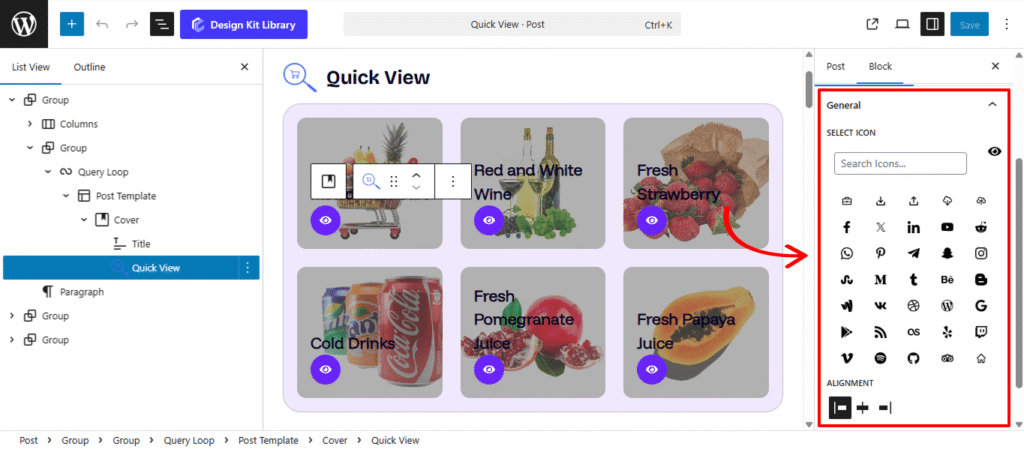
- Select Icon: Choose a specific icon from the library to represent the Quick View action. Selecting a recognizable symbol, such as an eye or a magnifying glass, ensures that shoppers intuitively understand they can preview product details with a single click.
- Alignment: Control the horizontal placement of the icon within the product card. You can align it to the Left, Center, or Right to ensure it complements your overall design and fits perfectly alongside other interactive elements like the Wishlist or Add to Cart icons.
Style ◑
Icon Styles
The Icon Style panel gives you full creative control over the appearance and interactive behavior of the Quick View trigger. These settings allow you to transform the icon into a polished button that reacts to user engagement.
- Width: Choose between a fixed width or a Full Width layout. A full-width button is highly effective in mobile grids as it provides a larger “tap target” for shoppers.
- Height: Control the vertical scale of the button. Taller buttons often feel more “premium” and are easier to interact with on touchscreens.
- Border: Define the stroke style, width, and color. A thin, subtle border can help a white button stand out on a light background.
- Border Radius: Soften the corners of the review boxes. A higher value creates a friendly, rounded appearance, while a value of 0px maintains a sharp, modern edge.
- Size: This control specifically scales the icon graphic (the “glyph”) itself within the container. You can use this to ensure the icon remains legible and balanced regardless of the container’s overall width and height.
- Color:
- Text Default: Set the primary color for your button label and icon.
- Text Hover: Change the color of the text when a user mouses over the button.
- Background Color: Define the base fill for the button.
- Background Hover: Select a slightly darker or lighter shade for the hover state.
Lightbox Style
The Lightbox Style panel allows you to customize the aesthetic of the Quick View modal window and the surrounding overlay. These settings ensure that the popup feels like a cohesive part of your store’s interface while maintaining high usability.
- Padding: Adjust the internal spacing within the modal window. This controls the “breathing room” between the product details (like the description and reviews) and the edges of the box, ensuring the content is easy to read and professionally framed.
- Color
- Close Icon & Background Color:
- Default: Set the colors for the “X” close icon and its background. Choosing high-contrast colors ensures users can easily find the exit point to return to their shopping.
- Hover: Define a specific color shift for when a user mouses over the close button. This subtle interactive feedback confirms the button is active.
- Background: Customize the color of the modal window itself. Most designs utilize a clean white or a soft neutral tone to keep the focus entirely on the product photography and information.
- Overlay: Control the color and transparency of the backdrop that covers the rest of the page when the Lightbox is active. A darkened or blurred overlay helps dim the background noise, drawing the shopper’s full attention to the product details inside the modal.
- Close Icon & Background Color:
Cart Button Style
The Cart Button Style panel gives you full control over the primary “call to action” within the Quick View modal. These settings allow you to design a button that not only matches your brand but also guides the user through the purchasing process with clear visual cues.
- Padding: Adjust the internal space of the button to control its size and clickability. Larger padding creates a more prominent, “tappable” button for mobile users.
- Margin Top & Bottom: Fine-tune the vertical positioning of the button within the modal layout, ensuring it is perfectly spaced away from the product description or price.
- Add to Cart / View Cart Toggle:This toggle allows you to customize the button’s appearance for two different stages: when the item is first seen and after it has been added to the basket.
- Button Label: Customize the text for each state (e.g., “Add to Bag” for the initial state and “Checkout Now” for the View Cart state).
- Border & Border Radius: Apply a stroke to the button and define its corner shape. You can choose sharp, professional edges or rounded, modern corners to match your site’s aesthetic.
- Typography
- Font Family & Size: Select the typeface and scale that best matches your site’s design system.
- Font Weight: Control the thickness (e.g., Bold for emphasis or Light for a modern look).
- Letter Case: Force the labels to Uppercase, Lowercase, or Capitalize without editing the form code.
- Decoration: Apply styles like Underline or Line-through if needed for specific design cues.
- Line Height & Letter Spacing: Fine-tune the vertical breathing room and horizontal character density.
- Color:
- Text & Background: Select the primary colors for the button in its normal state.
- Hover Colors (Text, Background, & Border): Define how the button transforms when a user mouses over it. Providing a distinct Border Hover or Background Hover color is essential for signaling that the button is ready to be clicked, creating a more responsive and satisfying shopping experience.
Typography
The Typography panel allows you to refine the text styles for the essential product details within the Quick View modal. These settings ensure that your product information is not only legible but also visually categorized to help shoppers scan for the most important data quickly.
- Content Toggles: You can individually enable or disable typography settings for the Product Name, Summary, and Price. This allows you to apply unique styles to each element, ensuring the price stands out while the summary remains clean and readable.
- Typography
- Font Family & Size: Select the typeface and scale that best matches your site’s design system.
- Font Weight: Control the thickness (e.g., Bold for emphasis or Light for a modern look).
- Letter Case: Force the labels to Uppercase, Lowercase, or Capitalize without editing the form code.
- Decoration: Apply styles like Underline or Line-through if needed for specific design cues.
- Line Height & Letter Spacing: Fine-tune the vertical breathing room and horizontal character density.
- Color:
- Text & Background: Select the primary colors for the button in its normal state.
- Hover Colors (Text, Background, & Border): Define how the button transforms when a user mouses over it. Providing a distinct Border Hover or Background Hover color is essential for signaling that the button is ready to be clicked, creating a more responsive and satisfying shopping experience.
- Typography
Review Style
The Review Style panel allows you to customize the appearance of customer feedback within the Quick View modal. By fine-tuning these settings, you can ensure that social proof is presented in a clear, readable format that builds trust with your shoppers.
- Padding: Adjust the internal spacing for each review entry. This creates a comfortable visual buffer between the text and the edges of the review section, preventing the content from feeling crowded.
- Navigation: Toggle the display of “Previous” and “Next” controls. This is ideal for allowing users to flip through reviews one by one.
- Pagination: Enable numbered page links. This helps users understand the total volume of feedback and jump directly to specific pages of reviews.
- Color:
- Author: Set a specific color for the reviewer’s name. Giving the author a distinct tone helps separate the reviewer’s identity from the feedback itself.
- Date: Choose a color for the timestamp. Usually, a softer or more neutral shade is used here to provide context without distracting from the main review.
- Content: Customize the color of the actual review text. Ensuring this has high contrast against the modal background is key to maintaining legibility.
Pagination Styles
The Pagination Styles settings is active when Pagination is enabled from the Review panel, this allow you to refine the appearance and interactive behavior of the navigation indicators (dots or numbers) for your Review Slider.
- Align: Set the horizontal placement of the indicators. Toggle between Left, Center, or Right to balance the layout against your team member cards.
- Vertical Positioning: Fine-tune the vertical offset to control how far the pagination sits below the carousel content.
- Gap: Adjust the specific spacing between each individual pagination dot to ensure they are distinct and easy to click.
- Default / Active (Toggle)
- Default:
- Width & Height: Define the base size of the inactive indicators.
- Border Radius: Control the shape, from sharp squares to perfect circles.
- Active:
- Width & Height: Increase these values to make the active slide indicator physically larger or longer (e.g., a “pill” shape) for better visibility.
- Border & Border Offset: Add an outline to the active dot and use the offset to create a “halo” effect (spacing between the dot and its border).
- Border Radius: Independently adjust the curvature of the active indicator.
- Default:
- Color:
- Default: The color of inactive indicators.
- Default Hover: The color shift when a user moves their cursor over an inactive dot.
- Active: The primary color for the dot representing the current slide.
- Active Default: The color of the active dot when hovered.
- Active Border: The specific color of the stroke surrounding the active indicator.
Navigation Styles
- Box Width & Height: Define the clickable area surrounding the navigation arrows. Creating a larger box ensures your gallery is touch-friendly and easy to navigate on mobile devices.
- Icon Size: Independently scale the arrow icon within its box. You can create a “minimalist small arrow in a large box” or a “bold arrow that fills the frame.”
- Border: Add a structural outline to your navigation boxes. This is ideal for “Ghost Button” styles where the background is transparent.
- Border Radius: Use the slider to transition from sharp, modern squares to soft, classic circles.
- Color
- Icon & Icon Hover: Set the color of the arrow itself. Providing a high-contrast hover color gives the user immediate tactile feedback.
- Background & Background Hover: Control the fill color of the navigation box.