
Product Category


The Product Category Block is a powerful navigation and discovery tool designed to showcase your store’s taxonomy in a visually compelling way. Instead of a simple text list, this block allows you to turn your product categories into high-impact entry points for your shoppers, helping them find exactly what they are looking for with minimal friction.
Settings ⚙
General
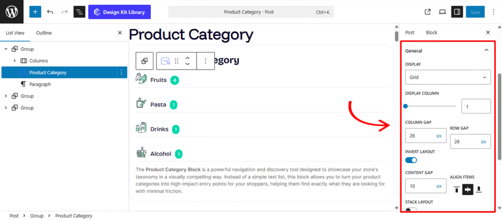
- Display: Select the primary arrangement for your categories:
- Grid: A classic multi-column layout.
- Carousel: An interactive slider for a space-saving, swipeable experience.
- Display Column: Available in Grid mode, this defines how many category cards appear side-by-side across desktop, tablet, and mobile devices.
- Column & Row Gap: Fine-tune the horizontal and vertical gutters between your category items to ensure a clean, breathable design.
- Invert Layout: Toggle this on to switch from a traditional vertical stack (image over text) to an Inline Layout (image beside text).
- Content Gap: When inverted, use this to set the precise distance between the category image and the category details.
- Align Item: Choose the vertical alignment (Top, Center, Bottom) of the text relative to the image in this horizontal orientation.
- Stack Layout: Enable this to automatically revert the inline layout back to a vertical stack on Mobile devices, ensuring optimal readability on smaller screens.
- Text Alignment: Quickly justify your category titles and product counts to the Left, Center, or Right to balance the visual weight of your product cards.
Query Options
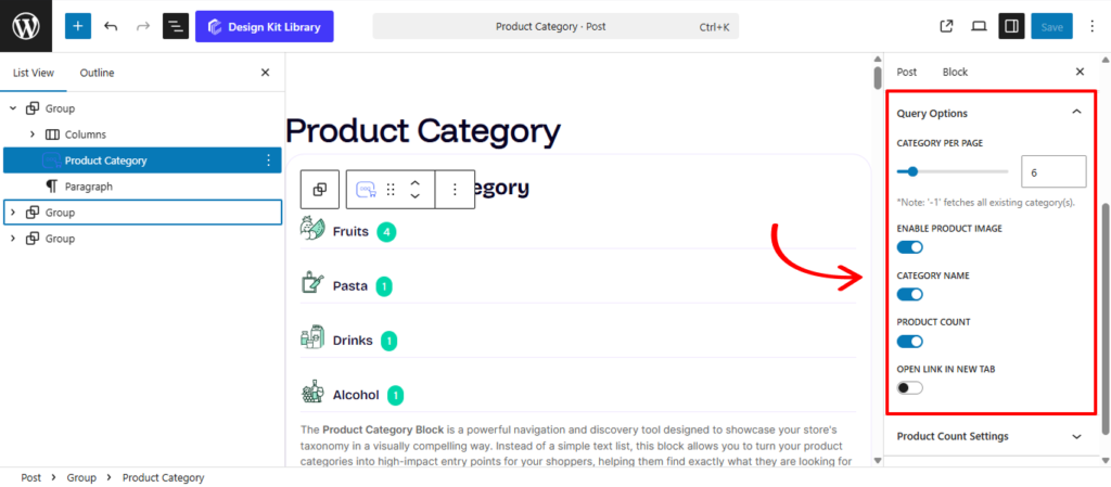
The Query Options Panel acts as the data-engine for the Product Category block. These settings determine which specific pieces of information are pulled from your WooCommerce database and how the block handles the redirection of your shoppers.
- Category Per Page: Define the maximum number of category cards to display within the block. This is essential for maintaining page performance and ensuring your layout remains clean, especially if you have dozens of sub-categories.
- Category Image: Enable this to pull the unique thumbnail image assigned to each category in your WooCommerce settings. This provides the primary visual cue for the shopper.
- Category Name: Toggle the display of the taxonomy title (e.g., “Men’s Apparel”).
- Product Count: Show or hide the numerical total of items currently assigned to that category (e.g., “12 Products”). This is excellent for providing social proof and indicating the depth of your inventory.
- Open Link in New Tab: When a user clicks on a category card, activate this toggle to ensure the destination archive opens in a separate browser window. This is a helpful navigation strategy for keeping your main landing or “Shop” page accessible while the user explores specific collections.
Query Options
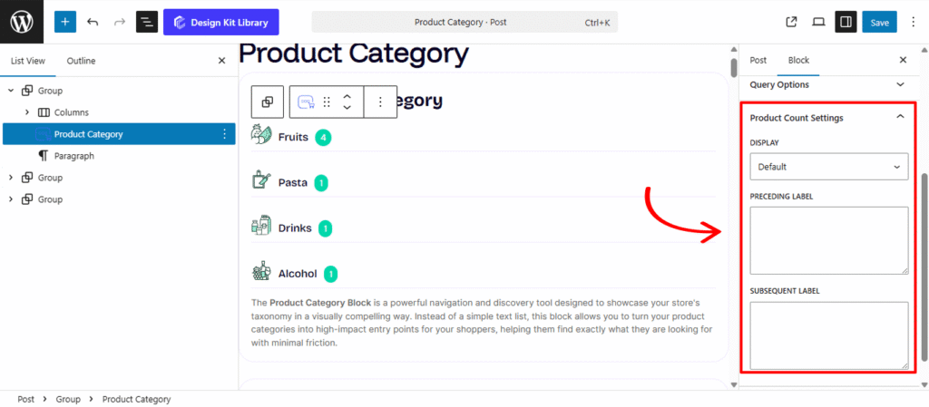
The Product Count Setting panel allows you to customize how the inventory totals for each category are displayed. Whether you want a simple text-based indicator or a prominent visual badge, these settings help you provide clear navigation cues to your shoppers.
- Display: Choose the visual style for the product numerical data:
- Default: Renders the product count as a standard text element, typically positioned below or beside the category name.
- Badge: Transforms the count into a stylized overlay or “pill” that sits on top of the category image, giving it a modern, app-like appearance.
- Badge Positioning: When the Badge display is active, you can pin the product count to specific areas of the category thumbnail:
- Position (Left/Right): Defines the primary horizontal anchor for the badge relative to the image container.
- Vertical & Horizontal Positioning: Use these granular controls (often sliders or presets) to offset the badge from the edges, allowing you to tuck it into a corner or center it perfectly.
- Preceding Label: Add a prefix like “Currently” or “Over” (e.g., Over 50 Items).
- Subsequent Label: Add a suffix such as “Items,” “Products,” or “Styles” (e.g., 12 Styles Available).
Style ◑
Item Box Style
The Item Box Style settings allow you to refine the visual presentation of each individual category card, ensuring they stand out as distinct, clickable elements.
- Padding: Adjust the internal space within each item box to give your images and text the proper amount of breathing room from the container edges.
- Border: Add a custom stroke around each individual category item. You can customize the border width, style, and color to match your site’s aesthetic.
- Border Radius: Define the curvature of the corners for each item. Use a value of 0px for sharp, professional corners or a higher value for a softer, more modern rounded look.
- Box Shadow: When the Box Shadow toggle is enabled, you can add depth and dimension to your container to make it “pop” off the page:
- Position: Choose Outline for a traditional drop shadow or Inset to make the shadow appear inside the container, creating a “pressed” effect.
- Horizontal & Vertical: Shift the shadow’s position along the X and Y axes to simulate a specific light source.
- Blur & Spread: Blur softens the edges of the shadow for a natural look, while Spread expands or contracts the overall surface area of the shadow.
- Shadow Color: Select the color and transparency (opacity) of the shadow effect.
- Typography
- Font Family & Size: Select the typeface and scale that best matches your site’s design system.
- Font Weight: Control the thickness (e.g., Bold for emphasis or Light for a modern look).
- Letter Case: Force the labels to Uppercase, Lowercase, or Capitalize without editing the form code.
- Decoration: Apply styles like Underline or Line-through if needed for specific design cues.
- Line Height & Letter Spacing: Fine-tune the vertical breathing room and horizontal character density.
- Color
- Background Default: Set the initial fill color for the category card when it is in its static state.
- Background Hover: Choose a different background color that appears when a user moves their mouse over the card, creating an interactive “light-up” effect.
Featured Image Styles
The Featured Image Styles panel provides the primary aesthetic controls for the visual thumbnails associated with your categories or products. Since these images act as the “windows” to your collections, these settings allow you to ensure a uniform, professional appearance across your Product Category or Product Grid blocks.
- Width: Set a specific width for the image container to maintain consistency, especially when using the Invert Layout.
- Height: Define the height of the image. This is crucial for creating a clean, aligned grid or slider, ensuring that all category cards remain the same size regardless of the original image’s aspect ratio.
- Spacing: Adjust the margin around the image to control its distance from the category title or the block’s outer border. This helps prevent the layout from feeling cramped.
- Border Radius: Soften the corners of your images. Use a small value for a subtle, modern look, or a high value to transform your thumbnails into perfect circles or “pills.”
- Hover Effect (Translate Y): Add an interactive layer to your storefront. When enabled, this effect causes the image to subtly shift upward (on the vertical Y-axis) when a user mouses over the card. This “lift” provides immediate visual feedback, signaling to the shopper that the category is clickable.
Content Box Style
The Product Count Styles panel provides the aesthetic toolkit to design the “Items” or “Products” indicator. Whether the count is a simple text string or a stylized badge, these settings allow you to control its spacing, shape, and visibility against your product category images.
- Margin Top & Bottom: Fine-tune the vertical breathing room between the product count and its neighboring elements, such as the Category Name or the bottom of the container.
- Padding: Control the internal space within the count’s boundary. Increasing the padding is essential when using the Badge display to ensure the numbers aren’t touching the edges of the background.
- Border: Add a solid, dashed, or dotted outline to the count. This helps define the badge’s shape and provides a clear separation from the background image.
- Border Radius: Curvature settings for the count container. A low value creates a modern “soft-square” badge, while a high value (like 50px) creates a perfect “pill” or circular shape.
- Typography
- Font Family & Size: Select the typeface and scale that best matches your site’s design system.
- Font Weight: Control the thickness (e.g., Bold for emphasis or Light for a modern look).
- Letter Case: Force the labels to Uppercase, Lowercase, or Capitalize without editing the form code.
- Decoration: Apply styles like Underline or Line-through if needed for specific design cues.
- Line Height & Letter Spacing: Fine-tune the vertical breathing room and horizontal character density.
- Color:
- Text Color: Set the primary color for the numerical data and labels (e.g., “12 Items”). Ensure high contrast against the background for accessibility.
- Background Color: Apply a solid fill behind the count. This is most effective in Badge mode, allowing you to use your brand’s primary or accent color to make the inventory count pop.