
Add To Cart
The Add to Cart Block is a high-performance conversion tool designed to bridge the gap between product discovery and purchase. Engineered to work seamlessly within a Query Loop, this block allows customers to add items to their basket instantly without leaving the current page. While it mirrors the core functionality of the standard WooCommerce “Add to Cart” button, it offers enhanced design flexibility, including custom iconography and deep aesthetic integration for a modern storefront.
Settings ⚙
General
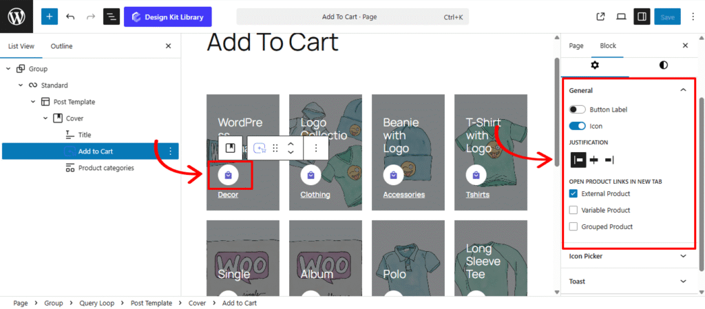
- Button Label: Customize the text that drives the conversion.
- Label Toggle: Enable or disable the text component of the button. Turning this off allows you to create a minimalist “Icon-only” button, perfect for tight grid layouts.
- Text Input: Define the specific call-to-action (e.g., “Add to Cart,” “Buy Now,” or “Grab it Today”). This text dynamically updates to “Select Options” or “View Product” for non-simple items unless overridden.
- Justification: Choose the horizontal placement that best balances your product metadata. Centering the button is a popular choice for modern, symmetrical product grids.
- Open Product Links in New Tab: Enabling these ensures the user keeps their current browsing place while exploring details:
- External Product: For affiliate or third-party items that redirect to an outside URL.
- Variable Product: For items requiring a size, color, or style selection.
- Grouped Product: For collections of items that need to be configured on the single product page.
Icon Picker
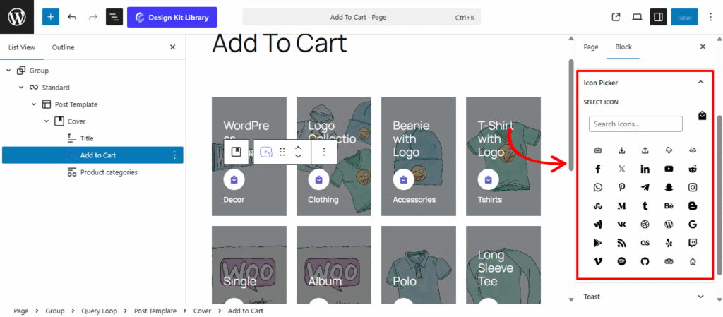
The Icon Picker Panel provides the visual styling and selection tools for the Add to Cart Block. With access to a comprehensive library of over 300 high-quality vector icons, you can move beyond standard text buttons to create a more intuitive, modern shopping experience. Icons like shopping bags, carts, and plus symbols serve as universal visual cues that guide customers toward the checkout.
Toast
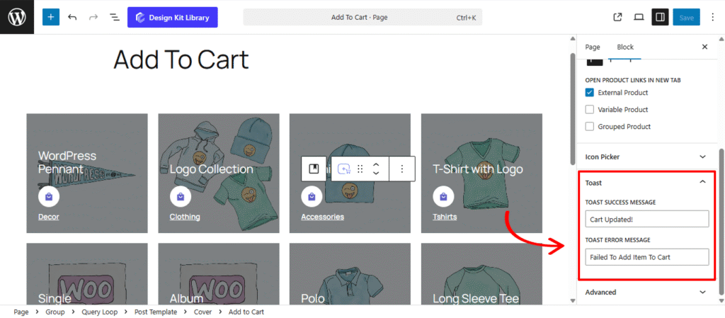
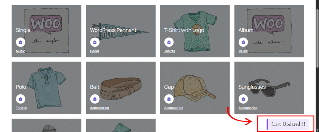
The Toast Panel manages the real-time feedback loop for the Add to Cart Block. These unobtrusive, “pop-up” style notifications appear at the edge of the screen to confirm an action was successful or to alert the user if something went wrong, allowing them to continue shopping without the interruption of a full page reload.
- Toast Success Message: Customize the confirmation text that appears when a Simple Product is successfully added to the cart.
- Toast Error Message: Define the alert text that displays if an item cannot be added (e.g., if a product is out of stock or a connection issue occurs).
Style ◑
Button Styles
The Button Styles Panel is where you define the physical presence and interactive behavior of your Add to Cart button. These settings allow you to move beyond the standard WooCommerce “Buy” button and create a custom-tailored call-to-action that matches your store’s unique design language, from minimalist flat designs to bold, tactile 3D buttons.
- Width: Choose between a fixed width or a Full Width layout. A full-width button is highly effective in mobile grids as it provides a larger “tap target” for shoppers.
- Height: Control the vertical scale of the button. Taller buttons often feel more “premium” and are easier to interact with on touchscreens.
- Border: Define the stroke style, width, and color. A thin, subtle border can help a white button stand out on a light background.
- Border Radius: Soften the corners of the review boxes. A higher value creates a friendly, rounded appearance, while a value of 0px maintains a sharp, modern edge.
- Gap: If you have enabled both an Icon and a Label, this setting controls the precise horizontal distance between them, ensuring your button text doesn’t feel crowded.
- Default/Hover Toggle: This allows you to set independent styles for the button’s static state and its “active” state when a user mouses over it. Switching between these tabs lets you create a dynamic transition (like changing the background color or border) that signals the button is clickable.
- Box Shadow: When the Box Shadow toggle is enabled, you can add depth and dimension to your container to make it “pop” off the page:
- Position: Choose Outline for a traditional drop shadow or Inset to make the shadow appear inside the container, creating a “pressed” effect.
- Horizontal & Vertical: Shift the shadow’s position along the X and Y axes to simulate a specific light source.
- Blur & Spread: Blur softens the edges of the shadow for a natural look, while Spread expands or contracts the overall surface area of the shadow.
- Shadow Color: Select the color and transparency (opacity) of the shadow effect.
- Box Shadow: When the Box Shadow toggle is enabled, you can add depth and dimension to your container to make it “pop” off the page:
- Typography
- Font Family & Size: Select the typeface and scale that best matches your site’s design system.
- Font Weight: Control the thickness (e.g., Bold for emphasis or Light for a modern look).
- Letter Case: Force the labels to Uppercase, Lowercase, or Capitalize without editing the form code.
- Decoration: Apply styles like Underline or Line-through if needed for specific design cues.
- Line Height & Letter Spacing: Fine-tune the vertical breathing room and horizontal character density.
- Color:
- Text Color: Set the primary color for your button label and icon.
- Text Hover: Change the color of the text when a user mouses over the button.
- Background Color: Define the base fill for the button.
- Background Hover: Select a slightly darker or lighter shade for the hover state.
- Border Hover: If you have a border enabled in the Button Styles panel, this setting allows you to change its color during a hover event.
Icon Style
The Icon Styles Panel provides granular control over the visual presentation of the icon within the Add to Cart Block. This panel allows you to treat the icon as a standalone design element, whether it’s tucked neatly beside your text or placed inside a stylized “box” to create a modern, high-end button.
- Icon Size: Define the scale of the vector icon itself. A larger icon can act as a strong visual cue, while a smaller one serves as a subtle accent.
- Box Width & Height: Enclose the icon within a dedicated container. By setting a specific box size, you can create perfectly square or circular “badge” effects for your icons.
- Margin Top & Bottom: Fine-tune the vertical placement of the icon relative to the button text. This is essential for ensuring the icon looks perfectly centered, especially when using custom fonts.
- Border: Add a stroke around the icon box. This is a great way to create “ghost” icons or to separate the icon visually from the button’s background.
- Border Radius: Control the roundness of the icon’s container. Set this to 50% alongside equal box width/height to create a perfectly circular icon housing.
- Color
- Icon Color (Text/Text Hover): Choose the fill color for the icon. You can set a unique color for the Hover state to make the icon “glow” or change color when the user mouses over the button.
- Background (Normal & Hover): Apply a background color specifically to the icon’s “box.” Using a slightly different shade than the main button background can create a sophisticated, multi-tonal look.
- Border Hover: Change the icon box’s outline color during a hover event to provide extra interactive feedback.
Toast Style
The Toast Styles Panel allows you to customize the visual presentation and placement of the “Add to Cart” confirmation alerts. These floating notifications provide essential feedback to your customers, and with these settings, you can ensure they are perfectly legible and non-obtrusive while matching your store’s notification system.
- Padding: Control the internal breathing room of the notification bubble. Extra padding ensures the success or error message doesn’t feel cramped against the edges of the toast.
- Border: Define a stroke style (Solid, Dashed, etc.) and color for the toast. Adding a thin border can help the notification stand out against complex backgrounds or high-contrast product images.
- Border Radius: Soften the corners of the review boxes. A higher value creates a friendly, rounded appearance, while a value of 0px maintains a sharp, modern edge.
- Vertical Position: Choose where the toast appears on the Y-axi, Increasing this value moves the toast further up from the lower edge of the screen.
- Horizontal Position: Set the X-axis alignment, A value of
0or a small pixel amount (e.g.,20px) pins the notification to the right-hand side of the viewport. - Color:
- Text Color: Set the color for your success and error messages. Ensure high contrast (e.g., white text on a dark background) so the message is readable at a glance.
- Background Color: Choose the fill color for the toast bubble. You might use a brand accent color or a neutral dark grey to keep the focus on the product addition.