
Magazine Grid


The Magazine Grid Block is a professional layout powerhouse designed to transform your content into a high-end, editorial-style showcase. Unlike standard post grids, this block excels at creating visual hierarchy, making it the perfect choice for homepages, news portals, and magazine-style landings where you want to emphasize specific stories alongside a collection of recent articles.
Settings ⚙
General
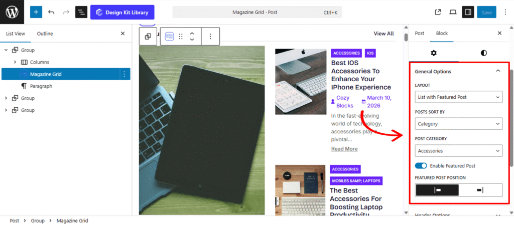
- Layout: Choose the core architectural style for your post collection:
- Grid with Featured Post: Creates a large “hero” post followed by a grid of smaller items.
- List with Featured Post: Pairs a large focal post with a clean, vertical list of secondary articles.
- Grid / List: Standard uniform arrangements without a highlighted featured item.
- Post Sort By: Define the logic used to populate the block:
- Latest: Automatically pulls the most recent articles published on your site.
- Category: Filters the feed to show content from a specific topic or department.
- Post Category: When “Sort by Category” is active, this dropdown menu allows you to select a specific category from your site. This is ideal for creating dedicated sections like “Technology,” “Lifestyle,” or “Editor’s Picks.”
- Enable Featured Post: A master toggle that activates the specialized “Hero” layout. When turned off, the block reverts to a standard, uniform grid or list.
- Featured Post Position: Once enabled, you can shift the high-impact featured post to the Left or Right side of the container. This allows you to create asymmetrical, magazine-style layouts that break the monotony of a standard web page.
- Enable Ajax Loader: When the layout is set to a standard Grid or List, you can activate this toggle to enable seamless content loading. This allows users to browse through post pages or filters without a full page refresh, significantly improving the browsing experience and site performance.
Header Options
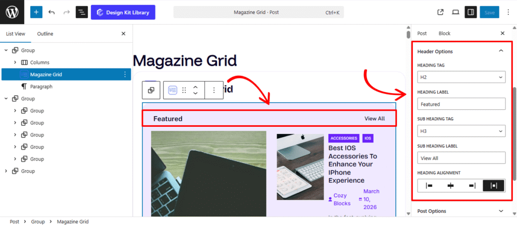
The Header Options panel provides structural and alignment controls for your block’s introductory text, allowing you to establish a clear visual hierarchy for your featured sections.
- Heading: Enable this to add a primary title to the block, such as “Featured Story” or “Editor’s Pick.”
- Heading Tag: Select the appropriate HTML rank (H1–H6 or Paragraph) for your main title. This ensures your site maintains a consistent SEO structure and follows proper accessibility standards.
- Sub-heading: Add secondary text, perfect for “View All” links or a brief lead-in sentence to provide extra context.
- Sub-heading Tag: Choose the HTML rank (H1–H6 or Paragraph) for your secondary text to keep the typography distinct from the main heading.
- Heading Alignment: Position your header elements to perfectly match your page layout:
- Left / Right: Aligns the text to either side of the container.
- Center: Positions the heading and sub-heading in the middle for a balanced, symmetrical look.
- Space-Between: Pushes the Heading to one side and the Sub-heading to the other, creating a clean, professional “navigation bar” feel.
Post Options
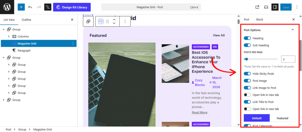
The Post Options panel offers a comprehensive suite of toggles and sliders to control exactly how your content is displayed. This level of granularity ensures your magazine grid remains clean, functional, and perfectly tailored to your editorial needs.
- Heading & Sub-heading: Toggle these to add specific titles within the post block area for extra context or section labeling.
- Post Per Page: Use this slider to define exactly how many articles should appear in the block. This helps you manage the length of your page and maintain a balanced layout.
- Hide Sticky Posts: Enable this to ignore posts marked as “Sticky” in WordPress, ensuring your grid always displays a natural chronological or categorical flow.
- Default / Featured: Use this toggle to switch between a standard post layout and a specialized “Featured” settings.
- Metadata & Icons: Choose to show or hide Post Categories, Author, and Date. Enable the Post Meta Icon to add visual cues (like a folder or calendar icon) next to this information for better scannability.
- Content & Excerpt: Toggle the Post Content to show article snippets. Use the Post Excerpt slider to set the precise word count for these previews, keeping your grid items uniform.
- Read More: Add a clear call-to-action link at the end of each post preview.
Note on Smart Linking: For every element that supports a link—such as Titles, Images, and the “Read More” button—you have access to two additional nested controls. You can toggle the Link option to make a specific element clickable or non-clickable, and use the Open Link in New Tab toggle to ensure the article opens in a separate browser tab, keeping your current page active for the reader.
- Exclude Post: Enter specific Post IDs (comma-separated) to prevent certain articles from appearing in this block.
- Post Offset: Skip a specific number of recent posts. This is perfect if you have a “Hero” block at the top of your page and don’t want to repeat those same stories in the grid below.
Featured Post Options
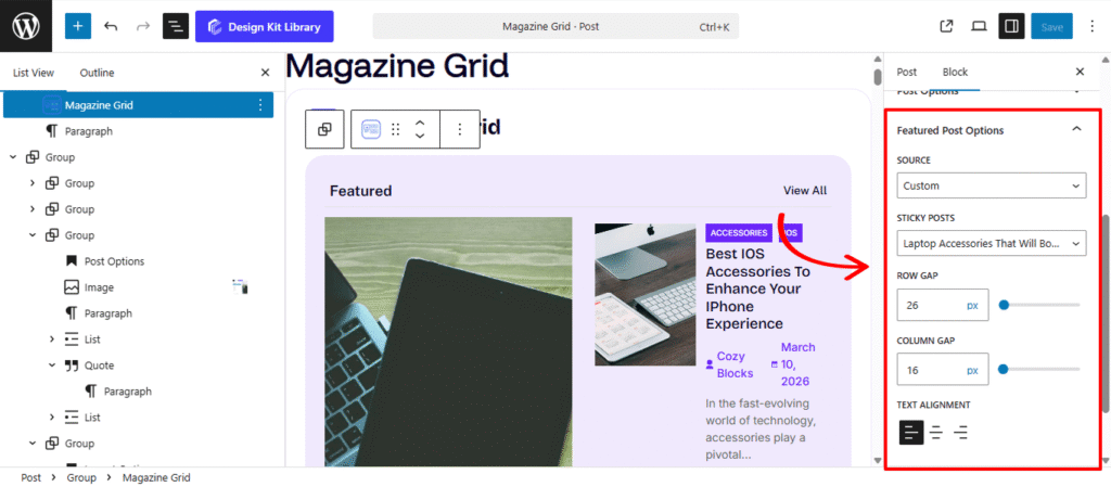
The Featured Post Options panel becomes available only when the Enable Featured Post toggle is activated in the General Panel. This section provides specialized controls to define the content and precise positioning of your block’s primary “Hero” article.
- Source: Define the logic for selecting your featured content:
- Latest: Automatically highlights the most recent article published on your site.
- Sticky: Pulls a post that has been marked as “Sticky” in the WordPress editor.
- Custom: Allows you to manually hand-pick a specific article to occupy the featured slot.
- Sticky Post: When the source is set to “Sticky” or “Custom,” this dropdown menu allows you to select a specific post from your library to ensure it remains the focal point of the block.
- Row & Column Gap: Fine-tune the spacing around your featured post:
- Row Gap: Adjust the vertical distance between the featured post and any items listed above or below it.
- Column Gap: Control the horizontal spacing between the featured post and the secondary post list/grid.
- Text Alignment: Set the horizontal alignment for the featured post’s content (Title, Meta, and Excerpt). You can choose Left, Center, or Right to match the visual balance of your layout.
Layout Options
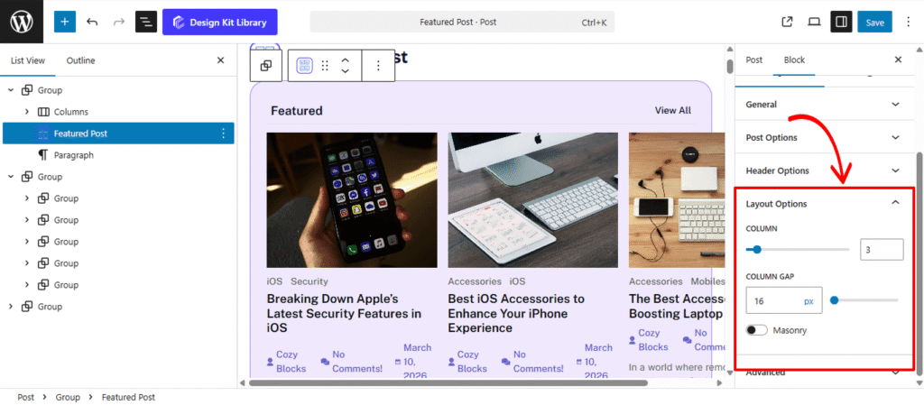
The Layout Options panel appears when your block is set to either a Grid or List display. These settings allow you to define the structural arrangement and spacing of your post collection to ensure a clean, organized presentation.
- Column: Define the number of columns to display in your grid. This allows you to scale your content from a single-column list to a multi-column gallery, depending on your page’s available width.
- Column Gap: Adjust the horizontal and vertical spacing (in pixels) between your post items. Increasing the gap creates a more airy, “breathable” layout, while a smaller gap maximizes the use of screen real estate.
- Masonry: Enable this toggle to create a dynamic, “brick-style” layout where post cards of different heights are automatically tucked into the gaps. This is ideal for grids where featured images have varying aspect ratios, as it prevents uneven white space between rows.
Ajax Loader Options
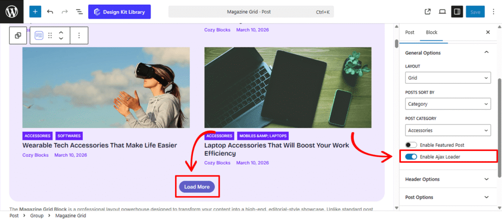
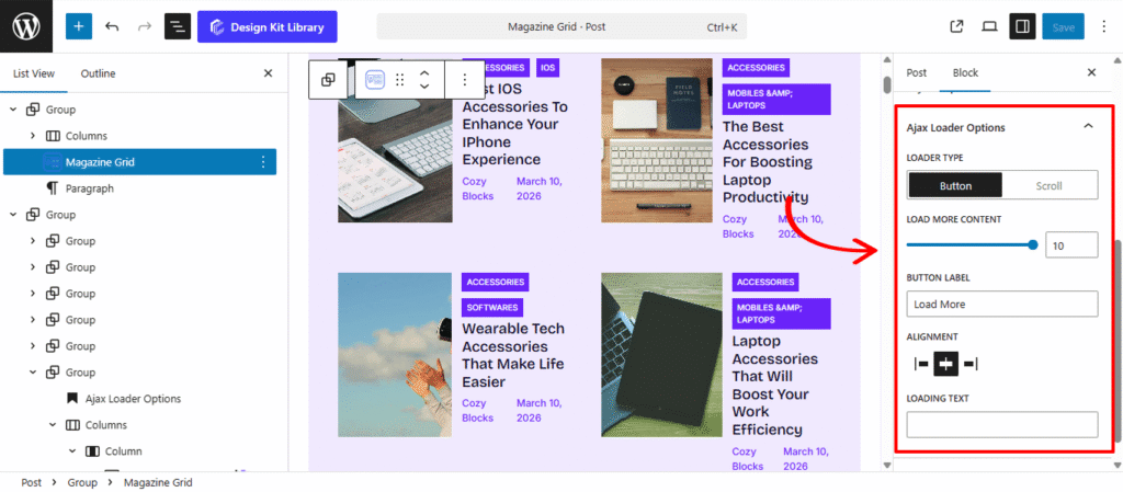
The Ajax Loader Options panel allows you to define how your block handles additional content. By enabling these settings, you can provide a seamless browsing experience that allows readers to discover more posts without the interruption of a full page refresh.
- Loader Type: Choose the interaction method for loading new content:
- Button: Displays a clickable “Load More” button at the bottom of the block. This gives users manual control over when more posts appear.
- Scroll: Activates “Infinite Scroll,” where new posts automatically load and append to the grid as the user reaches the bottom of the current list.
- Load More Content: Define exactly how many additional posts should be fetched in each loading cycle. This helps you manage site performance and page length by controlling the “batch size” of incoming data.
- Button Label: Customize the text displayed on your loader button (e.g., “Load More,” “Discover More,” or “View Older Posts”) to match your site’s tone of voice.
- Alignment: Position the loader button to align with your overall design. You can choose to place it on the Left, Center, or Right of the content container.
- Loading Text: Set the temporary message that appears while the block is actively fetching new data (e.g., “Loading…” or “Fetching stories”). This provides essential visual feedback to the user, ensuring they know the site is responding to their request.
Style ◑
Header Box Style
The Header Box Style panel provides comprehensive design controls for the container housing your section heading and category navigation. These settings allow you to define the visual boundary and spacing of the block’s top section.
- Padding: Adjust the internal spacing within the header container. Increasing the padding creates more room around the text and tabs, preventing them from feeling cramped against the container’s edges.
- Margin Top: Define the outer vertical space above the block to separate it from preceding content.
- Margin Bottom: Control the distance between the header box and the post results below for a clean, organized transition.
- Border: Apply a structural frame to the header area. You can customize the border width, style (solid, dashed, etc.), and color to match your site’s UI.
- Border Radius: Control the curvature of the header box corners. Use a low value for a professional, sharp-edged look or a high value to create a modern, rounded container.
- Color
- Color (Background): Set a specific background color for the entire header section. This is an effective way to create a distinct “header bar” that visually anchors the block.
Heading Style
The Heading Style panel provides granular control over the primary title of your block. These settings allow you to transform a simple text element into a high-impact design feature that defines the identity of your content section.
- Padding: Adjust the internal spacing between the heading text and its container boundaries. This is essential for creating “breathable” space, especially when a background color or border is applied.
- Border: Add a structural frame or underline to the heading. You can customize the thickness, style, and color to match your site’s brand guidelines.
- Border Radius: Define the curvature of the corners for each item. Use a value of 0px for sharp, professional corners or a higher value for a softer, more modern rounded look.
- Clip Path: Apply advanced geometric masking to the heading container. This allows you to create unique non-rectangular shapes—such as slanted edges, chevrons, or custom polygons—giving your header a cutting-edge, architectural look.
- Note: Enter only the CSS declaration value here (e.g.,
polygon(0% 0%, 100% 0%, 90% 100%, 0% 100%)). Do not include theclip-path:property name itself.
- Note: Enter only the CSS declaration value here (e.g.,
- Typography
- Font Family & Size: Select the typeface and scale that best matches your site’s design system.
- Font Weight: Control the thickness (e.g., Bold for emphasis or Light for a modern look).
- Letter Case: Force the labels to Uppercase, Lowercase, or Capitalize without editing the form code.
- Decoration: Apply styles like Underline or Line-through if needed for specific design cues.
- Line Height & Letter Spacing: Fine-tune the vertical breathing room and horizontal character density.
- Color
- Text Color: Set the hue of the title itself to ensure high contrast and readability.
- Background Color: Apply a fill color to the heading area. When combined with Padding and Clip Path, this creates a distinct “badge” or “tab” effect that separates the title from the rest of the header box.
Sub Heading Style
The Sub Heading Style panel provides comprehensive design controls for your secondary text or “View All” links. These settings allow you to create a dynamic, interactive element that perfectly complements your primary heading.
- Padding: Adjust the internal spacing within the sub-heading container. This is essential for creating a balanced “button” or “label” look, especially when background colors or borders are applied.
- Border: Add a structural frame to the sub-heading. You can define the thickness and style to create a subtle underline or a fully enclosed box.
- Border Radius: Control the roundness of the corners. Use a low value for a sharp, formal aesthetic or a higher value to create a pill-shaped link.
- Typography
- Font Family & Size: Select the typeface and scale that best matches your site’s design system.
- Font Weight: Control the thickness (e.g., Bold for emphasis or Light for a modern look).
- Letter Case: Force the labels to Uppercase, Lowercase, or Capitalize without editing the form code.
- Decoration: Apply styles like Underline or Line-through if needed for specific design cues.
- Line Height & Letter Spacing: Fine-tune the vertical breathing room and horizontal character density.
- Color:
- Text (Default & Hover): Set the initial color of the text and define a specific Hover color to provide clear visual feedback when a user moves their mouse over the link.
- Background (Default & Hover): Apply a fill color to the sub-heading area. Switching the background color on hover is a highly effective way to make your “View All” links feel interactive and tactile.
- Border Hover: Change the color of the border during user interaction. This allows for sophisticated transition effects, such as a border that “lights up” or shifts hue when the sub-heading is active.
Post Box Style
The Post Box Style panel gives you full control over the individual containers for each post. These settings define the structural “card” look of your content and allow you to add interactive depth through hover states and shadows.
- Padding: Adjust the internal spacing within each post box. This creates a balanced margin between the post content (image, title, meta) and the box’s outer edges.
- Margin Top & Bottom: Control the vertical spacing outside each post box to manage the distance between rows or separate the collection from surrounding elements.
- Border: Add a structural frame to your post cards, with full control over width, style, and color.
- Border Radius: Soften the corners of your post boxes. A subtle radius creates a modern, friendly UI, while a value of
0delivers a sharp, professional grid. - Hover Effect: Enable this toggle to activate transition animations when a user mouses over a post. This provides a tactile feel to your grid, signaling that the entire box is interactive.
- Default / Hover States: Use the toggle tabs to define different styles for the “Normal” and “Hover” states. You can shift colors, borders, or shadows to create a dynamic visual lift.
- Box Shadow: When the Box Shadow toggle is enabled, you can add depth and dimension to your container to make it “pop” off the page:
- Position: Choose Outline for a traditional drop shadow or Inset to make the shadow appear inside the container, creating a “pressed” effect.
- Horizontal & Vertical: Shift the shadow’s position along the X and Y axes to simulate a specific light source.
- Blur & Spread: Blur softens the edges of the shadow for a natural look, while Spread expands or contracts the overall surface area of the shadow.
- Shadow Color: Select the color and transparency (opacity) of the shadow effect.
- Box Shadow: When the Box Shadow toggle is enabled, you can add depth and dimension to your container to make it “pop” off the page:
- Color
- Background (Default): Set the base fill color for your post card. Use a solid color or subtle alpha transparency to match your site’s overall theme.
- Background (Hover): Define a secondary background color that activates when a user moves their cursor over the post. This is a powerful way to indicate interactivity and improve click-through rates.
- Border (Hover): Elevate the “active” feel of the card by changing the border color on hover. This adds a layer of sophistication, making the post box feel responsive to the user’s journey.
Post Style
The Post Style panel allows you to refine the visual presentation of individual post elements. These settings provide the flexibility to switch between a classic grid layout and a modern, immersive image-centric design.
- Image Overlay: Enable this toggle to transform the post layout. When active, the post content (title, meta, etc.) is moved inside the featured image area, creating a high-impact, magazine-style overlay effect that maximizes visual real estate.
- Image Hover Effect: Add dynamic animation to your featured images. You can choose effects like Zoom In, Grayscale to Color, or a subtle Opacity Shift to make the gallery feel more interactive.
- Padding: Control the overall internal spacing of the post item. This ensures that your text and images maintain a consistent “breathable” distance from the box borders.
- Post Image: Fine-tune the dimensions and spacing of the article’s thumbnail:
- Margin Top & Bottom: Define the vertical spacing around the image to separate it from the header or the title below.
- Height & Width: Set specific dimensions to ensure all images in your grid maintain a uniform size, regardless of their original aspect ratio.
- Radius: Adjust the corner roundness of the image independently of the post box.
- Post Title
- Margin Top & Bottom: Control the vertical positioning of the title to align it perfectly with the surrounding metadata and content.
- Additional CSS: A dedicated field for developers to inject custom CSS properties directly into the title element for unique styling.
- Color
- Post Title (Default & Hover): Define the primary color of your article titles and set a specific Hover color to provide clear visual feedback when a user interacts with the link.
Post Category Style
The Post Category Style panel allows you to customize the appearance of the category labels or badges that appear on your post cards. These settings help you create high-visibility tags that categorize your content at a glance.
- Padding: Adjust the internal spacing between the category text and its background boundary. This is key for creating a “pill” or “badge” effect.
- Margin Top & Bottom: Define the vertical spacing above and below the category tag to position it perfectly relative to the post image or title.
- Gap: When a post belongs to multiple categories, this setting controls the horizontal space between the individual category badges.
- Hover Effect: Enable this toggle to activate a transition animation when a user mouses over the category tag, signaling that it is a clickable link.
- Default / Featured: Use these toggle tabs to define separate styles for categories appearing on standard posts versus those on the primary Featured Post. This allows you to make the featured category stand out with a unique color or larger padding.
- Border: Apply a structural frame to your category tags. You can set the width and style to create a modern “outlined” look.
- Border Radius: Control the roundness of the tag. Use 0px for a sharp, rectangular tag or a high value (like 20px) for a fully rounded pill shape.
- Typography
- Font Family & Size: Select the typeface and scale that best matches your site’s design system.
- Font Weight: Control the thickness (e.g., Bold for emphasis or Light for a modern look).
- Letter Case: Force the labels to Uppercase, Lowercase, or Capitalize without editing the form code.
- Decoration: Apply styles like Underline or Line-through if needed for specific design cues.
- Line Height & Letter Spacing: Fine-tune the vertical breathing room and horizontal character density.
- Color & Interaction:
- Text (Default & Hover): Set the initial color of the category name and a distinct hover color for user feedback.
- Background (Default & Hover): Apply a fill color to the tag. A background color shift on hover is a standard way to indicate the tag is interactive.
- Border Hover: Define a specific border color that triggers when the mouse is over the tag, adding a sophisticated layer of visual depth.
Post Meta Style
The Post Meta Style panel provides specific design controls for the supplementary information of your posts, such as the author name, publication date, and comment count. These settings help you maintain a clear visual hierarchy by balancing metadata with your primary titles.
- Margin Top: Adjust the space between the post title and the metadata.
- Margin Bottom: Define the distance between the meta section and the contents below.
- Typography
- Font Family & Size: Select the typeface and scale that best matches your site’s design system.
- Font Weight: Control the thickness (e.g., Bold for emphasis or Light for a modern look).
- Letter Case: Force the labels to Uppercase, Lowercase, or Capitalize without editing the form code.
- Decoration: Apply styles like Underline or Line-through if needed for specific design cues.
- Line Height & Letter Spacing: Fine-tune the vertical breathing room and horizontal character density.
- Color
- Text Default: Set a subtle, secondary color for your metadata to ensure it provides useful information without distracting from the main post title.
- Text Hover: Define a specific color for when a user interacts with clickable meta elements (like an author’s name or a category link), providing a clear visual cue that the text is a functional link.
Read More Button Style
The Read More Button Style panel provides complete creative control over the final call-to-action for your post. These settings allow you to transform a simple link into a prominent, interactive button that drives user engagement.
- Padding: Define the internal space between the “Read More” text and the button’s edges. Increasing this value creates a larger, more touch-friendly target for your readers.
- Margin Top: Adjust the vertical distance between the button and the post excerpt above it.
- Margin Bottom: Control the space at the very bottom of the post box to ensure the button doesn’t feel cramped against the border.
- Alignment: Position the button to match your layout’s visual flow. Choose from Left, Center, or Right to align the call-to-action with your title and metadata.
- Border: Add a structural frame to the button. You can customize the thickness and style to create an “Outline” or “Ghost” button effect.
- Border Radius: Control the shape of the button. Use 0px for a sharp, rectangular look or a high value (e.g., 30px) for a fully rounded, modern pill shape.
- Typography
- Font Family & Size: Select the typeface and scale that best matches your site’s design system.
- Font Weight: Control the thickness (e.g., Bold for emphasis or Light for a modern look).
- Letter Case: Force the labels to Uppercase, Lowercase, or Capitalize without editing the form code.
- Decoration: Apply styles like Underline or Line-through if needed for specific design cues.
- Line Height & Letter Spacing: Fine-tune the vertical breathing room and horizontal character density.
- Color
- Text (Default & Hover): Set the initial color of the label and define a high-contrast Hover color to signal interactivity.
- Background (Default & Hover): Apply a fill color to the button. A distinct background color change on hover (e.g., shifting from a solid color to a slightly darker shade) provides essential visual feedback.
- Border Hover: Change the border color during user interaction. This is perfect for creating sophisticated “hollow” buttons that fill with color or change their outline hue when the mouse moves over them.
Ajax Loader Style
The Ajax Loader Style panel provides the design tools to customize the “Load More” button and the loading animation, ensuring that even the functional parts of your grid align with your brand’s aesthetic.
- Padding: Adjust the internal spacing of the “Load More” button. This is crucial for creating a comfortable, clickable area that stands out at the bottom of your post list.
- Margin Top: Define the vertical gap between the last row of posts and the loader button.
- Margin Bottom: Control the spacing between the button and the footer or the next section of your page.
- Min Width: Set a minimum width for the button to ensure it maintains a consistent shape regardless of the text length (e.g., “Load More” vs. “Show More Posts”).
- Border: Add an outline to the loader button. You can customize the thickness and style to create a sleek “ghost” button or a solid framed look.
- Border Radius: Control the roundness of the button corners. Use a high value for a modern, pill-shaped button or 0px for a sharp, formal edge.
- Typography
- Font Family & Size: Select the typeface and scale that best matches your site’s design system.
- Font Weight: Control the thickness (e.g., Bold for emphasis or Light for a modern look).
- Letter Case: Force the labels to Uppercase, Lowercase, or Capitalize without editing the form code.
- Decoration: Apply styles like Underline or Line-through if needed for specific design cues.
- Line Height & Letter Spacing: Fine-tune the vertical breathing room and horizontal character density.
- Color
- Text (Default & Hover): Set the initial color of the label and define a high-contrast Hover color to signal interactivity.
- Spinner Primary: The main color of the rotating loading icon.
- Spinner Secondary: This defines the color of the background track or “path” along which the primary spinner rotates, allowing for a sophisticated two-tone animation effect.
- Background (Default & Hover): Apply a fill color to the button. A distinct background color change on hover (e.g., shifting from a solid color to a slightly darker shade) provides essential visual feedback.
- Border Hover: Change the border color during user interaction. This is perfect for creating sophisticated “hollow” buttons that fill with color or change their outline hue when the mouse moves over them.