Categorized Post Tabs
Featured
- iOS
- Accessories
- Android
- Security
- Mobiles & Laptops
- Softwares
- Robotics
- IOT
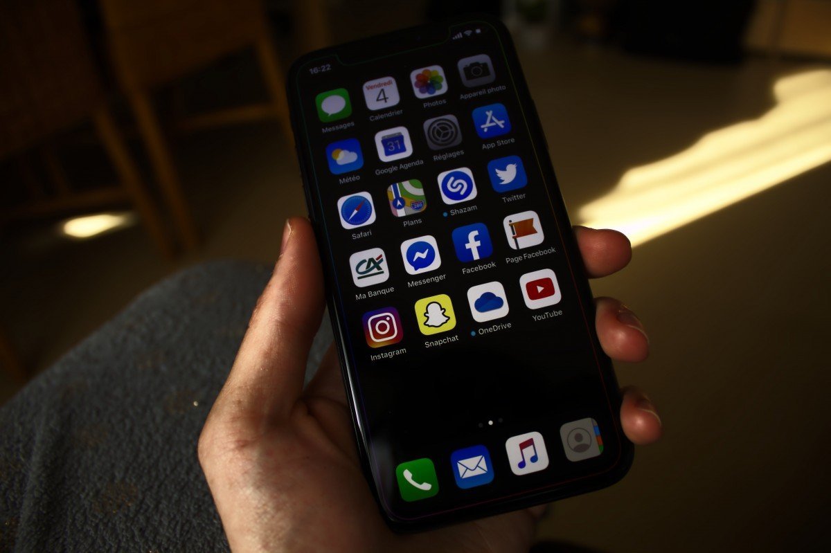
Best iOS Accessories to Enhance Your iPhone Experience
In the fast-evolving world of technology, accessories play a pivotal…Read More
The Ultimate Comparison: Android vs. iOS for Photography
In the ever-evolving world of mobile photography, both Android and…Read More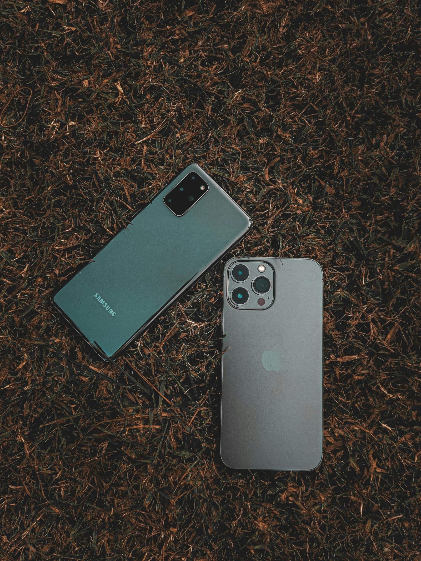
Understanding the Difference Between Android and iOS
When it comes to mobile operating systems, security is a…Read More
How AI is Revolutionizing Android Smartphones
Artificial Intelligence (AI) is rapidly transforming the smartphone experience, especially…Read More
The Best Accessories for Boosting Laptop Productivity
In a world where remote work, digital learning, and flexible…Read More
Wearable Tech Accessories That Make Life Easier
Wearable technology has revolutionized the way we interact with our…Read More
Laptop Accessories That Will Boost Your Work Efficiency
n today’s fast-paced work environment, having the right laptop accessories…Read More
Robotic Kits for Learning: A Guide for Beginners
Robotic kits have become an increasingly popular tool for education,…Read More
The Ultimate Comparison: Android vs. iOS for Photography
In the ever-evolving world of mobile photography, both Android and…Read MoreUnderstanding the Difference Between Android and iOS
When it comes to mobile operating systems, security is a…Read MoreHow AI is Revolutionizing Android Smartphones
Artificial Intelligence (AI) is rapidly transforming the smartphone experience, especially…Read More
New Android Security Features You Should Know About
Android 14 introduces several advanced security features designed to enhance…Read More
Top Cybersecurity Tips to Keep Your Data Safe
With our phones becoming an extension of our lives, mobile…Read More
A Comprehinsive Guide to Securing Your IOT Devices
As the Internet of Things (IoT) continues to grow, connecting…Read More
Laptop Accessories That Will Boost Your Work Efficiency
n today’s fast-paced work environment, having the right laptop accessories…Read MoreUnderstanding the Difference Between Android and iOS
When it comes to mobile operating systems, security is a…Read MoreHow AI is Revolutionizing Android Smartphones
Artificial Intelligence (AI) is rapidly transforming the smartphone experience, especially…Read More
Top Cybersecurity Tips to Keep Your Data Safe
With our phones becoming an extension of our lives, mobile…Read More
A Beginner's Guide to Building Your Own IoT Network at Home
Building your own IoT network at home is an exciting…Read More
A Beginner's Guide to Building Your Own IoT Network at Home
Building your own IoT network at home is an exciting…Read More
A Beginner's Guide to Building Your Own IoT Network at Home
Building your own IoT network at home is an exciting…Read More
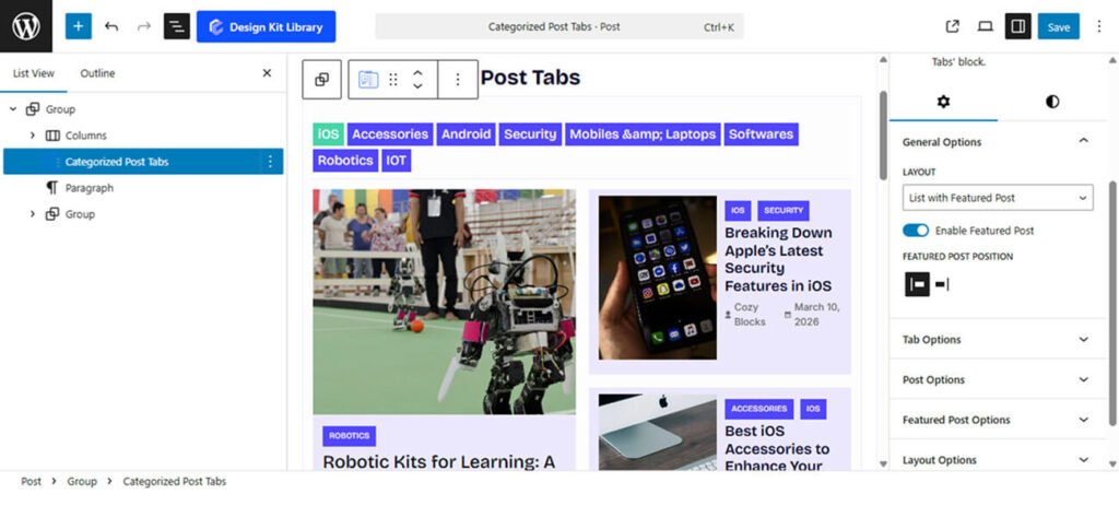
The Categorized Post Tabs block is a dynamic content solution designed to organize and display your articles through an interactive tabbed interface, allowing users to switch between categories seamlessly. This block features a professional Featured Post option that enables a magazine-style layout, where a single high-profile story is highlighted on one side while a collection of additional articles on the other. This dual-action design not only maximizes space efficiency but also creates a sophisticated editorial feel that keeps visitors engaged by offering both a focused spotlight and easy access to a broader range of content within each tab.
Settings ⚙
General
- Layout: Choose the primary structure for your post display
- List with Featured Post: Combines a large spotlight post with a vertical list of secondary articles.
- Grid with Featured Post: Pairs a large spotlight post with a supporting grid of smaller post cards.
- Grid: A uniform arrangement of posts in rows and columns.
- List: A classic vertical stack of articles for a clean, streamlined look.
- Enable Featured Post: Enable this to create a visual hierarchy. When enabled, one post (typically the most recent) will be enlarged and styled as a “Hero” item to grab user attention.
- Featured Post Position: Determines the layout’s focal point. You can swap the featured content between the Left or Right side to better suit your site’s visual balance or to vary the design across different pages.
Tabs Options
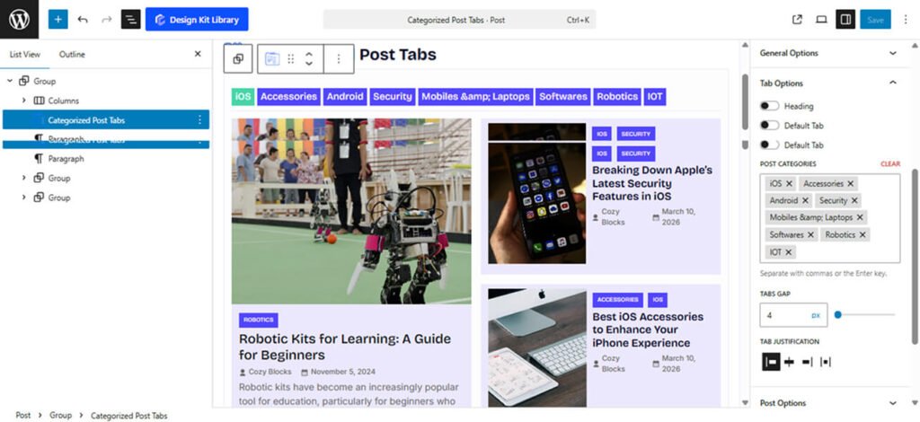
The Tabs Options panel gives you precise control over the navigation and organizational structure of your post filters, ensuring users can browse your content with ease.
- Heading: Enable this to add a section title above your tabs. This is useful for providing context, such as “Latest News” or “Browse by Topic.”
- Heading Tag: Choose the appropriate HTML rank for your heading (H1–H6 or Paragraph). This helps maintain a proper SEO hierarchy and consistent typography.
- Heading Gap: Adjust the vertical spacing between the section heading and the tab navigation bar.
- Default Tab: Define the primary “view all” state. This represents the initial tab where all selected blog posts are shown together before a user applies a specific category filter.
- Post Categories: Use this selection tool to pick exactly which categories you want to display as individual tabs. This allows you to curate the specific topics you want to highlight for your readers.
- Tabs Gap: Control the horizontal spacing between the individual tab buttons to ensure they are legible and easy to click.
- Tabs Justification: Align your tab navigation bar to fit your layout’s alignment:
- Left / Right: Aligns tabs to either side of the container.
- Center: Positions tabs in the middle for a balanced, symmetrical look.
- Space-Between: Spreads the tabs evenly across the full width of the block.
Post Options
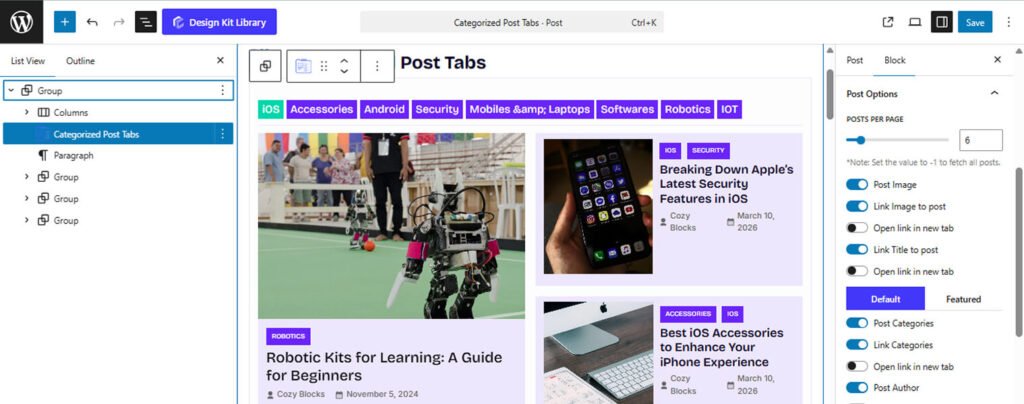
The Post Options panel provides granular control over the content and metadata displayed within your post tabs. This section features a unique Default/Featured toggle, allowing you to maintain different visibility settings for your secondary posts versus your primary spotlight post.
- Posts Per Page: Define the maximum number of articles shown at once. Setting this to -1 will display all available posts within the selected categories.
- Post Image: Toggle the visibility of the featured image for each post.
- Link Image to post: Turn the featured image into a clickable link to the article.
- Open link in new tab: Enable this to ensure the post opens in a separate browser tab when the image is clicked.
- Title Linking:
- Link Title to post: Make the article heading a direct link.
- Open link in new tab: Keep your current page active by opening the article link in a new tab.
- Default/Featured Toggle: Switch between these two modes to apply different settings to your standard posts and your hero (featured) post.
- Post Categories: Display the category labels assigned to each post.
- Link Categories: Make these labels clickable to lead users to category archives.
- Open link in new tab: Determines if category archive links open in a new window.
- Metadata Visibility: Toggle the Post Author, Post Comments, and Post Date to choose exactly which details your readers see.
- Show Meta Icon: Enable this to display small icons (like a clock or user icon) next to your metadata for better visual cues.
- Link Post Meta: Allow users to click on metadata elements (like the author’s name) to visit related archive pages.
- Show Meta Icon: Enable this to display small icons (like a clock or user icon) next to your metadata for better visual cues.
- Post Content: Show a snippet or excerpt of the article text. This is particularly useful for the Featured Post to provide a summary of the headline story.
- Post Excerpt: Use the slider to define the exact word or character count for the snippet. This ensures a uniform look across your post cards, preventing one long description from breaking the alignment of the grid or list.
- Read More: Enable this to add a “Read More” link or button at the end of your excerpt. This provides a clear call-to-action for users to dive into the full article.
- Open link in new tab: When the “Read More” link is clicked, this setting determines if the full post opens in a new browser tab, allowing users to keep their place in the categorized tabs.
Featured Post Options
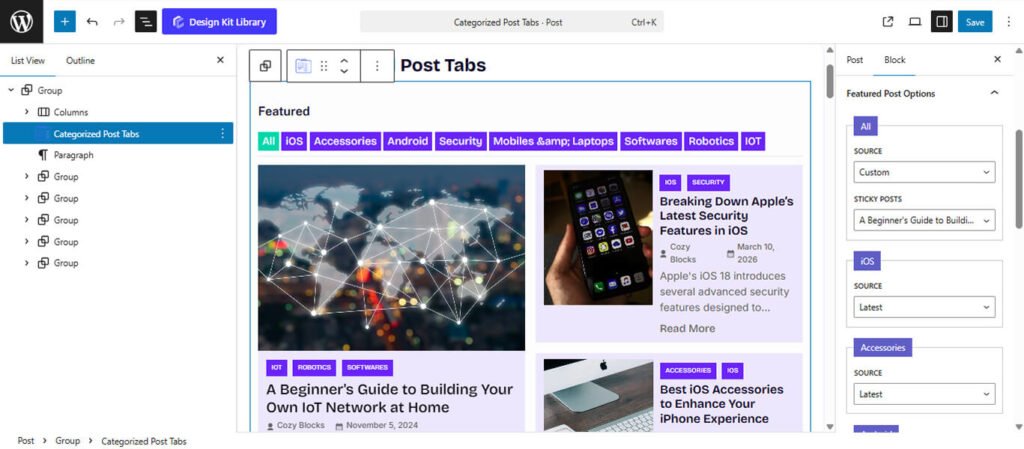
The Featured Post Options panel allows you to define the logic behind which article is highlighted as the “Hero” or spotlight post for each category tab.
- Source: Determine how the featured content is selected for every category in your tabs:
- Latest: The block automatically pulls the most recent post from the currently active category tab and displays it as the featured item.
- Sticky: This option prioritizes “Sticky” posts (posts marked as “Stick to the top of the blog” in WordPress) for the featured slot.
- Custom: This gives you full manual control, allowing you to hand-pick a specific article to remain as the featured post regardless of its publication date.
- Post Selection (for Sticky or Custom): When the source is set to Sticky or Custom, a selection interface will appear. This allows you to search for and select the specific post you want to feature for each respective tab, ensuring that your most important content always receives the highest visibility.
Layout Options
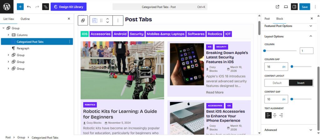
The Layout Options panel (located under Featured Post Options) provides specialized controls for managing the internal structure and spatial distribution of the content within your Featured Post or secondary post containers.
- Column: Define the number of columns used to organize the post cards. For a magazine-style featured post, setting this to 1 creates a powerful vertical spotlight, while higher values can be used to create a multi-column internal grid.
- Column Gap: Adjust the horizontal spacing between columns. This slider allows you to fine-tune the “gutter” width to ensure your images and text elements don’t overlap or feel too distant.
- Content Layout : Quickly flip the structural arrangement of the post elements:
- Default: The post is rendered in a Stacked (vertical) format. The image sits on top, and the post details (title, meta, excerpt) are placed directly beneath it. This is the classic “card” look.
- Invert: This converts the individual post container into a List (horizontal) format. The image and the post details are placed side-by-side.
- Content Gap: Control the vertical spacing between the internal elements of a post (e.g., the distance between the image, the title, and the excerpt). This helps you manage the overall “denseness” of the content card.
- Text Alignment: Set the justification for your titles, excerpts, and meta data. You can choose between Left, Center, or Right alignment to match the overall flow of your page design.
Style ◑
Header Box Style
The Header Box Style panel controls the design of the top section of the block—the container that houses both the section heading and the category navigation tabs. Styling this area effectively helps define the boundary between your page content and the post filter system.
- Padding: Adjust the internal spacing within the header container. This allows you to add room around your heading and tabs, preventing them from feeling cramped against the borders.
- Margin Top: Control the outer spacing above the header to separate it from preceding blocks.
- Margin Bottom: Define the distance between the header box and the post results below, ensuring a clean transition to the content.
- Border: Add a structural frame around the header area. You can customize the border width, style, and color to match your site’s UI.
- Border Radius: Define the curvature of the corners for each item. Use a value of 0px for sharp, professional corners or a higher value for a softer, more modern rounded look.
- Color
- Background Default: Set a specific background color for the entire header section.
Heading Style
The Heading Style panel allows you to customize the title section within the Header Box. These settings help you define the specific look of your block title (e.g., “Latest News”), ensuring it aligns with your brand’s aesthetic.
- Padding: Adjust the internal spacing between the heading text and its container’s edges. This is particularly useful if you have applied a background color or border to the heading itself.
- Border: Add a custom stroke or frame specifically around the heading text. You can define the thickness and style to make the title more prominent.
- Border Radius: Define the curvature of the corners for each item. Use a value of 0px for sharp, professional corners or a higher value for a softer, more modern rounded look.
- Typography
- Font Family & Size: Select the typeface and scale that best matches your site’s design system.
- Font Weight: Control the thickness (e.g., Bold for emphasis or Light for a modern look).
- Letter Case: Force the labels to Uppercase, Lowercase, or Capitalize without editing the form code.
- Decoration: Apply styles like Underline or Line-through if needed for specific design cues.
- Line Height & Letter Spacing: Fine-tune the vertical breathing room and horizontal character density.
- Color
- Text Color: Choose a color for the heading text. You can use your theme’s primary colors or a custom hex code to make the title pop.
- Background Default: Set a specific background color for the title section.
Tab Style
The Tab Styles panel allows you to customize the appearance of the individual category buttons. These settings ensure that your navigation is not only functional but also visually consistent with your site’s design system.
- Padding: Adjust the internal spacing between the heading text and its container’s edges. This is particularly useful if you have applied a background color or border to the heading itself.
- Border Radius: Define the curvature of the corners for each item. Use a value of 0px for sharp, professional corners or a higher value for a softer, more modern rounded look.
- Typography
- Font Family & Size: Select the typeface and scale that best matches your site’s design system.
- Font Weight: Control the thickness (e.g., Bold for emphasis or Light for a modern look).
- Letter Case: Force the labels to Uppercase, Lowercase, or Capitalize without editing the form code.
- Decoration: Apply styles like Underline or Line-through if needed for specific design cues.
- Line Height & Letter Spacing: Fine-tune the vertical breathing room and horizontal character density.
- Color
- Text Color: Choose a color for the Tab’s text.
- Background Default: Set a specific background color for each tab title.
Featured Post Style
The Tab Styles panel allows you to customize the appearance of the individual category buttons. These settings ensure that your navigation is not only functional but also visually consistent with your site’s design system.
- Padding: Adjust the internal spacing between the heading text and its container’s edges. This is particularly useful if you have applied a background color or border to the heading itself.
- Border Radius: Define the curvature of the corners for each item. Use a value of 0px for sharp, professional corners or a higher value for a softer, more modern rounded look.
- Typography
- Font Family & Size: Select the typeface and scale that best matches your site’s design system.
- Font Weight: Control the thickness (e.g., Bold for emphasis or Light for a modern look).
- Letter Case: Force the labels to Uppercase, Lowercase, or Capitalize without editing the form code.
- Decoration: Apply styles like Underline or Line-through if needed for specific design cues.
- Line Height & Letter Spacing: Fine-tune the vertical breathing room and horizontal character density.
- Color
- Text Color: Choose a color for the Tab’s text.
- Background Default: Set a specific background color for each tab title.