
Toggle Content


The Toggle Content block is a versatile layout tool designed to organize large amounts of information into manageable sections. It functions as a smart parent container for Toggle Content Item blocks, allowing users to switch between different sets of content without leaving the page. This is ideal for FAQs, pricing plans, or feature comparisons.
Settings ⚙
General
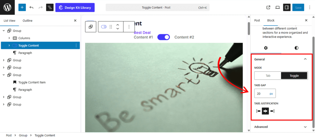
- Mode: Choose how the content switching behaves.
- Tab: Displays navigation as a horizontal or vertical list of labels. Clicking a tab instantly reveals its corresponding content while hiding the others.
- Toggle : Presents a “switcher” interface (often seen in pricing tables, e.g., Monthly vs. Yearly). This mode is optimized for binary choices where users flip between two primary content states.
- Tabs Gap: Adjust the spacing between the individual tab buttons or toggle labels to ensure they are distinct and easy to interact with.
- Tabs Justification: Control the horizontal alignment of your navigation labels. You can justify them to the Left, Center, Right, or Space Between to fill the entire width of the container.
Style ◑
Spacing
- Padding: Adjust the internal space between the edges of the block and the content inside it. This adds “breathing room” around your tabs and nested items, preventing the content from feeling cramped against the container’s borders.
- Margin Top: Define the specific amount of vertical space above the block. Use this to create a clear separation from the elements preceding it, such as a heading or an image.
- Margin Bottom: Control the vertical gap below the block. This ensures there is an appropriate distance between the Toggle Content and the next section of your page.
Border & Radius
- Border: Add a structural perimeter to the main container. You can customize the width, style, and color to give the block a clear boundary against your page background.
- Border Radius: Use the slider to transition from sharp, modern squares to soft, classic circles.Size: Independently scale the arrow icon within its box. You can create a “minimalist small arrow in a large box” or a “bold arrow that fills the frame.”
- Box Shadow: When the Box Shadow toggle is enabled, you can add depth and dimension to your container to make it “pop” off the page:
- Position: Choose Outline for a traditional drop shadow or Inset to make the shadow appear inside the container, creating a “pressed” effect.
- Horizontal & Vertical: Shift the shadow’s position along the X and Y axes to simulate a specific light source.
- Blur & Spread: Blur softens the edges of the shadow for a natural look, while Spread expands or contracts the overall surface area of the shadow.
- Shadow Color: Select the color and transparency (opacity) of the shadow effect.
Header Styles
The Header Styles panel allows you to customize the navigation area (the tabs or toggle switcher) of your block. These settings ensure the “triggers” for your content are visually distinct and perfectly aligned with your design system.
- Width: Define the horizontal span of the header area:
- Default: Stretches the header to the full 100% width of the parent container.
- Fit Content: Shrinks the header width to only occupy the space needed for the tab labels or toggle buttons.
- Padding: Adjust the internal spacing within the header. This controls how much room exists around the group of tabs, allowing for a more spacious or compact navigation bar.
- Margin Top / Bottom: Control the vertical clearance above the header and the gap between the header and the content area below it.
- Border: Add a stroke to the header container. This is often used to create a bottom “separator” line or a full box around the navigation buttons.
- Border Radius: Curvature settings for the header’s corners. Use this to create rounded “pill-shaped” navigation bars or subtle soft-edged containers.
- Color: Select a background fill for the entire header area. Applying a light gray or brand-tinted background can help distinguish the navigation labels from the content below.
Toggle Content Styles
- Typography
- Font Family & Size: Select the typeface and scale that best matches your site’s design system.
- Font Weight: Control the thickness (e.g., Bold for emphasis or Light for a modern look).
- Letter Case: Force the labels to Uppercase, Lowercase, or Capitalize without editing the form code.
- Decoration: Apply styles like Underline or Line-through if needed for specific design cues.
- Line Height & Letter Spacing: Fine-tune the vertical breathing room and horizontal character density.
- Color
- Text Color: Sets the color for the labels on either side of the toggle.
- Button Default: Defines the color of the sliding toggle button when it is in the inactive or initial position.
- Button Active: Sets the color of the sliding toggle button when it is moved to the “on” or active position.
- Background Default: The color of the switcher track (the area behind the button) in its starting state.
- Background Active: The color of the switcher track when the toggle is switched to the active state.
Toggle Content Item
The Toggle Content Item is a flexible, nested container used within the Toggle Content parent block. Each item represents a unique block of information that is revealed only when its corresponding tab or toggle switch is selected.
Settings ⚙
General
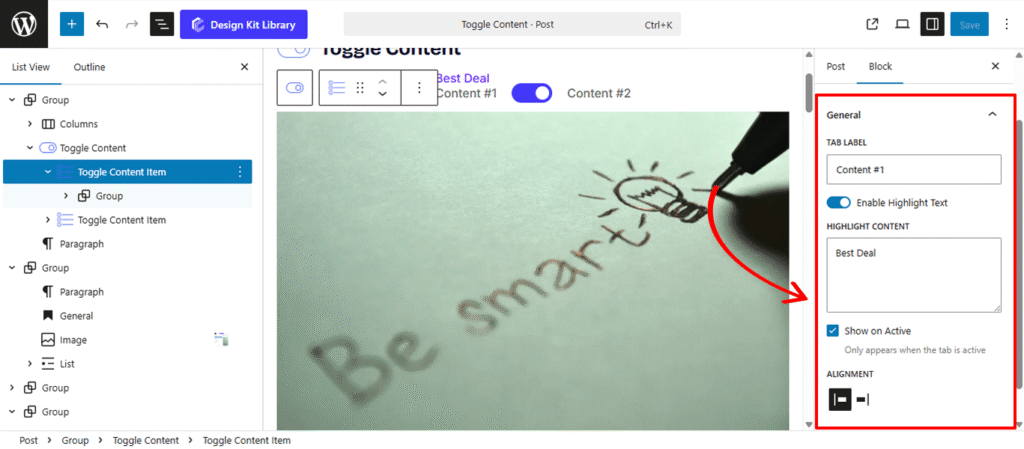
- Tab Label: Enter the text that will appear on the navigation tab or toggle button for this specific item (e.g., “Monthly” or “Features”).
- Enable Highlight Text Activate this to add a secondary, attention-grabbing piece of text to the tab, such as a “Save 20%” or “New” badge.
- Highlight Content: Input the specific text you want to display as the highlight. This is ideal for short, impactful callouts.
- Show on Active: When checked, the highlight text will only be visible when this specific tab is selected. This helps keep the navigation clean while drawing focus to the active choice.
- Alignment: Choose the placement of the highlight text relative to the main tab label, positioning it to the Left or Right.
Style ◑
Highlight Content Styles
- Padding: Adjust the internal space within the highlight badge to control its size and the “breathability” of the text.
- Border: Add a stroke around the highlight to make it pop. You can customize the color and thickness to match your brand.
- Border Radius: Control how rounded the badge corners are. Use 0px for a sharp rectangle or a higher value for a pill-shaped badge.
- Typography
- Font Family & Size: Select the typeface and scale that best matches your site’s design system.
- Font Weight: Control the thickness (e.g., Bold for emphasis or Light for a modern look).
- Letter Case: Force the labels to Uppercase, Lowercase, or Capitalize without editing the form code.
- Decoration: Apply styles like Underline or Line-through if needed for specific design cues.
- Line Height & Letter Spacing: Fine-tune the vertical breathing room and horizontal character density.
- Vertical Offset: Fine-tune the up-or-down positioning of the highlight. This is useful for “floating” the badge slightly above the tab label.
- Horizontal Offset: Adjust the left-or-right positioning to perfect the spacing between the main label and the highlight content.
- Rotate: Add a slight tilt to the highlight badge. A small rotation (e.g., -5° or 10°) can create a more dynamic, “sticker-like” visual effect.
- Color
- Text Color: Set the color of the highlight font for maximum readability.
- Background Color: Select the fill color for the badge container. Using a contrasting color (like a vibrant red or green) is effective for drawing the user’s eye to special offers.