
Social Shares
The Social Shares block empowers your visitors to easily distribute your content across their own social networks. Unlike standard social icons that link to your profiles, this block generates dynamic sharing links for the current page, helping to increase your site’s reach and engagement.
Settings ⚙
General
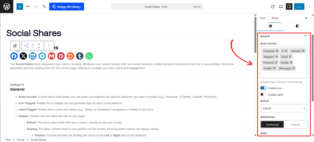
- Select Socials: A multi-select field where you can enter and organize the specific platforms you want to enable (e.g., Facebook, X/Twitter, LinkedIn, Pinterest).
- Icon (Toggle): Enable this to display the recognizable logo for each social platform.
- Label (Toggle): Enable this to show text labels (e.g., “Share on Facebook”) alongside or instead of the icons.
- Display: Choose how the share bar sits on your page:
- Default: The block stays inline with your content, moving as the user scrolls.
- Floating: The block remains fixed in one position on the screen, ensuring share options are always visible.
- Position: Choose whether the floating bar sticks to the Left or Right side of the viewport.
- Z-Index: Adjust the stack order to ensure the floating bar stays above other page elements like headers or popups.
- Orientation: Set your share buttons to stack Horizontally (ideal for the top/bottom of articles) or Vertically (ideal for floating sidebars).
- Align: Control the horizontal placement of the icons within their container (Left, Center, or Right).
- VGap & HGap: Granularly adjust the Vertical and Horizontal spacing between each share button to perfect the layout’s density.
- Wrap Icons: A responsiveness setting that automatically wraps buttons vertically on smaller screens, preventing horizontal overflow on mobile devices.
- Open Link in New Tab: When checked, social share windows will open in a separate tab, keeping your website open in the user’s original tab.
- Mark as No Follow: Adds the
rel="nofollow"attribute to the share links, instructing search engines not to pass SEO authority to the social platforms.
Style ◑
Wrapper Styles
- Padding: Adjust the internal spacing between the share buttons and the edge of the wrapper. This is particularly useful for creating a “pill” or “box” effect around your social set.
- Margin: Define the external clearance around the block. Use this to create distance from other page elements like text paragraphs or images.
- Border: Add a structural perimeter to the wrapper. You can customize the thickness, style, and color to better define the sharing area.
- Border Radius : Soften the corners of your container. Use a low value for a professional square look or a high value to create a fully rounded, pill-shaped container.
- Color:
- Background :Select the fill color for the wrapper container. You can use a solid brand color to draw attention, a neutral tone to blend in, or a semi-transparent background for a modern overlay effect on floating bars.
Icon Styles
- View: Select the base structure for your list items
- Default: A clean, standard layout where the icon and label sit directly on the page background.
- Stacked: Places each social share item inside a defined container (box), creating a distinct button-like appearance.
- Box Width & Height: Active only when View is set to Stacked. Manually define the dimensions of the button container to ensure all social items have a uniform and symmetrical look.
- Padding: Control the internal spacing within each social item. This ensures your icons and labels have enough “breathing room” inside their containers.
- Border: Add a stroke around each individual social button to provide more definition against your site’s background.
- Border Radius: Adjust the corner curvature of the buttons—ranging from sharp squares to fully rounded pills.
- Icon Size: A precise slider to scale the social logos. This ensures the brand symbols are legible and proportionally balanced with the accompanying text.
- Use Brand Color (Checkbox): When enabled, the block automatically applies the official colors of each social platform (e.g., Facebook Blue, Pinterest Red).
- Color: This setting is active only when Icon Color Layout is set to Custom.
- Icon Color: Set a custom color for the social logo (active only when Use Brand Color is unchecked).
- Label Color: Define the default color for the text accompanying the icon.
- SVG/Label Hover: Choose the color shift for both the icon and text when a user hovers over the button.
- Background: Select the default fill color for the button container (ideal for creating a unified theme).
- Background Hover: Select the color that fills the button container when a user’s cursor passes over it.
- Border Hover: Define a unique color for the button’s stroke during the hover state.