
Slider

Foo
I expected the usual bugs and confusion, but everything worked perfectly. I’m honestly a little concerned.

Bar
I didn’t read the instructions and it still worked perfectly. That’s when I knew it was good.


The Slider block is an immersive media tool designed to showcase high-impact imagery, featured content, or promotional banners. It provides a dynamic way to present multiple items in a single viewport, allowing users to engage with your content through a smooth, interactive experience. The Slider block acts as a parent container with a Slide block nested inside it; these individual slides are fully customizable and can house any block—from text and buttons to complex layouts—giving you total creative freedom over each frame.
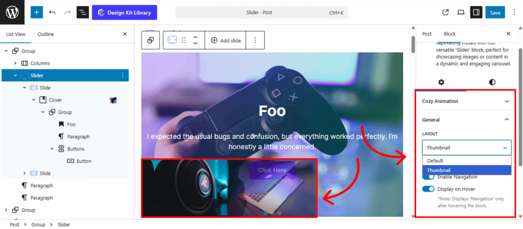
The Slide block is the individual frame within your slider. When the parent Slider is set to Thumbnail layout, you can define the specific image or icon for each slide’s preview directly within the Slide block’s settings. This ensures each thumbnail accurately represents the unique content of that specific slide.
Settings ⚙
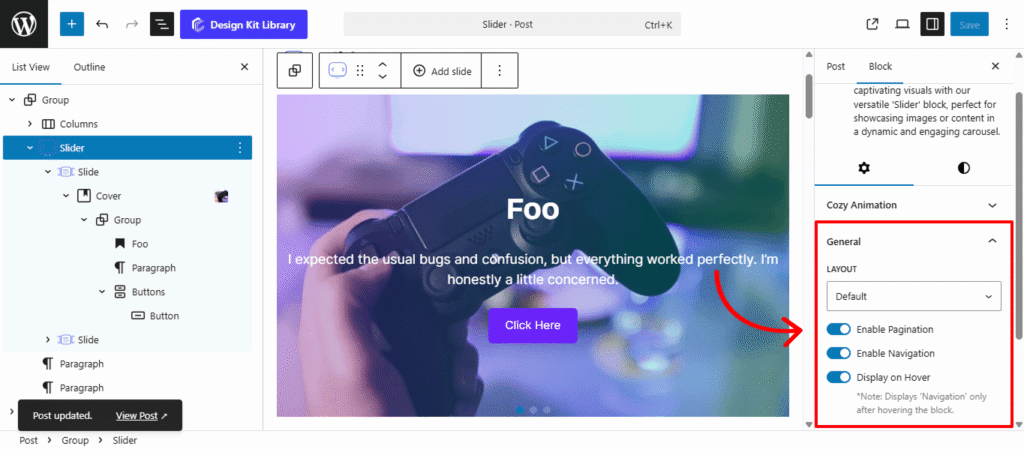
General
- Layout: Choose the structural navigation style for your slider:
- Default: A clean, standard slider that focuses on the main content with simple navigation controls.
- Thumbnail: Enhances the slider with a secondary row of smaller preview images at the bottom, allowing users to jump directly to specific slides via visual cues.
- Enable Pagination: Activate this to add dots or numbers at the base of the slider, providing a visual progress indicator for your users.
- Enable Navigation: Displays “Next” and “Previous” arrows, giving users manual control to browse through your slides at their own pace.
- Display on Hover: A visibility toggle that keeps the navigation arrows and pagination hidden by default, only revealing them when a user moves their cursor over the slider. This is perfect for maintaining a minimalist design while keeping functionality accessible.
Slider Options
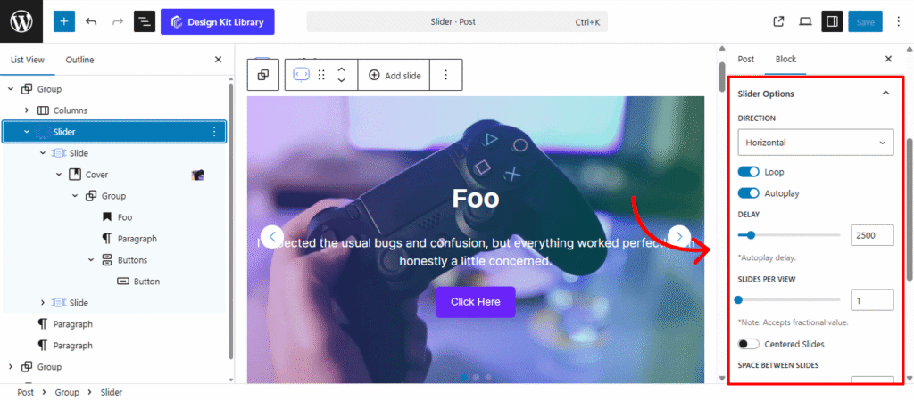
- Direction (Horizontal / Vertical): Choose the axis of movement.
- Horizontal is the classic side-to-side transition.
- Vertical creates a stacked scrolling effect, ideal for hero sections or unique landing pages.
- Height (Vertical Only): When the vertical direction is active, use this to define the specific height of the slider container, ensuring it fits perfectly within your page section.
- Loop (Toggle): Enable this to allow the slider to return to the first slide automatically after the last one, creating an infinite, seamless loop.
- Autoplay (Toggle): Set the slider to advance automatically without manual input.
- Delay: Define the duration (in milliseconds) each slide stays on screen before moving to the next.
- Slides Per View: Determine how many individual slides are visible at once within the container.
- Space Between Slides: Adjust the pixel gap between each slide to prevent content from feeling crowded.
- Speed: Control the duration of the transition animation itself, allowing for a snappier jump or a slow, cinematic glide.
- Slide Effect: Select the visual animation style used when moving between slides:
- Default: A standard linear slide.
- Fade: The current slide gently disappears as the next one appears.
- Cover Flow: A 3D effect where side slides are angled and the center slide is prominent.
- Cube: Transitions the slides as if they are faces on a rotating 3D cube.
- Cards: A “stacking” effect where slides slide over one another like a deck of cards.
Thumbnail Options
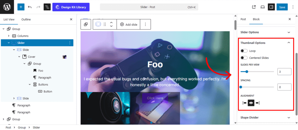
The Thumbnail Options panel is only available when the Thumbnail layout is selected. These settings allow you to control the behavior and arrangement of the preview images located at the bottom of your main slider, ensuring a seamless navigation experience.
- Loop (Toggle): When enabled, the thumbnail track will scroll infinitely. Reaching the last thumbnail will automatically bring you back to the first, mirroring the behavior of the main slider.
- Centered Slides (Toggle): Activating this ensures the thumbnail corresponding to the active slide is always positioned in the center of the thumbnail track.
- Slides Per View: Define how many thumbnail previews are visible at once. This helps you manage screen real estate, especially on smaller devices.
- Spacing: Adjust the pixel gap between each thumbnail to prevent the previews from feeling cluttered.
- Alignment: Set the horizontal orientation of the entire thumbnail track. You can toggle between Left, Center, or Right to align the navigation with your site’s header or content margins.
Shape Divider
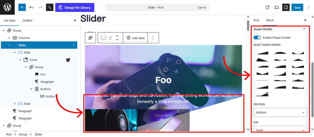
The Shape Divider settings allow you to break away from standard straight lines by adding decorative SVG layers to the edges of your block. These shapes create smooth, organic, or geometric transitions between different sections of your page.
- Enable Shape Divider: A toggle to activate the decorative layer. Once turned on, you can choose from a variety of unique silhouettes to frame your content.
- Select Shape Divider: Choose from a curated library of SVG designs, ranging from soft waves and jagged mountains to clean diagonal slants and curved “bubbles.”
- Position: Determine which edge of the container the shape should anchor to:
- Top: Places the design at the upper boundary, ideal for transitioning from a previous section.
- Bottom: Places the design at the lower boundary, perfect for leading the user’s eye into the next block.
- Flip: Mirror the shape horizontally to change its direction:
- Left/Right: Swaps the orientation of the SVG, allowing you to create asymmetrical designs or ensure the “flow” of a wave matches your layout’s focal point.
Style ◑
Pagination Styles
- Vertical Positioning: Fine-tune the vertical offset to control how far the pagination sits below the testimonial content.
- Gap: Adjust the specific spacing between each individual pagination dot.
- Align: Set the horizontal placement of the indicators. Toggle between Left, Center, or Right to balance the layout.
- Default / Active (Toggle)
- Default:
- Width & Height: Define the base size of the inactive indicators.
- Border Radius: Control the shape, from sharp squares to perfect circles.
- Active:
- Width & Height: Increase these values to make the active slide indicator physically larger or longer (e.g., a “pill” shape) for better visibility.
- Border & Border Offset: Add an outline to the active dot and use the offset to create a “halo” effect (spacing between the dot and its border).
- Border Radius: Independently adjust the curvature of the active indicator.
- Default:
- Color:
- Default: The color of inactive indicators.
- Default Hover: The color shift when a user moves their cursor over an inactive dot.
- Active: The primary color for the dot representing the current slide.
- Active Default: The color of the active dot when hovered.
- Active Border: The specific color of the stroke surrounding the active indicator.
Navigation Styles
- Box Width & Height: Define the clickable area surrounding the navigation arrows. Creating a larger box ensures your gallery is touch-friendly and easy to navigate on mobile devices.
- Border: Add a structural outline to your navigation boxes. This is ideal for “Ghost Button” styles where the background is transparent.
- Border Radius: Use the slider to transition from sharp, modern squares to soft, classic circles.
- Size: Independently scale the arrow icon within its box. You can create a “minimalist small arrow in a large box” or a “bold arrow that fills the frame.”
- Color
- Icon & Icon Hover: Set the color of the arrow itself. Providing a high-contrast hover color gives the user immediate tactile feedback.
- Background & Background Hover: Control the fill color of the navigation box.
Shape Divider Styles
Once you have enabled and selected your shape, the Style settings allow you to integrate the divider seamlessly into your page design. These controls ensure the transition between sections feels intentional and polished.
- Margin 🔗: Fine-tune the spacing around the divider.
- Height: Adjust the vertical scale of the SVG shape. Increase the height for a dramatic, sweeping transition (like high mountain peaks) or decrease it for a subtle, modern ripple.
- Color: Choose the specific fill color for the shape divider. This is typically set to match the background color of the adjacent section, creating a “cut-out” effect that masks the straight edge of the container.