Progress Bar
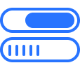
The Progress Bar is a versatile block designed to visualize activity completion through a user-defined numerical value. It features three distinct architectural modes: Default for standard horizontal tracking, Circle for radial or “doughnut” style data representation, and Vertical for upright bar layouts. Once a progress value is input, the component dynamically renders the percentage across the selected variant to provide immediate, scalable visual feedback.
Settings ⚙
Progress Bar
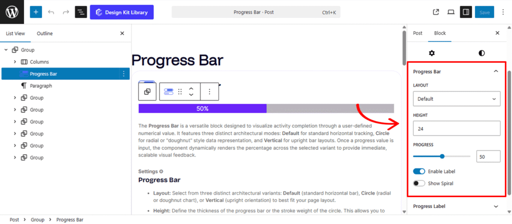
- Layout: Select from three distinct architectural variants: Default (standard horizontal bar), Circle (radial or doughnut chart), or Vertical (upright orientation) to best fit your page layout.
- Height: Define the thickness of the progress bar or the stroke weight of the circle. This allows you to create either subtle, thin indicators or bold, high-impact visual elements.
- Progress: A precision slider that allows you to set the exact completion percentage, dynamically updating the bar’s fill in real-time.
- Enable Label (Toggle): Activating this overlay displays the numerical value or percentage directly on or beside the progress bar for immediate data clarity.
- Show Spiral (Toggle): Adds a dynamic, “spiral” motion effect within the progress fill, creating an engaging animation that signals an active or ongoing process.
Progress Label
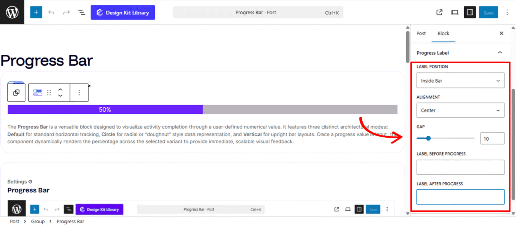
The Progress Label settings allow you to display numerical data or descriptive text directly alongside your progress visualization. These options dynamically adjust based on your selected layout(default or circle).
- Label Position (Default Layout Only): Choose between Inside Bar for a compact, integrated look where the text sits within the fill, or Outside Bar to place the label above or below the component for maximum legibility.
- Alignment (Default Layout Only): Precisely position your label across the horizontal axis:
- Left / Center / Right: Snaps the label to a specific anchor point.
- Spread: Distributes the “Label Before” and “Label After” content to opposite ends of the bar, creating a clean, balanced professional look.
- Label Before Progress: Input custom text or symbols to appear to the left of your numerical value (e.g., “Status:”).
- Label After Progress: Append text or units to the right of your value (e.g., “% Complete” or “GB”).
Style ◑
Container Styles
The Container Styles section allows you to define the structural aesthetics of the Progress Bar’s outer shell. These settings ensure the component integrates seamlessly with your page’s design language.
- Padding🔗: Adjust the internal spacing between the progress element and the container’s edge. This is essential for creating “breathing room” or a boxed-in look for your progress bars.
- Border Controls: (Visible when Border Type is set to anything other than “None”)
- Border Type: Choose your stroke style (e.g., Solid, Dashed, Dotted).
- Border Width: Define the thickness of the container’s frame.
- Border Color: Select the specific hue for the border to match your brand palette.
- Border Radius 🔗: Soften the corners of your container. Use a low value for a professional square look or a high value to create a fully rounded, pill-shaped container.
- Color: Set the fill color for the empty portion of the progress track, providing a visual “track” for the progress fill to move along.
Progress Bar Styles
The Progress Bar Styles settings control the appearance of the active “fill” that represents your completion percentage. While the Container Styles define the track, these settings focus on the dynamic element itself.
- Border Radius🔗: Define the corner curvature for the progress fill. You can sync this with the container’s radius for a uniform look or use a different value to create a distinct, nested shape within the track..
- Color: Select the color of the active progress indicator. This allows you to use brand-specific colors or status-based signaling (e.g., using blue for “In Progress” or green for “Complete”) to provide clear visual communication to the user.
Typography
The Typography settings provide full creative control over the progress percentage text, ensuring the data is both legible and stylistically aligned with your project. You can refine the font family, weight, and size to make the numerical value a prominent focal point or a subtle indicator.
- Typography
- Font Family & Size: Select the typeface and scale that best matches your site’s design system.
- Font Weight: Control the thickness (e.g., Bold for emphasis or Light for a modern look).
- Letter Case: Force the labels to Uppercase, Lowercase, or Capitalize without editing the form code.
- Decoration: Apply styles like Underline or Line-through if needed for specific design cues.
- Line Height & Letter Spacing: Fine-tune the vertical breathing room and horizontal character density.
- Color: Controls the color of the numerical progress value, allowing you to highlight the data point with a contrasting or brand-aligned shade.
Label Typography
The Label Typography settings allow you to define the visual character of the descriptive text surrounding your progress data. By adjusting the font family, size, and weight, you can ensure that your custom labels—such as “Task Completion” or “Storage Used”—are clearly distinguishable from the numerical percentage while maintaining a cohesive design throughout the block.
- Typography
- Font Family & Size: Select the typeface and scale that best matches your site’s design system.
- Font Weight: Control the thickness (e.g., Bold for emphasis or Light for a modern look).
- Letter Case: Force the labels to Uppercase, Lowercase, or Capitalize without editing the form code.
- Decoration: Apply styles like Underline or Line-through if needed for specific design cues.
- Line Height & Letter Spacing: Fine-tune the vertical breathing room and horizontal character density.
- Color: Defines the color for the descriptive text labels (e.g., “Label Before” or “Label After”), ensuring they remain legible against your background.