
Pricing Table
Base
Ideal for enterprises and large-scale projects.
$9.99
/month
- Role Based Permissions
- Outcome Reporting
- Service Level Agreement Rules
- Live Chat for Support
Features
Premium
Ideal for enterprises and large-scale projects.
$99.99
/month
- Role Based Permissions
- Outcome Reporting
- Service Level Agreement Rules
- Live Chat for Support
Features
Intermediate
Ideal for enterprises and large-scale projects.
$49.99
/month
- Role Based Permissions
- Outcome Reporting
- Service Level Agreement Rules
- Live Chat for Support
Features
The Pricing Table block is a powerful, conversion-focused tool designed to showcase your service tiers with clarity and impact. Built with a modular architecture, it allows you to toggle and fine-tune every component—from eye-catching promotional “Featured” tags to deep technical SEO settings—ensuring your plans are as persuasive as they are professional.
Settings ⚙
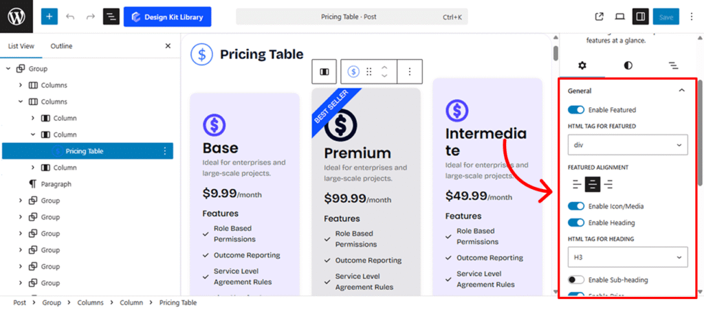
- Enable Featured (Toggle): This allows you to add a prominent “ribbon” or badge to the top of the table. It is ideal for highlighting specific tiers with text like “Best Seller,” “Popular,” or “Recommended” to guide users toward your preferred plan.
- Icon (Toggle): When enabled, this adds a visual graphic above your heading. You can use this to visually differentiate plans—for example, a “Starter” icon for your basic plan and a “Pro” icon for your premium tier.
- Heading (Toggle & Tag Selector): This activates the main title of your pricing plan. Once enabled, you can select the specific HTML tag (<h1> through <h6>, <p>, or <div>). This is crucial for SEO and Accessibility, ensuring your plan names are weighted correctly in the page’s document structure.
- Sub-Heading (Toggle & Tag Selector): Adds a secondary line of text beneath the main heading. Like the primary heading, you can choose its HTML tag (<h1> through <h6>, <p>, or <div>). This is perfect for short taglines that explain who the plan is for, such as “Perfect for small teams.”
- Price (Toggle & Layout Switch): This enables the numeric cost of the plan. It includes a toggle to switch between Inline (keeping the currency symbol and price on a single horizontal line) or Block (stacking elements vertically for a more dramatic, bold appearance).
- Description (Toggle): Enables a dedicated text area to provide a brief overview of the plan’s value proposition. Use this to summarize the core benefit of the plan before the user dives into the detailed feature list.
- Button (Toggle): Activates the primary Call-to-Action (CTA) at the bottom of the table. This is the final conversion point, where you can customize the text (e.g., “Get Started,” “Buy Now”) to prompt user engagement.
Icon & Media Settings
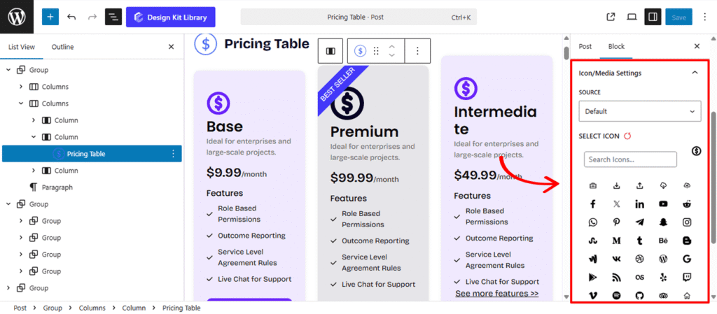
When the Icon toggle is enabled within the Pricing Table, the Icon/Media Settings panel allows you to define the visual branding of your plan.
- Source: Choose between Icon or Media.
- Icon: Select this to use a lightweight, scalable vector icon from the built-in library.
- Media: Select this if you prefer to upload a custom image, brand logo, or unique illustration to represent the plan.
- Select Icon: If the “Icon” source is chosen, this opens an icon picker where you can browse and search for the perfect symbol (such as a rocket, shield, or star) to sit at the top of your pricing card.
List Settings
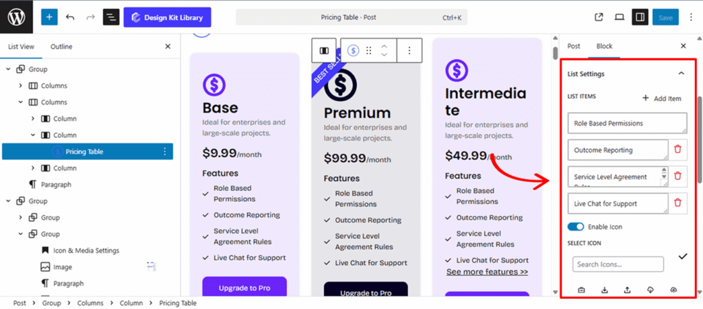
When the List toggle is enabled within the Pricing Table, the List Settings panel is the engine of your Pricing Table, allowing you to clearly communicate the specific value and “perks” of each plan.
- Item Management: Add, Remove, or Edit individual list items. This allows you to scale the length of your feature list dynamically based on the complexity of the plan.
- Icon Control (Toggle & Selection): Enable a dedicated Icon for your list items to act as bullet points. You can select a unique icon—such as a checkmark for included features or an “X” for excluded ones—from the integrated library.
- Icon Position: Choose between Left or Right placement for your icons. This allows you to create standard bulleted lists or more modern, right-aligned layouts.
- List Gap: Adjust the vertical spacing between each list item to ensure the text has enough breathing room and remains highly scannable.
- List Justification: Control the horizontal alignment of the entire list. You can set this to Left, Center, or Right to match the overall alignment of your pricing card.
- AJAX Loader & Label: Enable an AJAX Loader for a dynamic user experience. This allows you to display a custom Loader Label (e.g., “Updating features…”) while the list content is being fetched or refreshed.
- Show & Load Count: These settings allow you to manage long lists. Use Show Count to display the total number of items, and Load Count to determine how many items are initially visible before a “Load More” action is triggered.
- Justification: A secondary alignment control used to ensure that the list container sits perfectly within the boundaries of the pricing table block.
Button Settings
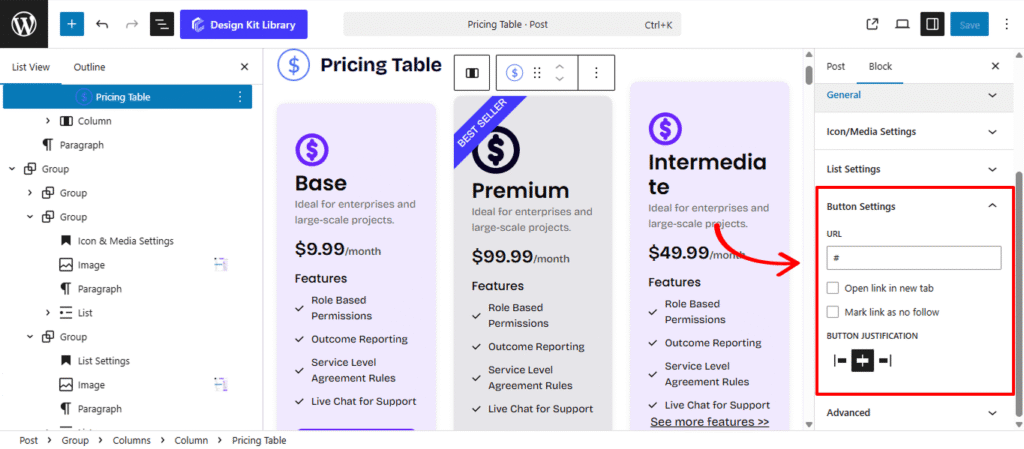
The Button Settings panel manages the primary Call-to-Action (CTA) for your pricing plan. When enabled, this button serves as the final conversion point, directing users to a checkout page, a contact form, or a specific product URL.
- URL: Enter the destination link where you want to send users when they click the button. This is typically the “Sign Up” or “Purchase” link for the specific plan.
- Open Link in New Tab: When this checkbox is selected, the link will open in a separate browser tab (target=”_blank”). This is highly recommended if you are sending users to an external site or a third-party checkout provider, as it keeps your pricing page open in the background.
- Mark Link as No-Follow: By checking this box, you add the rel=”nofollow” attribute to the link. This tells search engines not to pass “link juice” (SEO authority) to the destination page, which is a common practice for paid or promotional links.
- Button Justification: Control the horizontal placement of the button within the pricing card. You can align it to the Left, Center, or Right, or set it to Stretch to fill the entire width of the table for maximum visibility.
Style ◑
Spacing
- Padding: Adjust the internal spacing of the pricing card. Increasing the padding pushes the content away from the edges, creating a more airy, premium feel for your plans.
- Margin Top & Margin Bottom: Control the external distance between the pricing table and the elements above or below it. This allows you to stack multiple tables or separate them from section headings with ease.
- Overflow (Default, Visible, Hidden): This toggle manages how content behaves if it exceeds the boundaries of the table container.
- Default: Uses the browser’s standard behavior for the element.
- Visible: Ensures all elements— that might overlap or hang off the edge— remain fully visible to the user.
- Hidden: Clips any content that extends beyond the card’s border. This is particularly useful for maintaining clean lines or when using advanced CSS animations.
Border & Shadow
- Border: Sets the thickness, style, and color of the pricing card’s outline. You can use a subtle border for standard plans and a thicker, colored border to highlight a “Featured” or “Premium” tier.
- Radius: Controls the roundness of the corners. A value of 0 creates sharp, professional edges, while a higher value creates soft, rounded corners that give the table a friendly, modern app-like feel.
- Enable Box Shadow (Toggle): Activating this adds a layer of depth to your pricing table, helping it “lift” off the page and grab the user’s attention.
- Shadow Position: Choose between Outline (the shadow appears outside the card, creating a glow or lift effect) or Inset (the shadow appears inside the card, creating a “pressed-in” or recessed look).
- Horizontal & Vertical: These sliders control the direction of the shadow. Use the Horizontal offset to move the shadow left or right, and the Vertical offset to move it up or down, simulating a specific light source.
- Blur: Adjusts how sharp or soft the shadow is. A high blur creates a soft, natural ambient shadow, while a low blur creates a crisp, hard-edged shadow.
- Spread: Controls the size of the shadow. A positive spread expands the shadow beyond the size of the card, while a negative spread shrinks it.
- Color: Defines the color and transparency of the shadow. For a realistic look, use a semi-transparent dark grey; for a bold, artistic look, you can match the shadow color to your brand’s primary palette.
Featured Styles
The Featured Styles panel is designed to highlight your most important plans. This section controls the “Featured” tag (such as “Best Seller” or “Most Popular”) that sits at the top of your pricing card, allowing you to create eye-catching badges or ribbons that drive user conversion.
- Padding: Adjust the internal spacing of the featured title. Increasing the padding pushes the content away from the edges, creating a more airy, premium feel for your plans.
- Margin Top & Margin Bottom: Control the external distance between the title and the elements above or below it.
- Border & Radius: Define a Border to outline your tag for extra emphasis. Use the Border Radius to create sharp rectangular badges, rounded “pills,” or even a circle if the text is short enough.
- Enable Box Shadow (Toggle): Activating this adds a layer of depth to your featured title, helping it “lift” off the page and grab the user’s attention.
- Shadow Position: Choose between Outline (the shadow appears outside the card, creating a glow or lift effect) or Inset (the shadow appears inside the card, creating a “pressed-in” or recessed look).
- Horizontal & Vertical: These sliders control the direction of the shadow. Use the Horizontal offset to move the shadow left or right, and the Vertical offset to move it up or down, simulating a specific light source.
- Blur: Adjusts how sharp or soft the shadow is. A high blur creates a soft, natural ambient shadow, while a low blur creates a crisp, hard-edged shadow.
- Spread: Controls the size of the shadow. A positive spread expands the shadow beyond the size of the card, while a negative spread shrinks it.
- Color: Defines the color and transparency of the shadow. For a realistic look, use a semi-transparent dark grey; for a bold, artistic look, you can match the shadow color to your brand’s primary palette.
- Typography
- Font Family & Size: Select the typeface and scale that best matches your site’s design system.
- Font Weight: Control the thickness (e.g., Bold for emphasis or Light for a modern look).
- Letter Case: Force the labels to Uppercase, Lowercase, or Capitalize without editing the form code.
- Decoration: Apply styles like Underline or Line-through if needed for specific design cues.
- Line Height & Letter Spacing: Fine-tune the vertical breathing room and horizontal character density.
- Position
- Default: The tag behaves as a standard block, occupying 100% width of the card and sitting in line with other elements.
- Absolute: This unlocks “free-floating” mode, allowing you to place the tag anywhere on the card without affecting the layout of the other elements.
- Align (Left / Right): Quickly snap your badge to either the top-left or top-right corner of the pricing table.
- Vertical Align: Manually adjust the vertical spacing to nudge the badge higher or lower. This is perfect for “hanging” a ribbon slightly over the top edge of the card.
- Horizontal Align: Fine-tune the horizontal spacing. Depending on your Left/Right alignment, this adds space to perfectly inset the badge from the edges.
- Rotate: Add a creative tilt to your badge. By rotating the tag, you can create a classic diagonal ribbon look in the corner of your pricing plan.
- Color
- Text: Defines the color palette for your Featured tag. You can set a specific Text color to ensure your “Best Seller” message is crisp and legible.
- Background: A Background color to make the badge contrast sharply against the rest of the pricing card.
Icon/Media Styles
The Icon & Media Styles panel gives you full creative control over the visual symbol at the top of your pricing card. Use these settings to ensure your branding elements—whether they are simple icons or custom media—are perfectly sized and framed within your layout.
- Padding: Use Padding to control the internal breathing room specifically for the Icon within its container.
- Margin Top & Margin Bottom: Use Margin Top and Margin Bottom to precisely position the entire media element relative to the “Featured” tag above it or the Heading below it.
- Border & Border Radius: Define an outline specifically for the Icon using the Border settings. The Border Radius slider allows you to transform the background or border of both icon or media element from a sharp square into a smooth circle or modern rounded tile.
- Box Width & Height: These settings define the size of the Icon’s housing. By setting a specific Box Width and Box Height, you can create uniform, perfectly centered containers for your icons across multiple pricing tables.
- Size: This controls the scale of the icon or media itself. You can make your symbols small and subtle for a minimalist look or large and bold to emphasize a specific plan’s personality.
- Color
- Text: You can set a specific Icon color to ensure your symbol is bold and legible.
- Background: A custom Background color to create a distinctive “tile” or circular frame that sits behind the icon.
Heading / Sub-Heading Styles
When the Heading and Sub-heading toggles are active, the pricing card transforms from a simple container into a structured content piece.
- Margin Top & Margin Bottom: Control the external distance between the heading/sub-heading and the elements above or below it.
- Typography
- Font Family & Size: Select the typeface and scale that best matches your site’s design system.
- Font Weight: Control the thickness (e.g., Bold for emphasis or Light for a modern look).
- Letter Case: Force the labels to Uppercase, Lowercase, or Capitalize without editing the form code.
- Decoration: Apply styles like Underline or Line-through if needed for specific design cues.
- Line Height & Letter Spacing: Fine-tune the vertical breathing room and horizontal character density.
- Color
- Text: Defines the color palette for your Heading/Sub-heading.
Pricing Styles
Enabling the Price toggle activates the price component, which consists of two distinct, editable fields: the Default (representing the numerical value and currency, e.g., $99) and the Separator (representing the billing frequency or descriptive suffix, e.g., /yearly). This dual-field structure allows for precise control over the presentation of your plan’s cost and its corresponding subscription interval.
- Margin Top & Margin Bottom: Control the external distance between the whole price element and the elements above or below it.
- Typography
- Font Family & Size: Select the typeface and scale that best matches your site’s design system.
- Font Weight: Control the thickness (e.g., Bold for emphasis or Light for a modern look).
- Letter Case: Force the labels to Uppercase, Lowercase, or Capitalize without editing the form code.
- Decoration: Apply styles like Underline or Line-through if needed for specific design cues.
- Line Height & Letter Spacing: Fine-tune the vertical breathing room and horizontal character density.
- Color
- Text: Defines the color palette for your price amount.
- Separator: Defines the color palette for your price separator.
Button Styles
The Button toggle must be active to access styling and configuration for the Pricing block’s primary call-to-action. As the final conversion point for the card, this element functions as a dynamic CTA button, allowing you to bridge the gap between plan comparison and user acquisition through customizable links and specialized interaction states.
- Padding: Use Padding to control the internal breathing room specifically for the Button element.
- Margin Top & Margin Bottom: Control the external distance between the whole price element and the elements above or below it.
- Width: The Width setting allows you to define the horizontal scale of the button by inputting specific values. This control is essential for ensuring visual consistency across your pricing grid, enabling you to set a Fixed Width (e.g., 200px) for a uniform look or a Percentage (e.g., 100%) to create a full-width button that spans the entire base of the pricing card..
- Border & Radius: Define a Border to outline your tag for extra emphasis. Use the Border Radius to create sharp rectangular badges, rounded “pills,” for the button.
- Typography
- Font Family & Size: Select the typeface and scale that best matches your site’s design system.
- Font Weight: Control the thickness (e.g., Bold for emphasis or Light for a modern look).
- Letter Case: Force the labels to Uppercase, Lowercase, or Capitalize without editing the form code.
- Decoration: Apply styles like Underline or Line-through if needed for specific design cues.
- Line Height & Letter Spacing: Fine-tune the vertical breathing room and horizontal character density.
- Color
- Text (Default & Hover): Define the primary color of the button label for its static state and a contrasting shade for when a user hovers over it to ensure maximum legibility.
- Background (Default & Hover): Set the base fill color of the button to match your brand and a secondary hover color to provide immediate visual feedback during user interaction.
- Border Hover: Customize the outline color specifically for the hover state, allowing you to create a “glow” or “highlight” effect that signals the button is active and clickable.
List Styles
The List Styles panel provides comprehensive design control over the features and benefits section of your pricing card. The List toggle must be enabled to access these granular styling options, which are divided into three primary layers: the List Wrapper, the Individual Items, and the Icons.
- Margin Top & Margin Bottom: Control the external distance between the whole list element and the elements above or below it.
- Toggle (Wrapper / List Item): Select Wrapper to style the entire list block as a single unit, or List Item to apply styles to each individual row within the list.
- Padding: Adjust the internal spacing to prevent text from crowding the container or item edges.
- Border & Border Radius: Define outlines and corner roundness. This is ideal for creating “striped” lists or individual boxed features.
- Toggle (Icon / Heading / Text): Switch between these three sub-sections to refine the specific components of your list items:
- Icon:
- Icon Box Width & Height: Define a consistent square or rectangular frame for your bullet icons.
- Icon Size: Scale the symbol (e.g., checkmark or star) within its frame.
- Icon Radius: Round the corners of the icon’s background to create circular or soft-square bullets.
- Heading
- Margin Top & Margin Bottom: Control the external distance between the whole list item and the elements above or below it.
- Typography
- Font Family & Size: Select the typeface and scale that best matches your site’s design system.
- Font Weight: Control the thickness (e.g., Bold for emphasis or Light for a modern look).
- Letter Case: Force the labels to Uppercase, Lowercase, or Capitalize without editing the form code.
- Decoration: Apply styles like Underline or Line-through if needed for specific design cues.
- Line Height & Letter Spacing: Fine-tune the vertical breathing room and horizontal character density.
- Text
- Typography
- Font Family & Size: Select the typeface and scale that best matches your site’s design system.
- Font Weight: Control the thickness (e.g., Bold for emphasis or Light for a modern look).
- Letter Case: Force the labels to Uppercase, Lowercase, or Capitalize without editing the form code.
- Decoration: Apply styles like Underline or Line-through if needed for specific design cues.
- Line Height & Letter Spacing: Fine-tune the vertical breathing room and horizontal character density.
- Typography
- Icon:
- Color
- Icon & Icon Background: Set the primary color for the icon symbol (e.g., a checkmark) and a separate background color for its containing box to create a high-contrast, “tiled” look.
- Heading: Define the specific color for the list’s title (e.g., “Core Features”) to distinguish it from the individual feature descriptions below.
- Text: Control the color of your list items’ descriptions, allowing you to use a softer shade than the heading for better visual hierarchy.
- Wrapper Background: Apply a fill color to the entire list container, which is useful for creating a “feature box” that stands out from the rest of the pricing card.
- List Item Background: Set a background color for each individual row within the list, enabling “zebra-striping” or highlighted rows for specific perks.
List View ☰
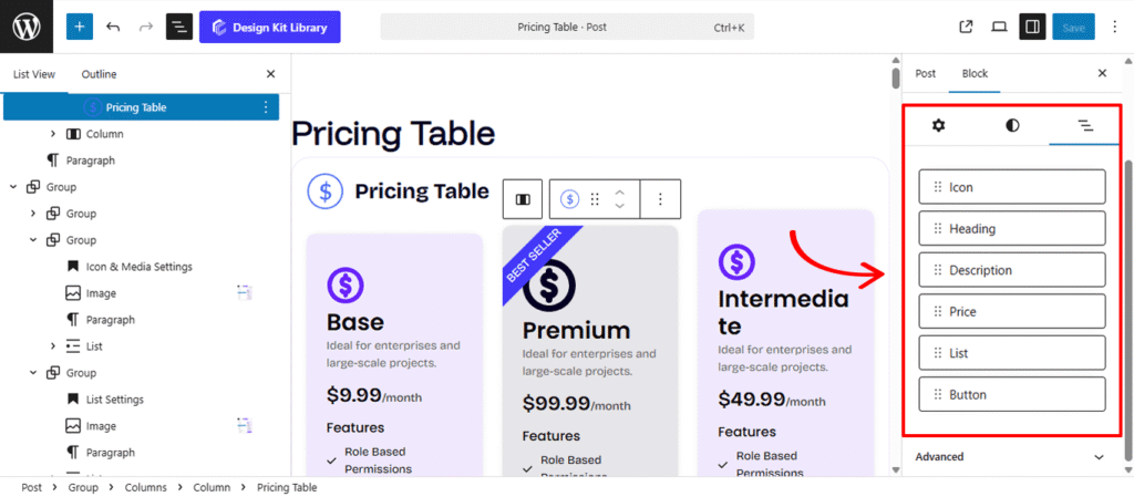
The List View tab allows you to easily rearrange inner blocks by dragging an element and dropping it into your desired position.