Icon Picker
The Icon Picker is a versatile tool that allows you to integrate high-quality vector graphics into your layout. With a library of over 250+ icons to choose from, you can visually represent features, services, or social links with pixel-perfect clarity.
Settings ⚙
General
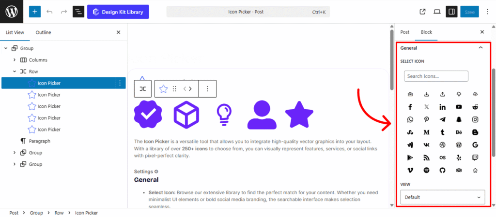
- Select Icon: Browse our extensive library to find the perfect match for your content. Whether you need minimalist UI elements or bold social media branding, the searchable interface makes selection seamless.
- View: Choose Default for a clean, standalone icon or Stacked to place the icon inside a background shape (circular or square).
- Layout: When in Stacked view, select Fill for a solid, high-contrast background or Outline for a sophisticated, transparent style with a thin border.
- Alignment: Position your icon exactly where it belongs in your layout—Left, Center, or Right—ensuring it balances perfectly with surrounding text or images.
- Add Link: Toggle this on to transform your icon into a functional button.
- URL: Define the destination for the click, whether it’s an internal page or an external site.
- Link Settings: Ensure a smooth user experience by checking Open Link in New Tab or protect your SEO by marking external links as No-Follow.
Style ◑
Icons Style
The Icon Styles panel offers fine-tuned control over the physical positioning and visual weight of your icons. These sliders allow you to move beyond standard alignment, giving you the precision needed to balance icons perfectly against adjacent text or containers.
- Custom Margins: Use the individual sliders for Top, Right, Bottom, and Left to create specific spacing around the icon.
- Icon Size: Scale the vector graphic up or down. A larger size is great for high-impact feature sections, while a smaller size works best for subtle UI hints.
- Opacity: Use the slider to soften the icon’s presence. Reducing opacity is a professional way to ensure the icon doesn’t visually compete with the primary title text.
- Icon Rotate: Add a dynamic touch by spinning the icon. This is particularly useful for directional arrows or creating a unique “offset” aesthetic for modern branding.
- Color Palette:
- Default: Set the primary color of the icon to match your brand.
- Hover: Define a secondary color that triggers when a user interacts with the block, providing immediate visual feedback.