

Featured Content Box
The Featured Content Box is a high-performance parent block designed to anchor your most important content in either a responsive Grid or an interactive Carousel. Operating through a sophisticated modular system, it manages the high-level layout logic while delegating content to nested Grid or Carousel Item blocks. This architecture ensures that your data structure remains intact even as you toggle between display modes, providing a seamless, scalable workflow for showcasing services, portfolios, or team profiles.
To match any design aesthetic, the block offers three distinct layout variations: Default for a clean hierarchical look, Stacked for added visual depth with layered secondary imagery, and Overlay for high-impact storytelling over dimmed background images. With granular controls for masonry behavior, column spacing, and responsive alignment, the Featured Content Box merges creative flexibility with architectural clarity, ensuring a polished and professional presentation across all device types.
Settings ⚙
General
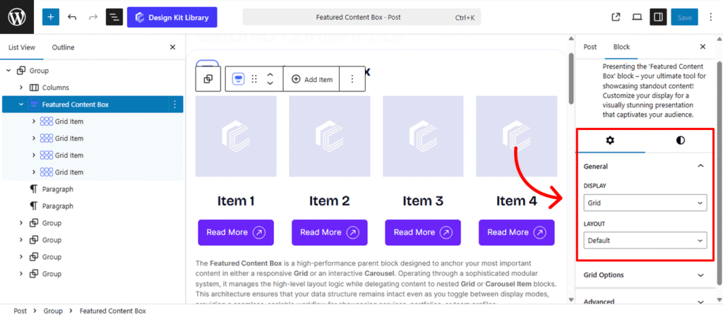
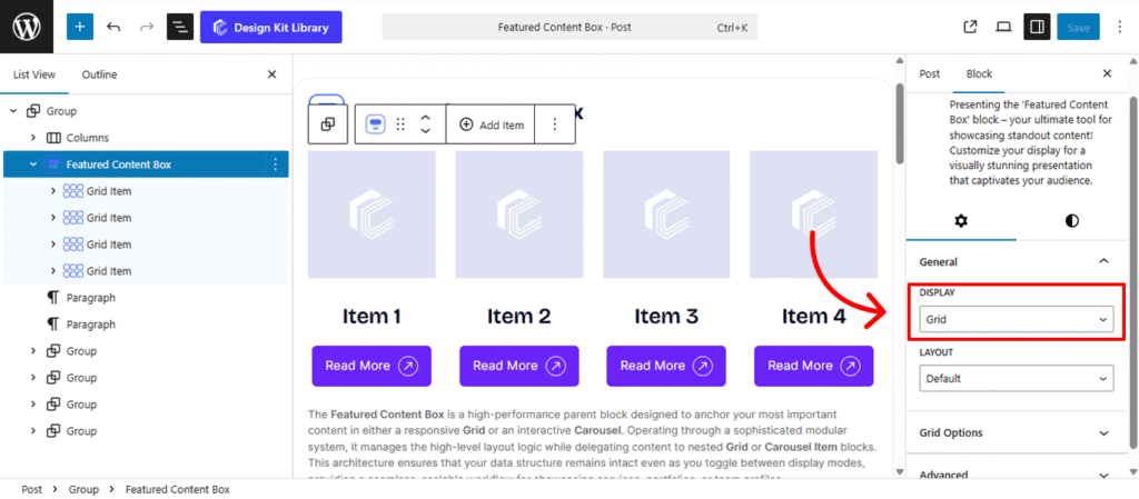
- Display Mode: Define the primary delivery method for your content items.
- Grid: Arranges items in a structured, multi-column format. This is ideal for “Our Services” or “Team” sections where all information should be visible at a glance.
- Carousel: Converts the items into an interactive, touch-friendly slider. This saves vertical space and is perfect for testimonials, portfolio highlights, or featured blog posts.
- Layout Variations: Choose the aesthetic framework that best fits your brand.
- Default: A clean, vertical stack featuring a primary image, title, description, and button.
- Stacked: Adds a sophisticated secondary image layer that sits slightly offset, providing a “3D” or layered modern design effect.
- Overlay: Places the text and button directly over the primary image(cover). This mode includes adjustable dimming and hover effects to ensure text remains legible against high-resolution photography.Enable Date & Week: Use these toggles to decide exactly what information is shown. You can choose to display the full date, include the day of the week, or both.
Grid Options
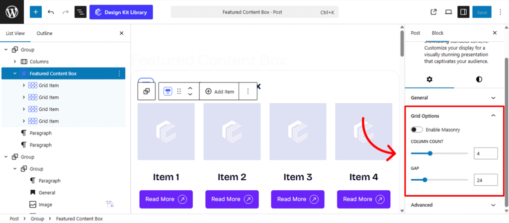
The Grid Options panel provides the structural framework for your content when the display mode is set to Grid. These settings allow you to define how many items are visible at once and how they interact with the surrounding whitespace.
- Enable Masonry: Toggle this on to create a dynamic, staggered layout. Unlike a standard grid where every row has a uniform height, Masonry allows items with varying content lengths to shift upward into empty spaces. This is perfect for Pinterest-style portfolios or blog feeds where image aspect ratios or text lengths differ.
- Column Count: Define the horizontal density of your grid. You can set the number of items per row to ensure your content is presented at the ideal scale—whether it’s a bold two-column feature or a detailed four-column service list.
- Gap: Control the “gutters” or gutters between your grid items. Adjusting the gap allows you to create a breathable, airy design with plenty of whitespace or a tight, seamless “tiled” look by reducing the value to zero.
Carousel Options
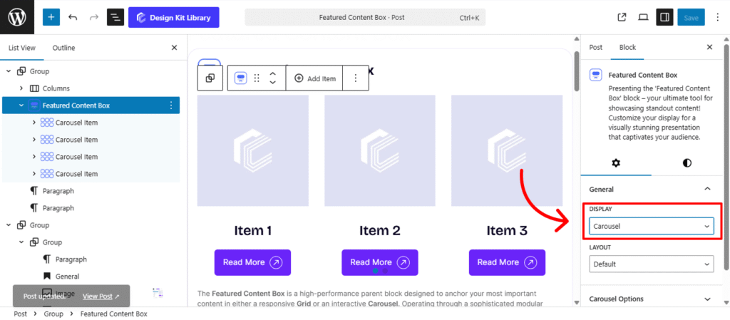
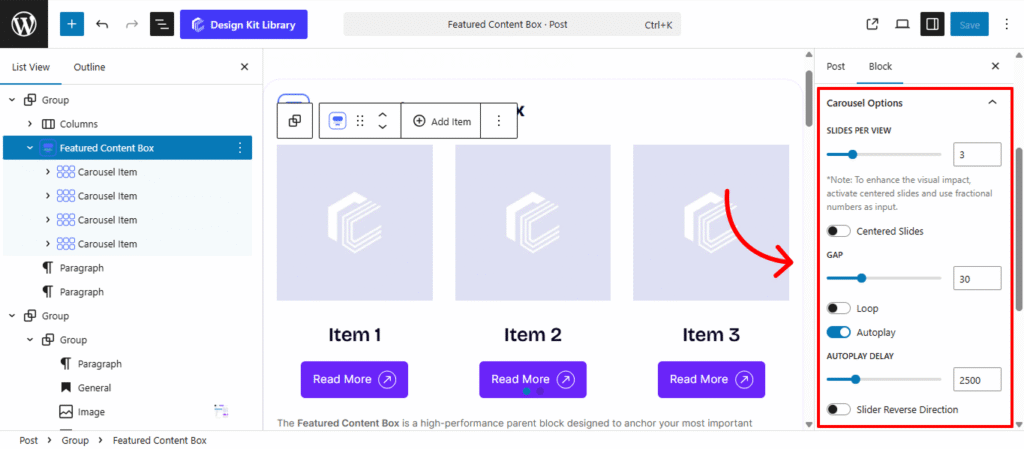
The Carousel Options panel converts your featured content into a dynamic, interactive slider. These settings allow you to control the movement, timing, and navigation of your content items to create a high-end, cinematic user experience.
- Slides Per View: Define how many content boxes are visible within the viewport at once. You can set this to a single hero item or multiple smaller cards to provide a “sneak peek” of upcoming content.
- Centered Slides: Toggle this to keep the active slide perfectly centered. This creates a focused focal point, often leaving partial slides visible on the left and right edges for a professional, “infinite” feel.
- Gap: Adjust the horizontal spacing between each slide. This ensures your content items remain distinct and don’t bleed into one another during transitions.
- Loop: Enable this to allow the carousel to wrap around infinitely, so the first slide follows the last without a “reset” animation.
- Autoplay: Set the carousel to advance automatically. You can define the Autoplay Delay (the pause between slides) and choose to Reverse Direction if you prefer a right-to-left flow.
- Speed: Control how quickly the slides physically move from one position to the next.
- Remove Slide Transition: Toggle this to disable the sliding animation entirely, resulting in an instant “snap” between items.
- Enable Pagination: Adds clickable dots or numbers at the bottom, allowing users to see their progress and jump to specific slides.
- Enable Navigation: Adds “Next” and “Previous” arrows to the sides of the carousel.
- Display on Hover: If navigation is enabled, you can hide the arrows by default and only reveal them when a user moves their cursor over the carousel area.
Style ◑
Container Styles
The Container Styles panel for the Featured Content Box allows you to define the outer spacing and positioning of the entire grid or carousel. This ensures that the section integrates harmoniously with the rest of your page layout, providing necessary separation from preceding and following blocks.
- Margin🔗: Controls the external space around the container, determining how it sits relative to other blocks.
The Link Tool 🔗: The chain icon connects all four sides to keep your design even. It is on by default; toggle it off to enter different values for each side (e.g., rounding only the top corners).
Demo


Item 1
Item 2
Item 3