
Date & Time
The Date & Time block provides a highly customizable way to display the current or scheduled date and time on your site. Use these settings to ensure the information is presented in a format that is both clear to your audience and consistent with your layout.
Settings ⚙
General
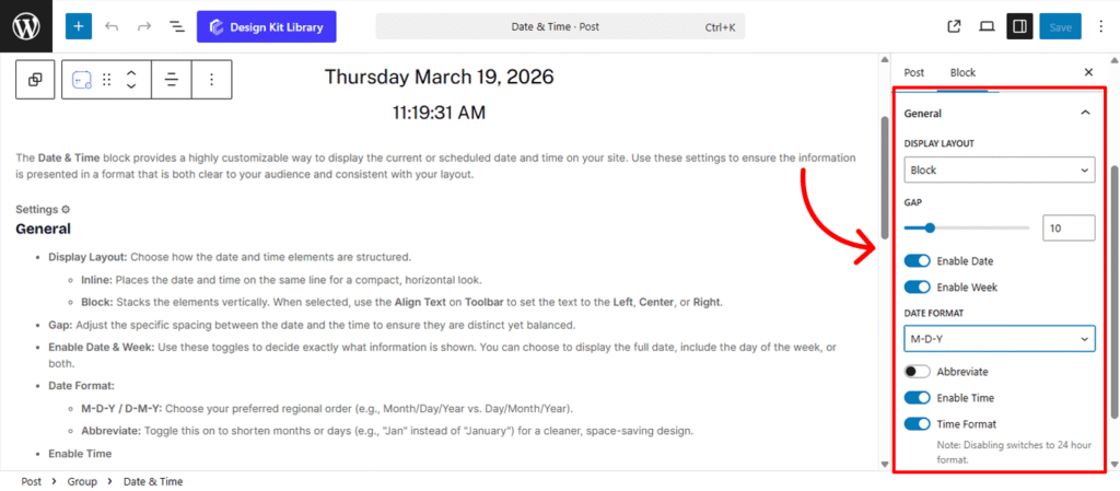
- Display Layout: Choose how the date and time elements are structured.
- Inline: Places the date and time on the same line for a compact, horizontal look.
- Block: Stacks the elements vertically. When selected, use the Align Text on Toolbar to set the text to the Left, Center, or Right.
- Gap: Adjust the specific spacing between the date and the time to ensure they are distinct yet balanced.
- Enable Date & Week: Use these toggles to decide exactly what information is shown. You can choose to display the full date, include the day of the week, or both.
- Date Format:
- M-D-Y / D-M-Y: Choose your preferred regional order (e.g., Month/Day/Year vs. Day/Month/Year).
- Abbreviate: Toggle this on to shorten months or days (e.g., “Jan” instead of “January”) for a cleaner, space-saving design.
- Enable Time
- Time Format: Toggle between a standard 12-hour format (with AM/PM) or disable it to switch to a 24-hour (military) format.
Style ◑
Container Style
The Container Styles panel allows you to define the aesthetic frame for your Date & Time display. These settings ensure the information doesn’t just sit on the page, but feels like a cohesive, designed element that matches your site’s branding.
- Container Padding🔗: Control the internal spacing between the date/time text and the edges of the container. Adding padding ensures your content has enough “breathability” and doesn’t feel cramped against the borders.
- Typography
- Font Family & Size: Select the typeface and scale that best matches your site’s design system.
- Font Weight: Control the thickness (e.g., Bold for emphasis or Light for a modern look).
- Letter Case: Force the labels to Uppercase, Lowercase, or Capitalize without editing the form code.
- Decoration: Apply styles like Underline or Line-through if needed for specific design cues.
- Line Height & Letter Spacing: Fine-tune the vertical breathing room and horizontal character density.
- Border Radius🔗: Define the curvature of the container’s corners. You can keep them sharp for a professional, corporate look, or increase the radius to create soft, rounded pods that feel modern and friendly. Linked by default for uniform symmetry.
- Colors
- Background Color: Set the fill color for the container. This is perfect for creating high-contrast “badges” or subtle tinted areas that draw the user’s eye.
- Text Color: Adjust the color of the date and time strings. Choosing a color that contrasts well with your background ensures maximum legibility across all devices.
Time Style
The Time Styles panel provides the same design controls found in the Container Styles, but with a specific focus on the time element. While the global Container Styles define the look for the entire block (both date and time), these settings allow you to override those defaults to give the Time its own unique visual identity.
The Link Tool 🔗: The chain icon connects all four sides to keep your design even. It is on by default; toggle it off to enter different values for each side (e.g., rounding only the top corners).