Cozy Container
Cozy Container Block
The Cozy Container acts as a high-performance evolution of the standard WordPress Group block, serving as a versatile structural wrapper for any content. It provides a more robust foundation for building complex layouts, allowing you to nest multiple blocks within a single, highly customizable environment that integrates seamlessly with your overall design.
This enhanced container unlocks professional-grade layout controls, including advanced CSS positioning—such as Relative, Absolute, Fixed, Sticky, or Unset—paired with Z-index management for precise layer stacking. Beyond structural positioning, it features a dedicated SVG Shape library for unique silhouettes and a dual-state styling engine that allows you to apply distinct backgrounds and borders for both Default and Hover states.
Settings ⚙
Container
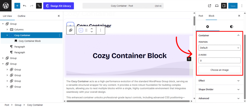
The Container Settings panel provides professional-grade control over how the Cozy Container behaves within your page layout. By moving beyond standard flow, you can create layered designs, “sticky” navigation elements, or perfectly centered overlays.
- Position: Define the CSS positioning method for the block.
- Default/Unset: The container follows the natural flow of the page.
- Relative: The container stays in the flow but can be nudged without affecting surrounding blocks.
- Absolute: The container is placed relative to its closest positioned parent, allowing for precise layering.
- Fixed: The container is pinned to the browser window and stays visible during scrolling.
- Sticky: The container remains in the natural flow of the page until it reaches a defined offset, at which point it “sticks” to the viewport and remains fixed within the boundaries of its parent element. Once the user scrolls past the bottom of the parent container, the block resumes its normal position, ensuring it never overlaps subsequent sections.
- Z-Index: Manage the vertical stacking order. Assign a higher value to ensure this container sits on top of other overlapping elements (like images or text).
- Placement (Fixed Only): When the position is set to Fixed, choose which corner or side of the viewport the container should anchor to (e.g., Top-Left, Bottom-Right).
- Vertical Positioning (Fixed Only): Fine-tune the specific vertical coordinate (top or bottom distance) to ensure the container sits exactly where needed on the Y-axis.
- Choose an Image: Set a custom background image for the container. This serves as the canvas for your nested blocks, allowing you to create hero sections or textured content areas.
Effects
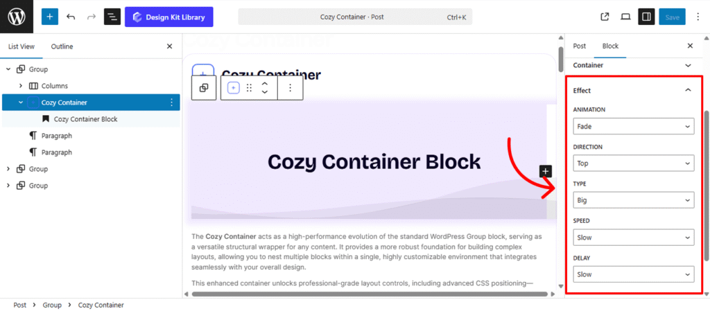
The Effects panel allows you to introduce motion and interactivity to your Cozy Container. By using subtle animations, you can draw attention to specific content and make your page feel more dynamic as users scroll or interact with the block.
- Animation: Choose the entry style for the container.
- None: The container appears statically without any motion.
- Fade: The container smoothly transitions from transparent to fully visible as it enters the viewport.
- Direction: Define the starting point of the movement. You can set the container to slide in from the Top, Right, Bottom, or Left.
- Type (Distance): This determines the “Translate” distance (X-axis for Left/Right, Y-axis for Top/Bottom) based on your chosen direction:
- Small: Moves 20px for a subtle, professional nudge.
- Normal: Moves 50px for a standard, noticeable entrance.
- Big: Moves 90px for a more dramatic, high-impact sweep.
- Speed (Duration): Control how long the animation takes to complete:
- Slow: 2 seconds for a soft, cinematic feel.
- Normal: 1 second for a balanced, natural flow.
- Fast: 0.5 seconds for a snappy, energetic transition.
- Delay: Set a pause before the animation begins once the trigger is hit:
- Slow: 1 second pause.
- Normal: 0.5 second pause.
- Fast: 0.2 second pause (ideal for staggered “reveals” of multiple containers).
Shape Divider
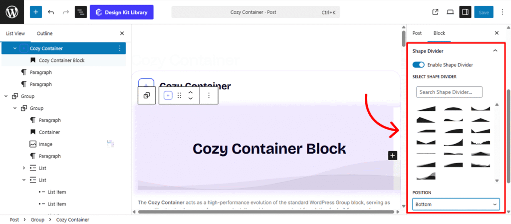
The Shape Divider settings allow you to break away from standard straight lines by adding decorative SVG layers to the edges of your container. These shapes create smooth, organic, or geometric transitions between different sections of your page.
- Enable Shape Divider: A toggle to activate the decorative layer. Once turned on, you can choose from a variety of unique silhouettes to frame your content.
- Select Shape Divider: Choose from a curated library of SVG designs, ranging from soft waves and jagged mountains to clean diagonal slants and curved “bubbles.”
- Position: Determine which edge of the container the shape should anchor to:
- Top: Places the design at the upper boundary, ideal for transitioning from a previous section.
- Bottom: Places the design at the lower boundary, perfect for leading the user’s eye into the next block.
- Flip: Mirror the shape horizontally to change its direction:
- Left/Right: Swaps the orientation of the SVG, allowing you to create asymmetrical designs or ensure the “flow” of a wave matches your layout’s focal point.
Style ◑
Container Styles
The Container Styles panel provides the essential tools to define the physical boundaries and visual depth of your Cozy Container. Use these settings to create structure, spacing, and a clear sense of hierarchy within your layout.
- Margin & Padding🔗
- Margin: Controls the external space around the container, determining how it sits relative to other blocks.
- Padding: Adjusts the internal “breathing room” between the container’s edges and the nested content inside.
- Border Controls: (Visible when Border Type is set to anything other than “None”)
- Border Type: Choose your stroke style (e.g., Solid, Dashed, Dotted).
- Border Width: Define the thickness of the container’s frame.
- Border Color: Select the specific hue for the border to match your brand palette.
- Border Radius 🔗: Soften the corners of your container. This setting is linked by default to ensure all four corners maintain the same curvature, creating a consistent look from sharp squares to rounded pods.
- Box Shadow: When the Box Shadow toggle is enabled, you can add depth and dimension to your container to make it “pop” off the page:
- Position: Choose Outline for a traditional drop shadow or Inset to make the shadow appear inside the container, creating a “pressed” effect.
- Horizontal & Vertical: Shift the shadow’s position along the X and Y axes to simulate a specific light source.
- Blur & Spread: Blur softens the edges of the shadow for a natural look, while Spread expands or contracts the overall surface area of the shadow.
- Shadow Color: Select the color and transparency (opacity) of the shadow effect.
- Background Color: Define the primary fill color of the container. This sets the stage for any text or images nested within.
Container Hover Styles
The Container Hover Style panel allows you to define a secondary set of visual properties that activate when a user’s cursor moves over the block. These transitions provide essential interactive feedback, transforming a static layout into a responsive, modern interface.
- Border Controls: (Visible when Border Type is set to anything other than “None”)
- Border Type: Choose your stroke style (e.g., Solid, Dashed, Dotted).
- Border Width: Define the thickness of the container’s frame on hover.
- Border Color: Change the stroke color to create a “glow” or a more defined outline.
- Border Radius 🔗: Smoothly morph the corners of your container. For example, you can transition from sharp 90-degree corners to rounded edges on hover for a playful, organic feel.
- Box Shadow: By enabling the Box Shadow toggle for the hover state, you can simulate depth and elevation, making the container appear to “lift” off the page:
- Position: Choose Outline for a traditional drop shadow or Inset to make the shadow appear inside the container, creating a “pressed” effect.
- Horizontal & Vertical: Shift the shadow’s position along the X and Y axes to simulate a specific light source.
- Blur & Spread: Blur softens the edges of the shadow for a natural look, while Spread expands or contracts the overall surface area of the shadow.
- Shadow Color: Select the color and transparency (opacity) of the shadow effect.
- Background Color (Hover): Transition to a new fill color to highlight the active container. This is often used to create a “highlight” effect or to shift the mood of a section during interaction.
Shape Divider Styles
Once you have enabled and selected your shape, the Style settings allow you to integrate the divider seamlessly into your page design. These controls ensure the transition between sections feels intentional and polished.
- Margin 🔗: Fine-tune the spacing around the divider.
- Height: Adjust the vertical scale of the SVG shape. Increase the height for a dramatic, sweeping transition (like high mountain peaks) or decrease it for a subtle, modern ripple.
- Color: Choose the specific fill color for the shape divider. This is typically set to match the background color of the adjacent section, creating a “cut-out” effect that masks the straight edge of the container.
Sticky Styles
The Sticky Styles panel becomes active only when the container’s position is set to Fixed or Sticky. These settings allow you to define a specific visual state for the container as it persists on the screen, ensuring it remains readable and distinct from the content scrolling behind it.
- Background Color: Choose a dedicated fill color for the “stuck” or “fixed” state. This is particularly useful for changing a transparent header to a solid color upon scrolling, or for adding a slight tint to a sidebar to ensure it stands out against the background elements it passes over.
The Link Tool 🔗: The chain icon connects all four sides to keep your design even. It is on by default; toggle it off to enter different values for each side (e.g., rounding only the top corners).