
Countdown Timer
-
252
Days
-
23
Hours
-
02
Minutes
-
51
Seconds
The offer ended!
The Countdown Timer Block displays a live, ticking clock that counts down to a specific date or time for promotions, product launches, or events. It automates the display of remaining time and cleans up the page layout once the event has passed.
Settings ⚙
General
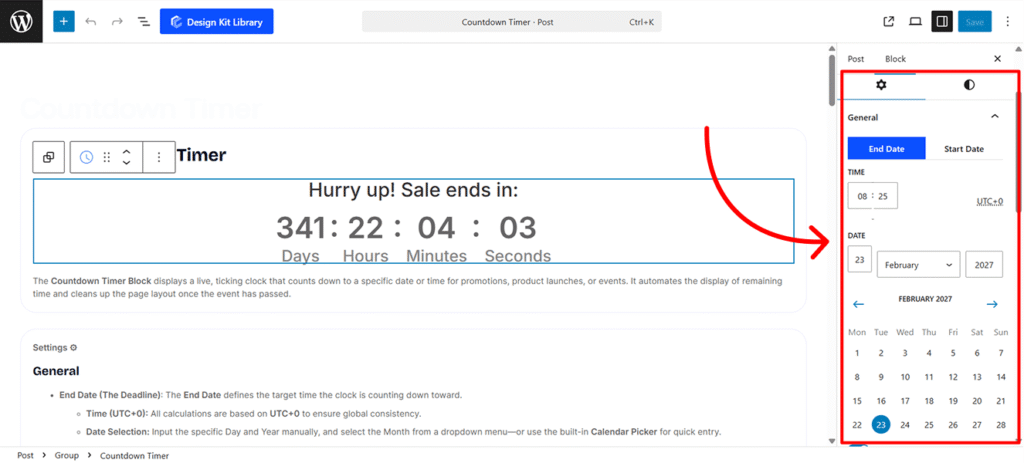
- End Date (The Deadline): The End Date defines the target time the clock is counting down toward.
- Time (UTC+0): All calculations are based on UTC+0 to ensure global consistency.
- Date Selection: Input the specific Day and Year manually, and select the Month from a dropdown menu—or use the built-in Calendar Picker for quick entry.
- Start Date (Visibility Trigger): The Start Date determines the exact moment the countdown timer appears on your website.
- Time (UTC+0): Set the specific hour and minute the block should become visible.
- Date Selection: Input the specific Day and Year manually, and select the Month from a dropdown menu—or use the built-in Calendar Picker for quick entry.
- Unit Visibility (Days, Hours, Minutes, Seconds):
- Enable Toggle: Individually turn each time unit on or off depending on the duration of your event.
- Label For: Customize the text appearing for each unit (e.g., changing “Days” to “Días”).
- Display Toggle Switch:
- Block: Places labels above or below the numbers(Default).
- Inline: Places labels to the left or right of the numbers.
- Label Position:
- For Block display: Choose Top or Bottom(Default).
- For Inline display: Choose Left or Right.
- Label Spacing: Adjust the distance between the digit and its label.
- Separators:
- Enable Separator: Toggle the visibility of dividers between time units.
- Separator Input: Define a custom character (e.g.,
:,/) to appear between the units.
- Justification: Align the entire countdown block to the Left, Center, or Right.
Countdown Options
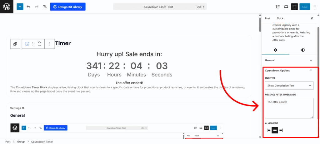
The Countdown Options panel allows you to determine how the block behaves once the timer reaches zero. This ensures your users receive a clear message or a clean interface after an event or promotion concludes.
- End Type: Choose the final state of the timer from the following dropdown options:
- Set to 0: The timer remains visible on the page but stops all digits at zero (e.g.,
00 : 00 : 00 : 00). This is useful for archiving a past deadline while keeping the layout intact. - Show Completion Text: The entire numeric timer is replaced by a custom message of your choice. This is ideal for announcing that a sale has ended or providing instructions for the next steps.
- Message After Timer Ends: This field becomes active only if Show Completion Text is selected. You can type any message here, such as “Sorry, this offer has expired!” or “The event has started—join us live!” This text will automatically swap in the moment the countdown hits its end date.
- Justification: Align the entire message block to the Left, Center, or Right.
- Set to 0: The timer remains visible on the page but stops all digits at zero (e.g.,
Before/After Labels
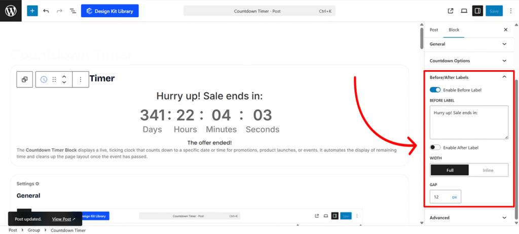
The Before/After Labels settings allow you to frame your timer with contextual text, such as “Sale ends in:” or “Remaining.” These labels help users understand exactly what the countdown represents.
- Before Label:
- Enable Before Label: Toggled On by default. This displays text immediately preceding the countdown digits.
- Label Input: When enabled, a text field appears allowing you to customize the message (e.g., “Hurry up! Sale ends in:”).
- After Label:
- Enable After Label: Toggled Off by default. This displays text immediately following the countdown digits.
- Label Input: When enabled, a text field appears for your custom suffix (e.g., “until launch”).
- Width
- Full: Acts like a Block element, placing the labels on their own line above or below the timer.
- Inline: Keeps the labels on the same line as the countdown digits for a more compact look.
- Gap: Adjust the specific spacing between the labels and the counter units to ensure the text doesn’t feel crowded.
Style ◑
- Colors
- Text : Set the color for the countdown digits.
- Background: Set the background color for the countdown digits wrapper.
- Typography
- Font Family & Size: Select the typeface and scale that best matches your site’s design system.
- Font Weight: Control the thickness (e.g., Bold for emphasis or Light for a modern look).
Spacing
The Spacing panel allows you to control the external and internal positioning of the entire countdown block. These settings ensure the timer integrates seamlessly with the surrounding content on your page.
- Padding: Adjust the internal space between the countdown elements and the boundary of the block wrapper. Increasing this value creates a “buffer” that prevents the timer from feeling cramped.
- Margin-Top: Define the external space above the block to separate it from preceding elements like headers or text blocks.
- Margin-Bottom: Define the external space below the block to create a clear division between the timer and the content that follows.
Border & Radius
The Border & Radius panel allows you to define the outer frame of the countdown wrapper, helping it stand out or blend into your page design.
- Border: Customize the stroke thickness, style (solid, dashed, etc.), and color to create a clear boundary for the timer.
- Radius: Adjust the curvature of the corners. A higher value creates a rounded, modern look, while a value of 0 results in sharp, professional corners.
- Box Shadow : Disabled by default. When enabled, it adds a shadow effect to the wrapper to create depth.
- Position: Choose between Outline (external shadow) or Inset (internal shadow).
- Horizontal: Shift the shadow along the X-axis (left or right).
- Vertical: Shift the shadow along the Y-axis (up or down).
- Blur: Control how soft or sharp the shadow appears.
- Spread: Increase or decrease the overall size of the shadow.
- Color: Select the color and opacity of the shadow effect.
Wrapper Styles
The Wrapper Styles settings allow you to define the container’s physical footprint and outer decorative elements, ensuring the countdown timer sits perfectly within your page layout.
- Width & Height: Define the horizontal and vertical dimensions of the timer container. You can set these to specific pixel values for a fixed size or use percentages to make the block responsive.
- Margin Top: Adjust the external space above the wrapper to separate it from previous content.
- Margin Bottom: Adjust the external space below the wrapper to create a clear division from following elements.
- Border: Customize the stroke thickness, style, and color to frame the countdown block.
- Border Radius: Control the curvature of the wrapper’s corners for a sharp or rounded appearance.
- Box Shadow : Disabled by default. When enabled, it adds a shadow effect to the wrapper to create depth.
- Position: Choose between Outline (external shadow) or Inset (internal shadow).
- Horizontal & Vertical: Shift the shadow’s position along the X and Y axes.
- Blur: Adjust how soft or diffused the shadow appears.
- Spread: Increase or decrease the overall size of the shadow.
- Color: Select the color and opacity of the shadow effect.
Timer Styles
The Timer Styles panel focuses on the individual digit containers (the Days, Hours, Minutes, and Seconds boxes). These settings allow you to define the shape and color of the actual time-tracking elements to make them visually distinct.
- Padding: Adjust the internal spacing within each time unit. This controls the distance between the digits and the edge of their individual containers, giving the numbers “room to breathe.”
- Border: Customize the stroke thickness, style, and color to frame the countdown block.
- Border Radius: Control the curvature of the wrapper’s corners for a sharp or rounded appearance.
- Typography
- Font Family & Size: Select the typeface and scale that best matches your site’s design system.
- Font Weight: Control the thickness (e.g., Bold for emphasis or Light for a modern look).
- Letter Case: Force the labels to Uppercase, Lowercase, or Capitalize without editing the form code.
- Decoration: Apply styles like Underline or Line-through if needed for specific design cues.
- Line Height & Letter Spacing: Fine-tune the vertical breathing room and horizontal character density.
- Color
- Text Color: Set the color of the numeric digits (e.g., the “364” or “17”) to ensure high contrast and readability.
- Background Color: Define the fill color for the boxes behind the numbers. This helps the timer stand out against the overall wrapper background.
Separator Styles
The Separator Styles panel allows you to refine the visual markers placed between the timer units (Days, Hours, Minutes, and Seconds). These settings help define the flow and rhythm of the countdown.
- Position
- Vertical: Aligns the separator centrally between the timer boxes, typically used for colon symbols (
:) to mimic a digital clock. - Horizontal: Places the separator on a horizontal plane, which can be used for custom stylistic layouts or underline-style dividers.
- Vertical: Aligns the separator centrally between the timer boxes, typically used for colon symbols (
- Size: Control the overall scale of the separator character or icon. You can increase the size to make the division more prominent or decrease it for a subtle, minimalist look that doesn’t distract from the digits.
- Text Color: Set the color of the numeric digits (e.g., the “364” or “17”) to ensure high contrast and readability.
Timer Label Styles
The Timer Label Style panel allows you to customize the appearance of the text identifying each time unit (e.g., “Days,” “Hours,” “Minutes,” and “Seconds”). These settings ensure the labels are legible and visually aligned with the numeric digits.
- Typography
- Font Family & Size: Select the typeface and scale that best matches your site’s design system.
- Font Weight: Control the thickness (e.g., Bold for emphasis or Light for a modern look).
- Letter Case: Force the labels to Uppercase, Lowercase, or Capitalize without editing the form code.
- Decoration: Apply styles like Underline or Line-through if needed for specific design cues.
- Line Height & Letter Spacing: Fine-tune the vertical breathing room and horizontal character density.
- Color: Select the font color for the labels. You can choose a high-contrast color to make them pop or a subtle shade to keep the focus on the primary countdown numbers.
Before/After Styles
The Before/After Label Styles panel provides granular control over the text that introduces or concludes your countdown (e.g., “Sale starts in” or “Left until launch”). These settings ensure the instructional text matches the aesthetic of the timer itself.
- Typography
- Font Family & Size: Select the typeface and scale that best matches your site’s design system.
- Font Weight: Control the thickness (e.g., Bold for emphasis or Light for a modern look).
- Letter Case: Force the labels to Uppercase, Lowercase, or Capitalize without editing the form code.
- Decoration: Apply styles like Underline or Line-through if needed for specific design cues.
- Line Height & Letter Spacing: Fine-tune the vertical breathing room and horizontal character density.
- Color: Set a specific color for the labels. You can make them match the timer digits or use a neutral tone to keep them secondary.