
Contact Form 7 Styler
The Contact Form Styler block allows you to visually customize forms created with the Contact Form 7 plugin. To get started, you must first create your form within the WPCF7 plugin and copy the generated shortcode.
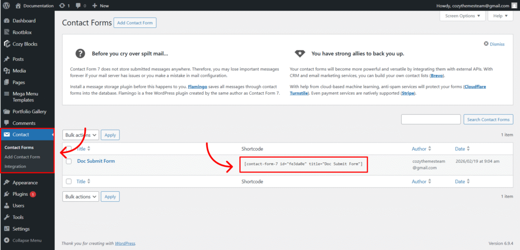
Once you add the Contact Form Styler block to your page, simply navigate to the General Panel and paste your code into the Add Shortcode field. This connects the block to your specific form, giving you full design control over its layout, typography, and colors without needing custom CSS.
Settings ⚙
General
The General panel provides the essential configuration to link your Contact Form 7 plugin with the styler block and manage its overall vertical spacing.
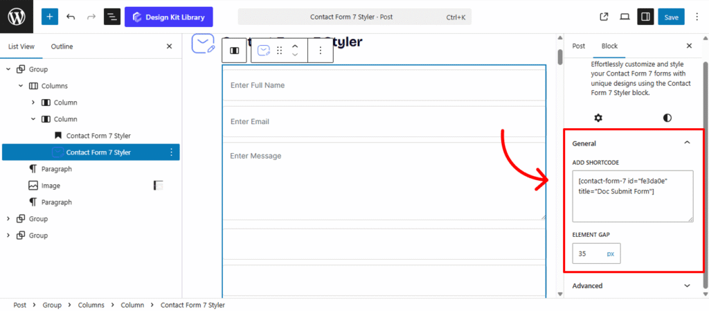
- Add Shortcode: Paste your generated WPCF7 shortcode here to display the form. This allows you to visually style the form’s elements directly within the editor.
- Element Gap: Control the vertical rhythm of your form by adjusting the margin-bottom for the final input element and the submit button, ensuring a clean separation from surrounding content.
Style ◑
The Styles panel allows you to define the core visual identity of your form elements, ensuring they align perfectly with your website’s branding.
- Color: Customize the Text color for readability and the Background color of the input fields to create a distinct look for your form.
- Font Family: Select the specific typeface to be used across the form fields to maintain typographic consistency.
- Font Size: Adjust the scale of the text within the inputs to ensure it is comfortable for users to read and type.
- Font Weight: Set the thickness of the characters (e.g., Regular, Medium, or Bold) to emphasize user input or maintain a clean, minimal aesthetic.
Spacing
The Spacing panel allows you to control the positioning and inner breathing room of the entire Contact Form Styler container. Use these settings to ensure the form sits perfectly within your page layout.
- Padding: Adjust the internal spacing between the form elements and the outer boundary of the container. This creates a balanced frame around your inputs and buttons.
- Margin Top: Set the external distance above the form to prevent it from crowding headers or preceding sections.
- Margin Bottom: Define the external space below the form to create a clear separation from the footer or subsequent page content.
Border & Radius
The Border & Radius panel allows you to define the outer frame and depth of the Contact Form Styler container, helping it stand out or blend seamlessly with your page design.
- Border: Choose the stroke style (Solid, Dashed, or Dotted) and set the Width and Color to create a distinct outline for the form area.
- Radius: Adjust the curvature of the container’s corners. Higher values result in a softer, more rounded appearance.
- Enable Box Shadow: Toggle this option to add depth to your form container. Once enabled, you can customize the following:
- Position: Choose Outline (external shadow) for a lifted effect or Inset (internal shadow) for a recessed, “punched-in” look.
- Horizontal & Vertical: Control the X and Y offsets to determine the direction of the light source.
- Blur & Spread: Adjust the softness of the shadow and its overall size relative to the container.
- Color: Select a shade for the shadow—typically a semi-transparent black or a subtle brand color—to create a natural elevation effect.
Label Styles
The Label Styles panel specifically targets the field descriptors (e.g., “Name” or “Email”) within your form. These styles will only apply if <label> elements are present in your WPCF7 form markup.
- Padding: Adjust the internal spacing around the label text to increase the clickable area or refine its position relative to the input field.
- Typography
- Font Family & Size: Select the typeface and scale that best matches your site’s design system.
- Font Weight: Control the thickness (e.g., Bold for emphasis or Light for a modern look).
- Letter Case: Force the labels to Uppercase, Lowercase, or Capitalize without editing the form code.
- Decoration: Apply styles like Underline or Line-through if needed for specific design cues.
- Line Height & Letter Spacing: Fine-tune the vertical breathing room and horizontal character density.
- Colors
- Text Color: Set the color of the label font for optimal legibility.
- Background Color: Apply a fill behind the label text—perfect for creating “floating” labels or badge-style headers.
Input Text Styles
The Input Text Styles panel gives you granular control over the appearance of your form’s text fields and textareas, including their interactive “Focus” states when a user clicks into them. The styles you define in these panels will apply only to their respective field types within the form.
- Padding: Adjust the internal breathing room within the input boxes to ensure text doesn’t touch the edges.
- Textarea Height: Specifically define the vertical scale for multi-line message fields to provide users with ample space to type.
- Default vs. Focus States:
- Border: Toggle between Default (static) and Focus (active) to set different stroke widths or colors. A distinct focus border helps users identify which field they are currently editing.
- Typography
- Font Family & Size: Select the typeface and scale that best matches your site’s design system.
- Font Weight: Control the thickness (e.g., Bold for emphasis or Light for a modern look).
- Letter Case: Force the labels to Uppercase, Lowercase, or Capitalize without editing the form code.
- Decoration: Apply styles like Underline or Line-through if needed for specific design cues.
- Line Height & Letter Spacing: Fine-tune the vertical breathing room and horizontal character density.
- Colors
- Text Color: Customize the Text for both default and focus states.
- Background Color: Customize the Background for both default and focus states.
Input Date Styles
The Input Date Style panel allows you to specifically format the date picker fields in your form, ensuring they match the aesthetic of your standard text inputs while maintaining their unique functionality. The styles you define in these panels will apply only to their respective field types within the form.
- Padding: Adjust the internal breathing room within the input boxes to ensure text doesn’t touch the edges.
- Margin Top: Set the external distance above the date field to separate it from preceding labels or inputs.
- Margin Bottom: Define the space below the date field to create a clean transition to the next form element.
- Border & Border Radius
- Border: Customize the stroke width, style, and color to frame the date input.
- Border Radius: Round the corners of the date field to match the rest of your form’s design language.
- Typography
- Font Family & Size: Select the typeface and scale that best matches your site’s design system.
- Font Weight: Control the thickness (e.g., Bold for emphasis or Light for a modern look).
- Letter Case: Force the labels to Uppercase, Lowercase, or Capitalize without editing the form code.
- Decoration: Apply styles like Underline or Line-through if needed for specific design cues.
- Line Height & Letter Spacing: Fine-tune the vertical breathing room and horizontal character density.
- Colors
- Text Color: Set the color for the date digits and placeholder text.
- Background Color: Define the fill color for the input box, ensuring high contrast for accessibility.
Input Dropdown Styles
The Input Dropdown Style panel specifically targets the selection menus (e.g., <select> elements) in your form. The styles you define in these panels will apply only to their respective field types within the form.
- Padding: Adjust the internal breathing room within the input boxes to ensure text doesn’t touch the edges.
- Width: Define the horizontal span of the dropdown menu. You can set it to 100% to fill the container or a specific pixel value for a more compact look.
- Border & Border Radius
- Border: Customize the stroke width, style, and color to frame the input.
- Border Radius: Round the corners of the date field to match the rest of your form’s design language.
- Typography
- Font Family & Size: Select the typeface and scale that best matches your site’s design system.
- Font Weight: Control the thickness (e.g., Bold for emphasis or Light for a modern look).
- Letter Case: Force the labels to Uppercase, Lowercase, or Capitalize without editing the form code.
- Decoration: Apply styles like Underline or Line-through if needed for specific design cues.
- Line Height & Letter Spacing: Fine-tune the vertical breathing room and horizontal character density.
- Colors
- Text Color: Set the color for the date digits and placeholder text.
- Background Color: Define the fill color for the input box, ensuring high contrast for accessibility.
Input Checkbox/Radio Styles
The Input Checkbox panel allows you to refine the appearance of your multi-select options, ensuring they are both touch-friendly and visually aligned with your form’s layout.
The Input Radio Style panel gives you precise control over the appearance of single-choice selection circles within your form, ensuring they are easy to navigate and visually consistent.
- Padding: Adjust the internal breathing room within the input boxes to ensure text doesn’t touch the edges.
- Size: Adjust the overall scale of the checkbox/radio icons. Increasing this value makes the clickable area larger, which improves accessibility and user experience on mobile devices.
- Item Gap: Control the horizontal and vertical spacing between individual checkbox/radio items.
- Typography
- Font Family & Size: Select the typeface and scale that best matches your site’s design system.
- Font Weight: Control the thickness (e.g., Bold for emphasis or Light for a modern look).
- Letter Case: Force the labels to Uppercase, Lowercase, or Capitalize without editing the form code.
- Decoration: Apply styles like Underline or Line-through if needed for specific design cues.
- Line Height & Letter Spacing: Fine-tune the vertical breathing room and horizontal character density.
- Colors
- Text Color: Set the color for the date digits and placeholder text.
Input Acceptance Styles
The Input Acceptance Style panel allows you to customize the specific input fields used for “Terms and Conditions” or privacy policy confirmations. Unlike standard checkbox settings, these controls specifically target the acceptance element to ensure your legal consent fields are prominent and properly aligned.
- Padding: Adjust the internal spacing around the acceptance element. This is essential for refining the distance between the input itself and the accompanying text, ensuring the layout feels balanced.
- Size: Control the overall scale of the acceptance input. By increasing the size, you make the field more accessible and user-friendly.Item Gap: Control the horizontal and vertical spacing between individual checkbox/radio items.
- Typography
- Font Family & Size: Select the typeface and scale that best matches your site’s design system.
- Font Weight: Control the thickness (e.g., Bold for emphasis or Light for a modern look).
- Letter Case: Force the labels to Uppercase, Lowercase, or Capitalize without editing the form code.
- Decoration: Apply styles like Underline or Line-through if needed for specific design cues.
- Line Height & Letter Spacing: Fine-tune the vertical breathing room and horizontal character density.
- Colors
- Text Color: Set the color for the date digits and placeholder text.
Input File Styles
The Input File Style panel allows you to customize the appearance of the “Choose File” upload button and the accompanying file path text, ensuring that your upload fields feel like a cohesive part of your design.
- Padding: Adjust the internal spacing within the file input area to create a larger, more comfortable click target for users.
- Border: Define the stroke width, style, and color to frame the upload field and match the aesthetic of your other input elements.
- Border Radius: Control the curvature of the input corners. You can create a sharp, professional look or a soft, modern feel with rounded edges.
- Colors
- Text & Text Hover: Set the color for the “Choose File” label and the name of the uploaded file. The hover state provides visual feedback when a user’s cursor is over the element.
- Background & Background Hover: Define the fill color for the upload field. Using a distinct hover background helps indicate that the area is interactive and ready for a file drop or click.
Submit Button Styles
The Submit Button Styles panel gives you full control over the final interaction point of your form. You can define the button’s physical footprint, positioning, and overall shape to ensure it stands out as the primary call to action.
- Padding: Adjust the internal space between the button text and its borders to create a larger, more touch-friendly clicking area.
- Margin Top & Margin Bottom: Control the external distance above and below the button to prevent it from crowding the final input fields or the footer of your form.
- Width: Define the horizontal span of the button. You can set it to a specific pixel value or use percentages to control how much space it occupies within the container.
- Display:
- Default: The button follows the standard flow of the form elements.
- Block: Forces the button to act as a block-level element, typically taking up the full width of its parent container unless restricted.
- Alignment: When the Block display is enabled, use this setting to position the button (Left, Center, or Right) within its designated row.
- Border: Choose the stroke style, thickness, and color to frame the button and distinguish it from the background.
- Border Radius: Curvature the corners of your button. Use a low value for a sharp, professional look or a high value for a modern, pill-shaped button.
- Typography
- Font Family & Size: Select the typeface and scale that best matches your site’s design system.
- Font Weight: Control the thickness (e.g., Bold for emphasis or Light for a modern look).
- Letter Case: Force the labels to Uppercase, Lowercase, or Capitalize without editing the form code.
- Decoration: Apply styles like Underline or Line-through if needed for specific design cues.
- Line Height & Letter Spacing: Fine-tune the vertical breathing room and horizontal character density.
- Colors
- Text & Text Hover: Select the font color for the button label. Changing the color on Hover (when a user moves their mouse over the button) adds a layer of interactivity that signals the button is ready to be clicked.
- Background & Background Hover: Define the fill color of the button. Using a slightly different shade or a contrasting color for the Hover state creates a “lift” or “glow” effect, making the form feel more responsive.
- Border Hover: Specifically adjust the border color when the button is hovered. This is a subtle yet effective way to highlight the button’s boundary, especially if you are using a ghost button (transparent background) design.