
Advanced Mega Menu
Transform your standard WordPress navigation into a high-performance, multi-column mega menu experience. Designed for professional site layouts, the Advanced Mega Menu block lets you organize complex site structures into visually rich, interactive navigation — without writing a single line of code.
This block works by integrating seamlessly with the core WordPress Navigation block. At its heart, the Advanced Mega Menu contains a Navigation block, and nested within it, a Cozy Custom Link — the key element to which Mega Menu Templates are applied. Mega Menu Templates are a signature Cozy Blocks feature managed directly from your WordPress dashboard, and they can only be assigned to the Cozy Custom Link found inside this block.
When a visitor clicks or hovers over a primary navigation link, the assigned Mega Menu Template instantly reveals a pre-designed, content-rich dropdown layout — giving your users a fast, intuitive browsing experience.
- Note:
- Mega Menu Templates are exclusive to the Cozy Custom Link inside this block. They cannot be applied to any other block or navigation element.
Setting Up Advanced Mega Menu
1. Create Your Menu Content
Before configuring the navigation, you must design the content that will appear inside the menu:
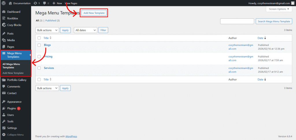
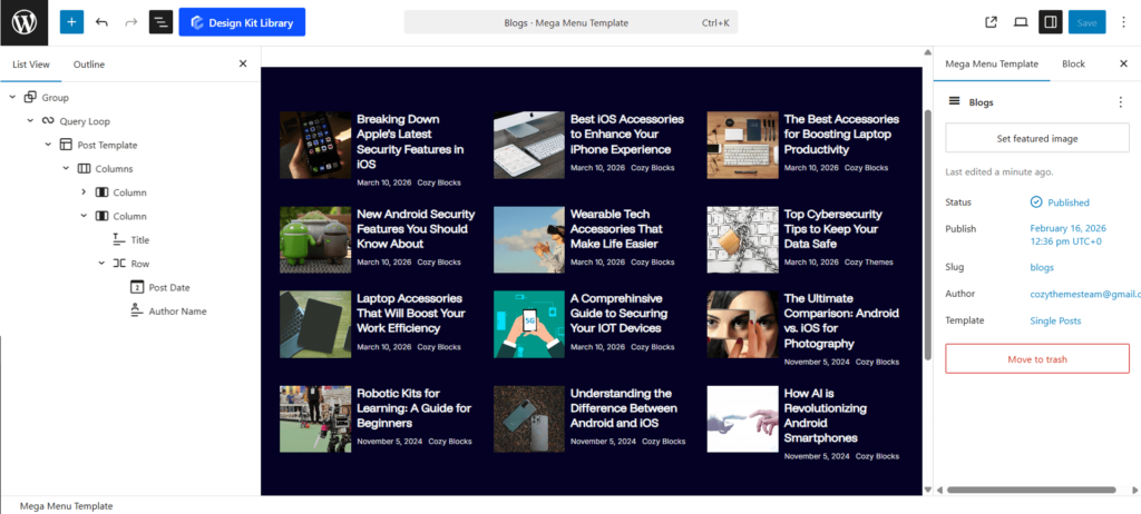
- Navigate to Dashboard > Mega Menu Templates > Add New Template.
- Build your layout using any block pattern or design. This template will serve as the rich content displayed when the menu is triggered.
2. Enable the Mega Menu Block
Once your template is ready, head to your page editor:
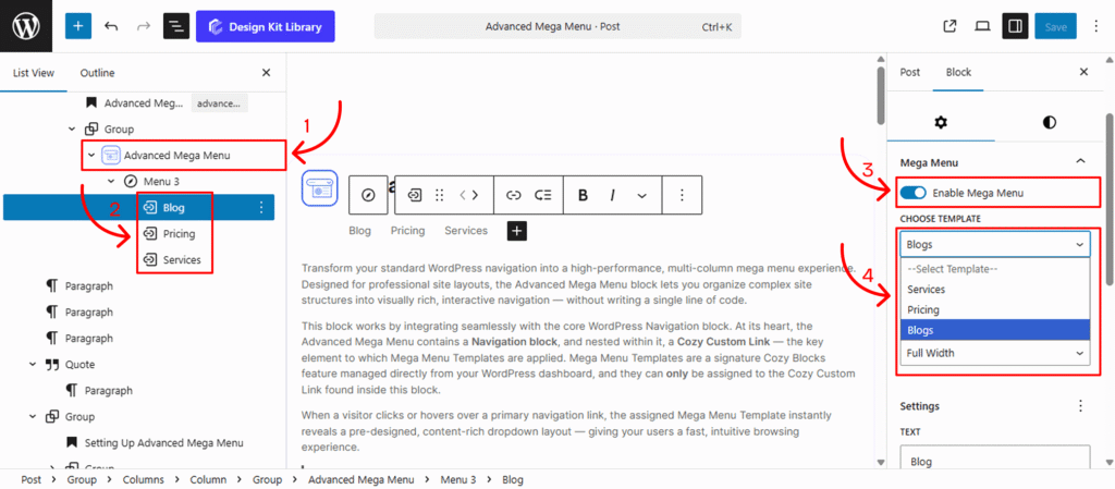
- Add the Advanced Mega Menu block
- Locate the Cozy Custom Block nested within your Advanced Mega Menu block.
- Open the Settings (⚙) tab on the right-hand sidebar
- Toggle the Enable Mega Menu option to On.
3. Assign Your Template
After enabling the toggle, a dynamic dropdown will appear:
- Select Template: Choose your pre-created template from the dropdown list.
- Content Width: Full Width allows the mega menu content to span 100% of the browser window. Default Width restricts the content to a specific size. You can then input the desired width (e.g., 1180px) to keep your navigation contained.
Note: If no templates appear, ensure you have published your design in the Mega Menu Templates section of the dashboard.
Settings ⚙
Mega Menu Settings
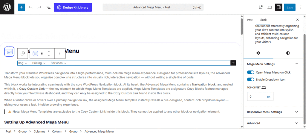
The Mega Menu Settings panel provides functional controls for how the menu behaves and appears to the user. These settings ensure the navigation is accessible and correctly positioned relative to the header.
- Open Mega Menu on Click: By default, the menu reveals on hover. Enable this toggle to require a mouse click to open the menu, which is often preferred for touch-screen compatibility and specific user experiences.
- Enable Dropdown Icon: Toggle this to display a visual indicator (such as a small arrow) next to the menu item, signaling to users that a sub-menu or mega-menu is available.
- Top Offset: Adjust the vertical distance between the navigation link and the start of the mega-menu container. This is useful for aligning the menu perfectly with the bottom of your header or overlapping it for specific designs.
- Responsive Control: Look for the Device Icon next to the slider to set unique offset values for Desktop, Tablet, and Mobile views.
Responsive Menu Settings
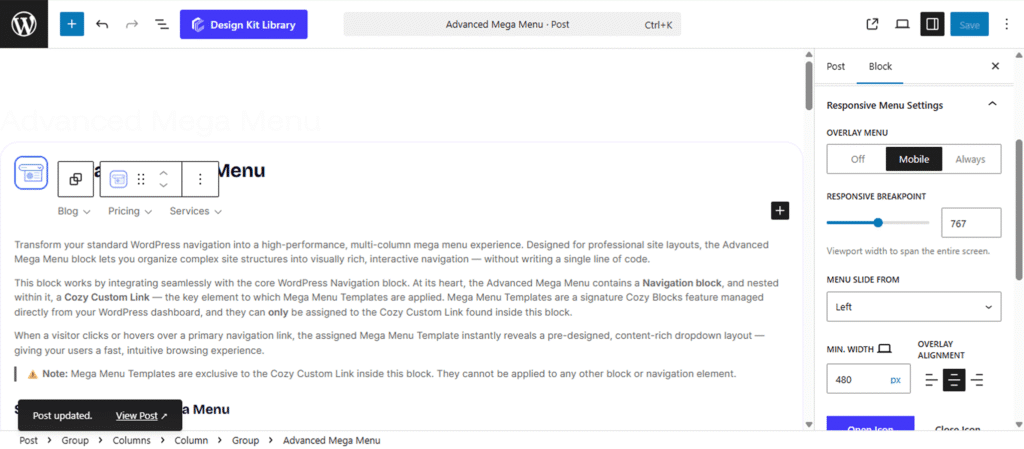
The Responsive Menu Settings panel ensures your navigation remains functional and aesthetically pleasing on smaller screens. Use these options to define how the mobile menu transitions and behaves across different devices.
- Overlay Menu: Enable this toggle to transform the standard navigation into a full-screen or slide-out overlay for mobile users.
- Responsive Breakpoint: Define the specific screen width (in pixels) at which the standard desktop menu switches to the mobile-friendly responsive layout.
- Menu Slide From: Select whether the overlay menu animates into the screen from the Left or Right side.
- Min. Width (Responsive): Set the minimum horizontal width of the slide-out menu container. Use the Device Icon next to the slider to adjust this specifically for Tablet or Mobile views.
- Overlay Alignment: Choose the text and content alignment (Left, Center, or Right) within the overlay container.
- Open & Close Icons: Select custom icons from the library to represent the “Hamburger” menu trigger and the “Close” button.
- Icon Alignment: Position the menu trigger icon to the Left, Center, or Right of the header area.
Style ◑
Responsive Menu Styles
The Responsive Menu Styles panel provides granular design controls for the mobile navigation experience. Use these settings to ensure the toggle buttons and overlay menus are perfectly branded and accessible on touch devices.
- Padding (Responsive): Adjust the internal spacing of the menu container. Use the Device Icon to set unique padding values for Tablet and Mobile to ensure content doesn’t touch the screen edges.
- Open & Close Icons (Toggle Menu): Customize the interactive boxes for both the Open and Close triggers.
- Box Dimensions: Set the specific Width and Height for the icon’s touch area.
- Border & Radius: Define the stroke thickness and corner curvature (use a high radius for circular buttons).
- Icon Size: Scale the actual graphic inside the box for better visibility.
- Color & Visual States: This section allows you to define the color palette for every state of the responsive interface:
- Menu & Submenu: Set the primary text colors for your main navigation links and nested dropdown items within the overlay.
- Background & Overlay: Define the solid or semi-transparent color for the slide-out panel and the background layer that covers the rest of the site content.
- Open Icon (Default & Hover): Customize the color of the “Hamburger” graphic, its background fill, and its border for both static and interactive states.
- Close Icon (Default & Hover): Define the specific colors for the “Close” trigger, including its background and border states, to ensure it remains easy for users to locate and exit the menu.