
News Ticker
-
New Android Security Features You Should Know About
-
Best iOS Accessories to Enhance Your iPhone Experience
-
Breaking Down Apple’s Latest Security Features in iOS
-
The Best Accessories for Boosting Laptop Productivity
-
The Ultimate Comparison: Android vs. iOS for Photography
-
Robotic Kits for Learning: A Guide for Beginners
The News Ticker Block is a dynamic, high-visibility component designed to showcase your latest headlines in a space-efficient, vertical scrolling format. This layout delivers high-impact updates through a sophisticated Vertical Scrolling Animation that mimics professional media outlets, allowing you to display a high volume of headlines within a compact, single-line container. With Dynamic Content Sync, the block stays perpetually updated by automatically pulling from your latest articles or specific categories, while Customizable Interaction settings—such as “Pause on Hover” and a customizable Static Label—ensure that readers can easily interact with your stories.
Built using WordPress Query Loop architecture, this block offers deep integration with your site’s native content management system. By leveraging the Query Loop, the News Ticker provides advanced filtering capabilities—allowing you to exclude specific post IDs, set offsets, or filter by tags—while ensuring optimal performance and compatibility. This technical foundation ensures the ticker is a powerful, data-driven tool that respects your site’s global query settings and scales effortlessly with your content.
Settings ⚙
General
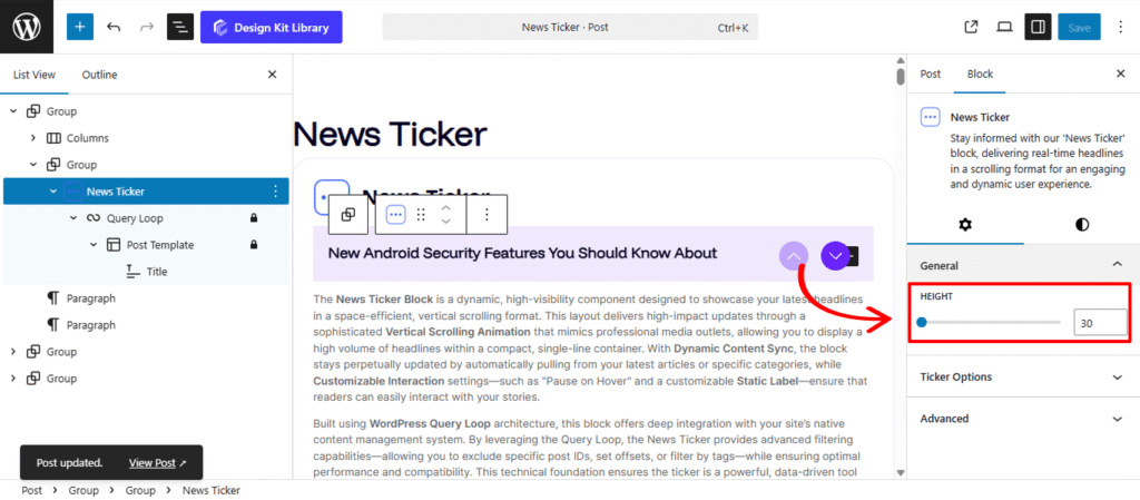
- Height: Use this slider to set the precise vertical height of the ticker box. This allows you to match the ticker to your header’s thickness or create a larger, more prominent “Breaking News” area that accommodates longer post titles.
Ticker Options
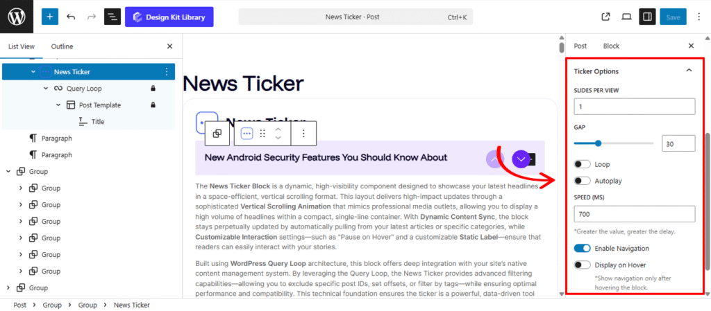
The Ticker Options panel gives you precise control over the movement and interactive behavior of your scrolling headlines. These settings allow you to transform a static list into a fluid, attention-grabbing news bar that fits the rhythm of your site.
- Slides Per View: Determine how many headlines are visible within the ticker at once. You can keep it to a single, high-impact headline or display multiple items to show a broader range of topics simultaneously.
- Gap: Use this slider to set the vertical spacing between individual slides. This ensures that even when multiple headlines are visible, the content remains legible and uncluttered.
- Loop & Autoplay:
- Loop: Enable this to create an infinite scrolling effect where the headlines restart automatically after reaching the last post.
- Autoplay: Turn this on to ensure the ticker starts moving as soon as the page loads, immediately signaling to readers that new information is available.
- Speed: Control the transition velocity of the vertical animation. A slower speed is ideal for long, descriptive headlines, while a faster speed creates a sense of urgency for breaking updates.
- Enable Navigation: Add manual controls (such as up/down arrows) to the ticker. This empowers users to browse through the headlines at their own pace if they miss a specific story.
- Display on Hover: Activate this toggle to pause the scrolling animation whenever a user moves their mouse over the ticker. This provides a user-friendly way for readers to stop and click on a specific headline without it sliding out of view.
Style ◑
Navigation Style
The Navigation Style panel provides the design tools to customize the interactive arrows or icons that control the vertical flow of your News Ticker. These settings allow you to create a high-visibility control area that matches your site’s aesthetic.
- Icon Size: Adjust the scale of the navigation arrows (e.g., Up/Down arrows) for better visibility.
- Icon Box Width & Height: Define the clickable area around each icon. Setting these values ensures the navigation buttons are large enough for easy interaction on both desktop and mobile devices.
- Margin Bottom: Control the distance between the header box and the post results below for a clean, organized transition.
- Border Radius: Control the shape of the icon boxes. Use a high value to create perfectly circular navigation buttons or 0px for a sharp, square professional look.
- Vertical Gap: Adjust the margin top spacing of up and down navigation icons .
- Horizontal Gap: Define the distance between the navigation set and the scrolling text to prevent overlapping.
- Color
- Background Color (Normal & Hover): Set the initial fill for the icon boxes and a distinct hover color to provide clear feedback when a user is about to click.
- Color (Normal & Hover): Customize the color of the icons themselves. A high-contrast color shift on hover ensures the navigation remains accessible and intuitive.