
Featured Post
Featured
View All
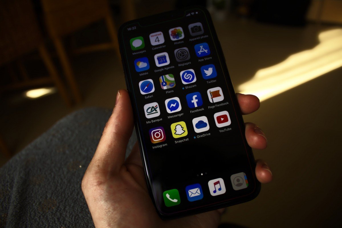
Breaking Down Apple’s Latest Security Features in iOS
Apple’s iOS 18 introduces several advanced security features designed to…Read More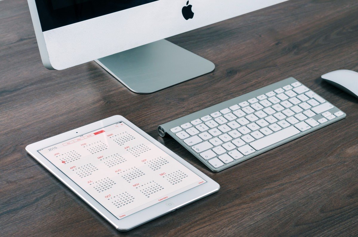
Best iOS Accessories to Enhance Your iPhone Experience
In the fast-evolving world of technology, accessories play a pivotal…Read More
New Android Security Features You Should Know About
Android 14 introduces several advanced security features designed to enhance…Read More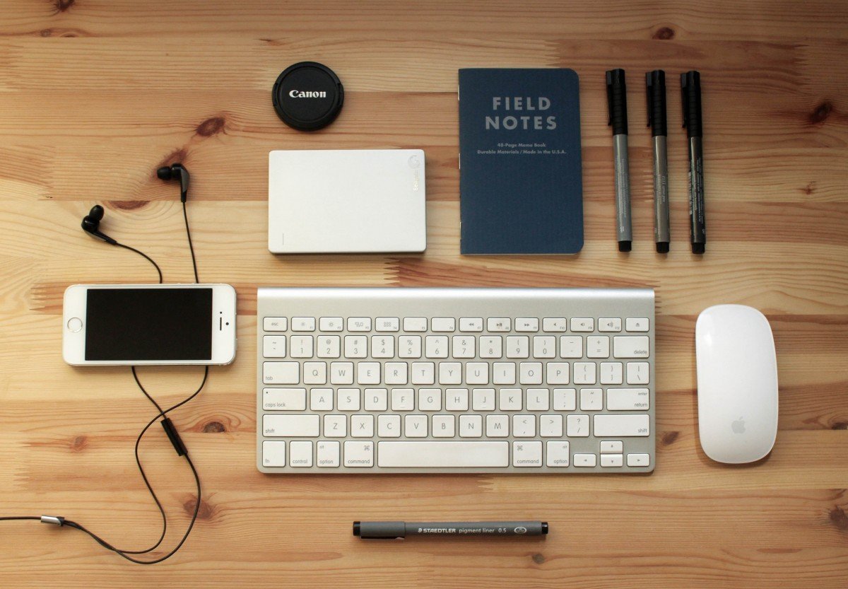
The Best Accessories for Boosting Laptop Productivity
In a world where remote work, digital learning, and flexible…Read More
Wearable Tech Accessories That Make Life Easier
Wearable technology has revolutionized the way we interact with our…Read More
Top Cybersecurity Tips to Keep Your Data Safe
With our phones becoming an extension of our lives, mobile…Read More
The Featured Post Block is a high-impact layout tool engineered to turn your most important content into a visual centerpiece. Ideal for hero sections, “Editor’s Choice” features, or breaking news highlights, this block moves beyond the standard post grid by creating a singular, immersive focal point. Its specialized design ensures that your top stories command immediate attention, providing a professional, magazine-style aesthetic that instantly elevates your homepage or landing page.
Settings ⚙
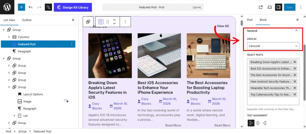
General
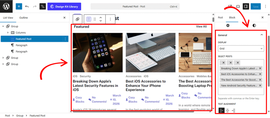
- Display (Grid, Carousel, List): Choose the primary framework for your posts.
- Grid: Organizes posts into a structured, multi-column layout—ideal for a clean, modern look.
- Carousel: Enables a touch-friendly, sliding interface that saves vertical space while showcasing multiple featured stories.
- List: Displays posts in a traditional vertical stack, perfect for sidebars or classic blog layouts.
- Select Post: Take full control over which content is highlighted. This intuitive search interface allows you to manually curate your featured section by typing the title and selecting the exact post from your library.
- Text Alignment (Left, Center, Right): Quickly adjust the horizontal positioning of your post title, meta info, and excerpt. This ensures your content remains readable and balanced, regardless of your chosen layout or image placement.
Post Options
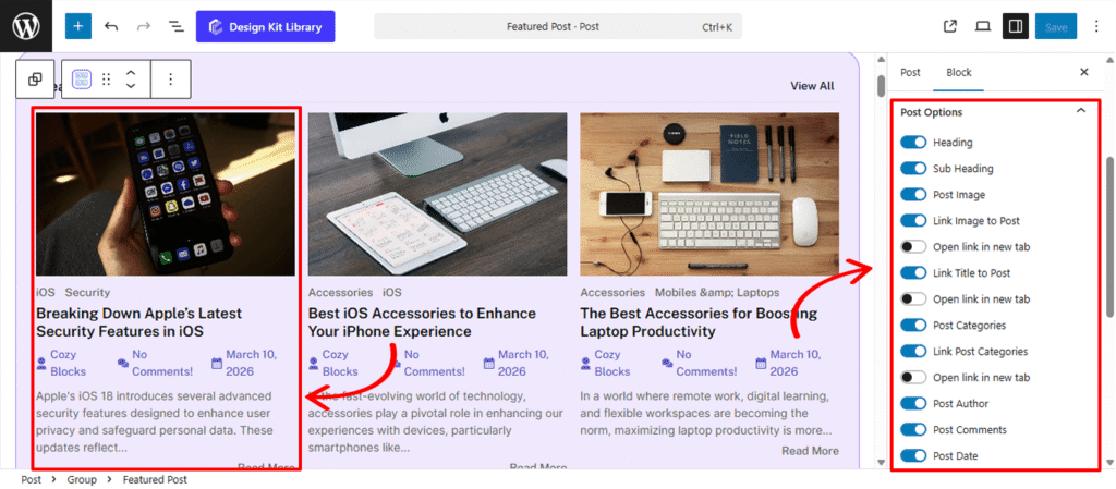
The Post Options panel provides a comprehensive set of toggles to control the visibility and interactivity of your featured content. Each individual element includes an additional nested toggle to link to the post and a secondary option to open the link in a new tab, giving you full control over the user’s navigation experience.
- Heading: Enable this to add a primary title to the block, such as “Featured Story” or “Editor’s Pick.”
- Sub-heading: Add secondary text, perfect for “View All” links or a brief lead-in sentence to provide extra context.
- Post Image: Toggle the visibility of the article’s featured image to create a strong visual focal point.
- Post Categories: Display the category labels to help readers quickly identify the topic of the post.
- Metadata Controls: Choose to show or hide the Post Author, Post Comments, and Post Date to keep your layout as clean or as detailed as needed.
- Show Icon: Enable this to add visual icons (like a clock or user silhouette) next to your post metadata for improved scannability.
- Post Content: Toggle the article preview text. When enabled, you can use the Post Excerpt slider to define the exact word count for the snippet.
- Read More: Add a clear call-to-action link at the end of your content, inviting readers to dive into the full story.
Header Options
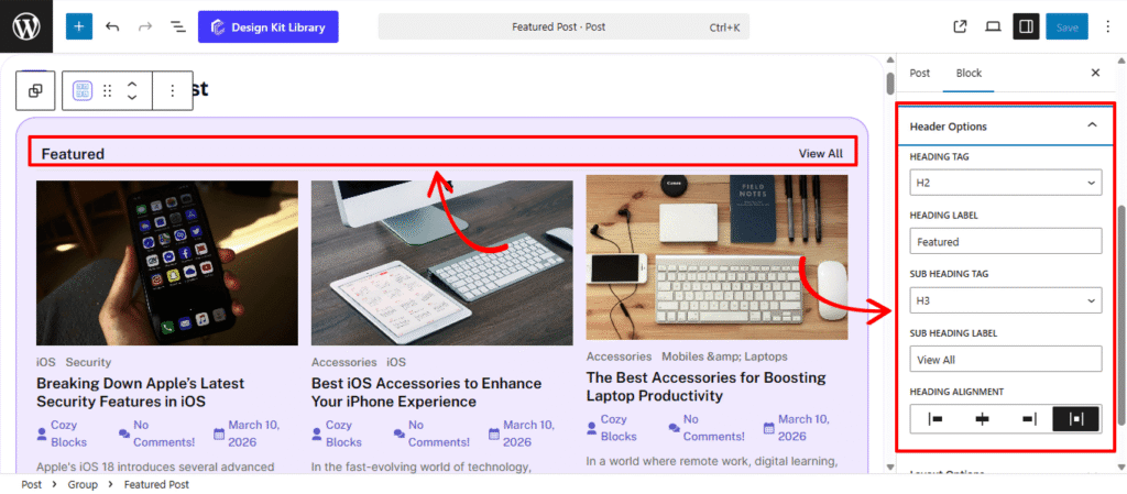
The Header Options panel provides structural and alignment controls for your block’s introductory text, allowing you to establish a clear visual hierarchy for your featured sections.
- Heading Tag: Select the appropriate HTML rank (H1–H6 or Paragraph) for your main title. This ensures your site maintains a consistent SEO structure and follows proper accessibility standards.
- Heading Label: Enter the primary title for your block (e.g., “Featured Stories” or “Editor’s Picks”) to give readers immediate context.
- Sub-heading Tag: Choose the HTML rank (H1–H6 or Paragraph) for your secondary text. This is ideal for adding a descriptive lead-in or a “View All” link while keeping the typography distinct from the main heading.
- Sub-heading Label: Add a secondary line of text. This is a versatile tool for providing additional context, adding a descriptive lead-in, or creating a functional “View All” link.
- Heading Alignment: Position your header elements to perfectly match your page layout:
- Left / Right: Aligns the text to either side of the container.
- Center: Positions the heading and sub-heading in the middle for a balanced, symmetrical look.
- Space-Between: Pushes the Heading to one side and the Sub-heading to the other, creating a clean, professional “navigation bar” feel.
Layout Options
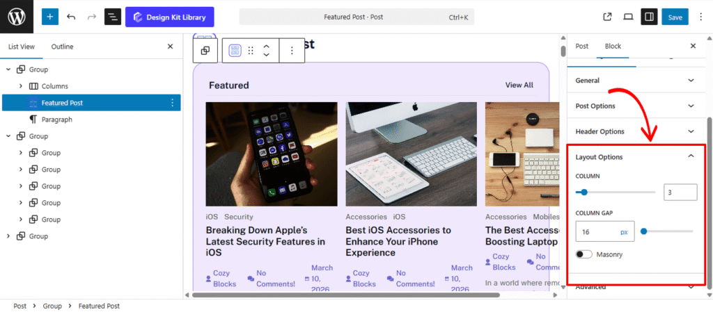
The Layout Options panel appears when your block is set to either a Grid or List display. These settings allow you to define the structural arrangement and spacing of your post collection to ensure a clean, organized presentation.
- Column: Define the number of columns to display in your grid. This allows you to scale your content from a single-column list to a multi-column gallery, depending on your page’s available width.
- Column Gap: Adjust the horizontal and vertical spacing (in pixels) between your post items. Increasing the gap creates a more airy, “breathable” layout, while a smaller gap maximizes the use of screen real estate.
- Masonry: Enable this toggle to create a dynamic, “brick-style” layout where post cards of different heights are automatically tucked into the gaps. This is ideal for grids where featured images have varying aspect ratios, as it prevents uneven white space between rows.
Slider Options
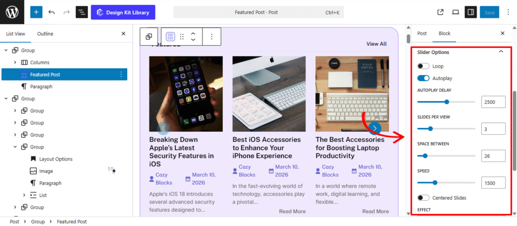
The Slider Options panel is available when the Display is set to Carousel. It provides a comprehensive set of controls to transform your content into an interactive, high-performance carousel. These settings allow you to manage everything from the timing of transitions to the specific visual effects used when moving between items, ensuring a dynamic browsing experience.
- Loop: Enable this to allow the slider to return to the first item automatically after reaching the last one, creating an infinite, seamless scrolling experience.
- Autoplay & Delay:
- Autoplay: Activate this to have the slides transition automatically without user input.
- Delay: Set the duration (in milliseconds) each slide remains visible before moving to the next.
- Slides Per View: Define how many items are visible at once within the slider container. This is ideal for creating multi-column carousels or focusing on a single featured post.
- Space Between: Adjust the horizontal gap (in pixels) between individual slides to ensure the layout feels balanced and airy.
- Speed: Control the duration of the transition animation itself. A higher value results in a slower, smoother movement between slides.
- Centered Slides: When enabled, the active slide is positioned in the center of the viewport. This is particularly effective for highlighting a primary post while showing glimpses of neighboring content.
- Effect: Choose the visual style of the transition to match your site’s aesthetic:
- Slide: The standard horizontal or vertical movement.
- Fade: A smooth cross-dissolve between items for a subtle transition.
- Coverflow/Cube/Cards: Advanced 3D transitions that add depth and a modern, high-end feel to the display.
- Enable Pagination: Adds clickable dots or numbers at the bottom of the slider for quick navigation.
- Enable Navigation: Adds “Previous” and “Next” arrow buttons to the sides of the block.
- Display on Hover: Keeps the navigation arrows or pagination hidden until a user interacts with the slider area, maintaining a clean and minimalist look.
Style ◑
Header Box Style
The Header Box Style panel provides comprehensive design controls for the container housing your section heading and category navigation. These settings allow you to define the visual boundary and spacing of the block’s top section.
- Padding: Adjust the internal spacing within the header container. Increasing the padding creates more room around the text and tabs, preventing them from feeling cramped against the container’s edges.
- Margin Top: Define the outer vertical space above the block to separate it from preceding content.
- Margin Bottom: Control the distance between the header box and the post results below for a clean, organized transition.
- Border: Apply a structural frame to the header area. You can customize the border width, style (solid, dashed, etc.), and color to match your site’s UI.
- Border Radius: Control the curvature of the header box corners. Use a low value for a professional, sharp-edged look or a high value to create a modern, rounded container.
- Color
- Color (Background): Set a specific background color for the entire header section. This is an effective way to create a distinct “header bar” that visually anchors the block.
Heading Style
The Heading Style panel provides granular control over the primary title of your block. These settings allow you to transform a simple text element into a high-impact design feature that defines the identity of your content section.
- Padding: Adjust the internal spacing between the heading text and its container boundaries. This is essential for creating “breathable” space, especially when a background color or border is applied.
- Border: Add a structural frame or underline to the heading. You can customize the thickness, style, and color to match your site’s brand guidelines.
- Border Radius: Define the curvature of the corners for each item. Use a value of 0px for sharp, professional corners or a higher value for a softer, more modern rounded look.
- Clip Path: Apply advanced geometric masking to the heading container. This allows you to create unique non-rectangular shapes—such as slanted edges, chevrons, or custom polygons—giving your header a cutting-edge, architectural look.
- Note: Enter only the CSS declaration value here (e.g.,
polygon(0% 0%, 100% 0%, 90% 100%, 0% 100%)). Do not include theclip-path:property name itself.
- Note: Enter only the CSS declaration value here (e.g.,
- Typography
- Font Family & Size: Select the typeface and scale that best matches your site’s design system.
- Font Weight: Control the thickness (e.g., Bold for emphasis or Light for a modern look).
- Letter Case: Force the labels to Uppercase, Lowercase, or Capitalize without editing the form code.
- Decoration: Apply styles like Underline or Line-through if needed for specific design cues.
- Line Height & Letter Spacing: Fine-tune the vertical breathing room and horizontal character density.
- Color
- Text Color: Set the hue of the title itself to ensure high contrast and readability.
- Background Color: Apply a fill color to the heading area. When combined with Padding and Clip Path, this creates a distinct “badge” or “tab” effect that separates the title from the rest of the header box.
Sub Heading Style
The Sub Heading Style panel provides comprehensive design controls for your secondary text or “View All” links. These settings allow you to create a dynamic, interactive element that perfectly complements your primary heading.
- Padding: Adjust the internal spacing within the sub-heading container. This is essential for creating a balanced “button” or “label” look, especially when background colors or borders are applied.
- Border: Add a structural frame to the sub-heading. You can define the thickness and style to create a subtle underline or a fully enclosed box.
- Border Radius: Control the roundness of the corners. Use a low value for a sharp, formal aesthetic or a higher value to create a pill-shaped link.
- Typography
- Font Family & Size: Select the typeface and scale that best matches your site’s design system.
- Font Weight: Control the thickness (e.g., Bold for emphasis or Light for a modern look).
- Letter Case: Force the labels to Uppercase, Lowercase, or Capitalize without editing the form code.
- Decoration: Apply styles like Underline or Line-through if needed for specific design cues.
- Line Height & Letter Spacing: Fine-tune the vertical breathing room and horizontal character density.
- Color:
- Text (Default & Hover): Set the initial color of the text and define a specific Hover color to provide clear visual feedback when a user moves their mouse over the link.
- Background (Default & Hover): Apply a fill color to the sub-heading area. Switching the background color on hover is a highly effective way to make your “View All” links feel interactive and tactile.
- Border Hover: Change the color of the border during user interaction. This allows for sophisticated transition effects, such as a border that “lights up” or shifts hue when the sub-heading is active.
Post Box Style
The Post Box Style panel gives you full control over the individual containers for each post. These settings define the structural “card” look of your content and allow you to add interactive depth through hover states and shadows.
- Padding: Adjust the internal spacing within each post box. This creates a balanced margin between the post content (image, title, meta) and the box’s outer edges.
- Margin Top & Bottom: Control the vertical spacing outside each post box to manage the distance between rows or separate the collection from surrounding elements.
- Border: Add a structural frame to your post cards, with full control over width, style, and color.
- Border Radius: Soften the corners of your post boxes. A subtle radius creates a modern, friendly UI, while a value of
0delivers a sharp, professional grid. - Hover Effect: Enable this toggle to activate transition animations when a user mouses over a post. This provides a tactile feel to your grid, signaling that the entire box is interactive.
- Default / Hover States: Use the toggle tabs to define different styles for the “Normal” and “Hover” states. You can shift colors, borders, or shadows to create a dynamic visual lift.
- Box Shadow: When the Box Shadow toggle is enabled, you can add depth and dimension to your container to make it “pop” off the page:
- Position: Choose Outline for a traditional drop shadow or Inset to make the shadow appear inside the container, creating a “pressed” effect.
- Horizontal & Vertical: Shift the shadow’s position along the X and Y axes to simulate a specific light source.
- Blur & Spread: Blur softens the edges of the shadow for a natural look, while Spread expands or contracts the overall surface area of the shadow.
- Shadow Color: Select the color and transparency (opacity) of the shadow effect.
- Box Shadow: When the Box Shadow toggle is enabled, you can add depth and dimension to your container to make it “pop” off the page:
- Color
- Background (Default): Set the base fill color for your post card. Use a solid color or subtle alpha transparency to match your site’s overall theme.
- Background (Hover): Define a secondary background color that activates when a user moves their cursor over the post. This is a powerful way to indicate interactivity and improve click-through rates.
- Border (Hover): Elevate the “active” feel of the card by changing the border color on hover. This adds a layer of sophistication, making the post box feel responsive to the user’s journey.
Post Style
The Post Style panel allows you to refine the visual presentation of individual post elements. These settings provide the flexibility to switch between a classic grid layout and a modern, immersive image-centric design.
- Image Overlay: Enable this toggle to transform the post layout. When active, the post content (title, meta, etc.) is moved inside the featured image area, creating a high-impact, magazine-style overlay effect that maximizes visual real estate.
- Image Hover Effect: Add dynamic animation to your featured images. You can choose effects like Zoom In, Grayscale to Color, or a subtle Opacity Shift to make the gallery feel more interactive.
- Padding: Control the overall internal spacing of the post item. This ensures that your text and images maintain a consistent “breathable” distance from the box borders.
- Post Image: Fine-tune the dimensions and spacing of the article’s thumbnail:
- Margin Top & Bottom: Define the vertical spacing around the image to separate it from the header or the title below.
- Height & Width: Set specific dimensions to ensure all images in your grid maintain a uniform size, regardless of their original aspect ratio.
- Radius: Adjust the corner roundness of the image independently of the post box.
- Post Title
- Margin Top & Bottom: Control the vertical positioning of the title to align it perfectly with the surrounding metadata and content.
- Additional CSS: A dedicated field for developers to inject custom CSS properties directly into the title element for unique styling.
- Color
- Post Title (Default & Hover): Define the primary color of your article titles and set a specific Hover color to provide clear visual feedback when a user interacts with the link.
Post Meta Style
The Post Meta Style panel provides specific design controls for the supplementary information of your posts, such as the author name, publication date, and comment count. These settings help you maintain a clear visual hierarchy by balancing metadata with your primary titles.
- Margin Top: Adjust the space between the post title and the metadata.
- Margin Bottom: Define the distance between the meta section and the contents below.
- Typography
- Font Family & Size: Select the typeface and scale that best matches your site’s design system.
- Font Weight: Control the thickness (e.g., Bold for emphasis or Light for a modern look).
- Letter Case: Force the labels to Uppercase, Lowercase, or Capitalize without editing the form code.
- Decoration: Apply styles like Underline or Line-through if needed for specific design cues.
- Line Height & Letter Spacing: Fine-tune the vertical breathing room and horizontal character density.
- Color
- Text Default: Set a subtle, secondary color for your metadata to ensure it provides useful information without distracting from the main post title.
- Text Hover: Define a specific color for when a user interacts with clickable meta elements (like an author’s name or a category link), providing a clear visual cue that the text is a functional link.
Read More Button Style
The Read More Button Style panel provides complete creative control over the final call-to-action for your post. These settings allow you to transform a simple link into a prominent, interactive button that drives user engagement.
- Padding: Define the internal space between the “Read More” text and the button’s edges. Increasing this value creates a larger, more touch-friendly target for your readers.
- Margin Top: Adjust the vertical distance between the button and the post excerpt above it.
- Margin Bottom: Control the space at the very bottom of the post box to ensure the button doesn’t feel cramped against the border.
- Alignment: Position the button to match your layout’s visual flow. Choose from Left, Center, or Right to align the call-to-action with your title and metadata.
- Border: Add a structural frame to the button. You can customize the thickness and style to create an “Outline” or “Ghost” button effect.
- Border Radius: Control the shape of the button. Use 0px for a sharp, rectangular look or a high value (e.g., 30px) for a fully rounded, modern pill shape.
- Typography
- Font Family & Size: Select the typeface and scale that best matches your site’s design system.
- Font Weight: Control the thickness (e.g., Bold for emphasis or Light for a modern look).
- Letter Case: Force the labels to Uppercase, Lowercase, or Capitalize without editing the form code.
- Decoration: Apply styles like Underline or Line-through if needed for specific design cues.
- Line Height & Letter Spacing: Fine-tune the vertical breathing room and horizontal character density.
- Color
- Text (Default & Hover): Set the initial color of the label and define a high-contrast Hover color to signal interactivity.
- Background (Default & Hover): Apply a fill color to the button. A distinct background color change on hover (e.g., shifting from a solid color to a slightly darker shade) provides essential visual feedback.
- Border Hover: Change the border color during user interaction. This is perfect for creating sophisticated “hollow” buttons that fill with color or change their outline hue when the mouse moves over them.