
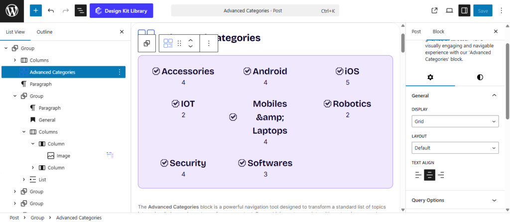
Advanced Categories


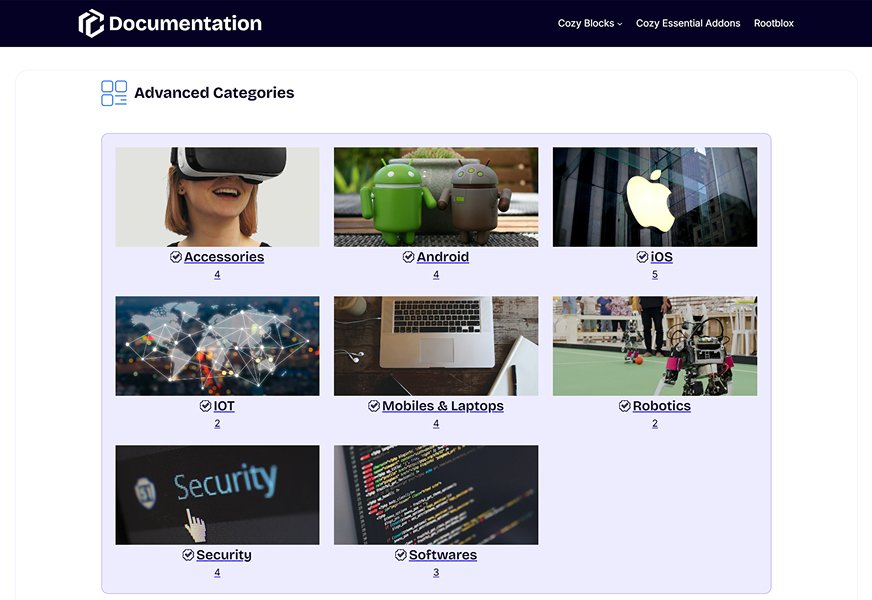
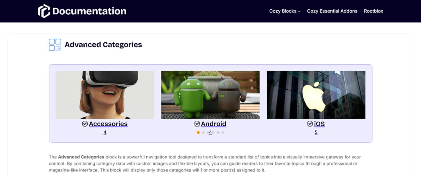
The Advanced Categories block is a powerful navigation tool designed to transform a standard list of topics into a visually immersive gateway for your content. By combining category data with custom images and flexible layouts, you can guide readers to their favorite topics through a professional or magazine-like interface. This block will display only those categories will 1 or more post(s) assigned to it.
Settings ⚙
General
- Display: Select the primary arrangement for your categories:
- Grid: A classic multi-column layout.
- Carousel: An interactive slider for a space-saving, swipeable experience.
- List: A vertical stack of categories, ideal for sidebars or clean navigation menus.
- List Item Height: Manually set the vertical height for each category row to ensure uniforDm spacing.
- List Item Height: Manually set the vertical height for each category row to ensure uniforDm spacing.
- List Gap: Adjust the spacing between each row in your list.
- Layout: Determine how the content interacts with the category image:
- Default: Displays the image and category text as separate, sequential elements.
- Cover: Places the category text directly over the image, creating a modern, immersive look.
- Overlay Hover Effect : Enable a visual transition, such as a color shift or opacity change, that triggers when a user hovers over the category card.
- Cover Element Position: Use a 3×3 grid selector to pin your category text to specific areas of the image (e.g., Top-Left, Center, or Bottom-Right).
- Text Align: Set the horizontal alignment of your category titles and post counts to Left, Center, or Right.
Query Options
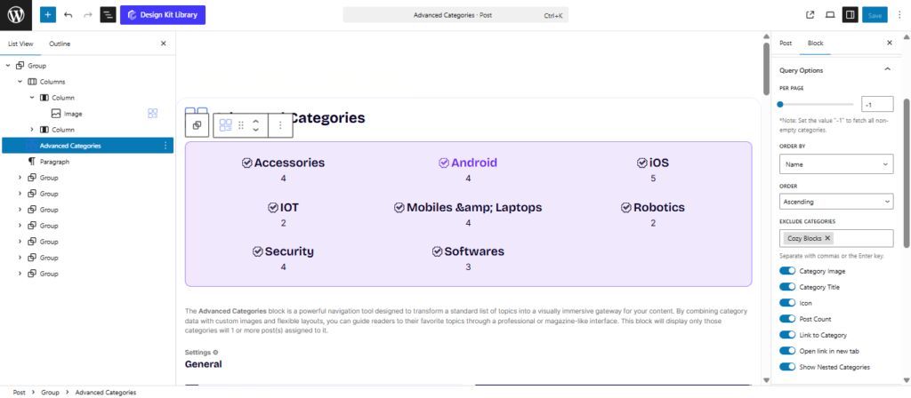
- Per Page: Use the slider to determine the total number of categories to display within the block.
- Order By: Define the logic used to sort your categories:
- Name: Alphabetical order by category title.
- ID: The numerical order in which they were created.
- Slug: Sorted by the URL-friendly version of the name.
- Count: Order by the number of posts assigned to each category (great for showing your most active topics first).
- Order: Choose between Descending (highest/latest first) or Ascending (lowest/earliest first).
- Exclude Categories: A selection field that allows you to hide specific categories from appearing in the block.
Toggle Controls
- Category Image: Show or hide the featured image associated with the category.
- Category Title: Toggle the display of the category name.
- Icon: Enable an icon display (if supported by your theme or category metadata).
- Post Count: Show the number of articles within that category (e.g., “Photography (12)”).
- Link to Category: Turn the entire category item or title into a clickable link that takes the user to the category archive page.
- Open Link in New Tab: (Visible if Link is enabled) Ensures the user keeps your current page open when clicking a category.
- Show Nested Categories: When enabled, this will include sub-categories in the display, allowing for a more hierarchical navigation experience.
Category Panel
The Category Panel provides granular, individual control over each specific category. Rather than applying a blanket setting to the whole block, these options allow you to curate the unique visual identity of every category card, ensuring that each topic is represented by the perfect image and color scheme.
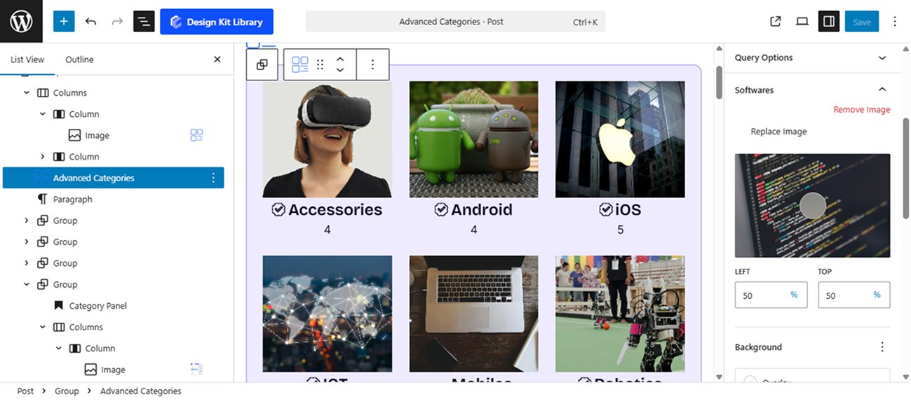
- Image Management
- Add Image: Upload or select a specific featured image from your Media Library to represent the category.
- Replace Image: Swap out an existing image for a new one without affecting the rest of the category’s settings.
- Remove Image: Delete the custom image and revert to a default color or placeholder.
- Focal Point & Positioning
- Left / Right (Focal Point Picker): Adjust the horizontal and vertical focus of your image. This ensures that the most important part of your photo (like a person’s face or a specific object) remains visible, even as the card scales for mobile devices.
- Color
- Background Color (Overlay): Apply a specific color tint over the category image. This is vital for maintaining high contrast and readability for the category title when using the Cover layout.
- Post Count Color:
- Text: Set a custom color for the number of posts.
- Background: Choose a fill color for the post count badge to make it stand out as a distinct UI element.
Grid Options
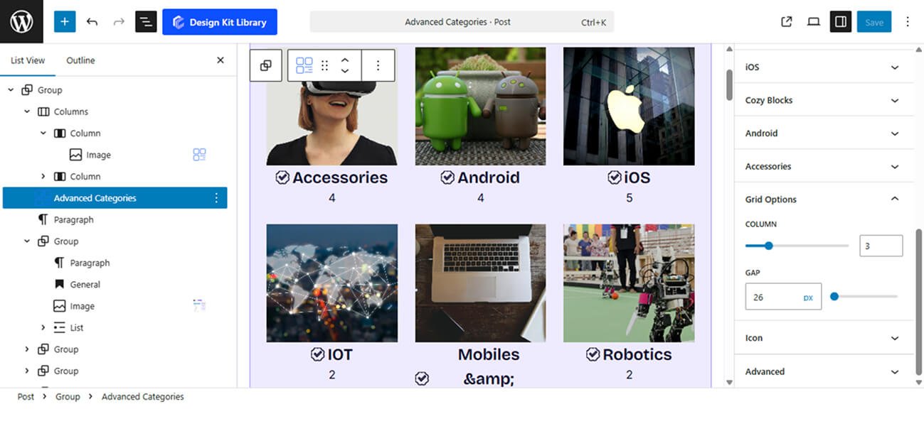
The Grid Options panel becomes active when the Display is set to Grid. These controls allow you to define the structure of your category gallery, ensuring the layout is balanced and aesthetically pleasing across all screen sizes.
- Column: Use the slider to set the number of categories displayed per row.
- Gap: Adjust the spacing between individual category cards.
Slider Options
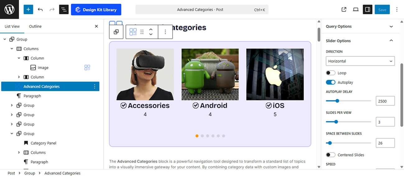
The Slider Options panel is activated when the Display mode is set to Carousel. These settings allow you to transform your categories into an interactive, touch-friendly slideshow, perfect for showcasing a high volume of topics in a limited space.
- Direction: Choose how the slides transition:
- Horizontal: The standard side-to-side swiping motion.
- Vertical: Slides move up and down, creating a unique, modern navigation feel.
- Loop: When enabled, the slider will cycle back to the first category after the last one, creating an infinite scrolling experience.
- Autoplay : Automatically advance the slides without user interaction.
- Autoplay Delay: Define the amount of time (in milliseconds) each category stays visible before moving to the next.
- Slides Per View: Determine how many categories are visible on the screen at once.
- Space Between Slides: Control the gap between each category card in the carousel to prevent the layout from feeling cluttered.
- Centered Slides: When active, the current slide will always be positioned in the center of the container, rather than starting from the left edge.
- Speed: Adjust the duration of the transition animation itself. A higher value results in a slower, smoother slide movement.
- Enable Pagination: Add navigation dots (bullets) at the bottom of the slider to show users how many categories are available.
- Display on Hover: When enabled, navigation arrows or pagination will stay hidden until the user moves their mouse over the block, keeping the design clean and focused on the imagery.
Icon Styles
The Icon Panel becomes available when you enable the Icon toggle within the Query Options. This allows you to add a symbolic layer to your categories, making them more recognizable at a glance (e.g., a “Camera” icon for Photography or a “Plane” icon for Travel).
- Gap: Adjust the spacing between the icon and the category title. This ensures the layout feels balanced, whether you want the icon to sit closely to the text or have more breathing room.
- Select Icon: Open the icon library to choose the perfect symbol for your category. You can search through a wide variety of professional SVG icons to find one that matches your niche.
Style ◑
The General Styles panel provides comprehensive control over the entire block container, allowing you to harmonize the Advanced Categories block with your website’s overall design. Within this panel, you can manage the visual identity of the Post Count by customizing its text and background colors, while the Typography options offer full flexibility over font families, weights, and sizes for all category labels. To ensure the layout sits perfectly on the page, the Spacing settings provide precise adjustments for both internal Padding and external Margins. Finally, the Border and Border Radius styling allows you to define the container’s frame and corner curvature, enabling you to switch between sharp, professional edges or soft, modern rounded designs.
Item Box Style
The Item Box Style settings allow you to refine the visual presentation of each individual category card, ensuring they stand out as distinct, clickable elements.
- Padding: Adjust the internal space within each item box to give your images and text the proper amount of breathing room from the container edges.
- Border: Add a custom stroke around each individual category item. You can customize the border width, style, and color to match your site’s aesthetic.
- Border Radius: Define the curvature of the corners for each item. Use a value of 0px for sharp, professional corners or a higher value for a softer, more modern rounded look.
- Box Shadow: When the Box Shadow toggle is enabled, you can add depth and dimension to your container to make it “pop” off the page:
- Position: Choose Outline for a traditional drop shadow or Inset to make the shadow appear inside the container, creating a “pressed” effect.
- Horizontal & Vertical: Shift the shadow’s position along the X and Y axes to simulate a specific light source.
- Blur & Spread: Blur softens the edges of the shadow for a natural look, while Spread expands or contracts the overall surface area of the shadow.
- Shadow Color: Select the color and transparency (opacity) of the shadow effect.
- Color
- Background Default: Set the initial fill color for the category card when it is in its static state.
- Background Hover: Choose a different background color that appears when a user moves their mouse over the card, creating an interactive “light-up” effect.
- Border Hover: Define a specific border color for the hover state, allowing you to highlight the active item with a glowing or contrasting frame.
Image Styles
The Image Styles panel allows you to control the aesthetic and behavior of the category’s visual media. These settings ensure your images are consistently sized and respond dynamically to user interaction.
- Image Hover Effect (Toggle): When enabled, this triggers a Zoom In animation when a user hovers over the category card. This subtle movement adds a layer of depth and makes the interface feel more interactive.
- Width: Manually define the horizontal span of the image. This is particularly useful for aligning images within List or Grid layouts to ensure a uniform look.
- Height: Set the vertical dimension of the image. Adjusting this helps you maintain a consistent aspect ratio (like 16:9 or 1:1 square) across all category items regardless of their original file size.
- Border Radius: Control the roundness of the image corners. You can match this to the Item Box Style for a cohesive look or give the images unique rounded edges for a “framed” effect.
- Color
- Overlay: Apply a semi-transparent color tint over the image. This is a crucial setting for the Cover layout, as it provides the necessary contrast to make white or light-colored category titles legible against busy backgrounds.
Content Box Style
The Content Box Style panel controls the specific container where the category title and post count are rendered. This is especially useful for the Cover layout, allowing you to style the text area as a distinct element over the image.
- Padding: Adjust the internal spacing between the text elements and the boundaries of the content box, ensuring your labels have enough room to breathe.
Title Style
The Title Styles panel gives you complete control over the appearance of your category names. Since these labels are the primary navigation cues for your users, these settings allow you to ensure they are both legible and visually striking.
- Typography
- Font Family & Size: Select the typeface and scale that best matches your site’s design system.
- Font Weight: Control the thickness (e.g., Bold for emphasis or Light for a modern look).
- Letter Case: Force the labels to Uppercase, Lowercase, or Capitalize without editing the form code.
- Decoration: Apply styles like Underline or Line-through if needed for specific design cues.
- Line Height & Letter Spacing: Fine-tune the vertical breathing room and horizontal character density.
- Color
- Text Default: Set the primary color for the title text to ensure it stands out against your background or image overlay.
- Text Hover: Choose a specific color that triggers when a user hovers over the category card, providing clear feedback that the item is clickable.
Post Count Style
The Post Count Style panel allows you to customize the small badge or label that indicates how many articles are contained within each category. This is a great way to add a subtle “data” element that encourages users to explore your most popular topics.
- Padding: Adjust the internal spacing between the number and the edges of the count badge. This allows you to create either a tight, compact label or a larger, more prominent button-style badge.
- Border: Add a custom stroke around the post count. You can define the width and style to make the count stand out as a distinct UI element.
- Border Radius: Control the roundness of the count badge. A high value will create a circular or pill-shaped badge, while a value of 0px keeps it rectangular.
- Color:
- Text: Set the specific color for the number itself to ensure high contrast and readability.
- Background: Choose the fill color for the badge container, allowing you to highlight the post count with your brand’s accent colors.
Pagination Styles
- Vertical Positioning: Fine-tune the vertical offset to control how far the pagination sits below the content.
- Gap: Adjust the specific spacing between each individual pagination dot.
- Align: Set the horizontal placement of the indicators. Toggle between Left, Center, or Right to balance the layout.
- Default / Active (Toggle)
- Default:
- Width & Height: Define the base size of the inactive indicators.
- Border Radius: Control the shape, from sharp squares to perfect circles.
- Active:
- Width & Height: Increase these values to make the active slide indicator physically larger or longer (e.g., a “pill” shape) for better visibility.
- Border & Border Offset: Add an outline to the active dot and use the offset to create a “halo” effect (spacing between the dot and its border).
- Border Radius: Independently adjust the curvature of the active indicator.
- Default:
- Color:
- Default: The color of inactive indicators.
- Default Hover: The color shift when a user moves their cursor over an inactive dot.
- Active: The primary color for the dot representing the current slide.
- Active Default: The color of the active dot when hovered.
- Active Border: The specific color of the stroke surrounding the active indicator.
Navigation Styles
- Box Width & Height: Define the clickable area surrounding the navigation arrows. Creating a larger box ensures your gallery is touch-friendly and easy to navigate on mobile devices.
- Border: Add a structural outline to your navigation boxes. This is ideal for “Ghost Button” styles where the background is transparent.
- Border Radius: Use the slider to transition from sharp, modern squares to soft, classic circles.
- Size: Independently scale the arrow icon within its box. You can create a “minimalist small arrow in a large box” or a “bold arrow that fills the frame.”
- Color
- Icon & Icon Hover: Set the color of the arrow itself. Providing a high-contrast hover color gives the user immediate tactile feedback.
- Background & Background Hover: Control the fill color of the navigation box.